The No-Nonsense Guide to Font Pairing

The business of pairing compatible fonts is a tricky one and involves more intuition that science. Indeed the first thing to note is that there are no hard and fast rules. A grasp of some fundamental principles however can make for more harmonious font pairings in our typography design systems.
Being typographically challenged myself, the development of Archetype (a tool I needed to help create typography designs more easily) enabled me to dig deeper into the accepted best practices of font pairing and consolidate the core concepts with associated dos and don’ts here in this time-sensitive guide. Without further ado, let’s get on with it:
1: Select Appropriate Font Personalities
- Pick fonts that exude the appropriate personalities for the job at hand, observe thus:

- Try and pair one font with a more overt personality with a second that is more neutral to establish an obvious hierarchy and avoid a battle for attention:

- Avoid combining fonts with conflicting personalities for obvious reasons:

- Avoiding well worn design clichés will lead to more unique, refined outcomes. A design cliché is often the most obvious thing that comes to mind when imagining a solution because it has become so overused (e.g wacky fonts for anything ‘fun’):

2: Create Visual Contrast
- It’s essential to establish the hierarchy of typography elements on the page by creating a high visual contrast, that is to say the visual differences need to be obvious enough to instantly understand the relative importance of each element:

- Assign roles for each font in your typography design and apply them consistently (usually the clearer and fewer the roles the better). For example you may have one font that is only used for specific types of headings and nothing else.
- Limiting yourself to just using 2 or 3 fonts in your design can make it easier to assign and stick to specific roles for each font (especially if you’re just starting out).
- Using different weights and styles from the same font family is sometimes a simpler way to create a high level of contrast whilst maintaining visual harmony between elements.
- Obvious one but vary the size of each font to strike the right contrast balance. The same two fonts can pair beautifully at certain ratios and form an indistinguishable muddle at others:

- Try varying the line-height, letter-spacing and the spacing between elements to find a pleasing visual contrast (utterly shameless but this is very easy to do in Archetype).
- Stand back and squint at your font pairing/typography elements. If they all blur into one amorphous blob, you need to create more contrast, the visual hierarchy should still be obvious:

- Beware, font pairs with too much contrast look unbalanced in larger blocks of text. They can however sit more happily together in logos or other such minimal-text applications:

- Only use weights and styles that the font was designed with. e.g. Don’t artificially bold it using CSS if no bold version exists, it won’t look natural and you’ll go straight to design hell.
3: Compliment Not Clash
- Pairing a sans-serif with a serif font is one of the most tried and tested routes to typographic harmony:

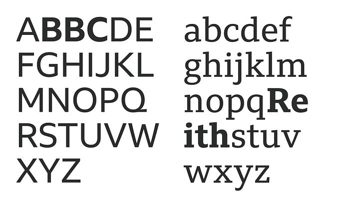
- Fonts that share a couple of roughly similar traits (e.g. x-height or glyph width) tend to sit alongside each other more agreeably than those that don’t:

- Fonts displaying similarities between their fundamental shapes (certain letters for example) can be more complimentary than those with noticeable differences (see above).
- Strive to pair fonts from different classifications to avoid an unseemly clash of font features. For example pairing two slab-serif fonts where the serifs themselves have noticeably different styles can look incongruous:

- Pairing fonts from the same time period that contain different features will often produce congenial results.
And if in Doubt…
Pairing a sans-serif header font with a distinctive personality alongside a more neutral serif body font is the ‘old faithful’ of typography design.