The Magic of Motion in UX Prototyping

When I started at HubSpot as a Product Designer early last year, I was immediately excited about many things — especially the tea-brewing robots. But nothing has positively impacted my day-to-day life as a designer more than Canvas: the design system we use to build our products.

Dozens of talented designers and developers worked for years to create the design system’s building blocks. Their hard work has made my job as a designer so much easier, allowing me to focus on people — not pixels.
The entire library of React-based components is shared publicly, as is what we’ve learned in creating it, getting it adopted, and keeping it evergreen.

With Canvas, it takes just a few clicks to make a high-fidelity prototype that looks just like the real HubSpot product.
Most HubSpot designers also use InVision to share designs and create rudimentary interactive prototypes. Its built-in tools allow anyone to provide feedback and collaborate on prototypes right in-line.

Sketch and InVision are great tools for creating and sharing static prototypes, and they work well for the majority of day-to-day design tasks. But sometimes, I feel like they hold me back.
The main issue with creating static prototypes is that they look, behave, and feel so different than the final product my team will ship. This means I have to spend a lot of time explaining the gap between the prototype and the product, whether through annotations, documentation, or team meetings. Even with these explanations, the people viewing my prototypes — designers, developers, and product managers — still have to make a mental leap to fully understand my intentions as a designer, which can lead misunderstandings and mistakes in development.
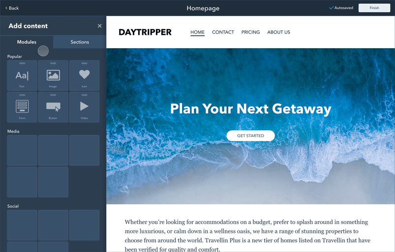
For example, suppose I had some rough ideas for a drag and drop website builder. A static prototype, annotated with interaction details, might look like this:
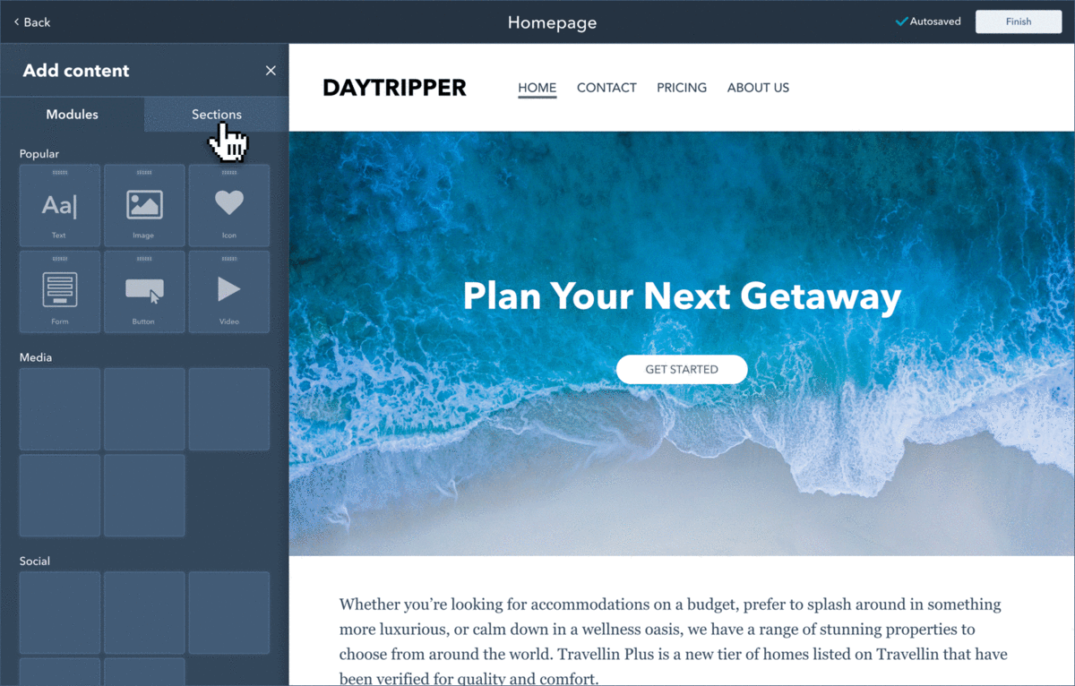
The annotations in the static prototype help explain the UI behavior, but it’s still hard to imagine how the product will ultimately look and feel.
Adding motion to the prototype removes the need for these annotations, and makes it very easy to understand what the user will ultimately experience:
Adding motion to prototypes isn’t always necessary, but I try to incorporate it whenever I can. I’ve found that motion can serve as an incredibly helpful tool to communicate with my team in three ways:
1. Generating buy-in
When in the early phases of a daunting project, it can be hard to imagine what its eventual outcome might look like. When so many details are theoretical, a simple interactive prototype can make a project feel real, and help get teammates excited about the work ahead.
2. Helping build user empathy
Users don’t experience software as a series of static screens; its behavior is much more complex than that. The more a prototype behaves like a real product, the better we’re able to understand how users will feel when interacting with it.
3. Explaining details
As shown in the gifs above, some interactions are difficult to describe with words & static screens. Interactive prototypes can often explain complicated workflows better and faster than dozens of annotated static images ever could.
As a bonus, prototyping with motion is a ton of fun. So, how is it done?
Getting Principled
Of all the interactive prototyping tools I’ve tried (Experience Design, Figma, Flinto, Framer, InVision Studio, Marvel, Origami, Principle & Proto.io.), my favorite is Principle. It’s great for quickly building prototypes with complex logic-based interaction and buttery-smooth animations, and its learning curve isn’t too steep.
In a nutshell, here’s how it works:
Pros
- Build virtually any interaction you can think of (drag & drop, sliders, loading animations, etc.)
- Incorporate motion design principles to make prototypes feel more real & delightful
- Zero lag, loading, & page flashes that are common in InVision
- Easy to learn
- Easy import from Sketch
- Handy & simple video export built-in
- 14 day free trial, $129 one-time purchase (no subscription!)
And just look at how dope these animations look:

Cons
- Mac only. This hasn’t much of a problem for me, since all HubSpot designers use Macs. Sketch is Mac-only as well, and we’ve been getting along just fine.
- Limited sharing options. Unlike InVision, Principle is not a web-based application, so its collaboration features admittedly aren’t great. I usually use Dropbox Paper to share and collaborate on the prototypes I make with Principle.
- Not as powerful of a standalone design tool as Sketch. Despite Principle’s limitations, I’ve never thought up a prototype I’ve been unable to build with it. On rare occasions, I’ll use Sketch to make a component that I can easily import into Principle.
Setup
I’m not going to go into all the details of how to use Principle, mostly because there’s hundreds of resources out there to help more than I ever could. Here’s a quick primer by the inimitable Pablo Stanley:
Principle’s website also contains excellent video tutorials that explain the basics. For the nitty gritty details and advanced features, I recommend reading Principle’s software documentation or this unofficial guide. If you’re interested in using Figma with Principle, the course from Design+Code is incredible.
Frequently asked questions (answers linked):
- How do I import a design from Sketch?
- How do I export a video or gif of my Principle prototype? Note: Principle has a built-in save-as-gif function, but it’s very slow and produces low-quality gifs. You’re better off converting a video to a gif with another tool (I highly recommend Gifski).
- How do I share an interactive version of my prototype with others?
A final word of caution:
While creating interactive prototypes can be a lot of fun, it can also be very time-consuming. Design is ultimately about communication; if a simple sketch or static prototype is all that’s needed to communicate an idea, there’s nothing wrong with keeping things simple.
Canvas Principle Library
When I started at HubSpot, The Canvas Library (while seriously the GOAT) only existed in Sketch. So, I took it upon myself to create and maintain a supplementary component library just for Principle. I built these components to match their Sketch counterparts pixel-for-pixel; I also made each component interactive, so they behave just like they would in the HubSpot product.
Below is just some of what’s included in the new Canvas Principle Library, which contains the vast majority of elements a HubSpot designer might use day to day.


Creating this component library was a lot of work, but it’s paid dividends in every interactive prototype I’ve made since. My hope is that this guide and library will make it easier for other designers to incorporate motion in their design process too, and experience the magic of motion in UX prototyping for themselves.
Thanks for reading! If this was helpful, let me know with a👏. If you’d like to see what else I’m up to, get in touch or check out my website.
Addendum
This article is based on a presentation I gave at HubSpot’s 2018 UX all-hands meeting and a previous article of mine, Getting Started with UX Prototyping.
For even more information on motion design’s role in UX, I highly recommend the following articles: