The Life Cycle of a Map
When I started making maps for Long Gone Days, about two years ago, I would stare at an empty canvas for hours. If I had to draw a forest, I would start drawing a tree, just to remember I didn’t have grass tiles yet, and then I would stop to think if the characters have enough space to move since there will be a cutscene.
It was far from efficient.
During the first months I struggled a lot because I wasn’t even considering level design to begin with, but nowadays I can finally work with confidence with every new map. These are the things I learned.
NOTE: This is not a pixel art tutorial! For the process of drawing assets, please refer to this section of our devlog.
You are making a game, NOT an illustration
This might seem obvious at first, but many artists want to make everything as beautiful/cool as possible, and this doesn’t always work well with games. No matter what, level design should come first.
Let’s take as an example this map from Mother 3:

In this scene, everything has warm colors, except for that bright blue pillow on the bed. So the player goes to check it out, because one would assume that if something stands out, it must be important.

And thanks to that, the player found out on their own that blue pillows allow you to take naps and restore your health. But, if this sort of invisible tutorial happened inside of Aeolia’s house, how many players would have missed it?

In short, think about the purpose of the map, and build around that. And more importantly, don’t confuse the player.
Making a fast prototype
Making a prototype not only allows you to make sure the characters have enough space to move/fight/talk, but it also allows you to progress with the development. Making the assets for a map takes time, and you don’t want to rush it just to finish the dungeon.

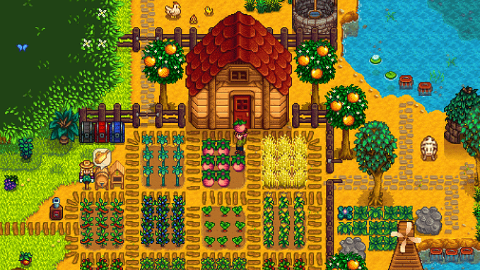
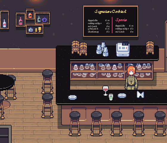
Our prototype maps start as something as simple as the image above. They are just collisions and events, and only the floor is visible. If you can manage to make a map feel interesting looking like that, it can only get better once it has the right art.
Now that you have an outline of the map, it’s easier to get started.
Looking for references
This is really important, even if it’s for something you see everyday. If you don’t have a big visual library of environments, things might look bland.
For example, if you are working on a map that needs a tree, probably the first idea that will come to your mind is one of a big round tree with green leaves and maybe some apples on it. If you go look for references, you could find a tree that would make your whole map more interesting:

Even for things like house interiors, and cities you see everyday, it’s always good to look for more. There might be cool ideas for wallpapers, tiles, furniture, even interior lighting. Don’t rely solely on what you know.
(P.S. Some of my favorite places to look for references and/or inspiration, are Reddit’s sfwpornnetwork and Airbnb for house interiors!)
Sketching a Map
With all the references ready, and knowing the purpose of the map, it’s time to start sketching. When there are a lot of tiny details, it’s easier for me to draw it on paper:

Then I would start tracing on top of it, and even add some filters, move stuff around, etc.
For things that are simpler, I would just sketch digitally, as if I was sketching any regular drawing:

What I like about sketching digitally, is that by the time I finish the sketch, I already have the color palette sorted out. This is by far the fastest way to do it.
Other times I would just start with a concept, like the lights and shadows of the scene, and I would continue adding details. This seems to work better for non-explorable maps, like the ones shown during cutscenes.

Just like the game itself, the maps are constantly evolving. A lot of the maps that were in the demo of Long Gone Days have been scrapped or redesigned. Some of these changes were small, others don’t even share an asset in common.

Thanks for reading!
I know there’s no right or wrong way to go when you are creating maps, but knowing these things have certainly helped me work faster. This is a general overview of the way I work, so if you have any questions, feel free to ask below!
You can follow the development of Long Gone Days on Twitter (@lgdays), Tumblr and Facebook.
Until next time!