The Greys in UX Design
The boom of minimalism in UX design in 2015 was accompanied by a wife and an escort. Both indispensable. The wife being the White and the escort being the Greys- all fifty shades of them.
Minimalism resonated with one uncontested anthem- content should shine. And it did. Whilst the White unfurled spaces that cradled content in a pristine ‘unadulterated’ fashion, if you will; the Greys nudged content into different pitches of importance, carefully manipulating her viewers to show facets she wants them to see.
There is an entire spectrum of colours and several (proven) theories of which colour evokes which emotion. In which context does a red CTA work better than a green one and vice versa? All this while the Greys sits unobtrusively and operates at a finer, subtler level.
So let’s break down her role:
1. Backgrounds and cards:
If you have content that is fragmented, a grey background provides a strong support for a card layout which would help draw user attention to each component.
Grey backgrounds are almost rendered invisible, and makes the content stand out and shine.

2. Forms and fields
Fields are the one of the trickiest components to design. Webpages which contain many fields are hard to scan and less likely to be filled up.
Greys help in face-lifting boring fields and segregating fields into sections to allow easy readability.

3. Improves readability
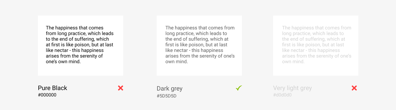
Pure black text is known to cause eye strain. White has 100% brightness and black has 0% brightness. This stark contrast and disparity in light input to the eyes causes the eyes to work harder to read.
Grey text improves readability by a whopping 58%. However, you must choose your grey wisely when it comes to text. Very light greys against a white background can be difficult to read and also cause significant eye strain.
4. Makes other colours pop:
Grey, with her generous neutrality, allows other colours to sing.
Also, because grey has a wide range of brightness (ranging from very light to very dark grey) it seems to work with just about every colour. It complements both masculine as well as feminine colours, earthy and classy colours.
If you want your website to have a hint of a particular character without coming across too strong, just wrap up your primary colour in a burrito of grey.

5. Elegant gender targeting:
Commonly held ideas of what what appeals to which gender applies to various components of a website; including images, text styles, illustration styles, shapes and colours.
Some stereotypes are:
Feminine: Images of babies and flowers, cursive and thin font styles, curves and circles, pastels and pinks.
Masculine: Images of automobiles and sports, thick and hard serif fonts, angles and sharp corners, blues and dark saturated colours.

Colour fads might come and go but Grey is here to stay. Something that is so flexible in its usage can adapt to different design rages in different capacities.
So the next time you wonder how to complement your hot pink brand colour without making it look too tacky, think Grey!
