The grand lifecycle of a small product change
It’s downright hard to change something within a live product. When we decided to change how users create cards in Purple.pm, we saw that difficulty firsthand and had to make some tough strategy calls. Our product, Purple, is made up of many different types of cards that you can lay out in a board to keep your project work all together — so, adding a card into your project is a fundamental part of the experience.
Our previous flow was decent. We had a menu in the corner which had a wonderful staggered-fade animation. From there, a user could select a card type to insert. The whole flow looked and felt nice. But it had a major flaw that only surfaced after the product was being used for big projects.

Before we go any further, if you’re not familiar with Purple, our homepage has a pretty quick explainer and a sample project. This will make the rest of this post more clear.
The Problem
As our users started using Purple for heavier projects, they were telling us that there should be a way to insert a card in the middle of the project. Sometimes they’re going back and adding content that they forgot to add. And in other instances, they were looping back and redoing an earlier part of the project. In order to add a card in the middle of the project, our users were forced to:
- Use the menu to add a new card (at the end of the project)
- Zoom out of the board
- Drag the new card towards the middle of the project.
- Zoom into the new card.
Designing and testing
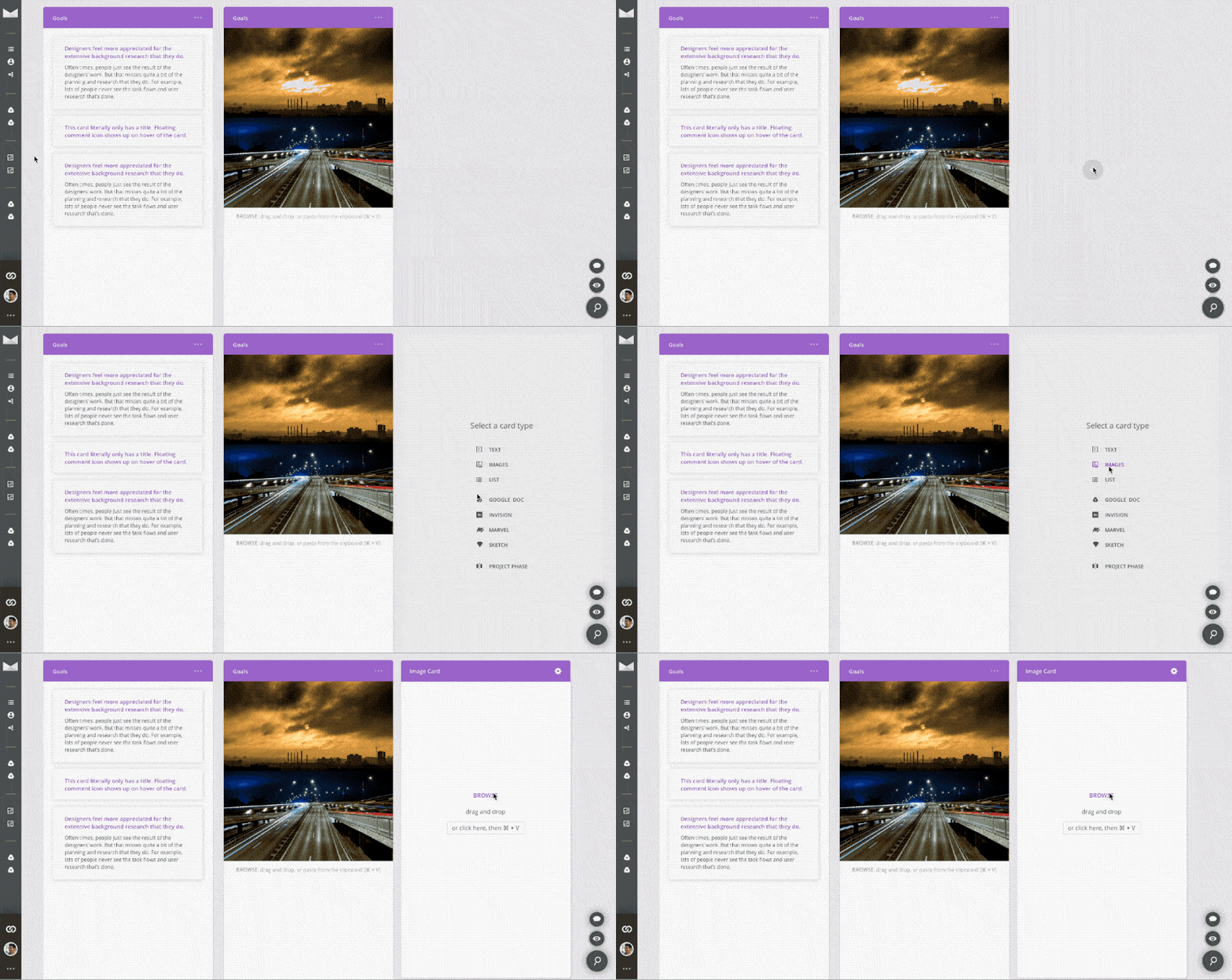
To resolve this issue, I redesigned the interaction model of inserting cards to be inline, rather than floating on a separate layer. You could still add cards at the end of your project using a big + button. But now, when you hover between two cards, a smaller + button shows up. Here were the Principle prototypes I created:


Usability testing
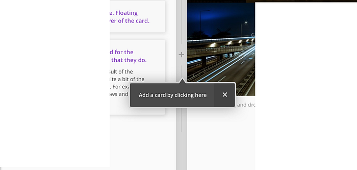
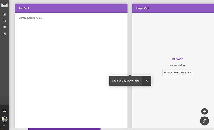
We tested the Principle prototype with four designers. The biggest takeaway for us was that it was going to be a big change for existing users of Purple — two users couldn’t figure it out on their own. But once we taught them how to use it, they loved it. This was encouraging! In response, I designed a little tooltip that would come up after you’ve inserted a few cards into a project.

This is where we hit a roadblock. After discussing the tooltip with the team, we found that it would take much longer to implement than we had expected. The actual UI is dead simple, but there were tons of edge cases to think through.
- Which two cards should we show the tooltip between?
- What happens if there is only one card visible?
- We know we’ll be building other tooltips soon to teach users, so we need to ensure that we design it and develop it in an extensible manner.
- etc.
Yikes! This brought us to a big decision point. Would this tooltip be worth the investment right away? In thinking it through, we considered one of our driving philosophies with regards to onboarding — be patient. Onboarding is incredibly tricky to get right, so it’s better to wait for actual customer data, and listen to how users describe features in order to craft the perfect onboarding experience. As long as we’re not taking something away from a user, it’s okay if a user doesn’t discover a new feature. No harm done.
So we decided on the following:
- Ship the feature without any onboarding tooltip.
- Explain the new UI to existing users by sending an in-app message through Intercom.
- Watch the data — if new users weren’t learning to insert cards between other cards, then we would implement the tooltip.
An Intercom message is not as optimal as a tooltip pointing you in the right direction, but it ensured that existing users wouldn’t be thrown off, and it required no dev work. We were essentially taking a bet that new users would be fine on their own. These kinds of compromises are tough as a designer, but they’re critical — your design skills are only as good as what ships. And if you can’t make compromises, then you won’t ship anything.
Here’s the message that we showed new users in the bottom right of the screen. This would come up immediately when they opened Purple. Even if the user didn’t read any text, the GIF would have at least caught their eyes and shown them everything that they need to know.

The resulting data
Once we shipped the feature, we watched our analytics to see how the feature was being received. It turns out that our existing users were fine with the Intercom message that we sent out. But only 25% of new users were finding the + button between cards. At the same time, there were some other features that we wanted to explicitly teach users — so we decided that now is a good time to dig in and create the onboarding tooltip.
We built the tooltip such that it appears 10 seconds after the user inserts their third card into a project. We figured that when a user is first starting out, they won’t need this feature — hence why we decided to show it after three cards were created. We wait 10 seconds because there would be too much “UI” coming up if the user inserted a card and a tooltip came up at the same time. Plus, a user is rarely going to want to create a new card immediately after creating a card. We’re also checking to make sure that they haven’t used the feature yet, and that they haven’t seen the tooltip before. There are other edge cases that we accounted for, but that’s the gist of how the tooltip works.

The final, final data
This time around, the data was fantastic. 89% of the people who have seen the tooltip subsequently inserted a card in the middle of a project. Furthermore, of the people that 89% bucket, 50% of the cards that they create are created in the middle of the project, not at the end. As a designer, these numbers were wonderful to see.

There’s a big drop off between the blue and the red because many of our users are “collaborators” — they’ll add one or two cards to their coworker’s project, but not enough to trigger the tooltip. But the green bar is 89% of the red bar.
From a results perspective, an 89% success rate on an onboarding tooltip and high feature usage proves that the feature is useful, and that we are teaching it to the user at more or less the right time.
From a more abstract view, this project was a good example of how a small feature change can be overwhelming. We had to use multiple forms of data input, make multiple strategy decisions based on limited data, and of course, patience. But when you do all of this, you’ll end up with a more polished product, and expanded use cases — for us, Purple is now being used to handle heftier projects by our users, and supports more serious collaboration needs.

