The “UX” (User Experience) designer is one of the least-understood roles in the tech industry, most likely because it was not a role that existed (at least not as it’s packaged today) more than 5 or 6 years ago. The confusion surrounding this role is compacted by its conflation with UI (user interface) designer, despite being different things (albeit with many overlapping responsibilities). That’s why I decided to look into the entire process that a UX designer might go through from idea to prototype, and beyond.
Here’s the scenario:
Imagine you are the sole UX designer hired by a company that wants to build a brand new app that you know nothing about. Since this company is well-established, and since you are generalist UXD, don’t worry about something like a lack of resources (i.e. if you need time/money, they’ll give it to you). Shortly after you get started, you will be collaborating with a whole team so that the app can be successfully developed. Some questions you might be wondering are: Where do you start? What do you need to find out? What steps do you have to take in order to get their developers to start working on the app?
Pre-Planning
First things first… you need to understand the problem the company wants to solve. There is typically a sort of kickoff meeting with the client, where you learn about their business and what they want with the product they hired you to design.
Phase 1: Research
Pre-interview Preparation
Conducting interviews with the client may take just hours, or possibly even days to complete (depending on the scope), but that doesn’t mean you need to stay in a room for 6 hours with your client until your questions are answered. For example, it may involve doing half-hour interviews with several key members of the team, one person at a time. However, before you get to the interview, it is reasonable to do some research on your own, which clients generally appreciate (since it means you don’t waste their time and already have greater insight into the company before you speak with them). Preliminary research may include:
- Business documents (mission statements, strategy documents, a chart of the organizational structure, etc.)
- Any research they’ve conducted (market/user research, competitor analyses, etc.)
- The client’s most recent annual report
- Examples of advertisements currently being used
Interview
When it comes to the interview, learning beforehand about some of the things above will help you to identify (if they exist) discrepancies with your client’s written documents and their verbal responses. In order to make the most impact, you do not want to bombard them with tons of questions. It’s better to have a relatively casual discussion about a few major areas. Tell them in advance what you’ll ask them, so they can be more prepared (and comfortable). By the end of the process, you should come away important points such as:
- The problem the client is trying to solve
- The KPIs (Key Performance Indicators) — It’s important to what success looks like, and this may help you understand the most important features in the product.
- The target market — This might be limited/basic information (your job will later be to learn much more about the client’s potential users)
- Who the competitors are, and how the client is different/better
- The client’s brand values
This is not the time for talking about features, functionality, or content of the app (you’ll do that later). You instead want to learn about the client’s culture, goals, and challenges. Do as many interviews as you need to understand the points listed above (for example, around 5–10).
Phase 2: Establishing the Persona(s)
Aggregate & Analyze Research
Based on the data you gathered on the client’s market, competitors, and potential users, you should spend some time researching more about what you learnt order to determine what types of people may use the product. For example, if your client is creating a new type of mobile app within the fitness or nutrition market, they may have a great idea but not a lot of info on potential users. However, if they have competitors with similar apps, you can investigate the competitors to generate new ideas. This may also be useful in determining what the competitor has done well and poorly, and who their users are. Otherwise, you may want to run some web analytics, conduct surveys, interviews, ethnographic (i.e. observational) research, etc.
Given enough research, you should be able to analyze your new mountains of data in order to spot patterns/trends. And by analyzing these patterns, you should be able to distill the data into what an “average user” might look like.
User Personas
“User personas” are archetypal representations of the product’s users; a hypothetical person that exists to enable everyone involved in developing the product to better picture who they are trying to appeal to. Essentially, personas are just tools that UXDs use to communicate their research findings. Here are some examples of user personas.
There are many such tools, but personas are one of the most popular. Some companies use real people (such as a family member or a friend) for their user personas. In such cases, they might even contact that individual to ask specific questions about things they may way to be incorporated into the product; but the vast majority of personas are made-up people.
In order to understand what kinds of motivations a persona has, some UXDs employ a tool called an empathy map, which generally includes what the persona says, thinks, does, and feels. Here’s an example of an empathy map for a developer named Rafa:
It would be a good time to note that many companies will create a slew of user personas, such as 5 distinct people with distinct motivations and life circumstances. This is usually more personas than is necessary; but honestly, the optimal number of user personas depends on the data itself. So you shouldn’t start making personas with preconceived ideas for how many there should be (though it looks like most sources I have seen suggest 2–3). Once you have enough personas for your app, you want to start to understand what your personas are supposed to experience, since the real power in personas is using them in scenarios.
Discovery & Planning
I like the term “discovery” in this context, because it emphasizes that the designer does not have all the answers. Rather than simply “creating” an experience, to some extent you have to “discover” it, based on what users think and want. Once you have discovered many things about the users, you can plan with those points in mind.
Phase 3–A: Common Techniques
User Scenario Mapping
A “user scenario” is just a story — a narrative that is meant to convey the user’s intention to do something, and the main steps along the way (i.e. you can even write a user scenario in short bullet-point form). But the real strength of using scenarios comes from implementing visualizations. There are many types of visualizations, including “narrative scenarios” and “storyboards,” but I am going to talk about one of the most popular methods in UX: scenario maps.
Scenario maps show each step of they way to performing some task, and they are used for several purposes. First, they help convey what motivates the persona to complete that task, which may help us discover and understand pain points, and help identify opportunities for improvement. The image below is a great example. Imagine that you have a persona named Paul, and Paul wants to order flowers for his mom on the client’s website. The scenario map shows each step of the way there, with useful additional information that was added by you or someone else who did this activity with you (i.e. imagining yourself as Paul, going through each step).
Other UXDs take it even further by including additional sticky notes for describing what the persona is saying, thinking, and feeling at each step of the way. However, you will notice that the steps do not describe how a task will be done, just what exactly will be done to get to the destination. Such functionality details will come later — not at this stage.
To create a scenario, you’ll probably want to talk to your client and discuss what the key tasks are (i.e., not common tasks like logging in or out). Once you know the key tasks, you can start imbuing your scenario with some context (i.e., who, what, when, where, why… but not how). Take the persona through the app with some other stakeholders (users, the client, product development team, etc.). Don’t worry if scenario maps become much larger, such as the image below.
The process of mapping scenarios, gathering feedback, reiterating accordingly and gathering more feedback takes more time than almost everyone expects. But when you are finished mapping out the key tasks, get feedback to make sure everything is progressing as it should be, and that questions are being gradually answered to allow for a more full picture of what the experience should be.
The data you get from this process may also help you discover what features may need to be added in the future; or, at the very least, help flesh out the user journey (described in the next subsection). Just keep in mind that you’re not trying to determine everything from the scenarios… just enough to enable you to keep moving the design discussion forward.
User Journey
Definitions for “user journeys” differ depending on who you ask. Some sources say that they’re derived from collections of scenarios; some say they’re narrative tools to help us understand the motivation of our personas; others say they’re diagrams or models of touch points between your user and your product; while others still say they are like journals that record emotions, and “may focus on different aspects of a solution, […including] the back-end server.”
There is also some variation in what they are supposed to look like or be called (some call it “experience maps” or “customer journey maps”); but the image below is a good outline of what most of them tend to look like.
As you can see, user journey maps are usually linear visualizations that are supposed to convey some aspect of the persona’s emotional state while experiencing the product. By highlighting things such as when they are annoyed, surprised, or delighted, it will be easier for you to identify areas for improvement (and potentially help you note things for other aspects of the app). User journey maps can be created with the feedback received through user interviews, observations, data from the previous phases, etc. Here is a detailed example:
Journey maps can be used for what the current experience is, or for the experience you are intending to create. If you use both, the product development team can compare them and determine what needs to change in order to reach this aspirational journey. Of course, both journeys may need refinement as new challenges arise and are overcome; but this process should help get everyone on the same page, which will make the product development team better able to move forward. In other words, you should come away with an action plan from this.
Phase 3–B: Alternative Approaches
User Stories (& User Story Map)
I didn’t want to go over every little technique in detail, but there seems to be a lot of confusion around the term “user stories,” likely because the word “story” is used colloquially often when talking about things like user scenarios and user journeys — even by myself in this very article (though I was careful not to write “user story” anywhere else). To further complicate things, we use the term user story in Agile development teams, which may be the source of confusion for designers. Designers might be using this as a means of communicating with developers to give them some direction. I don’t think this is a problem, and in fact that is how I will be using it. Just keep in mind that some designers will say “user story” to mean something else; but the rest of this subsection refers to the Agile meaning.
A user story is actually really simple — it is just a sentence that describes one aspect of how a user can interact with the app, in a way that is actionable for developers. Examples include:
- As a user, I want to be able to change the colour of the shoes, so that I can see what they look like
- As an admin, I want to be able to access the dashboard page so I can see the payment history
- GIVEN I am a user AND the time is between 9am & 5pm, WHEN I navigate to the home page, THEN the chatbot’s chat bubble will pop up with a greeting
In case you couldn’t tell, user stories generally have three parts to it: 1) who the individual in question is (and what the context is, since there can be multiple details, as seen in the third bullet-point), 2) an action, and 3) a consequence of that action. By looking at one of these bullet points, a developer should have a relatively good idea of how to proceed with this information (i.e., implementing it), which is why user stories are so common.
Creating user stories is not necessarily even the purview of the UX designer, but I wanted to include it because failing to do so may have led to more confusion by those who see the term used elsewhere. To be clear, someone like the head of development, the team lead, or scrum master would likely make user stories, based on (or in conjunction with) the user scenarios/journey you’ve created.
As for “user story maps,” there are certainly more articles out there that talk about the elusive visualization than actually show what it is supposed to look like. Presumably the reason for this is that developers use user stories, while designers are the ones writing articles about it; but whatever the case, I am left wondering how useful they may be… but maybe my own experience has clouded my judgment on this. Because despite using user stories regularly in my work as a developer, I have never used a user story map. Regardless, these examples should give you an idea of what they could look like, should you find need to create them yourself.
Service Blueprint
According to Learning Space Toolkit:
“A service blueprint is an operational planning tool that provides guidance on how a service will be provided, specifying the physical evidence, staff actions, and support systems / infrastructure needed to deliver the service across its different channels.
For example, to plan how you will loan devices to users, a service blueprint would help determine how this would happen at a service desk, what kinds of maintenance and support activities were needed behind the scenes, how users would learn about what’s available, how it would be checked in and out, and by what means users would be trained on how to use the device.”
Some service blueprints are more graphic than the text-based examples you see here, which is why I am including two examples below — one more text-based example with clear arrows, and another one which has more graphics but does not have cross-sectional arrows.
Phase 4: App Flow
Flows, Charts, & Maps
In my previous article on Flows (UX Flows, and Why They’re So Confusing), I discussed a myriad of options available to UX designers. They range from simple words and arrows all the way to high-fidelity User Flows. But at this point in the process you want to keep the fidelity (i.e. the amount of detail) low so that you can get feedback as early as possible. Therefore, these will help you determine the information architecture (the structure and hierarchy of information, and how that information is presented) as quickly as possible.
In the interest of speed, you should use anything that helps you visualize the actual flow of the app in its entirety. One option is the Text-based UI Flow. This makes iterating painless, and the nodes can be turned into sticky notes very easily for subsequent testing.
Flow charts are similar, though they utilize UML (Unified Modeling Language) to keep things consistent and understandable (especially when colour-coded). Site maps can also be useful for showing every single page in the site, but this is especially true for straight-forward websites rather than complex web/mobile apps. There’s a good chance you won’t need to use a sitemap (in lieu of another tool); but keep keep it in mind, just in case.
User Testing
Before you get to the more graphic/visual designs, you want to make sure that you are on the right track. After all, it is your responsibility as a UXD to give the developers what they need to help them develop an experience that users will like. Therefore, in order to ensure that you’re not wasting your time by redoing your work later, you need feedback from others.
Writing out the flow on paper for users (the client, developers, etc.) to test is a great way to have them start to “experience” the app. While this won’t give them a great sense of what the final product will be, it provides you an opportunity to get feedback. After all, Phase 4 is really just a sanity check — ensuring that you won’t end up throwing out your subsequent work after finding out about a problem that could have been prevented through proper communication and collaboration.
Have the testers “walk through” the app and see if everything makes sense, if they have suggestions, etc. The worst-case-scenario is that everyone says it’s fine, and then later, after you finish creating a full-blown prototype, someone says that the flow isn’t right or there is a fundamental problem that brings you back to this phase. Obviously revisions will be made in the future, but the time for major revisions is now.
Even if you mapped out the flow of the app on your computer, use sticky-notes to map out the app so that people can feel comfortable with criticizing it or moving things around. It doesn’t feel so “set in stone” when it’s on a bunch of sticky notes. For this reason, you also do not want to make them look pretty. You want people to be honest with their feedback, so don’t give them a reason to hold back their questions, apprehensions, or constructive criticism. In the same vein, don’t hold onto your preconceived ideas about how the app should flow… this phase is inside the “Discovery & Planning” section for a reason. Sometimes you just need to discover what the optimal flow for the app is, based on the feedback from users.
If you are hearing contradictions in the feedback, get even more people to test it, and look for patterns. When you have enough evidence to support the notion that your app flow is intuitive and works well, it’s time to advance onto the next phase.
Designing
Note: At this point, many designers like to use design systems — a system of reusable components that can be assembled according to defined standards. Design systems are great (I personally love the “Atomic Design” approach), but they aren’t for everything (or everyone).
The two main points for using design systems is to keep designs consistent, and make it easy to scale. However, while they might speed up the design process in the long run, it is a substantial time investment up front. You must first spend time building small components, which may not be so useful if you are using them only once or a few times each. For example, if you are designing the UI only for a small iOS app, then using a design system might be time-wasting overkill. For this reason, I am not including designs system in the process (but they can surely be adapted into it, so keep them in mind if you are interested).
Phase 5: Interaction Design
Interaction Map
Now that you have a sense of the app’s flow, from Phase 4, you can start to determine how you are going to navigate from one screen to the next. Take this opportunity to use an “Interaction Map” to help you understand what parts of the screen are interactive. For example, you should have boxes for each screen (but not scaled, sized, or positioned)… and include buttons, links, inputs, etc. without worrying about the actual aesthetics.
While it seems that designers often neglect/skip this step (probably because it takes more time, and many would rather go straight to wireframes), it can be especially useful when you are working with a client/team that wants constant reassuring, or likes to give constant feedback.
The image below gives a sense of what an Interaction Map could look like, since they are not full-screen mock-ups. But don’t get caught up with the fidelity — you can make this low-fidelity, even on sticky notes. The point isn’t to show what the UI will look like, but just that you know how you are getting from page to page. In fact, this image is not a perfect example, since it has some non-interactive elemtns as well; but it is pretty much the same as an Interaction Map.
Furthermore, if this is done well, this Interaction Map can serve as a good reference for the whole product development team in the future (since it doesn’t have a lot of other distracting elements that comes with the rest of the UI).
Wireframes & Wire Flows
Wireframes are just low-fidelity mockups. They are great for giving a (potentially vague) sense of where elements will be located on the screen. For this reason, some designers swear by using markers on white boards, because it forces you to write text in blocky letter, thereby making it impossible to scrutinize or worry about granular details. Wireframes are is supposed to indicate shape, size, and position, and that’s pretty much it (i.e., not font, colour, content such as images, etc.). They are great for you to make paper prototypes with (see below).
A Wire Flow is simply a diagram of wireframes that show the flow of the app. Although the definition of a Wire Flow is a bit loose… for our purposes, I specifically mean the those maps that indicate which elements are interactive (e.g., buttons), and to which screen they will lead the user when interacted with. This way, you are building up on the Interaction Map, by adding them to the wireframes.
I would be remiss if I did not mention one more tool UX designers can utilize in this phase. I have seen physical decks of cards that you can buy to speed up the process of designing the UX as quickly as possible.
While the downside to this is that there is no customization, that is precisely what makes this tool so quick to start using. Presumably, you would want to use this early on in the design process to get a quick sense of what the flow could be. Although you could always just download and utilize free digital UI kits which essentially do the same thing. Depending on the kit, you might also be able to customize things… but keep in mind, the trade-off is that customization takes more time, and that’s the strength of these cards.
Paper Prototype
Once you have an assortment of wireframes, it’s time to get more user feedback. Much like the testing done in Phase 4, you are going to need to test the flow. This time, the testers won’t need to rely as much on their imagination, since they can physically tap on the page, and you will be able to guide them through the process of navigating from stage to stage (…much easier when you have a handy Wire Flow to refer back to).
There is no “one true way” to do a paper prototype. You can use sticky notes, print out your designs, or cut out pages on which you have sketched. Just keep in mind that testers may feel a little less comfortable criticizing your work if you appear to have put a ton of effort into them. Luckily, many UX designers, and those who test them, find paper prototypes to be kind of fun; which certainly helps.
Paper prototypes can be eye-opening, since most people can get a real sense of what the experience of your app will be. And since you will be making constant improvements based on feedback, you should absolutely not spend time worrying about things like colours or images. You should be busy perfecting the flow of the app as it is right now (while fully expecting that it will probably change somewhat later anyways).
In other words, the goal here is to ensure that the subsequent feedback you receive is focused on the aesthetics, rather than the interactivity or flow in the app. If there are any qualms about how the app flows, that should be hammered out in this phase, before going forward.
Phase 6: High-fidelity Designs
User Interface Design
You knew it was coming at some point, didn’t you? Well here it finally is, the UI itself! In all its detailed, high-fidelity glory. While larger companies often split up UX and UI to such an extent that the UX designer may not even be involved in this aspect of the app (i.e., the dedicated UI designers would be)… you were hired in this hypothetical situation as the sole designer; so it’s all you.
The ironic thing about this phase is that it takes up a ton of time, it’s difficult, and there are so many things you can learn about it (from modern trends to design software)… but there really isn’t much to say in terms of defining its place in this process.
After all, it’s pretty straight-forward: You will now design what the screen will actually look like. Your designs will soon be given to the developers, who will implement those designs. If the users don’t like the screens (e.g., if they are not intuitive or attractive) then they won’t enjoy the app. But this is all stuff that you know already…
Naturally, you should get feedback on your designs when you feel the need for a second opinion, and when you finish them.
Additional Deliverables
Optionally (but recommended, especially for larger projects), there are some additional deliverables that will help set a consistent standard for visual design across the app. I hesitated to give this its own subsection since I did not do so for design systems, because both require an up-front investment of time, and may not be necessary (depending on the scope of the app). However, this can be created near the end of the design process. Of course, you could have started this earlier; but it is a case-by-case situation.
Here are some of the design deliverables you may want to consider making:
- Style guide: Documents that explicitly define consistent visual standards
- Mood board/Style tile: UI designs and aesthetic ideas that embody the “mood” or “feel” of an app/site, and help convey the brand through a standardized visuals aesthetic
Style guides range from highly visual descriptions of the UI elements to much more text-heavy explanations (like a small booklet, not a one-pager), with paragraphs of information justifying all their design choices. This can be useful, but you should probably confirm with the client/team whether or not this would be worth the trouble to make.
As for the other two… I am told there is a difference between mood boards and style tiles, but it sounds like nothing more than marketing semantics to me. They are both essentially collections of out-of-context components that have been designed to fit any context that may arise in the future. This is great for enabling the product development team to communicate the brand, and maintain a specific visual standard across the app.
If you are anticipating the creation of many new screens, pages or features in the future — or you are working on contract, and won’t be around to offer guidance later — this may be a worthwhile investment of your time. Take a look at several examples; it’s probably pretty easy to see the value on these.
Prototype
There is a lot of cool software out there to make prototypes. The thing about functional prototypes is that they actually simulate the whole experience. For example, you can tap the “next” button, and it will take you to the next screen, just like a real app. Of course, you don’t input or see real data (it’s all made-up), but this makes it very easy for testers to see what the real app will be like.
Needless to say, you’re going to want a lot of people to test this app. When your prototype is “ready” you can begin to collaborate with the developers on the implementation of your designs.
Production
Let’s be real, a team of developers should not be waiting for your finalized prototype in order to get started, since developing a complex app takes a lot of time. Especially if there is a lot of back-end development that needs to be done (i.e., building the server, structuring the database, etc.), the developers would have been working for a while now. But at this point, you have done the hard work and it is now their time to shine. So it’s time to collaborate with a more supportive role, in order to get it to launch.
Phase 7: Implementation & Management
Your work isn’t actually done when you give the developers a prototype. Rather, this is when you start to do any number of these kinds of tasks:
- Support your team: Answer questions about how things should look or work, provide guidance when necessary
- User testing: Get more feedback, see what users think, record analytics; determine if you need to make updates. You probably will, because QA (quality assurance) may be trying to break the app, and unforeseen issues might require your expertise
- Plan: New features (or revisions) may be planned, and you may need to be involved in discussions of what these updates should entail and how to go about them
- Update: Based on new problems that arise, new feedback that was received through testing, or new features that are planned, you may need to retreat to the jungle and update the designs again
How far back in the process you should go — in order to update your app — depends on several things. For example, how pressured you are for time, and what the update is (e.g., major overhaul, small bug fix, new feature, etc.). But rest assured, at some point you will be going back, since continuous improvement is a hallmark of the UX designer.
Wrap-up
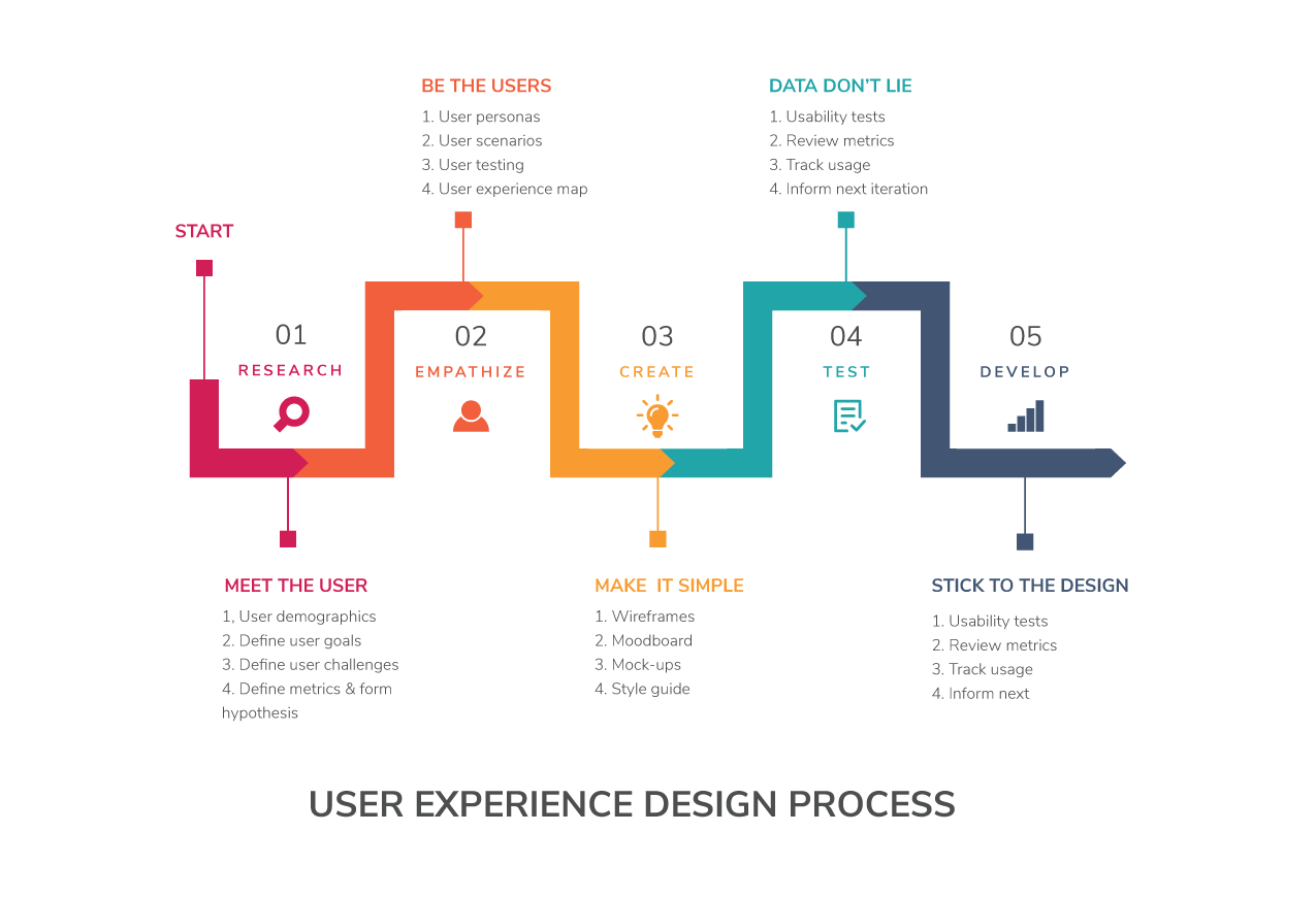
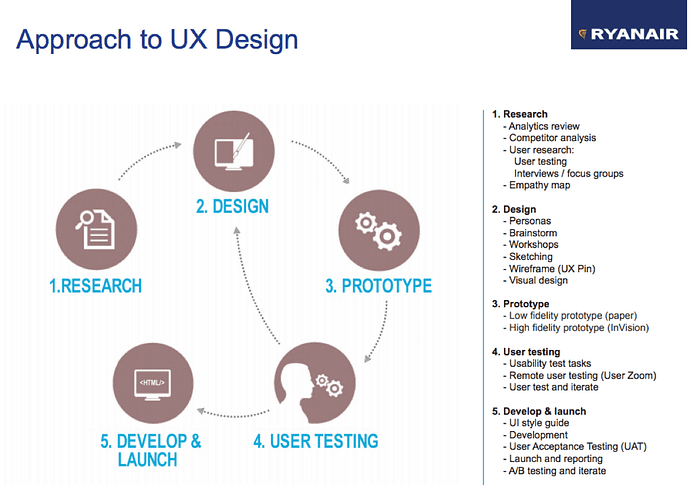
The process I have come up with as a result of my research has 7 phases:
- Pre-Planning — Research
- Pre-Planning — Establishing the Persona(s)
- Discovery & Planning — Common Techniques & Alternative Approaches
- Discovery & Planning — App Flow
- Designing — Interaction Design
- Designing — High-fidelity Designs
- Production — Implementation & Management
I did not go into great detail in any of the phases, since there is a lot of good information out there (much of which I linked to when relevant). But the process I have outlined seems to be pretty consistent with other models of UX design workflows, even if the number of phases or the way the information is organized varies slightly. For this reason, I am satisfied with my newfound understanding of the UX design process.