The Dilemma of Horizontal and Vertical Scroll in UX Design!
Hello reader, if you are also wishing if we could (maybe) reduce the pain from the user’s delicate fingers, and allow them to scroll through their eyes, like Google Glass — how wonderful the world would be?
But not all wishes come true, right?
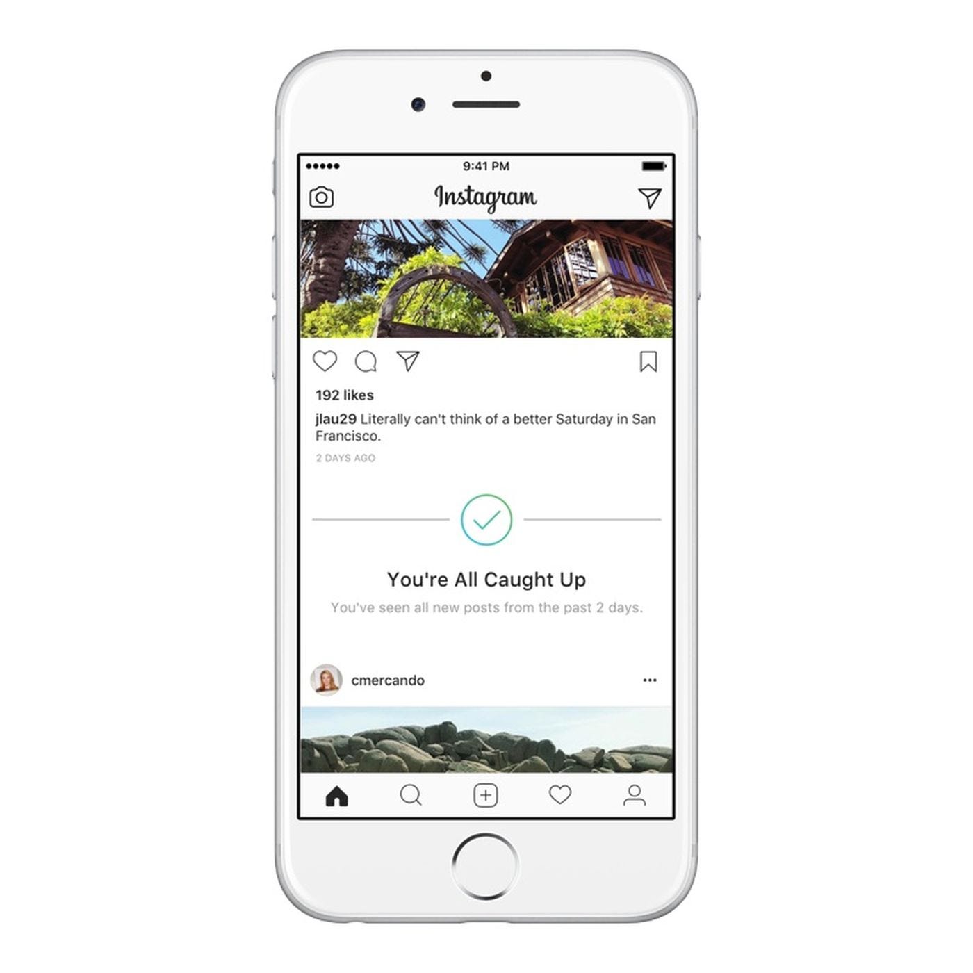
Till the time we have screen interfaces, people need to scroll. Sometimes, scrolling is fun — like when you are scrolling kilometres down into Instagram to see all those sassy posts and memes, so much fun that Instagram has to tell you to stop —
Designing for social media is something else, because here the user ‘willingly’ comes to spend (or waste) time, and they’re happy to do that! You can show them endless posts, and they will scroll. But what if when you are designing something that you ‘want’ the users to see? Something that isn’t as interesting as — your friends skinny-dipping into sub-zero temperatures in Russia on their vacation?
Well, then you must think about the user-first.
Although every single process in UX Design involves thinking about the user first, how do we make sure that what we are designing is right or not? When it comes to user research, you will get a variety of opinions. Some people will tell you that your solution is amazing, while some will hate it bluntly.
I have been a part of user-research team for a short-while in a company in Bangalore (India), and we interviewed local drivers for Uber. And they were as confused as a kid presented with a candy and a chocolate. We could hardly derive any meaningful result from that entire day’s session. But that is what user research is all about — isn’t it?
Now, generally a designer expects that user research will get him perfect insights — and sometimes, it does. But many times, the response is in the middle, and you have to take the call yourself!
What if A/B Testing yields equal amounts of As and Bs? What do you do then?Nothing — you take a call. A call that your head asks you to take. Something that is full of logic and common-sense. Nothing fancy, no magic happening here. Only common-sense.
Well, one fundamental thing to remember ALWAYS is that design, is a creative thing. There is no right or wrong in design, it is all just plain common-sense. Common-sense that you use in various contexts to produce meaningful designs.
Like, Instagram does not allow you to forward or rewind the videos that people post — now that, is a bad user experience! But also, they only allow one minute videos to be posted online, which means you’re not stuck there for more than a minute — brilliant!
But if you see YouTube now, you cannot apply same context to it. You cannot prevent users on YouTube from forwarding or rewinding the videos, videos that might be hours long — that is blatant cruelty!
You see what happened there? The game is all about context.
Now coming to the main topic — the dilemma of vertical and horizontal scroll. Vertical scroll is most comfortable, and something that the users are used to already, they all use Facebook and Instagram, so they know that the apps and websites go from up to down — nothing new to learn, hence no learning curve, hence you’re good to go!
Many times, while designing an app, you come across a situation where you have a secondary menu or a small tab-section that you absolutely cannot emit/ignore. You end up designing something like -

Now, if you have read my previous article, Perfect Design — A Myth, you will understand how wrong this is.
In reality, I have something like this to work with -

You see what happened above? The menu went out, and now I have to introduce a horizontal scroll for the user to understand that there are more options on the right. But —
- Horizontal scroll and vertical scroll on a single screen are mood killers!
- Here, as you can see, the user has no idea how many tabs/sections might be on the right. This is bad. The user has already lost interest.
- If every section exceeds the height of the page, the user will have to come up every single time, to move to the next tab.

Something like this will happen, and the user doesn’t want to go up, see the tabs, scroll horizontally, select one, scroll down (vertically) to read the content, go back up again — I am already frustrated writing this down, imagine what the user will go through!
Now, here we have one solution, the standard, classic vertical tabs. This is amazing, believe me. It might not look as beautiful as those perfect designs you see online, but you see, this is functional. The user here will not have to go through the pain of scrolling both horizontally and vertically at once —
These tabs are expandable, they are clean and they are vertical. The user can read the information as he scrolls — comfortable too!
But there is one problem that I personally feel with these solid coloured tabs, and now comes the visualisation/beautification part. The brand colour is dark (which can’t be helped with), because of which a lot of attention goes to these boxes. To reduce that, we can either have lined boxes like these —

Now you can feel the difference. They are not screaming for attention, they’re also not hard on the eyes, and they don’t hinder the reading flow either.
You might think this is the best, perfect solution to this problem, right? No. Wrong. There is always a scope for improvement, and here was the final solution that I came up with —

You can notice that I removed boxes completely — why? Space optimisation, that’s why!
When we can put more information in a limited space — why not?
The boxes remove a lot of clutter, and add to the visual appeal as well. The plus and cross sign, are also sharp looking, so I replaced them with these soft-edged arrows. When you have a section open, the arrow rotates and faces the top, and when the sections are closed, the arrows face the right — simple interaction.
Here you can observe that this looks like a smooth reading experience, without making the user feel like he constantly needs to work hard to keep his attention at place.
Now that is how much work and thought-process goes behind every single thing that a UX Designer makes. So next time you are loving an app — think about the pain that the designer might have to go through to make it so simple, interactive and easy for you to use. As they always say — simplest things are the hardest to make!
That’s all for now, I will continue here with my stories and tales from this amazing world of UX! 😊 Let us show each other some love and support, and let’s make this community awesome! 😎
