The Design Routine of International Super Apps: what AI doesn’t know that humans do
Super Apps
Super Apps are the imminent evolution of an app from some of the company’s key businesses during a period of growth. Example: Twitter. Typically, taxi services, messengers, banks and social networks become super apps. Conceptually, the iOS and Android operating systems are also super apps. The same for a browser: one application with many tabs.
The goal of super apps for business is simple: to increase the number of users of secondary/new services. For example, we want to promote home food delivery, trucking and pet transport through the taxi users. Instead of promoting all these services separately as individual applications, it is easier to combine them into one app and promote just one instead of several.

For users, the value of a single point of entry to the ecosystem. Booked to transport your belongings between cities with Uber? Here’s a discount on house cleaning. Here you utilize a multi-level JTBD for cases, which has develop a sticky factor at the end of the day. In this way, WeChat has become much more integrated into people’s lives than Grab. The super app is part of a person’s lifestyle, not just an icon on the phone with many services.
If your code base is just billions of legacy strings with a huge code debt, and it’s too complex to adequately merge multiple services into one, single sign-on is a huge step forward anyway. Different apps, but one account for everything. You can’t call it a super app, but it’s still an ecosystem. Inside the super app, the user does everything without leaving the app.
UX Features
Most likely, each micro-product within a super-app is developed by a separate team. There is probably a common design system, component sharing, but the teams, technologies and processes are still different. Does it look like the super app’s team is responsible only for main screen with links to different services? Not even close. A lot of functions should stay on the Super App team’s side, like sign-in and registration, that’s part of the host app. Also payment, delivery address selection logic, data collection, many things. The host app is not just a dashboard, it’s a huge amount of functionality. And the other products and services, with a zoo of different technologies and styles, should behave like an SDK. Then you don’t have to worry about whether it’s written with flatter or native. You just take an isolated piece of functionality and put it into a super app.
Typically, the main page is visually represented as a dashboard, a set of entities — shortcuts that lead to different scenarios. Shortcuts are the basis and the most popular way to design the main screen of a super app. There are other ways to do so: search bar, cards, tabs. And there is a trick. Depending on the region, use cases can be more complex. In South Africa, for example, we offer taxis and food delivery, while in Kenya we offer taxis, food delivery, microcredit and insurance. The home screen interface should not fall apart when features are added/removed: let’s remember the concept of antifragility.

Antifragile should not only be the main screen, but all scenarios. In addition to ordering a taxi car, taxi boats can be added in Bangkok and Dubai. And if there is a demand for green mobility in Dubai, then a separate scenario for electric boats. This means that the same screen can have very different content depending on the region and even the season. So layout components with limited space for content, such as tabs, are best avoided. They have a right to exist, but they often increase the number of clicks/taps.
Remember the cultural aspect: American super apps typically just list services on the home page. In Asia, super apps look garlanded, with lots of ads and short-term services. If you want to launch in all markets at once, your interface should be like a constructor. A block is removed, a block is added — nothing is broken. Antifragility.
And we go down to the level below, from screens to components. To give you an example, different cultures have different traditions of negotiating prices. In some places it is customary to negotiate down the price, in others it is not customary to negotiate at all. The controls for adding/reducing the price when negotiating taxi fares should take this into account, depending on the region. Hence the change in the price component: in some countries a fixed price will do better, in others a range is a king: $4.43 vs $2–6.
The problem with the antifragility and common ‘designer’ approach is unnecessary clicks. Designers tend to group and categorize everything. But in super apps, it’s very important to count clicks. My main goal as a manager is to help designers design Super Apps in such a way that we avoid increasing the depth of scenarios at almost any cost. If not, it kills conversions. Remember, the bigger it is, the more complex it is. If the user clicked two buttons in a standalone app to order a taxi, it should still be two clicks after moving to a super app. If this is not controlled, at some point the internal entanglement will completely beat the marketing budget savings.
Another UX issue is technical. Because we’ve packed a lot of stuff into one application, it’s an increased build size. Which will store a lot of pre-loaded data from different scenarios. This often leads to energy efficiency issues. I can only advise you to keep an eye on the engineers and not to let the build grow wide and deep, similar to the scenarios.
Copywriting and writing
For superapps, the importance of a UX writer cannot be overstated. After all, the tone of voice, editorial policy and glossary need to be consistent across all user scenarios within a single application. Developed by different teams.
Remember that all texts need to be checked with native speakers from a particular country. For example, South Africa uses English, but many terms are different: traffic light is called signal. In Brazil, Outdoor is American Billboard. In Korea, hunting means meeting a partner in a club. Multi-tap is extension cord in Korea, and Sharp is a mechanical pencil. In other words, you need someone from a cultural context with up-to-date knowledge to translate text, even in the age of AI.
The application needs to track the language of the operating system, otherwise you will send notifications that are not in the user’s language. You’ve probably seen this a million times. It’s especially weird when different notifications from different app features are in different languages. It really undermines brand trust.
Super apps usually work for many countries at the same time. And the issue of localization is very important. In the most primitive version, many companies use Google Docs for localization, where the translation strings and the source are stored. But Super App is a clear clue of business growth, and you need to switch to more advanced technologies. I’ve done a lot of consulting and process mapping for design teams, and I can highlight the following tools for translating the interface into multiple languages:
- lingui.dev
- Wrike + Crowdin (Figma plugin is available) + Jira
- lokalise with translation keys, JSON > GitLab
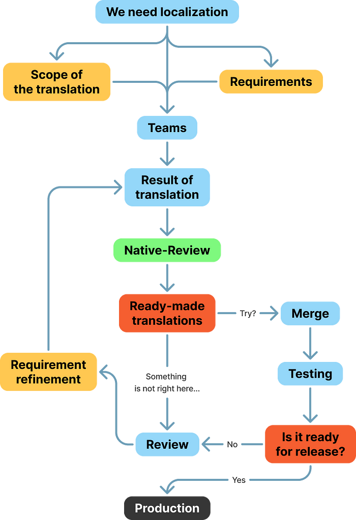
On average, the localization process will look like the diagram below. This is not an ideal process, but an aggregate of the processes I have seen in companies.
Analytics and data collection
Data must be collected. Period. Expert evaluation is not enough when working with super apps, even if you hire a super-mega-experienced C-level multi-award winning designer with all the FAANGs on their CV.
But most importantly, make sure you do your research before entering a new market. Competitor analyses, market reports, interviews, all the standard stuff. You must get an accurate picture of the obtainable market. Launching in a new country is expensive, and often you only have one try. Go-To-Market strategy should be detailed and gradual. Don’t roll out to all of Southeast Asia with one release. Go to Singapore first, become profitable there, capture some market share, and only then the Philippines. If you have endless money and you are willing to lose it, you can launch everywhere at once.
As designers, you need to know the answers to the questions at a minimum:
- App usage depth
- Switching between screens
- Average session length
- Median number of times one user accesses the app per day
It is also important to monitor the speed of dev teams and their adherence to the criteria of reusability, maintainability, reliability, extensibility, scalability and availability. If one service in the whole super-app is the cause of most failures and problems… well, that’s a problem.
All sorts of GMV and ROAS for sure, but that’s for the analysts to deal with.
Legal element
There is always a legal component in data collection. If you work for a large number of countries, you have to comply with a large number of laws.
There is a perception that when business enters markets in developing countries, where people have only recently started using phones, there are almost no laws to protect user data. This is not the case. In Thailand, for example, much personal data cannot leave local servers. Thailand uses PDPA, India uses PDPB, China uses the PIS standard and Africa uses Podia. And since one Super App requires many accesses and collects logs from all scenarios, this centralization of data collection makes any privacy expert go grey. And if your product owner has come up with the idea of implementing crypto payments, well… the first thing that should ring out in the meeting at this point is privacy and security standards.
Europeans and Americans are more sensitive about their personal data. Therefore, there should be more responsibility on the development team to ensure that users can explicitly control their personal data. If we can track a person by UserID without their consent, this is a clear violation of GDPR. Safe approach: we don’t store any analytics about a specific person, just aggregated data about the population.
This adds use cases. Designer has designed text fields to input name/surname/address? Should also design a button to delete personal data. And the dev team should be technically able to delete personal data from all databases, which is often a problem. Should be able to either set all fields with personal data to zero or to averages. Both options are bad, if anything. Masking is the better option.
Also remember that the laws are very vague and not easy to interpret. For example, we started in the UK. Formally, British payment systems can’t provide payment services in the EU because such activities require authorization from the local regulator (the first sentence of PSD2). In practice, however, European regulators have no jurisdiction over British payment services, and the FCA itself looks favourably on the situation. Apple gets away with a lot too. But you are not Apple (except you are), and when Kakao Talk introduced its payment system to bypass Google, it was prevented from updating the app in the store.
The services in the app are bought in the digital space, and the attitude to this in the financial sector is traditional prospecting. That is, where you ‘found’ the customer, the service was sold to them. So without a licence you cannot use a European domain, ask Google to show ads in the EU, etc. MiFID describes it clearly, PSD2 not so much, but the gist is as follows. As far as individuals are concerned, there is a caveat in the Rome Convention which says that in general an individual must have the protection of his home country’s law.
How to structure paddings
Now let’s talk about design systems. If you want the same paddings on all platforms and in all SDK applications, you will inevitably come across dynamic and static paddings.
Static padding is a set of fixed values, 8px, 16px, 24px, etc. This is not a flexible approach and you should aim to cover all projects with dynamic padding, both in design and in code.
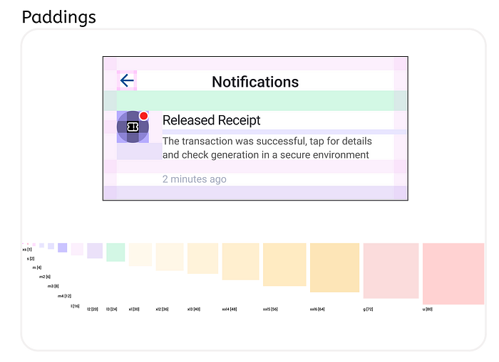
How it works. In Figma, the dynamic paddings system is made up of frames, where 1 padding value = 1 frame, i.e. 1 master component (screenshot above). The coloured squares are the frames responsible for paddings.
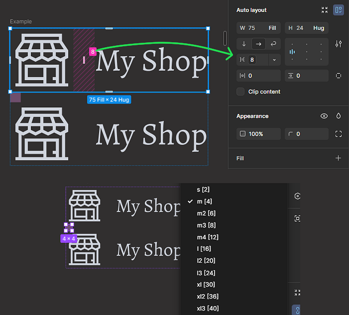
Dynamic paddings are then passed to interface elements via the Swap instance parameter. Static paddings are set by a specific value in the auto-layout of the element (screenshot below).
Is it a complication? Yes, it is. Do you have to run out and add it to your DS right away? No. Why not make everything via variables? You can. Before I reason, let me remind you that I don’t like to retype what has already been written 1,000 times on the Internet. I’m proposing a non-standard solution to an unresolved problem.
Explanation. In this case, Swap Instance allows you to limit the list of values in each particular component, reducing the chance of mistakes on the design side.
Yes, there are certainly disadvantages to this approach. Including a certain ‘unmodernity’. But working with variables also has its downsides. Everything always depends on the conditions and requirements under which this or that mechanic, this or that solution is implemented within a Figma or code.
Any attachment of numerical values to some entities in Figma, whether components or variables, always generates additional abstractions and conventions.
Indication of mandatory fields
A little thing that makes Super Apps horribly inconsistent: mandatory and optional fields. How to indicate, when to indicate, whether to indicate? The question is about 50 years old in the digital world alone, and there’s still no answer. Because the answer depends on the context. Let’s look at the context.
The most popular solution is to place an asterisk * next to the mandatory field. The solution is super old-fashioned, but it works. The asterisk has been an NNG best practice for a long time:
- It is recommended that mandatory fields are marked with an asterisk. It is slightly better if it is placed before the description label (so that mandatory fields are read more quickly).
- It is worth making the asterisk red. But this is optional. The main thing is to avoid low contrast colors, pale grey and the like, despite the aesthetics.
- It is also recommended to mark fields with autocomplete as mandatory.
However, in today’s world, B2B users expect a similar user experience to B2C users, so this solution may put off decision makers. Alternative: instead of an asterisk, use text for mandatory and/or optional, but what kind of text? I did some research and it turns out that not everyone knows the word «optional», «required» is a bit better (remember, I’m talking about emerging markets). Carbon uses both words, but in different situations. If most of the fields are required, they write ‘optional’ on the optional ones, and if most of the fields are optional, they write ‘required’ on the required ones.
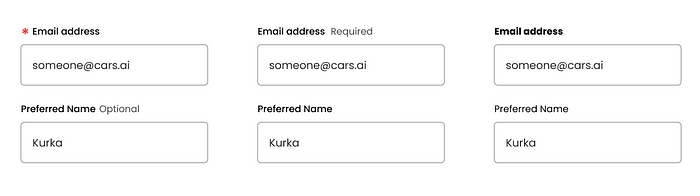
One thing that many designers forget is to mark optional fields. It is not mandatory to mark such fields, but if there is enough space, it is better to write ‘optional’ in text to save a user’s scanning time, if we are sure that users in a particular country will understand it. It turns out that we mark mandatory fields with an asterisk and optional fields with text. Downside: visual noise. When visuals are important in a project, plain text usually looks better.
Another approach is to use colour. I can’t recommend it, it always fails in research. But it is impossible not to mention it.
There are exceptions. On the login screen it is completely optional to mark the mandatory fields. Only have a username and password? No need for asterisk. But that’s up to the Super App design team, not the “services” teams.
Color steps and transparency. Again.
How to work with colour has been discussed many times. But how to work with colour transparency, that is the question. And yes, I still think transparent color is a good practice. The same can be said by Carbon, Atlassian and Apple teams.
Color selection often starts with color steps. The best practice is to keep parallel stretching with transparency. One such example is Radix, where each color has a clone with stretching. But you have to remember that their alpha sections are auxiliary. The base is still ordinary colors.
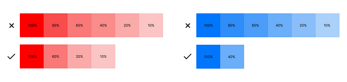
The most common argument against transparency is that it makes it harder to predict how one color will behave when it overlaps with another. Let me remind you what color stretching is for: to simulate the natural behavior of color. Designers should follow one strict rule: each color should have a limited number of transparencies. This is a necessary restriction if you decide to leave transparent colors in the design system for Super app.
The bottom line is that a super app is a huge business and design challenge. You can’t just take best practices from single-function application design and apply them to super apps. Hopefully this article has given you some material for thought and a little insight into the challenges faced by Super Apps design leaders.

