
The Design Hierarchy of Needs
Maslow’s Hierarchy of Needs (in terms of design) explains, at least at a basic level, what any product requires to be successful. In order for something to fulfill the next level it must first fulfill the current category (starting at the bottom). In reference to the pyramid below a design can not be fully reliable if it is not first functional. This does not mean an app or website can not have influences of creativity if it is not fully functional, but it does mean people will most likely not use the website or even bother using the app and the creativity is somewhat worthless. In order for the creativity to be appreciated and add to the design all categories below have to be addressed.

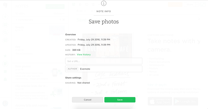
Evernote is a tool created to help “capture, organize, and share” notes. In many cases it well with Maslow’s Hierarchy of Needs but still falls short in some categories.
Evernote, or at least it’s homepage, appears to fulfill the aspects of functionality. It loads in a reasonable amount of time, and provides something that appears to be a form that I can interact with, as well as a few navigation links. If I click the sign up button before I have entered information it gives me a notification that I need to input information. If I click around all of the links and buttons work, and do what I would assume they do, bring me to a page or preform an action. This gives me the assurance that this site is reliable. I can continue to use the product without the worry that it might not work all of a sudden. It should be noted that a website isn’t the best example when it comes to reliability because if your wifi is working, it is an extremely rare occurrence for a website not to work (maybe if its under maintenance). Programs like After Effects which crash on a fairly regular basis if it is running on an outdated computer or too little RAM are not reliable. While there are steps to make it more reliable, it isn’t perfect and although a successful product, After Effects falls short in reliability. But back to Evernote!
As for usability the landing page does a great job. For instance the log in page is landing page is simple, explanatory and easy to use. It gives a clear and concise look into what their product is and a minimal form to get started. There is also an option to log in. These would fall under the usability aspect of the hierarchy. If any of these were missing the website would most likely not be used. If know one knows what the site does or how it would be helpful, there would be no reason to sign up. If they want to sign up but don’t have the option to they will never get anywhere. If they can’t sign back in the user will feel like they are at a dead end.

The next category a design can fulfill is proficiency. This means the product must not only be usable, but usable to the point that power users can effectively use the tool at a higher level. Macros in Excel and Loops in programing are great examples of how a user can accomplish much more in around the same amount of time if given the chance.

As for Evernote, its not top of line. After you create an account it brings you through an on boarding process. While its helpful, they pack way too much information in and give you far to many options to click on. This opportunity is helpful for power users and suggests that it could be proficient. But thats wrong! If we take a step back this page does not fulfill the requirements of usability. It is far too cluttered and honestly, I don’t know where to start. There are so many action buttons, a ton of widget options and even a few pop ups (ahhh pop ups!). While it is still understandable it is bordering on confusing and therefore not a prime example of a usable design. This takes away from the proficiency of the design. What does this tell us? Throwing a ton of features at a user, just because they exist or could help them do more does not always help them accomplish their task.
The screen above does a better job with usability only offering a few options to edit while giving a lot of information in a simple format. This action could also be categorized as proficiency because it allows the user to create and view additional information that a basic user would not necessarily need.
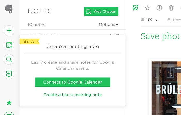
Another helpful tactic they use is not notify users of new content and functionality by using small but colorful “beta banners”. This small but effective banner leads to people recognizing the feature is new and perhaps being more likely to explore it. As an intern this summer, the company I worked for sometimes had problems with people not knowing about the updates that were made to their app and website. Evernote’s approach is clear and concise, gives a brief description in a light grey (to emphasize information hierarchy, and offers two actions, one more prominent than the other (the one with the green background).
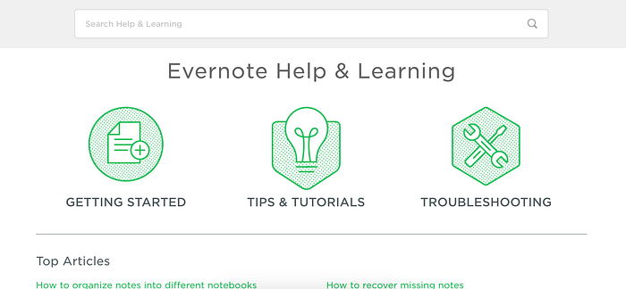
Another great aspect of Evernote is their documentation. This could fall under, or perhaps both, Functionally and Proficiency. Starting users, who have very little knowledge of the service and experts looking to become power users could both benefit from extensive but easy to navigate docs.

Plus they have awesome illustrations! This would fall under the creative aspect of the pyramid. Sometimes illustrations are used for direct information such as in an airplane pamphlet where it shows people what do in case of an emergency. In this case they are more to give a stylized feel to Evernote’s brand.
Overall this site does a great job with functionality (3). It lets the user complete tasks quickly and effectively. It is also reliable, the site had no problems with pages loading differently, or not at all (3). It was fairly usable (2) and with the exception of having a few over occupied pages it was simple and still let people with expert knowledge use it proficiently (2). It also was well designed and has awesome illustrations to add a nice touch of creativity (3).
LunaPic is an online photo editor. It basically Photoshop, except that it is incredibly difficult to use and the design is almost non existent.

With that being said, the web app is still highly functional and has a wide array of functions. It can pixelate photos, crop, draw, erase, filter, animate, export, and even has a help section. At first glance, the website does not appear to be anything special, but it does fulfill the functionality portion of the hierarchy.

On top that, it is fairly reliable. The only problem is if the user presses the back button. There is a function within the page that will undo an action, but because people are common to pressing the back button in a web format, it is easy to press back in the webpage and lose all of the progress. This is the only facet of reliability that I have had to deal with.
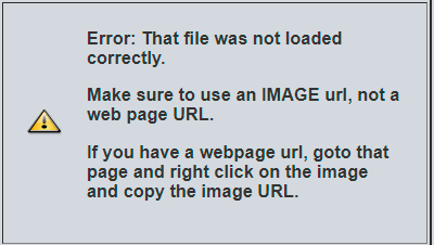
The error messages are also something that make this website far better than the plain design may suggest. They are informative and even give reasons of some action you have been doing wrong, such as giving a web page URL instead of an image URL. This helps the usability of the site to ensure people trying to accomplish a task are not getting stuck.
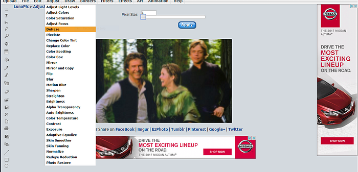
One aspect of the site that isn’t that great are the drop down menus. They are not categorized well and are so long it is difficult to find the effect you are looking for. Although there are tons of helpful tools and they are separated into groups it still seems to be a bit to long to sift through. This flaw could either go into the category of usability or proficiency. Beginners may have trouble finding the one effect they need, and expert users maybe find it annoying to continually use drop downs to apply the same effect. Photoshop has solved this by adding the last effect made to the top of the drop down so the user can keep applying the same effect over and over without going through the process each time.
Overall LunaPic is a fantastic site that allows users to accomplish a variety of tasks without having to pay for a program like Adobe. It is an accessible, functional (3) and reliable (3) site that looks plain and executes well. It is usable (2) to a certain extent and although not the most user friendly does not pose any huge problems due to the fact that the system is fairly straight forward. It is not helpful for anyone trying to a large scale project or work on many layers or pictures at one time so for that reason it is not incredibly proficient (1). As for creativity (0), I don’t think the designers even thought about it. However, they still crated an awesome small web based tool that helps a lot of people.
These two examples show two very different sides of design and functionality but also help to prove the legitimacy of the Hierarchy of Needs and why design is so important to the success of a product. Evernote is clearly more aesthetically pleasing than LunaPic but does not help their users that much more. Both sites are Functional and support the idea that good design can help people.

