The Biggest Landing Page Mistakes and How to Fix Them
As a Designer/consultant focused on optimising conversion rates and through analysing a lot of pages regularly and seeing what mistakes people tend to make I’ve compiled the most impactful/common ones so you can identify if you are doing them too and quickly fix them.
This article was a deep dive on one snippet from my newsletter where you get 1 actionable tip every week so you can improve your website (only the 80/20!), you can get it for free here btw.
No one gets what it does (at least fast enough)
This is another very common one and the real problem here is that you only have a limited amount of space to explain what you do and also a very limited amount of time before people get bored or frustrated until they leave, without ever converting :(
Here’s a framework you can use to make it easier:
- Make the title point out the desired result or a benefit
- Make the supporting text below very briefly explain how it works or how they get that result mentioned in the title
Bad example 👎

Good examples 👌


The CTA is way to easy to miss
You need to give visual priority to what is more important. This basically means if your titles are important make them bold, if your body text is not as important and it stands out less so it doesn’t conflict with the title and more importantly if you want people to click on something they have to see it in the first place! You can find below an example for this.
Bad example 👎

Look how easy the CTA is easy to miss if you just scrolling through the website, this example still has a visible headline that helps a little bit but trust me I sell this all the time no matter how basic it is.
Good example 👌
Since people scroll through the website pretty fast everything seems a little blurry. Notice how the CTA could still be prominent even in that case
The screenshots don’t support the explanation
This problem is super common among the SaaS landing pages where showcasing the actual interface is a common practice and it ends up being a bit generic, hard to tell apart from the competition and/or hard to understand/explain the product better.
How to make better screenshots:
- Make them visible by using big enough screenshots, reducing the viewport of the browser window so everything is closer together (if it’s a web app) and by zooming in if you want to emphasize one detail not the entire thing.
- Ask yourself if that’s the right thing to showcase in the first place. Is it a USP or just a generic dashboard view?
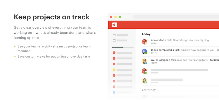
Good examples 👌
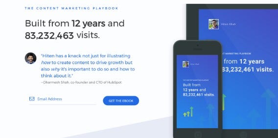
People buy benefits, not features
Probably the #1 mistake I see people making. Explaining features instead of the results/benefits it can bring doesn’t trigger an investment mindset from your visitor and that’s what you need to achieve if you ever want them to relate your product/service as a solution to the problem they need to fix.
You can get by if your product is cheap or your services are around the $10/month mark, if you are not on those categories then you really need to improve and you will need to get better and better at this the more expensive your product/service is. That’s why I mostly work with SaaS startups that have $500+/user/year as they can generate a lot of revenue with little customers and it’s much harder for them to convert visitors into customers in the first place.
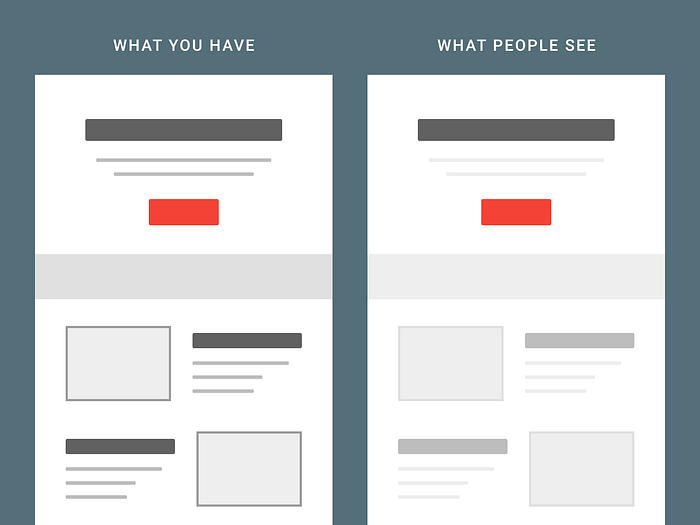
Ups… missed it
Similar to the problem on the CTA, some websites have important sections a little too small and without the proper amount of spacing between sections to make it much easier to follow along and harder to miss, because inevitably, people will scroll through the page not read through the page. It will make more sense in the examples below.
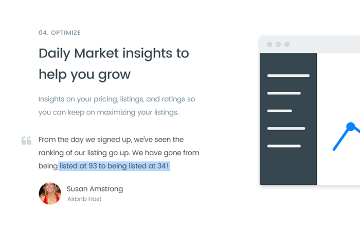
Example of benefits that are super easy to miss
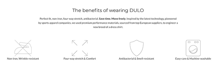
This is from the awesome guys building DULO, where the biggest reason to buy the shirts was pretty easy to miss (as this is super short and not in-depth) or not understand the entire value it could bring!
Don’t worry, they are fixing it, here’s the new version 😉
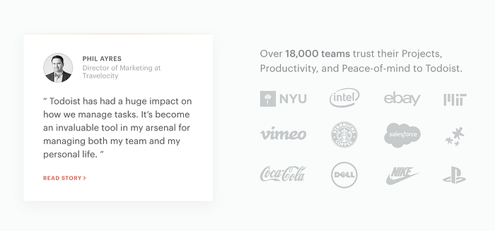
People need social proof, the right kind of social proof
Social proof is always a good addition to the landing page, right? Well…kind off. With people being more and more bombarded with similar social proof they will become more and more numb to it (or even suspicious), that means adding testimonials or random logos isn’t as “clever” as it used to be.
We now need to do a few tweaks to the current social proof you are using to make it more specific and therefore more trustable for the visitor, below you can find some examples of what you can do.
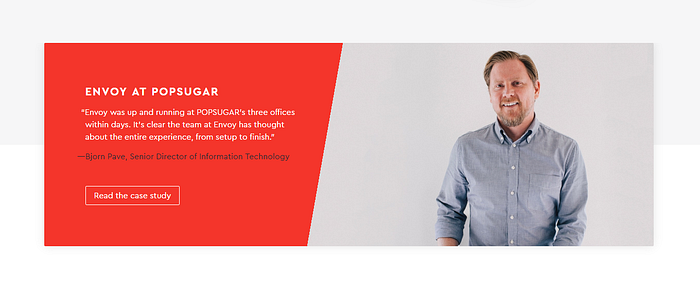
If you have testimonials:
- Try asking for specific things people enjoy about the product so you will end up with more effective proof than any generic testimonial
- If you have influencers in your niche using the product than feature them as a bit of their authority can rub off your product/service.
- Make them short and try highlighting the most important parts.
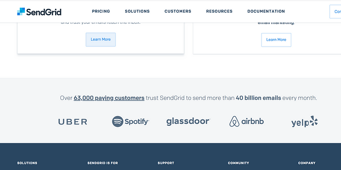
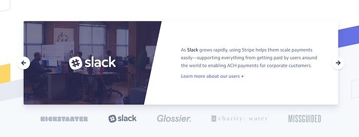
If you have company logos, try to choose only the companies that might be well known in your niche otherwise it seems you are playing bigger than you are as you are “bragging about” small companies no ones knows about, it might become more a bad thing than a good one.

If you have feedback from your customers about their results, offer them some kind of promotion in exchange for letting you write a quick testimonial on how their company used your product to get X result.
One thing, that’s it!
Do you like to get a bunch of information at once and then having to process it all by yourself? No? Then think about how are your visitors trying to understand the value of your product when they have too many things to process at the same time.
Divide your website into sections, and make them so they only explain one big thing at once, only have a CTA (most of the times and/or if you are super good at splitting the audience) and only ONE goal for that entire section.
▶️ [Free Video Breakdown]
Breaking down the Funnel I use to help SaaS Startups Turn Their Visitors into Customers

📨 Need help Generating Revenue with Your Website?
Would love to discuss your problems so feel free to tell me about your current situation, needs or goals in the comments 👇 or …
Want to chat? Schedule free consultation here
Email: pedro@cortes.design
Further Reading about SaaS Landing Pages
You can find weekly articles on optimizing websites for SaaS on my blog.

