SVG illustrations as React Components

As a UI Designer & Developer, my illustration skills are not the best. So, when I have to create illustrations for products, I always try to make them simple, reusable and able to cover different scenarios.
Like an alert component that can have a warning, danger and success state, an illustration can have them too. Transforming an SVG on a React Component, I can manipulate the markup and create different states. I can split the SVG markup into several components and reuse parts of it. I can pass props to control sizes, colours and adapt them to different scenarios.
This article explains how I built, React Kawaii, an open source library of SVG illustrations that can be easily customisable.
Hopefully, this article can help you build your own library!
1. The idea
Kawaii is a Japanese word, best translated as “cute”. It is known as one of the cutest forms of art in the world. Kawaii, can be an illustration of a cupcake or an apple with a happy face.
Almost anything can be Kawaii if we put a cute face on it. That’s why this type of illustration works well for web products. For instance, to a 404 error page, an icon of a planet with a sad face works well. When a user sends a message successfully, a happy icon can appear. An empty state for a Fintech product can be a coin with a face on it. The possibility of creating Kawaii illustration are endless.
Bearing this in mind, this type of illustration seemed perfect to transform into components.
2. From SVG to JSX
Having the idea defined, I created three illustrations on Sketch: a planet, a browser and an ice cream. Then I exported as SVGs, using a plugin for Sketch called svgo-compressor.

After that, I transformed the exported SVGs in JSX, and I started splitting the code into components. There’s a cool website where we can paste our code and convert it on JSX.
3. Common components
After having all the SVGs transformed in JSX it was time to define the common components. What all of them have in common? What can I reuse between the three illustrations?
One of the things are the faces. All of the illustrations have them. So one of the common components is the Face Component. It receives a prop called mood that is limited to specific values: sad, shocked, happy, blissful and lovestruck.

In the Face component, there are different eyes and mouths. All these elements are inside if statements. If the prop received is sad, only the elements inside the “if sad statement is true” are loaded. The same applies to the rest of the moods.
The KawaiiElementWrapper is another common component. It’s a wrapper for all the illustrations. It is also where the animations live and common styles.
The SpeechBubble is another component shared between all the illustrations.
4. Kawaii Component
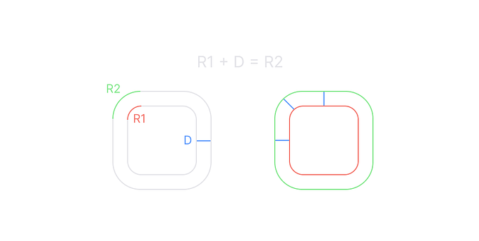
The Kawaii Component is the final exported SVG illustration with the common components there. For each of them, I removed the part of the SVG where the face was and replaced it with the component Face. This way I gained the ability to decide which mood I want to display.
I also replaced some attributes values by props. For instance, the fill value is replaced by the props colour.
5. Calling the components
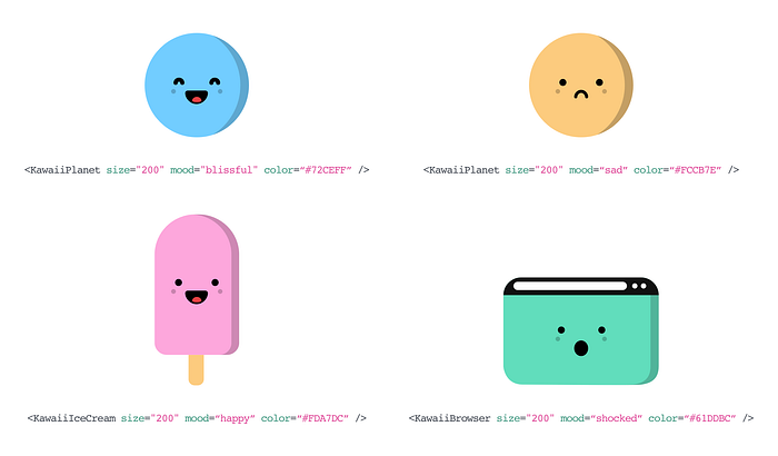
All the components can be imported from the react-kawaii library. Each component can receive different props: size, colour, mood and text.
You can find the complete project on GitHub and you can install it from NPM. It’s open source, and you can use it the way you want it.
npm install --save react-kawaii


