Stop Guilting Your Users
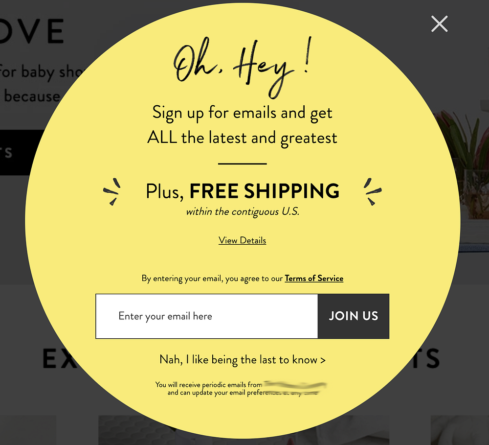
Has anyone else been noticing this trend in overlays? You get a proposition, such as savings, or entering your email address, and instead of just a regular old “X” button, you get another button that essentially opts out of the experience, but uses language that makes you feel bad for not complying.
“No thanks, I like paying for shipping”
“Nah, I like being the last to know”
“I’ll pay full price”
“Reject $10 Off”
…Said no one, ever!

For the love of all that is UX, please stop guilting your users into doing something you want them to. Did you ever think that shaming them might make them less likely to do what you want? Remember when you were a kid and an adult told you what to do and you did the exact opposite just to prove them wrong (or just wanted to rebel)?
I see directly through this cracked-up reverse-psychology marketing ploy, and I believe a lot of your users do too.
In reality, overlays (especially full-page) are not necessarily the best practice for your site, according to Nielsen Norman Group. There really are only 3 instances that a disruptive overlay may be necessary, and cornering your new users into giving their information to you is definitely not one of them.
Just because you can use an overlay doesn’t mean you should.
…don’t use an overlay unless you have a clear, compelling case for why this content should not be presented within a regular page. Good reasons for using an overlay could include:
• The user is about to take an action that has serious consequences and is difficult to reverse.
• It’s essential to collect a small amount of information before letting users proceed to the next step in a process.
• The content in the overlay is urgent, and users are more likely to notice it in an overlay.
– Nielsen Norman Group, “Overuse of Overlays”

The worst part about these overlays, after them being overlays to begin with, is the guilt-trip language used in CTAs. “No thanks, I like paying for shipping”. How petty is that?! Whenever I see one of these buttons or links I immediately cringe and look for the “X” button. Sometimes, this immature language isn’t even paired with an “X” button, and users just have to actually interact with the shaming copy. Most times, I would just leave the site because I’m not about to give a company my money or information out of guilt. It’s just icky.
A main goal of ours as user experience experts is to provide delightful and intuitive funnels for users to accomplish their goals. Great design goes unnoticed; when a user is able to step through their flow without hitting any bumps, a design is successful. Using aggressive or petty language directed towards the users’ behavior is the exact opposite of delightful.
I get the feeling that my truly user-focused family are not fully responsible for this, and that someone from another team came to them with “the, like, best idea ever” to get users to give them their email address. I’m sure it was one of those instances where with 50 other projects on your plate, you were like, THIS IS NOT WORTH THE FIGHT!
All I ask, is that if the time comes where you’re going to redesign this thing, if you can’t advocate for completely nixing it from your experience and finding a less obtrusive method to acquire info, at least get rid of the guilt-trip CTAs and stick with the intuitive and simple “X” or “Close”. Please. Pretty please?
Sincerely,
A Concerned (and Slightly Insulted) UX Designer


Edit: I just found out these have a name! “Manipu-links” (thank you Bronwyn Berkery 🙏🏻) and discovered NNG wrote about this in April of 2017, clearly people haven’t learned their lesson 😓

