Space & Hierarchy
Practical tips you can count on when designing interfaces
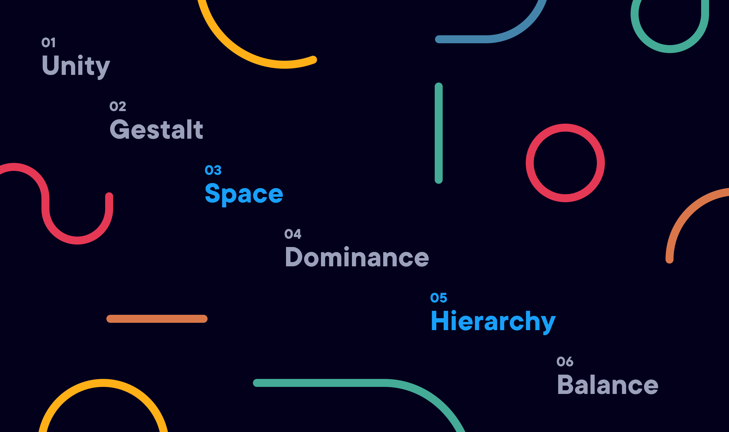
Designing interfaces becomes a lot easier when you’ve familiarized yourself with the basic principles of visual design. Two of those principles are layout and typography. Arguably, these are two of the most important principles. They create clarity and appeal in interface design. Not only that, but they make interfaces feel clean and sharp. In this article, I’ll be discussing space and hierarchy — two subcategories under layout and typography.
Definitions
Let’s start by clarifying these terms. You may have used them in your designs, but do you know what they mean?
Space
Space is simply the breathing room between design elements. When you prioritize space in your designs, you’re:
- Advocating for organization — this means you care about quality.
- Increasing simplicity, clarity, and balance — these principles are critical in interface design.
- Making information easier to scan and digest — this can lead to user satisfaction and even increase retention.
Hierarchy
Hierarchy involves organizing information into different levels of relative importance. When you prioritize hierarchy in your designs, you’re:
- Creating centers of interest and effective affordances — According to the book, Universal Principles of Design by William Lidwell, an affordance is a property in which the physical characteristics of an object or environment influence its function. For example, doors afford pushing if they have a flat plate and afford pulling if they have a handle to grab.
- Highlighting actions you want visitors to take — the goal/primary action of the interface now becomes clear.
- Establishing order and flow — as a result, information is easy-to-access.
How to Achieve
Now that we’ve established a solid foundation, let’s discuss how we can achieve space and hierarchy in our designs.
Space
Use both margins and padding — they are your friends
Margins are the space between two different elements, while padding is the space inside of an element.

It’s good practice to work in multiples of 8 (or 4) for margin and padding values. This ensures you’re being systematic, not random. Additionally, it follows principles set forth in the 8pt Grid system.
Here are some great resources if you want to learn more about the 8pt Grid:
Don’t be afraid to use space
When it comes to space, people seem to be afraid of using it. Remember that effective use of whitespace will lead to a cleaner design. In some cases, it can even cause designs to appear elegant. Try to strike the optimal balance when using space — don’t use too much and don’t use too little.
Hierarchy
Use a typeface with many weights
You may want to look into using a Superfamily. A superfamily usually houses a large variety of weights.

Don’t forget about casing
- Uppercase
- Lowercase
- Small caps (some typefaces include support for this)

If you’re using uppercase, I would also adjust tracking — the space in between letters. Even the slightest adjustment in tracking can make a drastic difference. But keep in mind, all typefaces are different — experiment until you find what looks right. And beware of longer headings. They may not mesh well with uppercase.

It’s completely acceptable to use a few different typefaces
Go ahead, pair a serif with a sans-serif. Or, check out some different classifications — Grotesque, Humanistic, Geometric, the list goes on!
In the example below to the right, I used a monospaced font for the header. Some people like monospaced fonts while others put them in the same category as Comic Sans. I wouldn’t let this stop you from experimenting. If you haven’t noticed already, visual design is subjective and often about preference.

Line-height
Please, please, please pay attention to line-height. In the example above to the left, you can see that the text is very hard to read when it’s so close together. Adjusting line-height will make interfaces cleaner and easier to consume.
Here’s the general rule to figure out an effective line-height:
Headings = font-size * 1.2
Body = font-size * 1.5
And similar to defining margin and padding values, I would also recommend working in multiples of 8 for line-height. This way, you can align text to the baseline grid.
For a more in-depth overview, check out this article I wrote:
Color and size
Last, color and size are two additional principles to take into consideration when trying to achieve hierarchy.
Pure black (#000) can often be seen as too striking. Try finding a less “in-your-face” value by incorporating a color hue. In this example, I fiddled with a blue hue.


You can also adjust opacity. The body text in the graphic above to the right is 80% opaque and it’s much easier to read.
Bonus Resource: Design is a Party by Elizabeth Lin
Visual design is super important. I hope this article gave you some ideas. Share or 👏 if you enjoyed it!
*All content was created in Figma for this article.
Sources:


