Sometimes you just have to ask
On making users discover value in your product
Getting people to do what you want is hard — this is also true for users of your product. They have that tendency to go left when you would like them to go right. At no time does this become more obvious than in user testing sessions where I regularly find my inner voice acting like a very impatient GPS. “Go left…now right…I said right!”. Of course, screaming directions at your audience is no option here. Nor is it with people using your product outside of the testing lab — The challenge becomes making your users aware of the valuable functionality that you want them to use.
Why product value sometimes hides
Users should not have to start searching for your product’s core use case. However, certain product functionalities might not be useful to them right from the start. They might have even learned about a feature but forgot about it the week after. Or, it might just be that there is too much stuff to do — big platforms, like Facebook, have grown in their feature set so much that there is a plethora of potential use cases that the user might not be aware of.
Micro… What? Microsuggestions
An effective vehicle for closing this hidden value gap in a subtle way are microsuggestions — small contextual nudges — which can help getting your users to do what you would like them to do.
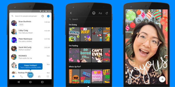
Dropbox, for instance, recognizes if a newly uploaded image contains text and then suggests its “Save as Scan“ feature for this image. Facebook picked Christmas time 2016 to offer its Messenger app users contextual help for using it’s new camera filters and stickers. The app’s camera button was changed into a Christmas ornament and allowed users to take a holiday themed selfie right away.

A microsuggestion uses the mechanics of a microinteraction— a small product interaction that is focused on completing a single task in very short time. Every small interaction, from activating an alarm by flipping a toggle to hitting the Facebook “Like” button can be considered a microinteraction.
A microsuggestion adopts this concept by showing subtle, contextual messages that make users engage with the additional functionality in a convenient way.
Users do not have to come look outside of their core experience to find value as you bring it to them in moments when it is most useful — no need to dig through every corner of your product to find it. In a world where screens are small, attention spams short, and products rich in functionality, these kind of quick interactions are especially useful and help your audience learn about your product.
Getting microsuggestions right
While microsuggestions are great to drive engagement, they can also quickly drive a user into leaving the product when misused. To build successful interactions it is important to keep some key aspects in mind.
Contextual: Try to prevent the “Why am I seeing this” effect. What you are suggesting should be based on the user’s behavior or characteristics. To make sure there is context between what you are suggesting and what the user is doing, you ideally connect with an action the user just did.
By tailoring your message to what your user is doing you ensure high approval and conversion rates on the suggestions. Offline reading app Pocket uses the contextual suggestion to ask users who copied a URL into their clipboard if the URL should be added to their Pocket.
As for our own experience in our job search app, we started suggesting our search alert feature to users who frequently run the same search. We tell them that they can be notified by us, instead of checking for new results of the same search everytime. Search alerts are a great re-engagement tool and one of the core activity drivers in our product. Needless to say, we were happy to learn that we managed to achieve a double digit conversion on the microsuggestion and strong growth in search alert subscriptions overall.

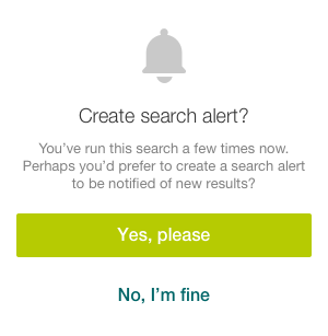
Actionable: Don’t just throw images and text at your user. Your microsuggestions must be actionable, allowing the user to engage with the new suggested functionality within a few seconds. Spotify, for instance, provides a shortcut for finding music similar to what’s already in one of your playlists. Instead of needing to remember that you can find similar music on artist pages, the information is brought right to the user as it is addable at the bottom of your playlist, thus becoming actionable with one click.


In our jobs app we use an actionable suggestion to make users login. Only users who are already logged-in to our main app (a German business network with a large user base) see this screen as we can log them in with one click. Right after the login, we can show our users job recommendations based on their profile and preferences. Since we launched the login suggestion, we saw a high double digit growth in logged-in users as well as a traffic rise to the recommendation section.
Balanced: Even though you are suggesting something of value to the user, never forget that you are still interrupting the current usage flow. Therefore, the total number of suggestions a user sees in a given timeframe must be balanced — not every visit should be used to show yet another message as this will distract from the core use case.
Consistent: While microsuggestions can come in different types (actionable tooltips, snackbars, fullscreen modal views, and overlays to name a few) the design of your suggestions should be consistent. Use the same type of suggestion where you can. Also, remember the design language and color pattern of your product when designing suggestions. Otherwise, you risk that the design will feel out of touch with the rest of the product and more like advertising than a helpful suggestion.
Know the basics: As microsuggestions are in essence very targeted microinteractions, the basic guidelines for them also apply here. You need:
- Triggers— initiates the suggestion
- Rules — suggests what happens
- Feedback — gives feedback when user interacts with the suggestion
- Loops & Modes — defines what happens after the interaction and how the suggestions can be reused at a later point.

Keeping users on the right path
Watching your users miss out on product functionality in user tests can be stressful. However, this inner unrest often goes away quickly when you see their odysseys coming to an end and they engage with what you wanted them to see in the first place. Microsuggestions are a way to drive your users towards this moment faster, making functionality available to them in a contextual and actionable way — All the user needs to say is Yes.
This is one of two connected posts I wrote on small interactions that help to improve product experiences. The second post is about using shortcuts— small interactions that help users users to get what they want quickly, thus keeping them engaged with the product
What could also interest you
- More examples: Jason Zimdars shows how Instagram and Amazon use microsuggestions to educate users about the proper way of sharing information
- Microsuggestions are a great way to keep your users engaged and in Product Flow (neither bored nor overwhelmed). My post below explains more about the Flow concept and how it applies to product management.
- For more information on microinteractions, I recommend Dan Saffer’s book Designing with Details as well as the following post from Juan Lasarte:


