
Sketch users: here’s why you should consider switching to Figma
I know. It feels like we all just recovered after moving to Sketch from Photoshop.
Also, we like Sketch. It’s built for us from the ground up, it’s updated every month or so instead of every 2 years, and it’s made by good people who listen to their users.
Here’s the thing though: competition is good. It’s exciting to be a product designer right now because lots of people are building new tools for us. I for one hope this trend continues.
Enter Figma
Figma’s like Sketch. In some ways, a LOT like Sketch. They’ve obviously gone out of their way to ease the transition. Things like the layers and properties pane are in the same place. Many of the keyboard shortcuts are the same. There are some important differences, but it feels pretty familiar.

Things Figma does that Sketch doesn’t do
Collaboration
Figma at its core is a web app (though it has a desktop wrapper app, like Slack). If you’re like me, that idea makes you nervous at first. It’s hard to make web apps feel convincingly like desktop apps. Also, one of the great things about Sketch was how it felt like a native Mac app, vs Adobe’s bizarro interpretation of a Mac UI.
Overall, Figma does an impressive job of making it work. And here’s the upside: simultaneous collaboration and shared revision history. Remember the first time you collaborated in Google Sheets? That’s what shared files in Figma are like. TWO PEOPLE CAN DRAW AT ONCE!!! Okay, maybe not that practical. But what IS practical is that you can share a file without worrying about somebody making a change while you have it open and stepping on your changes, because you’re both just editing the same document.
You can also use Figma to present your work: people who have access to your file can click on your user icon in the top right to follow along with your screen, so as you pan and zoom they’ll see what you’re seeing.
Inline commenting
I’ve often used tools like Red Pen, Invision, or even just Dropbox links to get comments from my team on a design revision. In Figma, sharing a file is like sharing in Google Docs (in fact that share dialog looks awfully familiar doesn’t it). You can choose whether people can edit or just view your file. In either case, they can leave comments inline, pointing out specific areas of your design. You can also get email or Slack notifications for comments.

Inline support
Figma’s support team is just a click away, via chat accessible from the little question mark in the corner. Being able to ask questions right from inside your design tool is kind of amazing. They may not respond immediately, but most requests have been answered within a day. I suspect they’re getting tired of the constant feature requests I drop in there as I work, but if so they haven’t said anything yet.
Things Sketch does that Figma does better
Components (a.k.a. Symbols)
Symbols are a complex feature. Figma’s version of them are called Components, and there are a few things about them that I find more intuitive than symbols in Sketch:
- Overrides happen inline
Sketch’s solution for overriding the values of text layers and image fills in symbols is to provide a bunch of inputs in the detail pane, one for each override-able layer. In Figma, you just edit the values inline in your component instance, which feels more intuitive and scales better (it still works even if you have a ton of text layers).

- Colors and styles can be overridden for things like button states
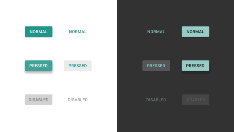
Because of the inline overriding thing, it’s easy for Figma to allow you to override all kinds of stuff beyond just text values and images. You can override basically anything in an instance, from colors to borders, effects, and even visibility. This means fewer master components you have to create. It’s great for things that have many different states, like buttons.
- Root components can live inside a frame (artboard)
In Sketch, when you create a symbol, it’s moved out of your artboard to either a separate page, or somewhere else on the canvas. This sometimes makes drilling down through symbols a disorienting experience. In Figma, when you create a component from a group or layer, it stays right where it is. Don’t worry, you’ll still be able to find it by clicking the “Find Component” button from any instance.
Constraints
Constraints are another recent Sketch feature where the Figma version feels a bit more intuitive. In Sketch, there are four constraint behaviors: Stretch, Pin to corner, Resize object, and Float in place. I honestly have a hard time keeping track of which of these does what. In Figma, constraints work similarly to how Auto Layout constraints work in iOS. For a given layer, you can choose which of its four sides should keep its position relative to the containing frame.
Speaking of frames: A “frame” in Figma is a special kind of group, where you can give it a grid and constraints to position its sub-layers. Frames at the top level are treated like artboards, but they can be nested as many levels as you want. It takes a little experimentation to fully get how they work, but frames allow for some very complex responsive behavior that would be difficult or impossible to create with the current Sketch constraint tools.
Vector Networks
I don’t spend a lot of time with the pen tool in Sketch (sadly my days of drawing a lot of iconography are past). Figma’s pen tool feels the same, but the way paths work is fundamentally different. Figma calls them “vector networks”, and the basic difference is that any two points can be connected, even if a point already joins two lines. Here’s something that’s always a pain to draw with traditional paths, an arrow:
Rough spots
Figma’s still pretty new. Looking at the release notes, you can see that they only go back to September, and that some of the features I’ve mentioned here are only weeks old. Here are a few things I’ve noticed that still need polish:
- Layer navigation is tedious compared to Sketch’s keyboard shortcuts (e.g. there’s no shortcut for selecting the parent group of a layer, or the next layer in the list)
- Pixel snapping is less reliable than I’d like. When groups or frames get scaled, their sub-layers sometimes end up with partial-pixel widths or heights, and then dragging layers nearby makes them snap to those partial-pixel positions.
- I went a little nuts with constraints and nested components in the project I’m working on now, and performance really starts to suffer when things get complex. Understandable, but it feels too easy to make problems for myself.
- There’s no plugin ecosystem like Sketch has. Not a huge problem for me as I don’t really rely on any plugins, but I know many designers do.
- There’s no notion of “pages” like there is in Sketch, which makes organizing your work a little harder.
All that said, the pace at which they’re releasing new versions makes me optimistic that these issues will get cleaned up soon. I’ve been keeping an eye on it over the past few months, and recently it’s gotten to the point where I think it’s totally usable for my regular work.
Getting started
Giving Figma a try is pretty easy. Since it’s a web app, you can just sign up at figma.com and start using it. If you like it, it’s worth downloading the desktop app.
You can import your Sketch files. This didn’t work totally perfectly for me when I tried it, but it was 95% of the way there, which is a lot better than starting from scratch. You can also import SVGs.
You’ll also find the interface to be generally pretty familiar. Many of the keyboard shortcuts are the same, the arrangement of the workspace is basically the same, exporting layers, frames or slices works the same way (including at different densities).
I still like Sketch, and there are still several things it’s better at. I’m keeping it around, and I may use it for projects in the future. But I’m very excited about where Figma’s going, and I’m happy to live in a world where there are such great tools to choose from.


