7 Best UX Practices for Designing Long Online Forms
For those who are designing long forms that have more than 7 questions, this article is for you. Here is a guide to help you build better long format forms, applications, or information requests.

Making online forms should be more than just taking a paper form and making it digital. Digitising a paper form comes with additional complications that have to be accounted for because some things just don’t directly translate. But the upside of digitising a paper form means that you can add some sweet logic and improve the interaction experience for the person filling it out.
The first thing you will want to do is gather insights to inform your design. You do this by interviewing a selection of the people who fill out the form and people who process the form. These insights are critical for removing questions, adding questions, or rewriting them. Then make a list of all of the questions that you intend on asking in your online form.
For really long forms with many questions, here are seven things that you can try:
1. Group your questions into sections
Sort your questions into manageable chunks. When you have a long form you are likely asking questions across many different themes. Your goal is to identify what these themes are and sort your questions into easy to understand sections.
Once you have sections this means that you can more clearly map where a person is in their process of completing the form. Completing sections also allows for small rewards in a long and likely not fun form filling process.
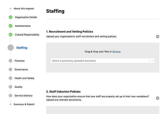
2. Make location visible
With a paper form, you can scan the whole document before answering any questions. This means that the person filling out the form always know their location and can estimate how long it will take to finish.
A key difference between short forms and long forms is that they require a different user experience. Short forms are filled out in a couple of minutes, long forms can take hours — and it is expected that people will take breaks between sessions. For long forms, you need to include a “you are here” feature, that keeps the person orientated while also giving the ability to estimate how much time is remaining.
To make location visible, you want to show where the person filling out the form is in the process. You can use a percentage to complete icon, page numbers, bread-crumbs, loading bars, a stepper, etc. There is no standard go-to design for this, you’ll need to find a system that works with your form.
3. Don’t make questions out-of-focus

Only hide out-of-focus questions surrounding the in-focus question for very short forms. This design is good for a simple form like a survey but bad for long online forms with many questions.
When I fill out a form like this, I can feel my heart-rate rise because I’m trying to figure out if I’m being tricked into thinking the form is shorter than it really is.
This style of reducing the opacity for out-of-focus questions is not accessible. People will inevitably feel like they should read the out of focus text before it comes into focus. But, because the colours of the text on the screen does not meet contrast accessibility standards, the readability is reduced causing either difficulty for the person trying to read the out-of-focus question if they can even see it in the first place.
4. Use a stepper
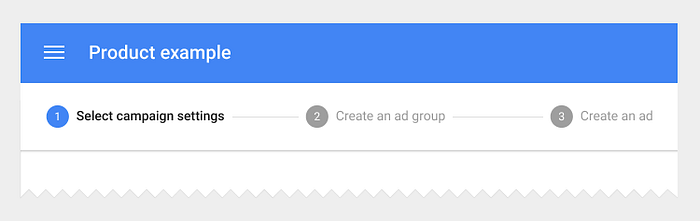
Show all sections of the form at all times and show where the person is at in their journey to completion. Highlight the active section, show which sections are complete.
Numbering the questions that are in a section, allows for orientation. I can scroll to the bottom and see that there are 14 questions in this section then go back to the top and start working on the first question with knowledge and forecast about the amount of work ahead of me.
5. Set expectations before the start
To prepare the person for starting the form, give them as much context as possible. This will increase completion rates for individuals that start the process.
Questions an introduction could answer are:
- Why is the person is filling out this form?
- How long should it take to fill out the form?
- What is the timeline for the next steps?
- Do they need to prepare anything in advance (e.g. have a drivers license handy or prepare documents)?
- What happens to the information they provide? Who has access to it, how will it be used, how does it meet privacy standards?
- Does filling out the form cost money? Don’t surprise people at the end with the cost.
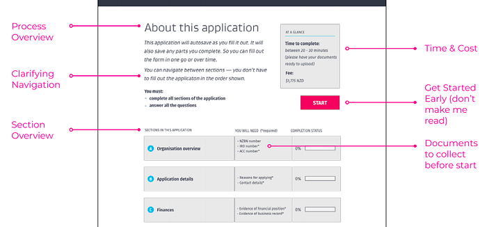
Other things that might be worth considering are:
- Does the form autosave?
- If they walk away or take a long time on a page, is it possible to lose all the information that they entered?
- Who do people contact when they get stuck? Is that person different than technical support?
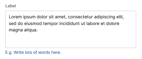
6. Add help text and make it understandable
Add help text to every question. It amazes me how many times I’ve worked with a person who processes a form and they intentionally want to make a question hard to understand. The top three reasons I’ve heard for keeping questions complicated are:
- “Well, it’s what the legislation says.”
- “If we give them examples, we will only get the example scenario as an answer and we want to see more information.”
- “Why should I help them, they should know how to fill out this form.”
These three reasons are not justifiable. When designing a long form with many questions you should always:
- use plain and understandable English (or language),
- provide a lot of help text, and
- give examples of what you expect from the answer if possible.
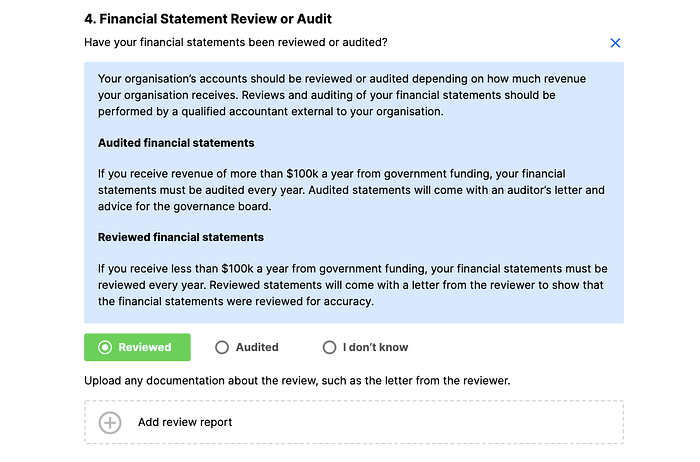
You get bonus points for help text that explains why you are asking the question in the first place. Good help text provides understanding for the user to understand why they are going through the effort of answering the question. It also ensures that they provide a better answer on their first try, which reduces the cost of additional communication after the form is submitted.
If there are concerns regarding legislation, hire a Plain-English legal copywriter to translate jargon-filled questions and help-text into easy to understand copy.
7. Don’t stop people from clicking ‘SEND’
Do not block the person from continuing to the next step in the process because they have not filled out a mandatory question correctly. Instead, use question help text and form field helper text to encourage people to answer the question in the format that you want.
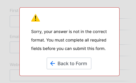
Chances are that the specifications for what gets built into the code have not accounted for every scenario or edge case. Even a simple field like a name can be a disaster if it is a mandatory field. For example, there are many options for name field design, but some of the most commonly used formats prevent people from answering the form.
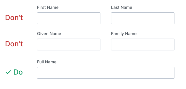
Both the first two examples do not account for individuals with more than one last name. And the first example does take into account a scenario where the person’s first name is their family name and their last name is their given name. “Modern Chinese names consist of a surname known as xing (姓, xìng), which comes first followed by a personal name called ming (名, míng)” (link).
If possible, always just ask for a name in the format of how the person wants to respond.
Sometimes form fields have validations on them that inform the person if they have used an unexpected format. Reduce validating scenarios if possible. For example, Does a field require the name to follow traditional western case-sensitivity where the first letter is capitalised?
See if you can avoid this entirely, allow people to submit the form and follow up to correct it later. You can always add supplementary helper text to the form field to suggest how you expect the answer to be formatted. Adding mandatory questions or validations ultimately increases the cost and reduces usability.
Below is a real-world example of why you should not make any question mandatory and instead build a system that can be updated later. This excerpt is from a phone call between ReplyALL podcast hosts, PJ and Alex, and a Syrian refugee living in Turkey, Sal. Sal couldn’t apply to a Canadian University because of a mandatory question that was case sensitive on their online application form. I chose this example because it was publically broadcasted and I do not have any affiliations with the people involved. Also, it was already transcribed on their website ReplyAll #139.
…
SAL: Oh, thank you so much. And ever since like, 2016 I’ve been really working hard, and trying to like, get into college abroad. And so, towards the end of last year, December of last year, I take the SAT and I get a 1540.PJ: Holy crap.
ALEX: Oh my god.
PJ: That’s really good.
SAL: And, like, in 2016, Trump comes into office. And obviously, there’s a travel ban. And I’m no longer allowed into the U.S. So, god damn it–I’m really tongue-tied.
PJ: Oh, that’s okay. Just take your time. We’re here.
SAL: Okay. And so, like, the only option I had then was Canadian universities. And I tried to register to the best of my ability on the internet. And I just, like, there was–the websites, all of them, were so bad and like–
PJ: Just like hard to actually use?
SAL: Like, so many problems. Like, for example, my name is in all caps in English, because that’s how we do it in Syria. I don’t know who decided that. And so like, on a lot of the, like, websites, I put my name. And they were all like, “Oh, the–your name is case sensitive. So you need to capitalize it as it is in your like passport.” And, I go in there and put it in all caps, because that’s the way it is in my passport. And they’re like, “We can’t accept that.” And so like I literally hit them up. I, I call them. I call the university and they’re like, “We don’t know.” They’re, they’re just like, “We don’t know.” Flat out. That–that’s like McGill.
Clearly, well I seriously hope, this is was an oversight by the designers and web developers that made McGill’s online application. I assume they did not intend to prevent an entire group of people from different cultural backgrounds, include refugees, from submitting an application on their website.
As a designer or tech-worker, your role is to think about the implications of your decisions because even implementation and design of something as simple as name field on a university website can have a huge impact on peoples lives.
TL;DR
Do these seven things to make a usable long online form:
- group your questions into sections,
- make location visible,
- don’t make questions out-of-focus,
- use a stepper,
- set expectations before the start,
- add help text and make it understandable, and
- don’t stop people from clicking ‘SEND’
I hope these seven tips help you build really great experiences for people online. Do you have comments or questions about designing usable online forms? Let me know in comments below!
Ashlyn is a product manager and user experience designer. She consults on product strategy from Wellington, New Zealand for Traject and works on cool products like Accreditron.

