Salt: A UX Case Study
Redesigning Salt’s Web Experience
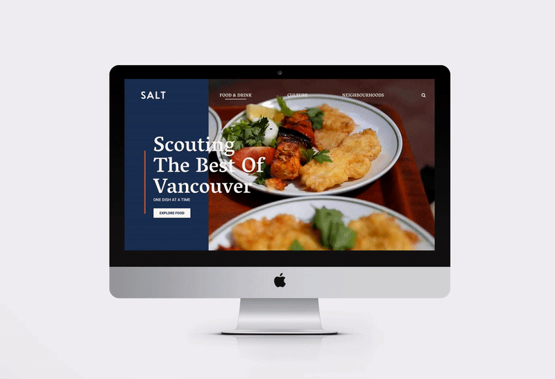
Salt is a fictional client based off the popular Scout magazine, Vancouver’s leading food and culture website. Their main objective is to ‘scout out’ and promote the things that make Vancouver such a sweet place to be. To celebrate their commitment to local food and culture, we were tasked to redesign their local guides section.
*This website redesign is a student design concept. It is no way supported or endorsed by Scout Magazine.
Opportunity
Our client wanted to redesign the existing website to create an engaging experience exploring Vancouver’s food and drink eateries. Through our initial audit, the current website lacked intuitive and consistent information hierarchy. The goal of the redesign is to simplify the navigational system while leveraging Salt as a curated and visually enticing experience.

Our Approach
We wanted to leverage Salt as a highly curated platform that features Vancouver’s finest and hidden gems, from the next upcoming cafe on their radar to their Top 10 lists. Our key goals in this redesign are to simplify the navigational system and establish consistent information hierarchy.
Research
Our demographic target are Millennials ages early 20s to late 30s looking to try something new and add some adventure in their daily lives. They are technologically savvy and used to having any and all information that they need right at their fingertips. This demographic group is: Social, Adventurous, Conscious, Curious and Well-Informed.


Art Direction
As a go-to source for Vancouver’s trendy dine-outs, we wanted Salt’s visual branding to have a comforting, down-to-earth feel while injecting a charming, modernist look. Taking inspiration from the Pacific Northwest, our photographic treatment and colour palette reflects this moody and lush region through mute, earth tones with a pop of brighter hues.

As Salt’s content focuses food and drinks, photography plays an important role in showcasing these enticing dishes. Along with typography, these visual elements are arranged within our grid through the use of layers and overlays.
Lo-Fi
We wanted Salt to entice users into further exploring Vancouver’s local food and culture. In our initial lo-fi sketches, we streamlined Salt’s layout and structure with an emphasis on concise and clearer headlines, a shorter footer as well as featuring content relevant to each page.

Salt’s Archives page has a wealth of posts full of diverse information, however in our initial audit, it was a challenge to distinguish their metadata. We optimized this page as a Search Results page and included the use of filters to sift through vast amount of content such as tags, cuisine type, price range and distance.
Previously, Salt’s posts were lengthy and would take time to scroll through in order to view all of its contents, especially in their Top 10 features posts. To mitigate this, we truncated the content and included a summary list of all the 10 places, giving users the option of spending more or less time interacting with the content information.
Mid-Fi Design & Testing
After transferring our sketches to digital wireframes, we conducted usability tests with 3 users from our target group. We gave them the task of searching for a single post and asked them to think aloud as they completed the process.
Using our heuristic analysis and results from the usability testing, we identified some frequent issues in our initial design such as vague link and button names, which were addressed by renaming them in our final design.

UI Style Guide & Grid Demonstration


We utilized a modified 12-column grid throughout Salt’s redesign.
See it in action here →
Prototype
Taking note from feedback received from our usability testing, we implemented changes into our final prototype.

In our Top 10 page, we implemented a descending countdown as a marketing strategy to have users spend more time going over each ranked item before reaching our top recommended eatery. We also made adjustments to the typographic overlay on photographic elements in our prototype.
Explore the desktop prototype →
Outcome
The final design was well-received with our target audience, whom noted the improvement in the ease of navigation along with a clearer information hierarchy as well as the addition of filters in the archives search results page. We also had a special shoutout for our Error 404 page! (see if you can find it in our desktop prototype)
Future Considerations
We hope to expand and implement a social media feature in order to increase our visitor’s engagement with Salt’s web content.
Another feature we would like to consider is implementing animated micro-interactions throughout our site to create a more engaging experience for our visitors to interact and search for the next tasty Benny in the neighbourhood.
Thanks for reading!

