Robinhood Redesign: Explore
A redesign challenge for the 2019 Kleiner Perkins Design Fellowship

Inspiration & Background
Last summer, I attended a Meetup in New York that discussed well-designed onboarding to help shape users’ impressions of a platform. Trade Coffee spoke upon utilizing onboarding to provide a tailored experience for users to make them feel more integrated, meaning for them, pinpointing the perfect coffee for users based on their preferences. This, in turn, helps companies create lasting relationships with people, helping to grow their business.
Over the past two years, I’ve started investing in the stock market, all stemming from diving in head first using Robinhood to explore. After attending the meetup, I thought back and analyzed my current and previous usage of Robinhood, and how my experience could improve if the discovery of stocks became more integrated with the platform, just as I had learned at the meetup.

Can a concept similar to Trade Coffee be applied to Robinhood? Would it make a difference for users? Why would they need this?
Below is my process based on researching, designing, and iterating.
Design Process & Sections
- Secondary Research
- User Interviews
- Ideation
- User Interviews (Round 2) & Affinity Mapping
- Low Fidelity Designs (Concept Sketches, Wireframing)
- High Fidelity Designs (Prototyping, Animations)
- Validation
- Reflection
Timeframe: 3 weeks
Focus: American Millennials, Stocks, iOS app

Robinhood’s primary userbase consists of millennials and younger investors looking to get involved in stock market investing. Being a generation that is based on ditching the instruction manual and diving right into products, Robinhood’s mission of democratizing the American financial system and brand work in harmony with millennials to create the perfect storm for disrupting the financial industry.
Robinhood’s easy-to-approach, user-friendly design, offering commission-free trading, creates the counterculture to traditional modes of investing, resonating with millennials.
Thus, I decided to focus on millennials for the scope of the project.
To learn more about the intersection of millennials and the stock market, along with common trends and characteristics of Robinhood users, I did secondary research, looking at existing data and studies that have been done, in comparison to primary research. My assumption before researching was that millennials lacked knowledge in investing
These three points summarize my findings and opportunities that I discovered from various studies, news articles, and financial publications:
1) The average millennial lacks involvement and exposure into the industry

These trends can be justified when looking back at the average millennial’s past. Coming into adolescence either during the recession or soon after, millennials first glimpse of the stock market was scary. From either their inner intimidation or their parents overemphasizing of saving, many millennials may have avoided learning about stocks and growing their financial literacy.
Lack of financial literacy can cause people to choose not to invest, or to invest without sufficient knowledge, risking not creating a financial foundation, or making poor investment decisions.
2) The average Robinhood user’s portfolio is undiversified

Millennials are most likely the generation to invest according to their beliefs, meaning they pick companies they are surrounded by and trust, hence, mostly investing in tech stocks.
While investing where you know is not the worst thing, an undiversified portfolio could lead to fewer profits, in the long run, hurting these millennials and not exposing them to other parts of the market.
3) Robinhood creates the perfect storm for app-hungry millennials

Millennials, who are very alert to their phone apps, are the catalyst that makes Robinhood’s clean and quick design work great. Often in response to push notifications, these users access Robinhood to check into price movements of stocks that they are tracking or invested in.
This is a dream for most tech companies, not only having a large userbase but one that is insanely active.
Insights from Research
Combining the three key takeaways from my research, there lies an overlap that Robinhood could reap the benefits of.
Since…
- Their main userbase tends to lack a strong financial education
- Their users’ portfolios are undiversified
- And they have a loyal userbase that is more or less addicted to the app
…Robinhood has the opportunity to educate their highly active userbase on financial literacy and help them diversify their portfolios,
increasing activity in Robinhood, and furthering the business’s impact at large on the industry.

Seeing the opportunities and trends of millennials through research gave me a broad direction of where to go, so I took a step further to interview some real users.
Making sure to talk to the right users is key, so I chose a dozen and a half people from a diverse group.
Demographics
- Both younger (18–25) and older (25–30) millennials
- Currently living in the US and foreign countries
- Variety of backgrounds: Heavy Finance, Strictly Tech, Business
- Current and inactive users
Understanding Users’ Backgrounds
Understanding how users came into Robinhood was important to use as a baseline in moving forward with talking to them, and also in seeing trends with the types of users that Robinhood attracts.
My findings included:
1) The majority of users still utilized the app
Years later, they’re still in love with no-commissions and the design. Those who do not still use it were due to reasons of switching to other platforms, and also a lack of interest/capital to move forward.
2) Most came into the app with no investment experience

The majority of these users were coming in blind with no experience, embodying the millennial mindset of learning by doing. Those who had prior experience with investing used Vanguard, E*TRADE, or even dabbled in mock-trading sites.
Robinhood Usage
After getting a baseline for their background, I asked about their current usage of the app to find where they see value in the app.
Findings included:
1) Most use external methods to learn and decide what to invest in

Most users did research through other sources, or talked to other people, and came back into the app. Any good investor uses several sources before they make a decision.
2) Most strictly use Robinhood for buying or selling

After going out and deciding what to invest in, most users were coming back into Robinhood for the actions of buying and selling, not discovering anything within the app itself.
How often do you discover new stocks on Robinhood?
“I can’t say I ever have. I’ve looked at their top gainers/losers listings. But I’ve never invested in any of them” — Adit A.
“I would say hardly, definitely not something that seems at the forefront of the the app for me.” — Zac D.
“Rarely. When I’m on Robinhood it’s not really to research, it’s more-so to check on how my portfolio’s doing” — Tanner G.
It became clear that users generally viewed Robinhood as simply an app for the routine tasks involved with managing their portfolio, something that the simplistic design and easy interaction work very well for, but allow Robinhood to be vulnerable to market competition.

Looking at the userbase after research and user interviews, I saw two problems:
1) Millennials coming into the app don’t have much exposure or financial literacy
2) Current users look outside the app for research
In both scenarios, Robinhood has the opportunity to have an impact on shaping new users, by giving them tools to learn about the stock market, and existing users, by giving them a tool to explore other areas of the market and keep them interested.
In doing so, new and current users alike would be more likely to keep investing and using Robinhood over competitors.
What is Already Known
1) Risk tolerance data
In Robinhood’s current onboarding process, they already ask the user:
“The global stock market is often volatile. If your entire investment profile lost 10% of its value in a month during a market decline, what would you do”
Options: Sell all, some, or buy more
From this, a risk tolerance value can be interpreted and utilized.
2) Robinhood likes simplicity
Since millennials want a balance of ‘what you need to know’ manuals and love learning by doing, the last thing they need is too much information and direction. Keeping the solution simple and not forced would further help Robinhood’s direction with attracting millennials.

Since Robinhood is something that newbies to the stock market are already jumping into, I wanted to further explore if providing more resources in the app could be advantageous to helping new users become comfortable with investing, and keep current users inside the platform, while not overwhelming them.
I asked the interviewees objective questions on their preferences and their needs.
Findings included:
1) The majority appreciated when apps provided recommendations
With the growing trend of discovery-inspired experiences such as Pinterest, Instagram Explore, Spotify Discover Weekly, and Trade Coffee, apps are utilizing machine learning to provide users a more integrated experience.
2) Almost all were open to tailored stock recommendations

Most people liked the concept of adding a discovery dimension to Robinhood and thought it would even help them save time.
3) A page within the app, accompanied by push notifications, resonated with most users

Affinity Mapping
I did a couple rounds of affinity mapping to organize the insight from users and explored potential solutions and the impact that they would have.


A few things became clear:
1) Users wanted to see tailored information
- Not just the hottest stocks, but ones that would help them with diversification
2) It is important to be transparent about the metrics involved
3) It would save time but would have to be easy to understand and update quickly
Potential Solution
Give users recommendations on stocks they should invest in, further helping them become more educated, diversifying their portfolio, and keeping users in the app.
The pieces were all coming together until…
Boom! Roadblock
During this round of user interviews, I found out that providing recommendations may not be a possibility for Robinhood, based on legality and how they are registered with the SEC. Whether in the company mission or simply from a legal standpoint, the company makes it clear that they do not suggest or advise any users to invest in stocks that appear in certain instances.
To look deeper, I researched to see specifically what speed bumps might be in the way. At a time where tech companies are being scrutinized for data security, the solution not only needed to be compliant with existing law but also should give users insight into what the software is truly doing.
Some important findings:
1) Investment advisors and brokers have a world of different regulations
Everything I could find pointed to Robinhood being registered as a broker-dealer instead of an investment advisor, meaning they indeed could not by law recommend stocks.
2) The new SEC Investment Advice Rule
This regulates that brokers need to “act in their clients best interest”, meaning they can’t place the firm’s financial interests first.
Combining regulations with Robinhood’s intent to not recommend and suggest, a workaround could be reached merely with an algorithm to explore stocks based on already utilized data and personal preferences and be a way to ‘filter’ rather than recommend.
Industry Input
I talked with a few banking and wealth management professionals to gain a wider view on regulations, what metrics would be important for such a concept, and if my proposed workaround would be viable.
Findings:
1) Volatility is correlated to risk
Volatility is one of the most well-known ways and understood metrics for determining risk tolerance. The lower the risk tolerance of the investor, the lower the Beta and volatility of stocks are better for them, and vice versa.
2) Once individual investors fail, they turn to investment advisory groups
“I see a lot of clients after they’ve blown themselves up” — Brian M. (Wealth Management Relationship Advisor)
3) There’s a market need in the investment space for this
“A lot of these products are cumbersome to use. This would be super helpful for the end user to say, ‘here’s my level of risk’, and be able to learn.” — Brian M.
The solution to simply provide a way to filter stocks based on existing data and user’s preferences didn’t seem to violate any laws, from both my research and the connections that I spoke with.
In fact, by incorporating the explore functionality into Robinhood, users could be more educated and not ‘blow themselves up’, keeping them as active users in the platform.
Data Summarization & Hypothesis
To condense all of the data, I summarized the goals and frictions of new and current users from when they first joined the app and their thoughts throughout.

Hypothesis
Adding the explore tab will be a useful feature for millennials as it will help educate new users and save them time.
This will keep users inside Robinhood and increase the active user count.

Goals:
- Help brand new users gain insight into investing and build their financial literacy
- Give existing users a tool to continue to build and diversify their portfolio efficiently
- Be transparent about metrics
- To not conflict with current search functionality integrated into the platform
Achieved through:
- Explore page
- Easily understood designs
- Updating quickly
- Push notifications
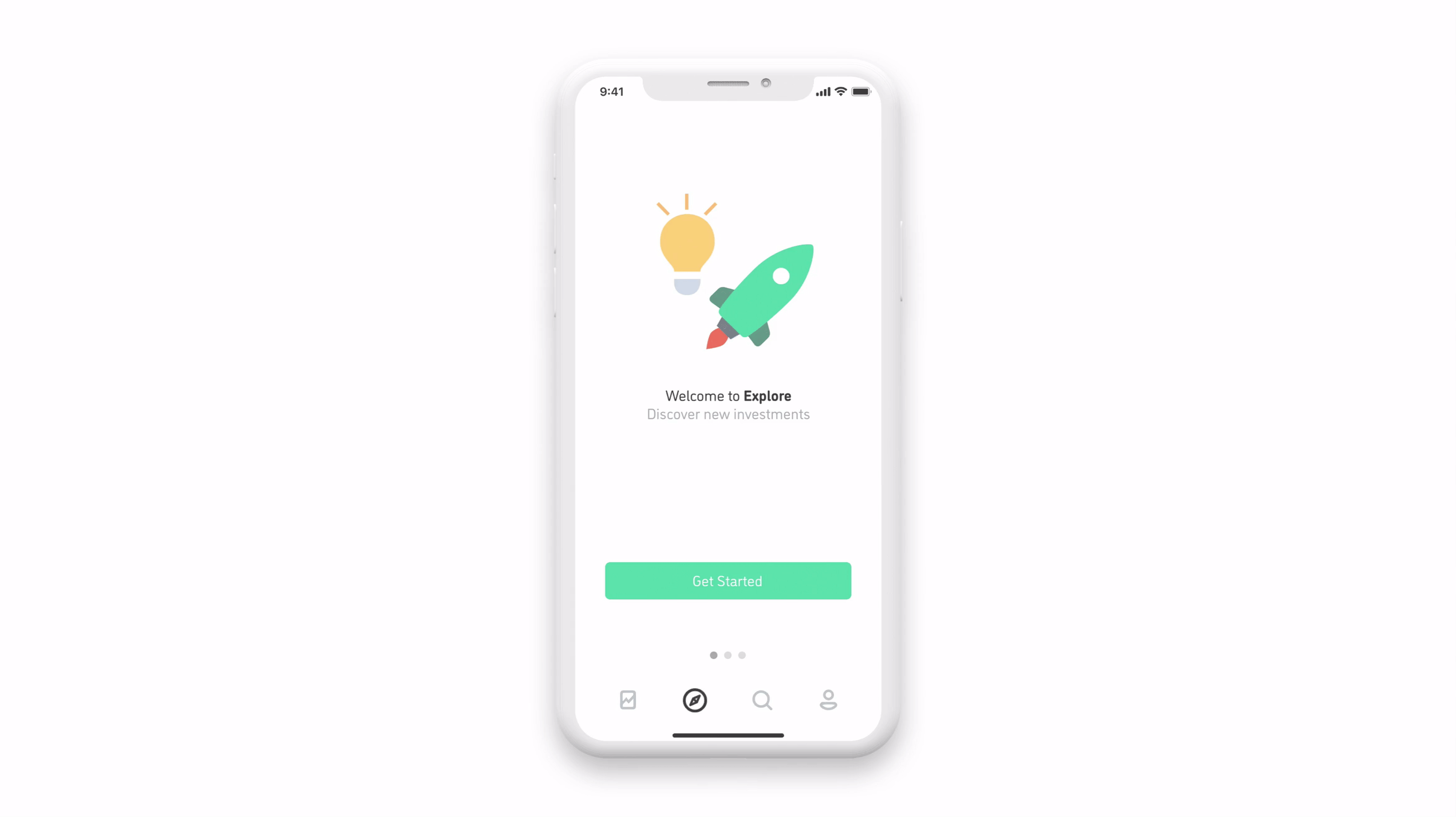
- A short onboarding experience
You can find the interactive InVision prototype here.


By creating a simple onboarding experience for the first time users open the explore page, they can learn more about how it works, the metrics behind why certain stocks are displayed to them, and validate the current information in their investment preferences.
Similarly, current users could update the stored risk tolerance level and learn more about the platform too. Users prefer a simple onboarding experience that takes less than a minute, so in both scenarios, simplicity is important.

New users, those who are brand new to the app and just went through the main onboarding, are also led through the Explore Onboarding once they click into the tab.
Current users, meaning those who already went through the explore onboarding, are sent push notifications to help them to continually discover new stocks and increase active engagement for Robinhood as a whole.

I chose to go with sectors instead of industries to help keep the filter page more concise, breaking them down even further with 3D touch for users that want to gain more information.
Accomplishing Multiple Goals at Once
How can the main explore screen accomplish the goals set out for both new and existing users?
- The feed, by default, gives all users exposure to a variety of sectors based on their risk level
- The ability to filter to select multiple volatility ranges, market caps, and sectors gives a tool to more skilled users, while new users can learn more about each through 3D touch

Onboarding
By incorporating an onboarding phase, the user gets a simple introduction to what the new feature is, why it matters to them, and insight into the metrics and terms.
Users are also asked about their risk tolerance, validating the previously stored information, and given insight into how different levels are correlated to different results. The onboarding helps accomplish the goals of giving users insight and building their financial literacy while being transparent about the metrics.

Explore Main Screen
The main screen helps to accomplish the goals of giving new and current users insight about other stocks to help them grow their portfolio.
Users are given an ‘endless’ feed of stocks to check out. It gives them basic information and a description, with the opportunity to tap on each stock and learn further.
The ‘card’ approach helps to accomplish the user needs of being easy to understand, and the refresh functionality helps it to update quickly.
Tradeoffs:
- I decided against building out content for the learn more button to avoid getting too specific into legal terms
- I chose to use the first few sentences of the company description in an effort to keep the design simple & not cluttered

Filters
Users have the opportunity to constrain their feed to display stocks pertaining to certain volatility, sectors, and market cap. By default, the feed gives users stocks based on their stored volatility/risk level, and all sizes of market caps and sectors.
This gives more knowledgeable investors a tool to dig deeper into their search, and also gives new users descriptions and a way that they can explore the market on their own.

3D Touch
Users can press harder on certain options to see more information about a level of volatility, sector, or market cap. For sectors, it gives them a description and outlines the industries within each.
This helps to give both new and existing users yet another tool to learn more about the stock market. It helps to solve the issue of millennials lack of financial literacy while providing a solution that maintains the simplicity of the design.

Push Notifications
While they are away from the app, push notifications are delivered to the user. These provide them with the name of a stock, the risk tolerance, and the sector. Upon tapping on the notification, the user would then be led right into the stock details page.
This provides users with information to help them build their portfolio and save them time.
From a business standpoint, it helps Robinhood as a business by bringing users back into the app and increasing active users.

After designing the prototype, I circled back to the users that I interviewed to gather their opinions and ask them a few questions to validate if my assumptions accomplished goals I had set out at the beginning of designing.
Hypothesis
“Adding the explore tab will be a useful feature for millennials as it will help educate new users and save them time. This will keep users inside Robinhood and increase the active user count.”
Education, Time Efficiency & Transparency
Two of the goals in the hypothesis were to help new users educate themselves on the market while helping current users save time spent researching through other mediums.
Learning
The general consensus was that the tool would help them in learning about the market and stocks they had not seen before, while not overwhelming them, both through content and visually.
One thing lacking on this front was that even though some descriptions were provided, there still could be more information about risk and what it means to investors.
“The descriptions are great, but when I first started investing I had no idea what risk meant or what risk I should be at.” — Tina B
Saving Time
Most of the interviewees acknowledged that it would save them time as well, allowing them to do research inside the app instead of having to go on different websites, thus, shortening their process.
One potential area to improve upon would be adding visuals or other data to the company descriptions, as users found the amount of text less helpful and wanted to get a consensus quicker.
Transparency
Another goal of the project was to be transparent and explain certain metrics. Users thought the solution was satisfactory in this sense, showing more information would be helpful to advanced users.
“If you’re going to classify risk and the objective is to give more info to users, show the beta level so you can quantify the movement with relation to the market.” — Aman G
Success Gauge
Based on the hypothesis, the success of the solution would mean helping new users to have more resources to learn about the market, diversify their portfolio and add a valuable tool so existing users can save time in stock research.
Judging from user-based feedback, I would say the solution was successful and the hypothesis stood true, but still has room to grow and be refined to widen the impact.

Robinhood At Large
As with any design change, the new functionality needs to fit into the current architecture of the app and align with the mission of the company.
The feature fits into the mission of democratizing the financial system by giving users the power to be individual learners by providing education for those that may not have had the privilege to learn in a formal setting.
The explore functionality fits in the app nicely by not interfering with the user’s ‘Invest’ tab, where they can view their portfolio’s status, and also not interfering with the search functionality, where they can quickly search for a company or see top charts.
What I learned
The intersection of finance and technology is continuing to evolve
The progression of fintech software opens new doors so users can interact with markets and invest. Continuing to adapt to users’ needs will help drive the industry forward.
Overcoming challenges
Any new concept is destined to run into roadblocks and challenges, such as I did with the Investment Advisor regulations. I overcame the roadblock by taking a step back and using resources to analyze a way to pivot. I learned the importance of persistence and creating workarounds.
Utilizing resources
By consulting with other designers and users along the way, I learned the value of constantly validating and iterating, and how important they are in product design.
Using design resources around me was incredibly valuable for sharpening my framework and prototyping skills. Thanks to InVision and TheNounProject for some help with iconography.
Looking forward
Testing and iterating
By doing research and interviewing users, I gained great insight and a roadmap for direction. That being said, there are endless directions to go and gathering more objective data could help to refine the concept.
Per the user feedback, changes that could be implemented in the future could be less text for the company descriptions and more visuals such as earnings graphs. Additionally, it should give the new user end of the spectrum more information on what risk really means, and more experienced users more data such as beta values.
Financial research
Conclusions about risk tolerance and other factors are ever-changing, so talking to more financial professionals and users could help define what risk really means to them and how to relate this with the common user’s experience in the app.
The true legality of the concept could be refined further, and talking to lawyers could help to give more insight into the solution.
As complex as it is, I still learned a ton and bettered my own financial literacy during the project.
Improving my knowledge with the design
The project opened my mind to more details about the stock market and helped show me my passion for designing systems that help users connect deeper with technology and discover new things.

