Responsive Interface Design Pattern
Highlights of a practical talk presented by Vitaly Friedman, co-founder of SmashMag

We are so glad that DesignX community could collaborate with Vitaly Friedman, co-founder of SmashMag, as well as Scotiabank Digital Factory to present this amazing event.
Before Vitaly started the talk, he clearly stated that:
This talk is about TECHNIQUES.
And about clever DESIGN PATTERNS.
And what works in REAL-LIFE PROJECTS.
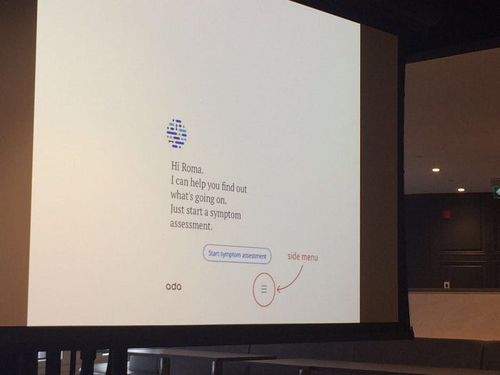
All about Navigation and Layout: From Hamburger Menu to Designing for the Thumb
1/Visibility wins
Vitaly started from the hot hamburger button on tablet and mobile devices. Seems it is a good choice as it collapses all the menu options into a single button, so even some websites use it if they have a large menu listings.
But there is an issue with hamburger button, the visibility. Users tend to engage with what is visible on the table so no matter how hard we change the menu button, from a single icon, to an icon with “menu” even with an overlay stating that the menu is just hidden beneath the button, the users’ engagements still drop.
Learn more about the drawbacks of hamburger buttons and different solutions in this post from Tech Crunch and this post.
2/Position matters
Vitaly showed One example of which the return button of the sliding menu was on the opposite side of the hamburger menu. Along the history, designs like switch, start button of windows already make people used to open and close something at the same place.
3/Design for the thumb

On touch devices, people use thumb a lot to access to the content. The above image is the touch area of a medium-size device for the right handed. As the screen size becomes bigger and bigger, the thumb zone is also evolving. Check out this post from SmashMag about the thumb zone and this post about how to design for the thumb for more information.
4/The bottom bar trend
Feeling the pain of hamburger, some pioneers started to experiment different solutions. The bottom bar started to arise, instead of using a hamburger menu, people started to fix a bottom menu bar, which proves to be a better choice then the hamburger.

Some even placed the hamburger menu at the right bottom, instead of top to down, the menus are from down to top.
5/Mobile Trend in 2017
- 4–6 inch screens
- high resolution screens
- portrait orientation
- one-handed grip(left/right)
- thumb-drives 75% of interaction
- Bottom control easier to reach
- design for most constrained app
6/Data visualization — the arise of Tab-like-Map
Map has always been an issue on touch devices, but recently websites started to adopt the tab-like-maps, which means the sizes of different areas are adjusted in order to be touch friendly.
*Bonus: The best website of the world.Hundred thousands of dollars have been spent on user research and user testing.
Love the carousel, Hate the carousel
1/Carousel doesn’t work
Vitaly showed many bad examples of using carousels, including massive amount and extremely hard to tap circles on mobile. Research have showed that most people only see the first image of the carousel. There is an interesting website called Should I Use a Carousel?.
2/Use Carousel for creative exploration
When used right, carousel can be a very delightful and creative design, especially in some showcase websites, carousel provides something for the audience to explore.
Responsive layout and design
1/Responsive icons
A responsive icon, an icon reduce the complexity as the size gets smaller, has a lot to do with explorable shape, visual glue and iconography. As the width of the screen changes, the logos should be modified to be less complicated while still keeping the brand style and readability. Check out this websites showing different responsive logos of some well-known brands.

2/Art direction is important for global scaling
When the product is scaled to a global size, it is going to use different languages and fit into different culture and values. Art direction is extremely important here as the design needs to be changed and localized in order to target multi-layers of users.
3/Responsive layouts
Some websites use lots of illustrations and unique design to present their personalities. Responsive layout is extremely important as those unique components are the soul of the website. But at the same time, illustrations are normally in a static format, so the awareness of being responsive is necessary at the early stage of building the component.
Be creative, be personal, build connections
1/Are you building a product just for people to use, or are you building a personal connection with the audience?
Vitaly used the example of Uber and Mailchimp. They are both very successful products, but for him, Uber is a good service for people to use and walk away, while he already feels a connection with Mailchimp so he will stay even if they increased the price.
There are no right or wrong. Both paths can lead to success, it just depends on people’s different value and choice.
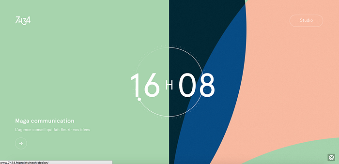
2/Be creative and show your personality
Be brave enough to break the rules and layouts. Use dynamic shapes instead of rectangles and circles. Vitaly showed lots of unique websites which push the boundary and create strong personality, which is “better than any bootstrap framework website”.
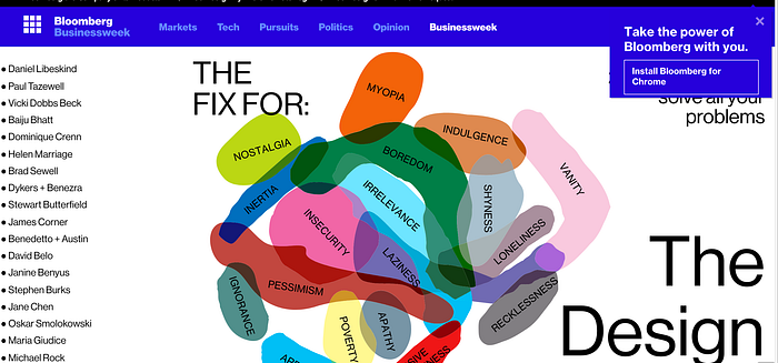
Some people may argue that Bloomberg’s design website has lots of issues, looks clumsy…But they have pushed themselves far, and reinvented their personalities.

He also shared the story of the worst hotel in the world, going extreme in building personalities but achieved a great success.
Vitaly also introduced the new website design of SmashMag and shared some details they’ve put great effort on to create a personal connection and unique personality, such as the error messages, the unique coupon code related to anything about cats….which all make the website warm and personal. The website is still under construction, but feel free to explore and try to find the 64 cats hidden!
Highlights from Q&A
1/How to balance between being creative and accessibility as well as usability?
Build an accessible markup on top of the creative content. Use labeling and attributes, make sure to allow users to jump to main menu directly.
Nowadays, “intuitive” and “don’t make me think” have been overused. Vitaly holds a slight different opinion: he thinks it is necessary to make users think sometimes. Otherwise, the product will become “a no-brain machine with soulless functionalities.”
2/How do you look at mobile first design principle?
Vitaly personally is not a fan of this principle and he introduced his workflow:
- Stakeholders meeting (record if possible to really figure out what they want and need — the true expectations and requirements)
- Write UI copies -start with the content
- Component design based on requirement and content
- Visuals and development
The core Vitaly clearly conveyed to us tonight is being creative and build up your personality.
We want to thank everyone again who supported DesignX and this event. Keep the discussion going on DesignX Toronto Community:D

