Reducing the Outbound from Onboarding — a Case Study
Introducing appointment scheduling to our onboarding
Uber onboards thousands of drivers every week. Sometimes it’s as straightforward as uploading a few documents and (getting in you car). But sometimes more is needed – such as a Vehicle Inspection.
If one is required (as per state regulation), the driver must have their car inspected (either by local mechanic or an Uber Greenlight center). It’s just as important as your Driver’s License and Insurance – without it, you can’t get on the road.
The current Vehicle Inspection step introduces a high point of friction — leave your computer and go to a physical location. Over 5,000 drivers drop off each week when they hit this step in the process.
A multifaceted problem
When we conducted user research (around VI), we found out that drivers had confusion around 3 major points — the where, when and why.
Where — The first issue confusing users was where to go. Locations have different options and perks – a traditional mechanic would charge a fee while partner mechanics would do it for free and Uber locations would even go beyond with in-depth guidance for folks who has question. This was not explained clearly and left people confused on what those different locations offered.
When — Since we dropped them on a map with no clear next action, people were unsure when they could get an inspection. “Can I go now?” usually led to waiting to visit (then forgetting after a couple days).
Why — it was unclear why a Vehicle Inspection was needed in the first place. And expectations around a visit were never mentioned (ie, “do I need to bring my documents?”, “how long will it take?”).
In addition, there was no clear, actionable task to take. The driver was shown a list of locations where an inspection could be obtained but after that, we asked them to upload a picture. There was a giant hole in the driver’s journey and we didn’t even address it — what now?
My role
I was apart of the Driver Onboarding team from Aug 2015 through Oct 2017 and was responsible for much of the Driver Onboarding flow. I led the design for the Scheduling feature, working alongside a Product Manager, Copywriter, Researchers and worked closely with other stakeholders including the team of Engineers who built the final product.
A Holistic Overview
Our main goal was to help more people get to inspection centers since we knew that folks who did have higher rates of successful activation which leads to taking more first trips – two important KPIs for our team.
By solving existing user problems in the Vehicle Inspection experience, we can expect an increase in users visiting lots.
Aligning business and user goals
We knew we could control the experience at an Uber Greenlight Hub (low wait times, guided app walkthroughs, etc.) so we decided to push people to those over partner mechanics. But if a user didn’t have a Greenlight Hub close to them (in the case of suburban & rural drivers), we wanted to make the choice transparent: great service versus distance to location.
Our business KPIs were In-Person Visits, 14d successful Activations & 14d successful First Trips.
Mapping Out a (Design) Strategy
After many meetings and discussions with the team, we solidified the principles that dictated the design strategy:
- Encourage people to want to go to a vehicle inspection lot, prioritizing Uber locations
- Answer common questions around inspections, remove ambiguity
- Be simple and lightweight while still being easy for non-technical folks
- Provide actionable next steps
Design process

Wireframing a winning flow
Part of the confusion of the existing experience stemmed from a bad user flow which didn’t account for all use cases. Nailing a clear, simple flow was integral to the feature’s success.
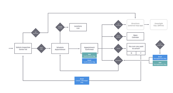
As we iterated we tested each new flow with simple Invision prototypes. One difficulty was trying to balance the amount of information on screen — too dense, folks would lose interest; too sparse, they would be left with questions.
Half way through the design process, I began to print and display each iteration of the flow. This allowed transparency into the design process and also created an open forum for feedback and discussion with the whole team. This also helped to account for all the use cases and make sure they all worked independently.

Upon reviewing one iteration, we decided to scale things back by removing the Add to Calendar feature. Through testing we found the first few screens didn't adequately communicate the value prop along with confusion brought by introducing the concept of Uber locations. To remedy this, I worked side-by-side with our copywriter to craft simple, understandable content.

The final flow has a good balance between explanation and simplicity while having separate flows for each of the use cases.
Knowing when to go
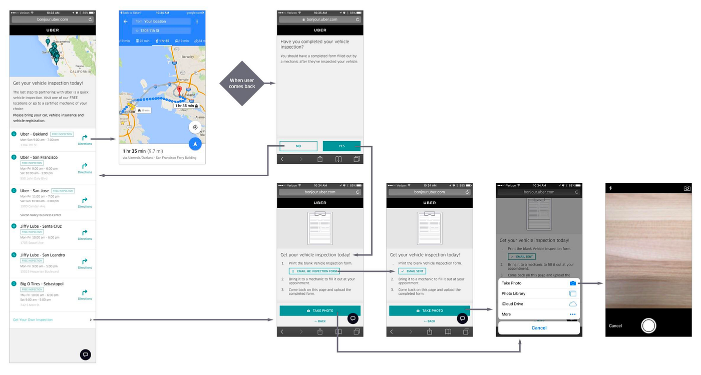
To get more context of what users went through at the locations, we talked to our representatives at an Uber lot. They mentioned that when people came in they frequently held their phones up, usually showing a screenshot, to reference why they were there. If folks were doing that already, why not leverage this natural behavior by encouraging it when they visit?

This was the start of the Boarding Pass concept. Functioning much like Apple’s Wallet app and an actual physical ticket, it helped users to actively show up to their appointments by giving them a summary of where (the specific location), when (time & date), and what (extra info such as documents to bring, parking for each location, etc.). The action on this screen corresponds to getting directions (which would launch an external map app).

Finding the best location
The location list was a major part of the flow but we opted to remove it from the “ideal flow”– for users who were close by a Greenlight Hub. Once the user shared their location with us, we showed them the best, nearest Uber location. If the user didn’t want this location, they could choose to pick another by opening the Location List.
When users opted to pick from the location list, the biggest challenge was how to still promote the Uber locations above the regular ones (remember, we wanted to give our drivers the best experience possible, which we could do at Uber’s Greenlight Hubs). Instead of having a combined list with iconography to differentiate Uber and partner mechanics, we found with testing that it was clearer to split up the lists. In addition we saw that distance and hours were the most important info for drivers making a decision.

Impact, By the Numbers
Adding the ability to schedule a Vehicle Inspection had a positive impact on Driver Onboarding. We saw an immediate increase in Activations (+9.5%) and First Trip Rate (+6.5%) which was brought on by more people doing in-person visits to inspection centers.
We quickly rolled this into the native onboarding experience and saw even bigger improvements.
Room for improvement
Since this was just the first iteration of Scheduling, there is room to grow. Upon reflection, the next version could have integration with the user’s calendar and native could give Push notification reminders when your appointment is coming up.
While our quest for improving Onboarding and Scheduling doesn’t end here, this was a good first step in making the user’s experience clear and informative which hopefully leads to the eventual goal of getting more folks on the road and earning.

