
Rediscovering Apple’s Human Interface Guidelines from 1987
UX Lessons from the Dawn of the Personal Computer
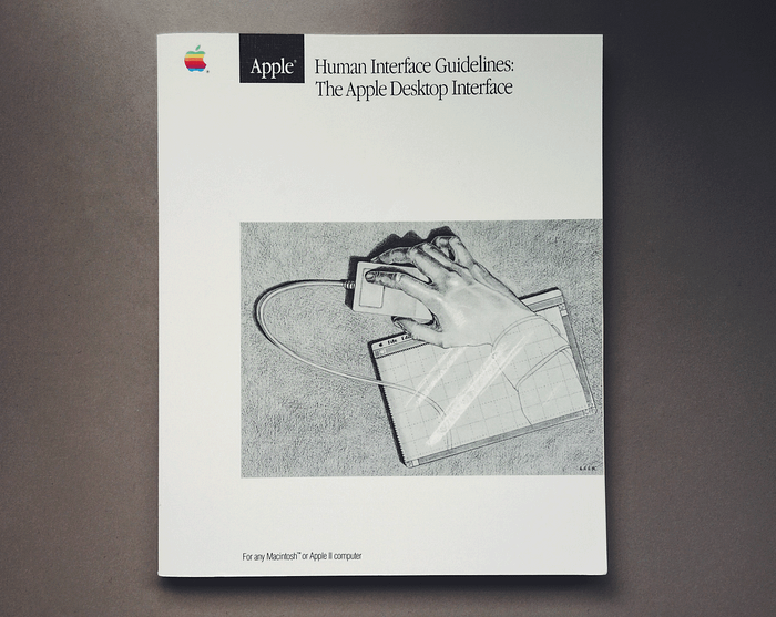
1987 was the year that the Macintosh II, Apple’s first Macintosh to be released with a color display (supporting a spectrum of 256 colors), was released. It was also the year Apple published their Human Interface Guidelines.
As I read through an original copy of the book, I was impressed that, even though personal computers were still in their infancy in the 80's, these guys already had a strong foundation of core human-computer interaction design principles. As a UX designer, this book really had me thinking about what I do and why I do it.
Explaining the whys
One of the things that impressed me about the book was how they explained the why behind nearly every guideline. Knowing the reason behind each guideline reinforces its importance and empowers the reader to know when a guideline might not need to be followed.
Consistency in a UI is one of those qualities most designers seem to inherently strive for. Consistency is one of the main reasons why we spend so much time creating branding schemes, style guides, and pattern libraries. But have you ever stopped to think about why it’s so important? This book nails it from the very beginning:
“The purpose of visual consistency is to construct a believable environment for users… The transfer of skills is one of the most important benefits of a consistent interface, especially for beginning users.” pg. 10
“…consistency makes it easier for a user to learn new applications; it also makes it less likely that a user who follows habits learned from one application will make a disastrous mistake when using a different one.” pg. xi
Another commonly valued UX principle is feedback. What’s most interesting to me about the following quote is the first sentence. Before the guideline is communicated, the why is explained; making the guideline more meaningful.
“To be in charge, the user must be informed. When, for example, the user initiates an operation, immediate feedback confirms that the operation is being carried out, and (eventually) then it’s finished… This communication should be brief, direct, and expressed in the user’s vocabulary rather than the programmer’s.” pg. 7
Another principle that I feel like many designers instinctively tend to apply is providing information when that information is needed to perform a task, but the way this principle is described in the book helps me to get deeper into the mind of the user and understand why that principle is so crucial.
“Users rely on recognition, not recall; they shouldn’t have to remember anything the computer already knows.” pg. 4
Who is in control?

While reading, I sensed that 1987 was a different time. Unlike today where both consumers and engineers appear to be itching for all of the automation and self-operating machines they can get, those who were dealing with computers early on foresaw their vast potential and were extremely wary of relinquishing any control to them.
“The user, not the computer, initiates and controls all actions. People learn best when they’re actively engaged. Too often, however, the computer acts and the user merely reacts within a limited set of options. In other instances, the computer ‘takes care’ of the user, offering only those alternatives that are judged ‘good’ for the user or that ‘protect’ the user from detailed deliberations.
“On the surface, the concept of computer as protector may seem quite appealing, but this approach puts the computer, rather than the user, in the driving role — something quite at odds with the basic philosophy of the Apple Desktop Interface.
“In the Apple Desktop Interface, if the user attempts something risky, the computer provides a warning, but allows the action to proceed if the user confirms that this is what he wants. This approach ‘protects’ the beginner but allows the user to remain in control.” pg. 7
My assumption about those working on those first models of personal computers back in the day had been that they were just obsessed with the technology they were engineering and today we are different. We are much more user-focused. However, this simple statement leads me to believe that they were very well-grounded in the human experience.
“People aren’t trying to use computers–they’re trying to get their jobs done.” pg. 2
The early Apple engineers clearly knew what they were dealing with. For them, the computer was a extraordinary tool with the dangerous potential of becoming more than that.
If computers make all the decisions and users merely react, then the users aren’t learning. They aren’t growing.
“The Apple Desktop Interface is based on the assumption that people are instinctively curious: they want to learn, and they learn best by active self-directed exploration of their environment. People strive to master their environment: they like to have a sense of control over what they are doing, to see and understand the results of their own actions.” pg. 2
Why read an old style guide?
You may have read later versions of the Apple Human Interface Guidelines and be thinking that they cover pretty much the same stuff, and you would be right. There are two main reasons why my rediscovery of the 1987 version was novel for me:
- It blows my mind that UX designers today, for the most part, operate under the same basic principles as software designers in the 80’s. These early pioneers knew their craft and their ideas continue to be relevant.
- In my opinion, the wording and explanations feel more clear and, in some cases, more correct than the current Apple Human Interface Guidelines, so I feel like some of the richness of the original guidelines has been lost in the successive revisions.
Other noteworthy quotes
“[People] are most productive and effective when the environment in which they work and play is enjoyable and challenging.” pg. 2
“Graphics are not merely cosmetic. When they are clear and consistent, they contribute greatly to ease of learning, communication, and understanding. The success of graphic design is measured in terms of the user’s satisfaction and success in understanding the interface.” pg. 9
“If images don’t effectively convey meaning, the user is lost in an environment of random objects, and communication breaks down.” pg. 10
“People appreciate visual effects, such as animation, that show that a requested action is being carried out. This is why, when a window is closed, it appears to shrink into a folder or icon. Visual Effects can also add entertainment and excitement to programs that might otherwise seem dull. Why shouldn’t using a computer be fun?” pg. 4
UPDATE 10/26/17
There are several people who have asked me who the original writers of the Apple HIG were. Was it written by the Steve Jobs himself? Well, there were no credits published in the official 1987 edition, but I did recently come across a digital version of the pre-released 1985 Apple II HIG which shows the following “modification history” which, at least, gives us some clues about who may have been involved and when.

You can follow me on Twitter @BryantHodson and see my portfolio at be.net/bryanthodson.

