Redesigning the Thrasher Website ~ UI/UX Case Study
Please note, this is a self-directed project. It was done for a love of design, and in the interests of self-discovery, learning (and a bit of shameless self-promotion.) There are many things that I would do differently next time and I’d love to hear your thoughts on this too. I hope that sharing my process here can be of some benefit to others. See full disclaimer below.

Introduction
Thrasher Magazine is arguably the most influential skate magazine in the world and is often referred to as the ‘Bible of Skateboarding’. However, when visiting their website, I couldn’t help shake the feeling that the experience just didn’t reflect the iconic reputation of the brand. This marked the beginning of this project and my thinking.
What to do and how broad to reach?
I knew a facelift would help hugely, and if I’m honest with myself as a designer, this is my safe space and where my core strengths lie. But I also knew it would be a bit of a cop-out, and I wanted to scratch beneath the surface and also push myself.
This was an opportunity to completely re-imagine the digital experience and the way that people engage with Thrasher’s content. Also being aware of the decline in sales of physical magazines within the industry in general, I wanted to create opportunities for Thrasher to build its footprint and add alternative revenue streams.
Hmmm, this could turn into a big project. I often read comments about how self-directed projects aren’t valuable as real design is about navigating business constraints, viability, budget and many other factors. Whilst I agree to an extent, I also believe that every project and environment has it’s own challenges and learning opportunities and right now some constraints would actually make things a bit easier. I decided to lock down a problem statement and some project goals.
Problem statement
Within a rapidly changing environment for traditional publications, how can I leverage the website to build on their brand outside of the core magazine?
Project goals
- Redefine the ways in which content can be discovered and consumed within the website in order to increase engagement and dwell time.
- Create alternative revenue opportunities such as endorsement, accreditation and sponsorship and increase the brand footprint.
- Evolve the Thrasher brand elements to create a recognisable and congruent visual language.
- Elevate the overall experience to align with the iconic reputation of the brand and the quality of content it produces.
Approach
Here’s a quick overview of the activities and stages of the project. There’s some more detailed notes on the ‘behind the scenes’ stuff at the end of the post.

Discovery
I created two broad research objectives. With each person that I spoke to, really I just wanted to be able to understand how they were finding and consuming skateboarding related content, regardless of whether or not it had been created by Thrasher.
- Understand how skateboarders are currently finding and engaging with skateboarding related content online across any channel or environment
- Understand how existing Thrasher website visitors are engaging with the current website and their behaviours related to repeat visits and dwell time.
Thankfully, living close to a skate park and having friends who skate (or used to in some cases) made this pretty easy. After I’d convinced someone to spend 10 minutes with me, the first question that I asked was “Can you show me some skate footage/news/photos that you really love”. After that the conversation seemed to evolve naturally and I’d have to try to steer it back to my list of questions.
The Takeouts
On synthesising my notes, two mindsets seemed to emerge the most frequently.

The Fanboy
19 of the 30 google searches that I observed involved the names of pro skateboarders. Nobody visited a Thrasher channel or website during our chats but everyone was aware of the brand when asked.
“Yeah, I follow skateboarders like I do bands. Skateboarding isn’t something I do to get fit or some shit like that, it’s my life.”

The Binge-Watcher
All of the people that I spoke to discussed skate videos with me, often flicking from one video to another and sharing stories about them. They are a huge part of skate culture. When teams release new vids, they become talking points within the community.
“Sometimes I’ll study tricks frame by frame, over and over… Sometimes I’ll get home and just leave skate vids on in the background”
Insight-lead opportunities
Surface the best content associated with individual skaters in a way that tells a story and forms a narrative that appeals to ‘fanboys’
Create video experiences which seamlessly connect ‘Binge-watchers’ to other related content within the Thrasher ecosystem
The solution
Skater specific content streams
Currently, Thrasher content is organised chronologically and via category type/topic. However, my research highlighted that people were often searching for content associated with particular skaters. To better cater for this behaviour I wanted to create an experience which focussed on individual skaters.
The concept was simple. “The fanboy’s feed’. All of the best content of the year associated with a particular skater within a rich and immersive experience. I wanted the page to be all about the skater, almost the skater’s own microsite. To achieve this I mixed in their own stats, social content, pull quotes etc. The supersized hero panel and dark interface creates a cinematic experience and intentionally contrasts with other pages of the site.
The skater’s sponsors can purchase hero panels to link out to their products.
To keep the pages alive and current, the content changes based on engagement levels. By default, the highest performing entries for each content type are pulled into the feed. However, the display can be changed using the filter on the right hand side to dig deeper. At the bottom of the ‘Best of’ section, the user can continue to scroll to load more content. Or they can traverse through a list of other featured skaters. Ensuring that there is always a relevant onward journey.


Video pathways
Video makes up the majority of content within the Thrasher website. The skaters, the boards, the shoes, and even the locations that appear in the videos all have great content associated with them that can’t currently be accessed from the video pages. I wanted to change this by using time-stamping to create an interactive timeline so users can discover all of this great supporting content.
Timestamps for external products can be purchased by sponsors or partner brands.

Thrasher TV Page (video discovery)
Video content within the existing website can only be accessed via 18 fixed categories. Among the skaters that I spoke to, the comprehension of these categories was low and I suspected that this may be a barrier to discovery. The skater with the highest result here, could still only effectively communicate what would be found within 6 of the 18 content buckets.
I wanted to address this by creating a landing page for all video so that people didn’t have to choose a content bucket first. Whilst not ground-breaking, this simple change gives people the ability to browse across different content buckets and refine if they wish using the filters or the tags that are surfaced in each video.
The endlessly scrolling feed is broken up every so often with large, full-bleed panels to highlight exclusive or promoted content. These promo spots would be available to purchase.

Article Pages
During my observations, articles were often just scanned and not really read in any detail. People would generally jump down to the imagery or video content. With this in mind I wanted to improve the image components by creating larger formats, additional in-line components and galleries.
I created a range of supporting editorial components such as pull quotes, galleries, videos and featurettes that can be inserted within the flow of copy to break up the page. The light theme, large baseline copy size and narrow line-length were chosen to make reading easier across all devices and screen sizes.
In order to increase discoverability and dwell time, additional articles are loaded and inserted as the user scrolls to the bottom of the page. The resulting page load is selected based on tag affinity.

Skater of the Year Award
The Skater of the Year award has been running since 1990 and remains one of the most respected skateboarding accolades worldwide. Each year there’s a huge amount of hype in the lead up to the announcement and afterwards. I wanted to create an experience that builds on the hype and also allows people to participate.
The pre-announcement page counts down to the reveal date and allows viewers to cast their vote and see the results reflected in real time. You can also see the video submissions and browse the contender’s profiles. Once the award is presented, the page switches states and becomes a celebration of the best content for the winning skater.
Building anticipation and slowly performing ‘The Big Reveal’ was key to the experience. Visitors to the site must scroll through partially obscured footage, view the submission statistics, read the ‘drumroll’ announcement and view a flurry of celebratory images before the winning name is finally revealed. All building on the suspense and adding to the celebratory nature of the accolade itself!

Behind the scenes: The Approach

Developing the Art Direction
One of the big goals for me was to more closely align the overall look and feel of the redesign with the reputation of the brand. When reviewing the existing website, and the magazine itself, the current brand aesthetic was often disparate. I wanted to evolve the brand and build out a suite of recognisable assets and styles that could be used across the site and also drive future evolutions of the magazine.
I needed to understand the essence of the what the Thrasher brand really stands for. Being a self-directed project, this information wasn’t easily accessible. However, I have faith in the process that I use with clients to uncover this information and asked some good friends from the design industry (with a good understanding of branding) to step into the shoes of Thrasher for this part and form a small project team.
Stage 1: Distill
It can be tricky to distill the voice, tone and style of a brand into words but this is a really helpful activity when evolving a brand or creating a visual identity from scratch. To help unpack this challenge, and get everyone in the right headspace, I created the following workshop…
Workshop: We ARE, We ARE NOT
I created 60 cards with contrasting attributes on front and back and asked the team to sort each card into piles of “We ARE”, We ARE NOT” and cast aside any that are not applicable. We then reduced this list into the ones that resonated most and aimed for only 5–10 in each.

Stage 2: Curate
For the next step, I created 3 mood boards all with different interpretations of the key words from our We ARE/NOT activity. What’s important here is that all of the elements within these boards are curated and not designed. Being relatively quick to create, these boards help to ensure I don’t go off on the wrong track during the next phase.
Workshop: The at a glance (or 5 second) test
Everyone on the team gets to see each mood board for five seconds only and rates each on a scale of 1–10. Five seconds is too short for reading copy or for noticing specific details, but is enough for forming an impression on the overall visual style which is all I wanted at this stage.
Workshop: Reflections, details and takeouts
This is a super quick session where we come together to review the results across the team. For each mood board, regardless of score, the group decided on one overall response and one action statement. These help guide the output of stage 3…

Stage 3: Define
Using the feedback from the previous activities, I created a style board which began to define some of the fundamental building blocks of the visual language, such as fonts, colours, treatments, and basic components. This allowed us to focus on visual design decisions only, without blurring any feedback with things such as content hierarchy etc, which aren’t relevant at this stage.
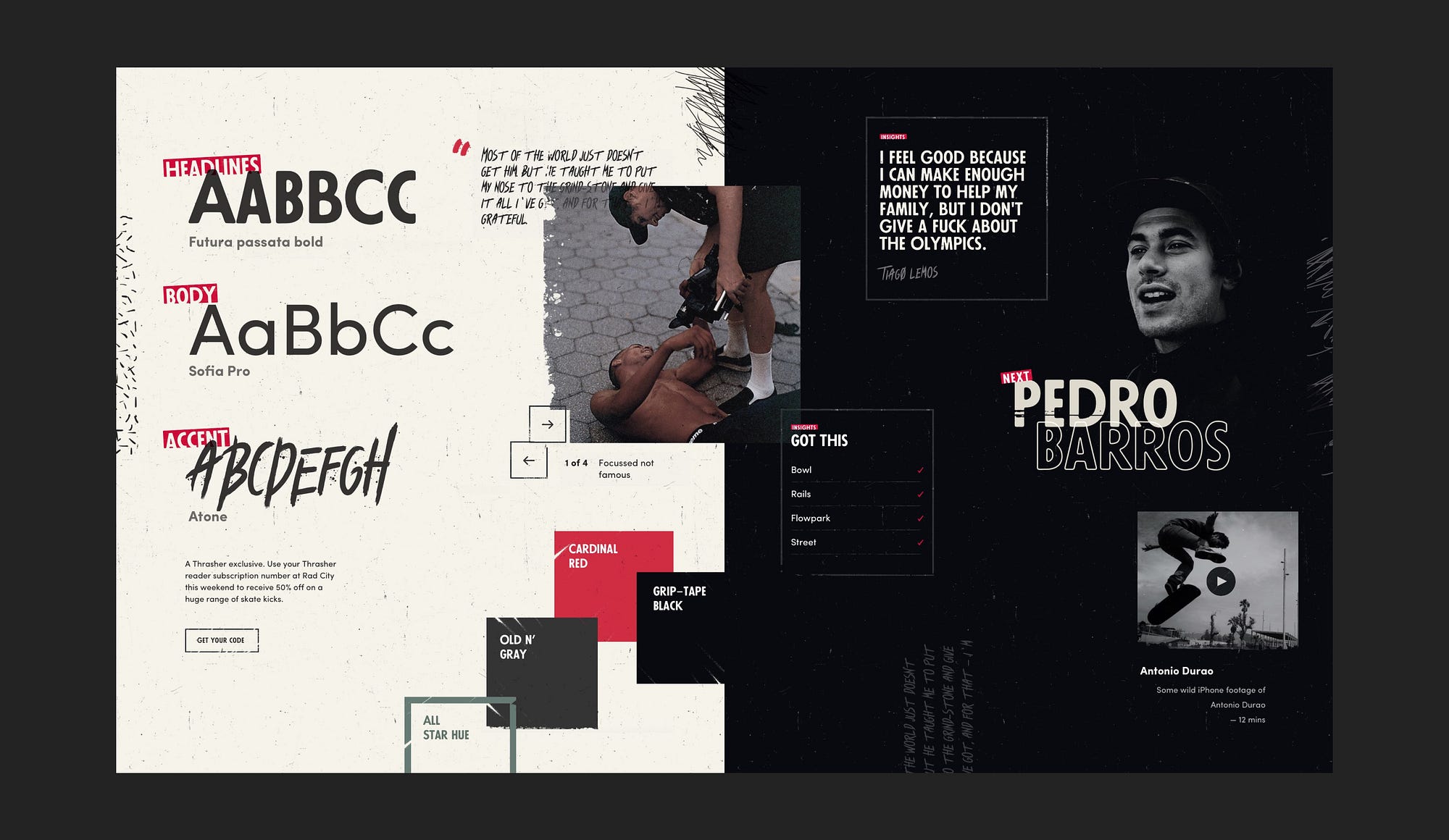
Design Direction Summary
- An experimental headline font with two widths for each glyph gives a randomised and slightly jarring flow
- Tilted labels, offset grids and texturing combine to create the imperfect and worn look that we were striving for
- A custom, 10-column grid with breakouts allows for more unconventional and mixed width layouts that the standard 12-column grid
- An expressive, hand-drawn font used for quotes and highlights gives a raw, almost angry kind of vibe
- Distressed displacement maps used to add rawness to image transitions and hovers
User Interface Design
Stage 1: Sketching
I worked with sketches for the first stage of the interface design. This allowed for quick experimentation and rapid iteration. I personally enjoy working in this very low fidelity for as long as possible as it makes it much easier for ideas to be tested and discarded as time taken for creation is much lower. Sketches are shared, developed and then given the thumbs up for the next stage

Stage 2: Wireframing
I created wireframes to flesh out the decisions made within the sketches. During this stage I also began to develop layout rules and visual hierarchy. In most cases I created these for two screen sizes. I find this particularly helpful when the experience changes between desktop and mobile, or if the responsive layout changes considerably.
Stage 3: High fidelity visual design
Once the wireframes were evolved and shared with my friends in the project team, I then created high fidelity visual design mockups. I also highlighted a number of sections which would require some UI animation. In other projects that I’ve worked on, I’ve found this to be essential in order to ensure that detailed micro-interactions, transitions and state changes are effectively communicated with developers. In my opinion, when done well, these details can elevate good design to great design.


Motion design and prototyping
Whilst it makes sense to run through the stages of sketching, wireframing and hi-fi design sequentially. I find it really beneficial to create quick prototypes at any stage of the project and even in low fidelity. Sometimes representing an interaction with a static visual or sketch just isn’t enough to be able to invite valuable feedback from your peers.
Sketch, Principle and After Effects were used in combination for this project
Thanks for reading
Don’t forget to 👏👏👏 if you enjoyed reading
My name is Chris George,
I’m a digital product designer based in Sydney.
Feel free to reach out here or via Linked In.
—
Disclaimer
This project is not endorsed by Thrasher Magazine, or at least not officially ;-) and it doesn’t reflect the views of anyone working within Thrasher Magazine or High Speed Productions, Inc. Example image and video content used in this project belong (with respect) to their original authors (Thanks legends). I don’t take personal credit for any third party content used within this project.

