Redesigning the Oscars Winner Card: a C.R.A.P. Analysis
If you’re at all interested in the Oscars or are surrounded by people who are, by now you’ve probably seen this:

And I know what you’re thinking:
what a badly designed card!
Here’s one designer’s articulation of why this card is ho-hum and what we can do to improve it.
To get things started, the first thing we need to ask ourselves in any design problem is along the lines of…
What problem are we solving?
In this case, the card holds the answer to a specific question: “what is the winner of the Oscars Best Picture award?”
So the problem that we’re trying to solve may be stated as:
How might we provide the answer to <insert above question> clearly, quickly, confidently, and accurately.
Cool.
For the purposes of this exercise I’m going to assume we’re sticking to the paper medium. In other words, I am eliminating the use of apps, bots, or a good ol’ game of telephone. Sorry, you creative kids.

Ok, so, with the above problem statement and assumptions stated, I’m going to dissect this visual design problem using a framework that you might find very useful.
C.R.A.P. is a simple (and unfortunately named) framework that was, afaik, first articulated as such by Robin Williams (the designer, not the late actor). If you haven’t yet, I would highly recommend checking out her book, The Non-Designer’s Design Book.
For the purposes of the rest of this post, I have recreated the card below and will do the remaining iterations on it.

Roll up your pants and let’s jump right in!
C.R.A.P.
Contrast
“Contrast focuses our attention and should be used to highlight the most important points that the audience should take away.”
Now lets take a look at the card again:

At quick glance, there are 3 distinct pieces that contrast against each other: the header, the body, and the footer.
How this contrast is achieved is by using whitespace and styling, i.e. all three slices are spaced apart and they all have distinct typographic treatments. The problems start in the way these three parts of the card content are treated. Lets take it from the top:
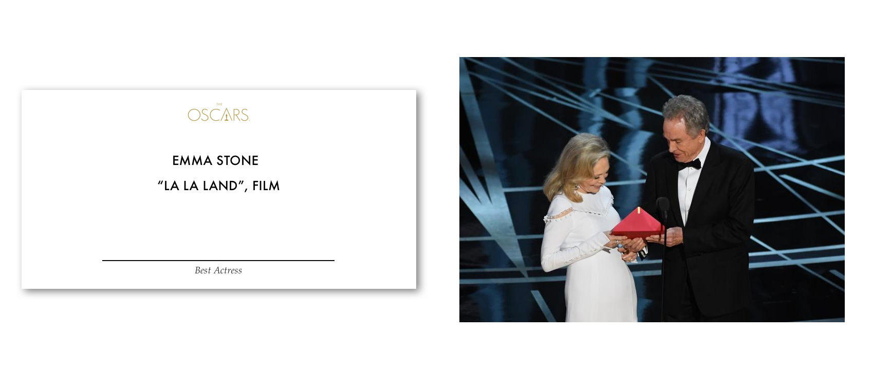
- The header is essentially the Oscars logo. At first glance, this doesn’t seem out of place. After all, it is the Oscars we’re at. But when you ask yourself the question: “does this help me solve my problem?” things may start to get a little murky. There’s no real reason why I should see the logo. It’s not really telling me anything I don’t know or need to know! And so, I’ll just remove it.

2. The body contains the title of the Best Picture award winner, the names of the producers of the film, and their descriptor. And besides the double quotes around the film’s name, the typographic treatment on the body is the same throughout. This lack of contrast makes the reader to take their time understanding what’s in front of them. Or, worse, to rush towards assuming what it says. Ask Warren and Faye!
Robin Williams (remember, the designer behind CRAP, not the actor) gives one tip to creating effective contrast:
If two items are not exactly the same, then make them different. Really different.
Lets go ahead and listen to Robin.

Since the movie title is in fact the direct and only answer to our original problem question “what is the winner of the Oscars Best Picture award?” I think we can confidently say that is a damn important line that mustn’t be missed. And so, I have chosen to make it the biggest line on the card. And while I was at it, I decided to drop the quotes because I felt the title was now sufficiently contrasted against the rest of the card that the quotes became superfluous.
But we’re not done with the body yet.
As far as I can tell, the names of the producers weren’t called out during the Oscars. But I can’t say for sure that this would never be needed so I can’t simply remove it altogether. As a compromise, I’m going to mute the producers names a little. In case the awards presenter needs to call out their names, he/she can still read them without much extra effort.

Notice also that I’ve chosen to keep the descriptor (i.e. the “Producers” title) as-is. It would have otherwise looked just like the names, which adds a little extra cognitive effort for the reader to tell them apart. By keeping the names muted and the descriptor darker, I’m adding contrast between them, making it clearer to tell them apart quickly.
And now it seems kind of odd to have the descriptor, Producers, come after the names. So I’m going to switch them around.

Sweet. Let’s move on.
3) The footer is … wait what? The title of the card is in the footer? And it’s tiny?? Why!?!
After the name of the winning film, the phrase “Best Picture” — which describes the award category we’re actually talking about — is arguably the most important piece of information on the card. It also plays a direct hand in solving our initially stated problem.
In order to resolve this, I’m going to swiftly move this to the top of the card. Like a-so:

Phew. Ok, I think we’ve got a slight hand on contrast now. Lets move on to the next principle.
Repetition
[Repetition] is a conscious effort to unify all parts of a design [by achieving consistency] — Robin Williams
Our latest iteration above has, at first glance, a lot of different typographic stylings going on. But upon inspection, the information on it can be broken down into two types: Descriptors and Names.
Names are already consistent in their typeface — they are in Futura Medium.
The Descriptors, however, are in two different typefaces. The Award Category title is in Palatino Italic and the Producers title is in Futura Medium. I’m going to change them both to Palatino Italic.

Not only has this led to a more harmonized and consistent look, it also has given us a bonus contrast between descriptors and names. Neato!
And speaking of contrast (it’s ok if we revisit some principles non-linearly), I’m starting to think we can apply some consistent contrast treatment to this card. We have two descriptors here that are in Palatino Italic — why not add a little color to further contrast them from the rest of the content?

Ok, not bad. Lets see what else we can do.
Alignment
Nothing should be placed on the page arbitrarily. Every item should have a visual connection with something else on the page. — Robin Williams
Good alignment in typography (and design in general) further lends visual harmony that makes things easier on the eyes and, more importantly, delivers the message more effectively.
As far as our card is concerned, the content on it is center-aligned. Upon closer inspection, though, we can make this center alignment even tighter. I’ll zoom in on the body and specifically the Producers line. While it is centered on the card, I’m not liking how the names are lined up one after another in wrapping lines. Lets stack ‘em.

By stacking the names of the producers, we’ve given the card a tighter visual flow. Like buttoning up the front of a suit. The name of the film still stands out and the producers take a backseat. We haven’t sacrificed on clarity, so this is looking good, if I do say so myself.
But here’s the thing with center-alignment, though; it doesn’t give a very anchored look and can lead to some general jaggedness of content.

The general guidance is that if you find yourself with a lot of content, then you probably should avoid center alignment. I find, however, that it’s always good practise to experiment with left and/or right alignment as well.
With respect to our Oscars Award Winner card, the amount of content on it is admittedly not that much. Center-alignment probably is fine here, but we can be a bit more pedantic and bold. Just because this card will likely only be read by at most a handful of people doesn’t mean we should be laissez-faire about its design!
Lets try … left-aligning it:
This looks pretty neat! The strong left-alignment gives the card a more put-together look, if you ask me.
Again, this change wasn’t necessary. The center-alignment would’ve probably worked, but I’m personally liking the left-alignment better. My only concern may be that the left-alignment may cause some of the text to be covered up by the readers hand as he/she is holding the card. I’ll assume this isn’t a big problem, for now.
Now, onto the last principle!
Proximity
Group related items together. Items or groups of information that are not related to each other should not be in close proximity to the other elements, which gives the reader an instant visual clue to the organization and content of the page. — Robin Williams
This one’s pretty straightforward. Mostly because through our previous iterations, the groups have already presented themselves are self-evident.
We just need to clean it up a bit. I’ll push apart the award winner (primary content) from the Producers (secondary content), and align it all with equal padding from the top and bottom edges of the card for more visual harmony.

Now, with just a glance, we are able to tell who/what the award winner is and who the Producers are. Awesome!
Insert Monkey Wrench
We could end it right here, but, just for kicks, lets throw in a surprise, as it so often happens in client work.
Lets say the Oscars required the logo to be present on the card. Maybe it’s their way of saying the card is official and credible. How can we go about doing this?
The first thing I’d do is take into account how the card’s design is now visually weighted. If I were to add the Oscars logo back in, I want to ensure that it does so without disturbing the visual harmony of the card’s design.
Since the content on the card is currently left-aligned, I’ll place the logo on the most natural counter-balancing point: the right.

Good stuff. But wait. Now the logo looks too overbearing. We don’t want it distracting the reader away from the most important content: the winners.
So I’m going to mute it significantly.

By muting the logo, we’re using the power of contrast once again to direct the reader’s focus to the main part of the card, the winners.
Lets revisit the problem statement I had made in the beginning:
How might we provide the answer to “What is the winner of the Oscars Best Picture Award?” clearly, quickly, confidently, and accurately.
Does the last card solve the above problem? I think so! But I’d like to know what you think.
And with that, we’re done! 👏
One more thing …
Remember that the Moonlight card wasn’t the one that caused confusion. Warren Beatty was thrown off by a card that had Emma Stone on it as the winner of the Best Actress award. And it was Faye Dunaway who blurted out La La Land as the winner after quickly glancing at the card in Beatty’s hand.
So lets apply the typographic treatments we went through above and apply it to what the Emma Stone card would have probably looked it. The transformation would be something like this:
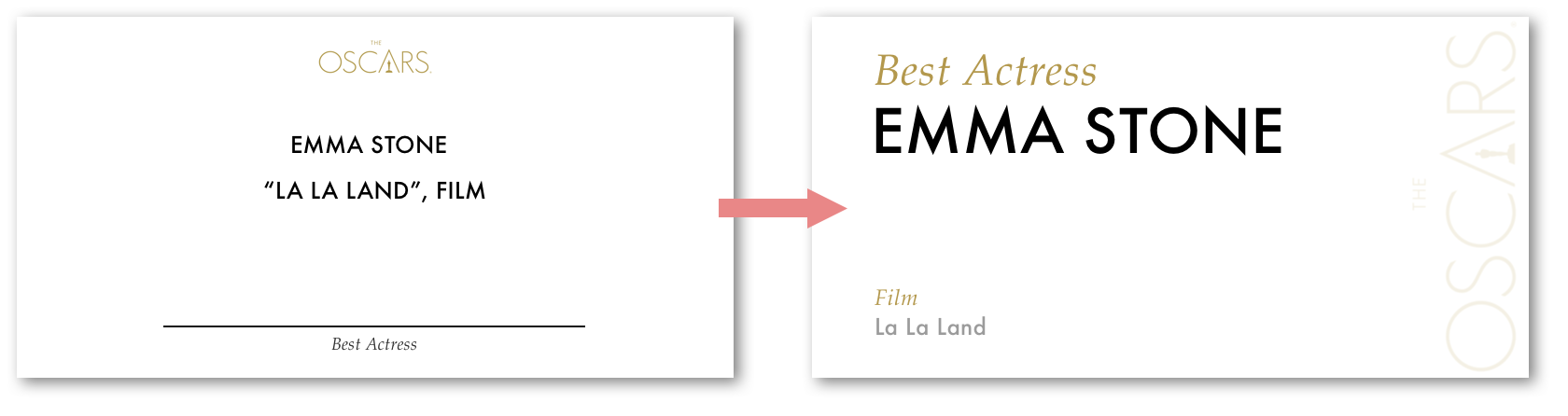
Do you think this redesign would have delivered the message clearly to Warren Beatty that he was holding the wrong card?
Do you think this redesign would have prevented Faye Dunaway from quickly jumping to the conclusion that the winner of the Best Picture award was La La Land?
Tell me in the comments below!
Apparently, while my head was down on this, another designer had already beaten me to the punch. Catch this piece by benjamin bannister — it provides a good alternative design!


