
Putting Figma’s Auto-Layout through its paces
Spoiler: It’s pretty sweet.
A few months ago, the evil geniuses at Figma tweeted this teaser image:
Many of us guessed that this was probably hinting at the ability to rearrange components in a group based on their size. Well, we were right (yay), and Figma calls this feature auto-layout.
Let’s see what it can do!
First, let’s talk about fundamentals. For most people, auto layout is going to allow you to design elements that contain text without having to redesign them when the text changes. The first use most of us will have for this feature are dynamically resizing buttons, as seen in this great tweet:
As the length of the text increases, so does the other elements in the button. Neat. You can see above how much time this saves us.
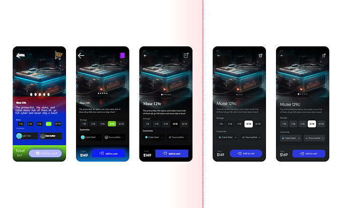
The other awesome new use for this is rearranging elements in a group. To explain this in detail, let me introduce you to a screen I’ve been working on:

This is a pretty basic screen layout. Header, footer, and some content. For this example, we’ll focus on the content. I’ve got an image element, a heading, and some body copy.
The first pain point here is adding copy to the heading, or the body copy. In a pre-auto layout world, adding a second line to the heading would mean rearranging the layout to accommodate a second line.

As you can see, it’s completely ruined my spacing. I’ll need to go in and fix that manually, moving and resizing my components, since that’s the only option.
But, there’s gotta be a better way!
Let’s turn on auto layout and see how flexible we can make this relatively simple layout.

As you can see, I’ve asked auto-layout to arrange the components vertically. Furthermore, I’ve set the spacing between objects to 16 pixels. Let’s go in and do a few things that would have broken to the layout before — resizing the image and adding an extra line to the header.

You can see here that the image is smaller, and the heading is now two lines. However, auto-layout has rearranged these components automatically to retain the 16-pixel spacing.
If you think about the time you just saved, it’s obvious this feature is pretty tremendous.
You can embed auto layouts into your components, too, so you don’t have to replicate this behaviour every time you use this arrangement!
To take it to the next level, though, let’s look at putting some auto layout groups inside an auto layout:

As you can see, when I add additional copy or resize the images, the layout adjusts to match.
I can’t really understate how great this is for your design process — you not basically have a flexible layout that will automatically adjust to new copy, new images, or new content blocks entirely. No work required from you, just drag your elements into the layer list or update your content, and everything is fixed.
For building screens with dynamic content, like blog posts or feeds, this is an enormous time-saver.
I know I probably sound like I’m overstating it, but this feature is a gamechanger for responsive layouts. This article barely scratches the surface of what you can do, so I encourage you to dive into Figma and try it for yourself. If you have any questions, feel free to reach out to me on Twitter, too.


