Psychology of a button

If you are lucky (or old, choice is yours) enough to be born without a smartphone soldered to your palm, chances are you appreciate a well designed push-button (later called just a button).
The old, mechanical button, with very noticeable key travel, and the culmination — surprisingly satisfying click sending the message:
I just did my job, and I did it well!
Don’t get me wrong, I’m far from saying our lives used to be better before a digital era. Those good old days though, together with slow evolutionary changes, shaped the way we perceive the world.
Shaped our demands towards buttons.
Principles of a button
First, what makes a button… a button? We make it ourselves for the most part.
How?
- Our brain converts 2D image captured by eyes into 3D model of a space around us, giving an idea of what can possibly be a clickable object.
- Certain shapes tell us where does a button start and end.
- Lighting circumstances informs about button’s status.
Just to name a few. Let’s take a closer look at human perception, and its applicability to UI design.
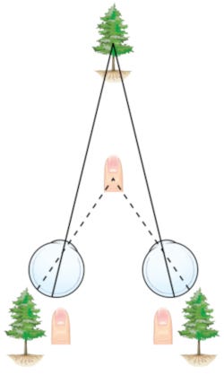
1. Binocular disparity
It is a trick you possibly heard of already thanks to 3D movies, or raising popularity of photos with bokeh effect.

How does it work? Two lenses (in our case eyes) placed side by side provide us with two almost identical images. Almost makes a big difference, because by comparing those two images, our brain can figure out a distance from an object (bigger a difference — closer an object). This phenomenon has been explained years ago by for ex. Bela Julesz in 1971.
How does it apply to button design then?

Back in a day when buttons were mostly physical, people needed a clear indication of what is clickable. Letting buttons stick out of device’s shape was a good way to attract attention, raise curiosity (Loewenstein, 1994), so press can be easily performed.

Push-buttons are one thing, but digital world also uses the same technique to simulate 3D effect on screen.
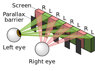
Among the most common examples a solution present in Nintendo 3DS gaming console can be found. Every pixel on a screen has two iterations, one for each eye, which are later smartly filtered by barrier covering unwanted pixels. This way game elements can literally pop-out of the screen asking for attention.
This solution is rather uncommon though. How about depth cues we see every day on our screens?
2. Lighting and shading
Imagine you see two buttons side by side. Same size, shape, colour, but there is something different about them that tells you to press one of them, not the other.
Lenny Lipton in his book Foundations of the Stereoscopic Cinema from 1982 explains how we learned to use light reflections and shadows to perceive shapes. Our smart brains can instinctively distinguish tiny differences between pressed and unpressed keys, ex. longer shadow means longer key travel, and higher chance of successful press.
As mentioned above, it is a skill we acquire over time. According to American Optometrist Association, children require at least 9 months to have a good understanding of field depth (at this age they usually pass a Visual Cliff test), so nuances of small shadows may require even more time to catch, but we can still own it!

Why is it so important?
Because this is why the first smartphones with touch screens were able to guide people from physical buttons to displayed ones.
The original iPhone was full of shadows and light reflexes to guide our fingers around the screen. Just look at the slider on the left. It literally screams:
I’m indent and slippery! Go ahead and slide on me!
This metaphor is still being used in 2018, so go ahead and check how does your phone highlight what requires attention.
3. Gestalt principles
Gestalt theory emphasizes that the whole of anything is greater than its parts. That is, the attributes of the whole are not deducible from analysis of the parts in isolation. [Encyclopedia Britannica]
As a result of this approach, gestalt psychologists formulated set of principles explaining human perception. Let’s discuss an example, shall we?

Name properties of a button on a TV remote:
- Set, easy to recognise shape — rule of figure/ground & regularity
- Stand out from remote’s casing and other buttons if not related — rule of good form
- Be clearly divided from a casing with a visible gap (independent part) — rule of continuity
Those and many more of gestalt principles/rules proved to be accurate, so designers are still following them in their projects with success. I truly recommend visiting Interaction Design Foundation website if you haven’t heard of those principles already.

But back to the point!
Such a simple notepad app you may think, but it fulfils all requirements mentioned above:
- The only one, important button is easy to find at the bottom.
- Shape is classic and stands out on the screen due to suggestive ‘+’ icon, and a shadow (shadows still rockin).
- Subtle, but continuous border of a button highlights it’s independence, hence interactiveness.
Here we reached the last, and personally the most important accent of every, single, button on Earth.
4. Feedback
I bet you were in a hurry at least once in your life. Time is ticking, you are just one crossing away from destination, but you have to wait on for a green light…

Mashing this red, well exposed, and distinctive (design on point) button does not help at all. Actually, you don’t even know if it helps, because a press indicator is broken, but is it?
You actually can’t say, because do don’t get any feedback!
If you hear a click it is not that bad, at least this tactile response makes you feel like you did everything possible to turn this light green, but can you be sure?
Don Norman in his book Design of Everyday Things introduced a concept of:
Affordance — … the perceived and actual properties of the thing, primarily those fundamental properties that determine just how the thing could possibly be used.
If a button at the pedestrian crossing is neither changing lights immediately, nor displaying -
I’m on it bud, gimme a sec!
how can you know if this system even serves it’s function? Such disconnect between perceived function of something, and it’s actual behaviour leads to common, unpleasant, state you would rather avoid — cognitive dissonance.
Nobody likes to be fooled, and apparently all wrong about a function of the pedestrian crossing button, so feedback is essential, period.
In a digital world of immediate response, and lightning speeds, importance of it grows quickly. In 1997 people were willing to wait up to 10 sec. for a web page to load (Nielsen). Would you wait so long for this post to load?
Basic feedback is a must, but you can try to take it to the next level like Apple (sorry for the Apple reference again) with their Taptic Engine. More on this topic in Saoud’s Medium post. Worth a read if you are interested a bit more. For video enthusiasts, short presentation from Apple:
It may be a personal preference, but how this haptic feedback engine works is very satisfying to me. It really gives assurance about performed actions, even though you can still see them on a screen.
Does it still matter?
I referred to many theories, historic examples and real physical objects. Without a doubt, we can, and should learn from lessons from the past. But when it comes to designing for other human beings, one rule mentioned earlier is always above anything else.
First, what makes a button… a button? We make it ourselves for the most part.

Button is just a concept we agreed to, and we are used to.
Shape, size, form, type of feedback doesn’t matter as long, as we know what can be achieved with that key press. Observe a Few-Year-Olds using smartphones. They can’t read, but will download the favourite game from App Store in literally seconds! Simply because they don’t have a well grounded concept of a phone, a button, a drawer, a menu. Touchscreen with a digital content is a default way of interaction for them. They don’t have any previous experience interfering with the new one.
Was this entire post pointless then?
Just take a look at trends, new tech, and make it work. Push our world forward, but when in doubt, remember you can always look back at what worked in the past.
Don’t worry! It can make your design better, without being old-school.
We don’t know how interactions of the future will look like. New solutions are still competing (AR, VR, Voice Commands, Gestures, Brain Waves, etc.) and with them, our world will be different.
However I strongly believe the world of the future can still be accessible to everyone, and cosy like home, if we only decide to make it look familiar. Familiar like a good old push-button.
(At least until we are all cool with ordering milk through mind controlled flying androids. At that point, just forget about buttons.)


