Product Learnings from Daniel Kahneman’s Thinking Fast and Slow
Thinking Fast and Slow is often touted as one of the best books on behavioral psychology. The book offers simple yet ingenious ideas/takeaways that Product, Design and UX teams can use to be more effective. Through this article, I describe applications of these learnings in the Product world.

1. You dispose limited attention budget of attention that you can allocate to activities, and if you try to go beyond your budget, you will fail
Product Learnings:
- The number of notifications hogging up our screen and mental space is increasing by the day
- Product folks should deliberately look to rationalize the notifications sent to its users
2. Priming: Sources of impulses often become your choices and your actions.
Product Learnings:
- Product journeys can be visually primed to focus on the user goals that the PM wants the user to achieve
- In this context, I love the blurry-eyed test which talks about whether the design is able to visually communicate the intended goal if you blur the screen
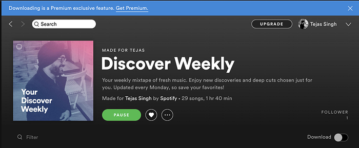
3. Affect Heuristic: People make decisions (or their decisions are likely to be influenced) based on their current emotions
Product Learnings:
- Affect heuristic has deep implications in nudging users to take a particular action based on their immediate interaction with the product/service
- In the example below, as a ‘free’ user of YouTube Music, I was immediately shown this notification upon locking my phone. This nudged me to try the free trial for its premium version — this was a perfect moment as my music immediately stopped upon locking the phone

- Similarly, as soon as I try to download my Spotify playlist (refer bottom right of the image below), I am shown the message that “Downloading is a Premium exclusive feature”
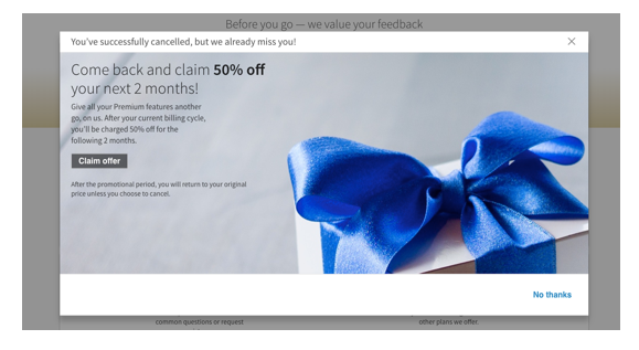
4. Endowment Effect: People attach a higher value to things because they own them
Product Learnings:
- Ownership is a powerful concept in designing product experiences, especially in boosting conversions and retention
- For companies that offer premium membership and free trials — once the users have got a taste of paid membership, there are more likely to attach a higher value to the additional features or personalisation that comes with going premium
- Similarly, the premium users are less likely to cancel their subscription if they can continue to see the value addition and the ‘benefit of the ownership’ that a premium membership provides. Refer the LinkedIn example below, contextual nudges designed by companies to get back a cancelled Premium user can potentially work brilliantly
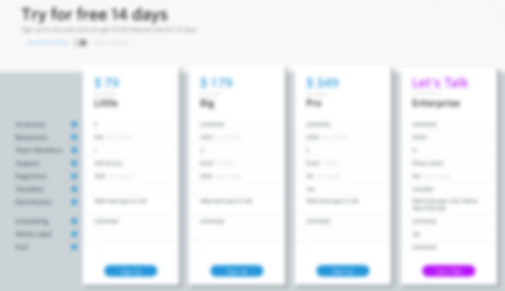
5. Anchoring Effects: Powerful anchoring effects are found in decisions that people make about money.
Product Learnings
- While designing subscription and pricing plans, the displayed options can set the anchor for users to make their decision
- In the example below, 12 months membership option anchor the users to go for the more lucrative 24 months option

6. Less is More: Decision-making is easier with less information because users cannot cope with lots of information and easily gets confused.
Product Learnings
- Too much information distracts us from the most important task
- While building product journeys, we should constantly look to reduce, rationalize and eliminate information or steps that do not add any value or can potentially confuse the user
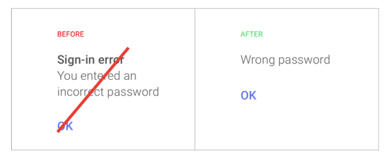
7. Anything that occupies your working memory reduces your ability to think
Product Learnings:
- Product-first mindset requires us to be ruthless about the quality of UX writing in our features.
- UX writing is the art of writing impactful content while building the product journey and experience — this includes the text of call-to-action buttons, content of notifications to longer-form guidance messages.
- Always ask whether the content is specific, relevant, easy-to-read, consistent, and in a simple non-technical language that users can understand?
- Often, UX writing is an iterative process — it should be given the due time it deserves
8. Availability Bias: People’s opinions and views are greatly influenced by information that easily comes to mind
Product Learnings
- While prioritizing product features/improvements, we need to conscious about whether our product decisions are impacted by our personal predilections
- In this context, forming an unbiased hypothesis, looking at the data as the source of truth, and sounding decisions with another team member are always helpful
9. Illusion of Validity: People have greater confidence in research or predictions that confirms to their believes and values
Product Learnings:
- Framing the question in a particular manner, such as, “Do you like/dislike the product” may lead to the respondent thinking only about the positives or negatives
- Instead, feedback should be solicited in a neutral manner, asking the user about how they feel about the product/feature and/or describe their experience with the product
- The example below illustrates how Indigo’s rating system, with default 10s, is inherently biased

10. Framing Effect: People react to different choices based on how they are presented
Product Learnings:
- Simple changes to the presentation of existing elements in the product can have a discernible impact
- In an experiment that we conducted internally on our product, we found that with no change in communication, full-screen view had a drastically better click-through-rate (CTR) than a modal pop-up view
- The pop-up modal seemed intrusive and distracting with other elements in the background; these problems were solved through a simple and distraction-free full-screen communication
Note: The communication was presented in context of the user’s journey and was not advertorial or promotional in nature.

11. Familiarity breeds liking. This is a mere exposure effect.
Product Learnings
- When we think about delivering a consistent design and experience, it can be looked from two perspectives: (a) Consistent within the product (b) Consistent to the users’ expectations of using other products that they have used before.
- The latter, however, is the more important element — building something that the users already understand and know. Familiar associations reduces the cognitive load for the user
- This learning, of course has some exceptions and depends on context. But it is still mostly true. The use of color associations, iconography, typography, interactions, etc. does not usually change across products.

