Product Design: Perception and the psychology of User Experience
Cognitive behavior patterns that influence the user experience and product perception
“Don’t judge a book by it’s cover” as the saying goes, does not apply on-line. Users don’t really care about your back-end, they just want YOUR system to do the job FOR them, maybe even make them money with minimum effort and little or no cost.
There are a lot of great articles on user targeting, so I won’t go into that. This article is about understanding homo sapiens.
Attention Transition: Grab and Move
People are programmed to pay attention to something that is different so grabbing the attention can be done through bright colors, large fonts, sound and micro interactions.
Filed of vision variance must be tested and adjusted to address change blindness, a surprising perceptual phenomenon that occurs when a change in a visual stimulus is introduced and the observer does not notice it so constructing blocks of texts and “breaking” them with quotes, visuals, subtitles will be more stimulating to read than a simple page of text, as you can observe.

The Power Of Choice
People will always want more information than they can process which gives a sense of choice and therefor control. The sentiment of control is consolidated by constant feedback, this means: loading bars, messages, warnings, info, tips… etc
The user doesn’t care that if the file takes 2 or 4 seconds to load, the user needs to know at all times WHAT is going on.
Lateral information: is a term I made up to use the field of vision to teach the user new tricks.
Example:
by showing the requested data graph of recent sales, we place under the graph 2 columns: a table of recent admin logins and a table with with system users and their time spent in the admin panel.
After, we continue with outer data from the requested group: product most sold, top customers, average cart value, abandon rate etc.
We just thought the user that he can monitor the hours his employees spend working in the admin system, without him asking for it.

People make mistakes
“new users always clicks in the wrong place” is a very accurate saying about user behavior in the exploratory process of understanding and achieving that much needed control.
Thinking about all the moving parts that allow the user to interact get and receive data is fascinating and leaves room for a lot of mistakes. Adding a confirmation dialog to every button or an error message informing the user that he “can’t do this because of that” will be frustrating.
The key is to handle errors silently. Constant user feedback must positive or neutral at best so we can sustain the feeling of control and use messages like “Something went wrong. We are fixing it now…” to show that the able machine slave can heal itself if need be, while the proud master watches and waits for the next click.
Mental Models and Unconscious Processing
Dosing the information and interaction in a gradual way, will allow the user to evolve their own way of using the platform, using a set rules defined by the grand master (YOU), but still having the choice as to HOW they are applied, creating their own mental model on WHAT the platform does for them.
Google Analytics
that complex mess of tables and information that we all know and love that gives us a fabulous (and creepy) amount of data to model and interact with is a analytics tool (duh) but for a human standpoint is what they perceive it to be:
1. a tool that feeds the ego
2. a confirmation of social status
3. a tool
4. a sad table that helps confirm victim status “people are stupid. f*ck ‘em”
A latent state of perception combined the seemingly endless lines of code that work in perfect tandem to serve characters at the speed of light to humans who give it meaning through unconscious processing and association with precedence that influenced and shaped the very perception used to interpret and use these magic machines.
Limitations
Human limitations vary by knowledge, age, interest, mental ability but also stress, fatigue, state of mind and with that the time allocated to understanding and learning is affected in positive or negative ways.
Too much text and nobody will read, to less text and nobody will care, multi-tasking is a definite no, that should be a user choice not a system one.
Headers define the idea text blocks are the content allowing the user to quickly decide to pursue or not, titles and subtitles offer a brief resume of all that will follow and must be intriguing enough to get them to read.

Structure your content so that the user has enough information to make his/her own decision about how the system should be used, while providing sufficient options and feedback to educate as to where is better to act.
Color Psychology In Marketing
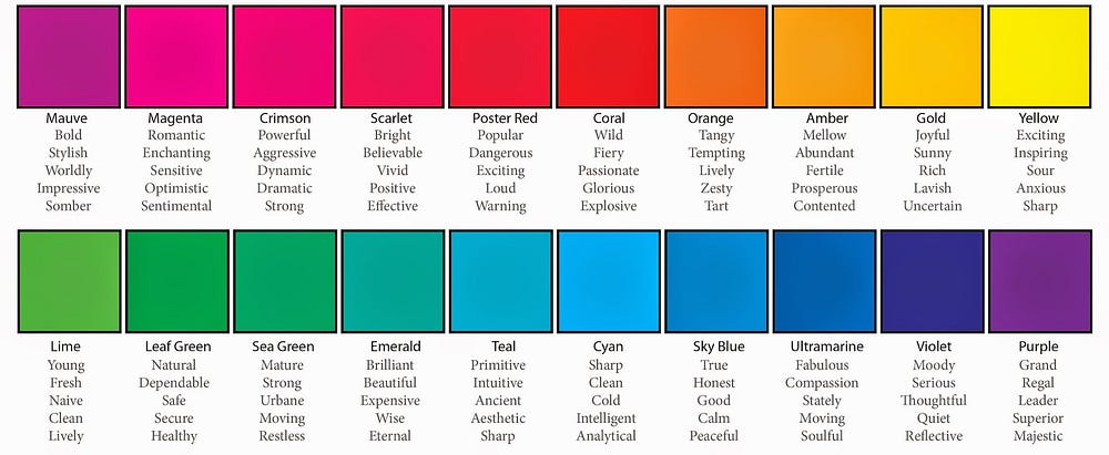
You’d be wise to consider the psychology of color when designing your marketing materials. Be it business card, brochure, web site, posters or other material, you’ll be making color choices. Colors not only enhance the appearance of the item — they also influence our behavior. You will do well to consider the impact that the colors you use will have on your target audience.
For instance, have you noticed that most fast food restaurants are decorated with vivid reds and oranges? It’s no accident that these colors show up so frequently. Studies have shown that reds and oranges encourage diners to eat quickly and leave — and that’s exactly what fast food outlets want you to do.
It’s also no accident that you see a lot of reds and blacks on adult web sites. These colors are thought to have sexual connotations.

Hope you enjoyed and don’t forget:
Tailor for target and human
Check out my latest blog posts and lets connect via Twitter, Linkedin

