Pattern Libraries
Pattern Library: https://natashahockey.github.io/pattern-library/
Introduction
Pattern libraries and their importance have gained a lot of attention in the tech space recently. Designers and developers are now understanding the benefits of having tried and tested components ready to go for projects. It means that it takes less time to build new features and pages. Whilst the initial period of designing and developing a pattern library may take a while, the benefits that follow will save time and improve the code base.
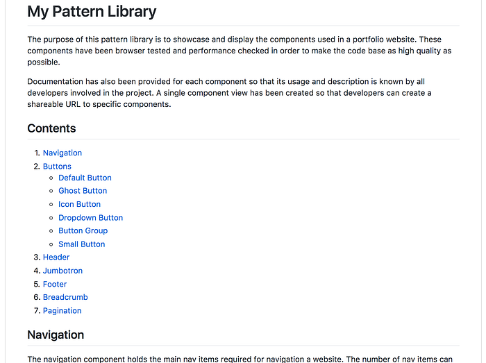
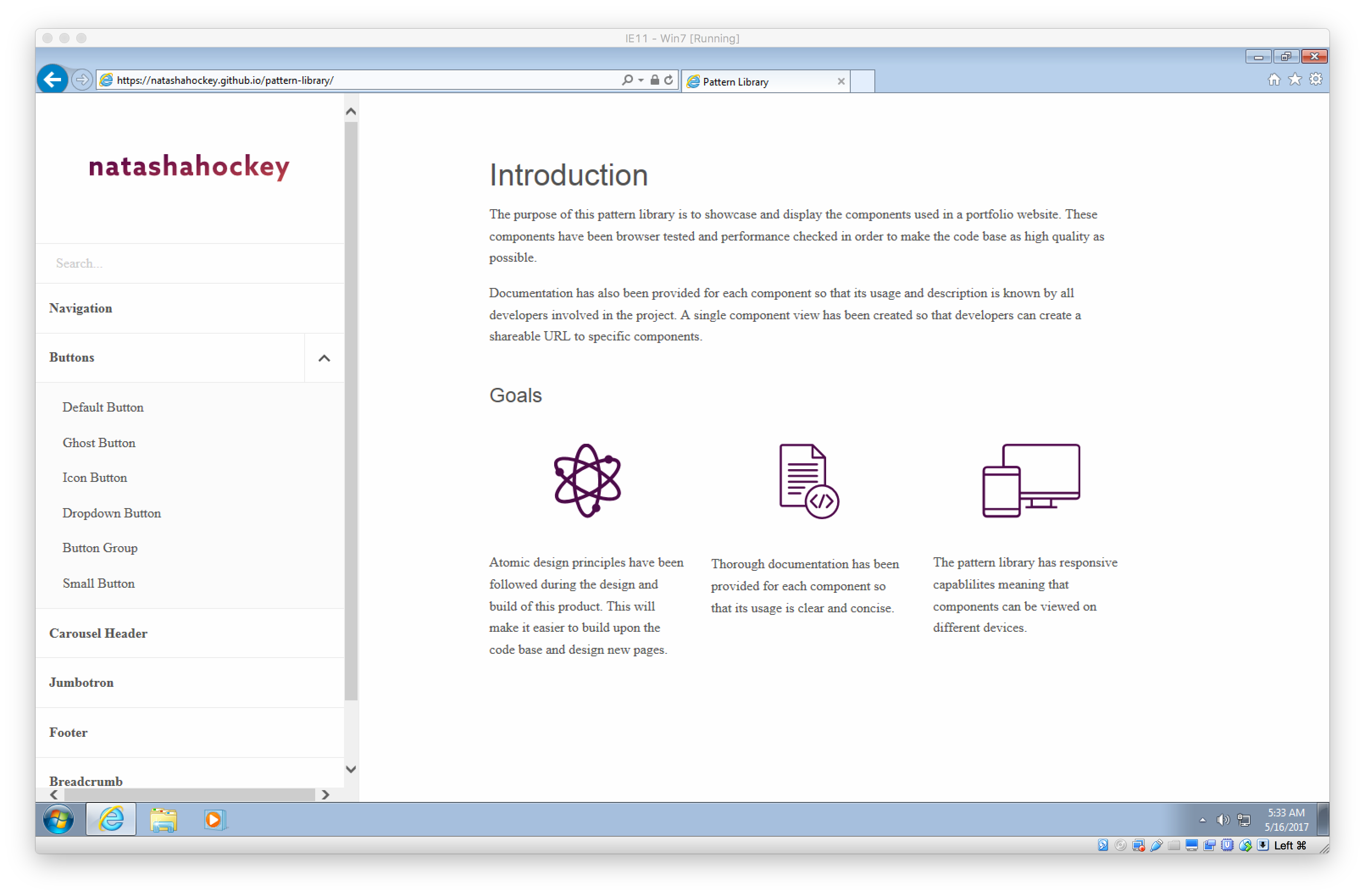
The purpose of this brief is to design and implement a pattern library that has a collection of 6 components. Modern industry standards should be followed in order to ensure a high end product is delivered at the end with appropriate documentation.
Research and Analysis
What is a pattern library and why is it so important?
The main purpose of a pattern library is to help create consistent websites that are easy to maintain. Paul Boag is passionate about this and he understands the struggle faced by companies. He stresses that the solution to these problems is designing and building a pattern library.
One of the biggest questions that’s asked a lot is what’s the difference between a style guide and a pattern library, aren’t they the same thing? The simple answer is no as they serve different purposes. A style guide typically documents brand guidelines, which can include logo usage, colour palettes and typography. Style guides are a stand-alone document that don’t rely on accompanying data. Whereas pattern libraries are made up of UI elements, this could be anything from buttons, to menus and grids. This often conforms to Brad Frost’s Atomic Design principles.
Brad Frost talks a lot about how when designing websites and apps for clients it’s easy and typical to fall into the mind-set of delivering what the client is asking for (the website or app). This leaves the pattern library as an after-thought and simply just some helpful documentation. Working with this mind-set shows that the pattern library is an individual piece of work and not a reflection of the current build.
“Once the pattern library ceases to reflect the current state of the products it serves, it becomes obsolete” — Brad Frost
Best practice would show that the pattern library becomes a solid part of the design and development process. Building websites at a component level makes the build come together quicker and on a more solid and tested foundation.


In order for components within pattern libraries to serve an important purpose it’s essential for each component to be accompanied with a title and description. This will help to understand what the component is and what it does.
Existing Pattern Libraries
There are many different styles of pattern libraries that exist and a large portion of them can be found on styleguides.io. This is a website that has hundreds of contributors who showcase a large variety of pattern libraries. Anna Debenham is one of the leading contributors and is really passionate about this field of design. I did reach out to Anna on Twitter to ask her some questions about her thoughts on pattern libraries, but unfortunately I didn’t get a response. She has written many blog posts and a book on this which has been a great help for this project.
I’ve looked into three of the most interesting pattern libraries that I’ve found and these can be found below.
Polaris — Shopify

Polaris is Shopify’s latest creation. It’s a design system that has been created to help build engaging experiences across all Shopify platforms. Polaris launched a couple months ago and it has set the bar high in the world of pattern libraries. There is an interesting thread on Designer News where industry professionals are stating how inspiring Polaris is for companies trying to achieve a similar library of components.
Polaris has documentation for everything that could be needed when designing new / maintaining existing interfaces for Shopify. It’s the one stop shop to finding out how to create content, visuals and components.
The core navigation for Polaris is done through a sidebar. This is a common trend that I have found when researching pattern libraries. It allows users to quickly click through different components whilst being in the same interface. Including a sidebar also allows for hierarchy to be added easily and this can be seen in the screenshots below.


Lostmy.name

Lost My Name is a shop that illustrates, creates and sells personalised books for children. It started in 2012 after existing as a side project, and after winning Dragon’s Den the shop expanded drastically. Lost My Name created a design system that followed an Atomic design structure. Unlike most pattern libraries that exist Lost My Name provides controls for users to adapt components. This could be anything from toggling content on and off to choosing a specific viewport. has been achieved through having an additional sidebar.
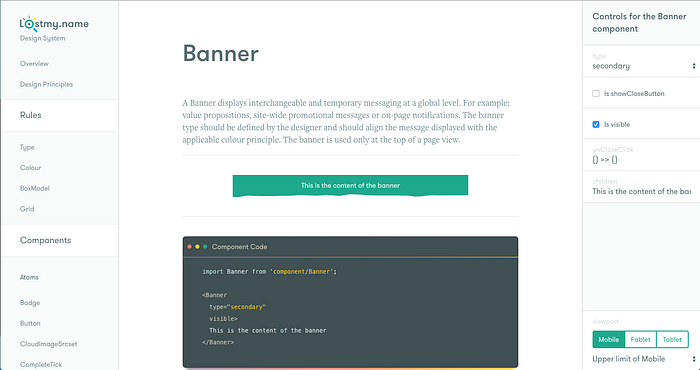
The Lost My Name design system has created its components following the Atomic design principle. Within the sidebar components are broken down into atoms and molecules. This shows how components are build from scratch to a finished product.


This design system does not have any responsive capabilities, which only proves that it is not necessary for pattern libraries to be accessible on all devices.
Salesforce — Lightning Design System

Salesforce have created an intuitive design system that holds the important documentation for creating coherent experiences across all Salesforce products. The design of the Lightning Design System follows a similar structure to the other pattern libraries that have been analysed. The navigation for the system appears in a sidebar where components and guidelines are listed.
When viewing a single component such as alert a button that creates a shareable URL exists. This means that a single component can be sent to other team members / clients easily. Creating this functionality within the design of my pattern library would be really beneficial.


There are a huge variety of pattern libraries and design systems that exist and they all showcase a different take on documenting design projects. A common trend that has occurred is the use of sidebar navigation. This creates a navigation system that is scalable. When designing a pattern library it is important to consider how every project that relies on this system is going to be different. This system should work for small and large projects successfully.
Responsive Pattern Libraries
After having a good chat with Alex Pate about pattern libraries I broached the topic of should pattern libraries be responsive. Its an interesting debate as to whether users should be able to access components on mobile devices. For me, I don’t see why you shouldn’t. If you are building a responsive website then surely being able to see components behave responsively is really important. Alex agreed and went on to say that if the patterns being built are responsive then the pattern library should be too. Interestingly enough Lystable, the platform Alex is working for isn’t responsive so currently their pattern library only works for desktop devices.
For the design of my pattern library, I have decided to only implement it to work on desktop. This is a MVP (minimum viable product). In my opinion it is better to have a well designed desktop interface that can then be scaled down than to tackle everything in one hit. It is going to be challenging to get the navigation of a pattern library to be scalable and effective on mobile devices.
Methods
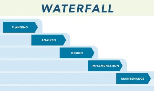
Due to the time constraints and other commitments for this project a waterfall methodology has been followed. In ideal circumstances an Agile methodology would be adhered to, as this would allow for iterative sprints for the design and development phase. However, time constraints have meant that the Waterfall approach is best suited for this project.
Waterfall methodology essentially means that each phase of a project needs to be completed before moving onto the next phase. The only disadvantage being that if there are design changes that want implementing after the development this is not technically possible due to the constraints of Waterfall. The image below shows the principle of Waterfall methodology and how it works.
A total of 64 hours needed to be spent on this project, which seems like a good amount of time to research, design, build and test the production of a pattern library. A Gantt chart has been created to show how the project life-cycle has evolved and this can be seen below.

The Gantt chart above has been followed for the most part. However, this assignment got a week extension due to final projects being due. This meant that the project was finished later than expected but all the tasks were still carried out in the same order.
Specification
A pattern library consisting of a minimum of 6 components needs to be designed and implemented. The specification list below shows what’s required to fulfil this brief.
1. Design a pattern library that works for users on desktop devices. Whilst also creating a clickable prototype for mobile users to show how this pattern library could scale down.
2. A minimum of 6 components need to designed and implemented. This will include a navigation bar, header element, 6 button types, jumbotron, footer and a component of my choice.
3. Appropriate documentation needs to exist alongside each component inside the pattern library. This will include each components usage and a brief description.
4. Ensure that the HTML has been used correctly and conforms to WS3 standards. Comments also needs to be added throughout the code files to show a solid understanding.
5. Browser testing and performance checks need to be carried out to ensure that the pattern library is working to a high standard.
Test Plan
Once the design and development of the pattern library has been completed it is going to be very important to follow a test plan. This test plan will involve browser testing the pattern library, validating the code files and gaining feedback. All of these findings will exist in a criteria for success for this project and this will be analysed at the end of this project.
Browser Testing
Browser testing will be needed to ensure that the pattern library behaves as expected for all users. The following browsers will be tested:
- Google Chrome
- Safari
- Firefox
- Internet Explorer
- Edge
Validation
Once all the development work has finished it will be important to run the code files through a validator. This will help to ensure that all the HTML files conform to the latest web standards.
Feedback
Gaining feedback on the final pattern library will help to understand where the project succeeded and failed. This feedback will be collected through a survey asking a few questions about the design of the interface and its functionality.
Planning, Designing, Experimentation & Implementation
Planning
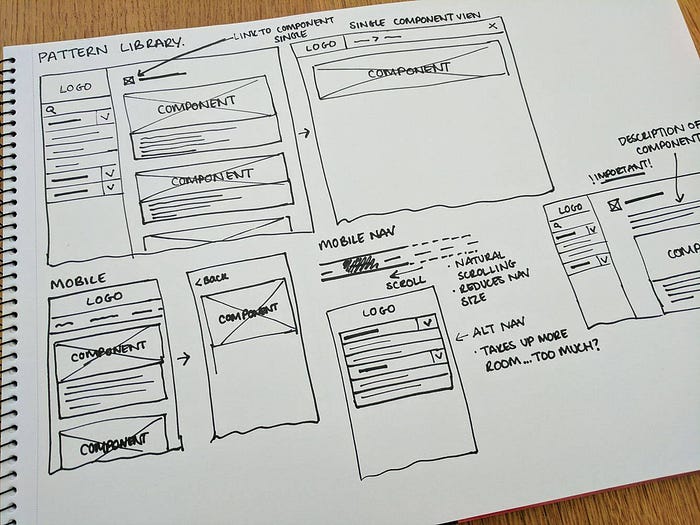
An important part of the design process is being able to experiment with design layouts before committing to a final design. More often than not designers get attached to their first idea and sometimes it isn’t always the best. Exploring options through low fidelity wireframes is the quickest and most effective way of doing this. Below you can see a photo of the wireframes I created for the pattern library. A mixture of desktop and mobile designs have been planned and these will now be further developed at a medium fidelity.
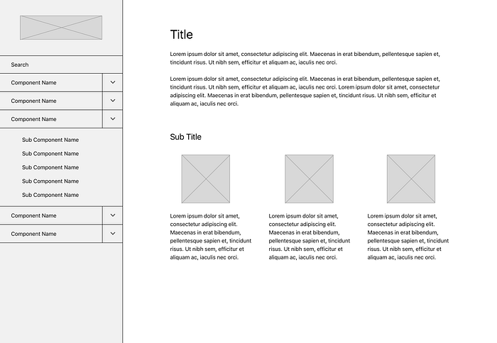
It’s important to test designs at a medium fidelity as it helps to put sketches into perspective. Doing this also helps to iron out any major design issues earlier on in the design process. This is a quick way of testing out site maps and is especially effective for large scale design projects. The medium fidelity wireframes can be found below.
Design
Sketch by Bohemian Coding has been used to create high fidelity designs of the pattern library based on the previous planning work achieved. Having all of this work already planned made the design process a lot quicker and smoother.
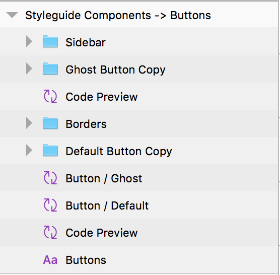
Nested symbols have been used to create the components for the pattern library. Using nested symbols helped me to ensure that when the components were being designed, the development phase was being considered. Brad Frost’s Atomic Design principle was relied on and adhered to during the design and development process. Recently Tim Van Damme published an article talking about how to use a component based workflow in Sketch. This really influenced my use of symbols and naming conventions within the Sketch file. The naming conventions of layers have been done with the development phase in mind and using the atomic design principle. An example of this would be “button / default” and “button / ghost”.
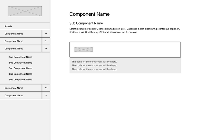
A lot of time went into designing the side bar of the pattern library as this is the core navigation. It was really important to consider the information architecture and hierarchy of the navigation items. Creating a sidebar that works at a high and in-depth level was crucial in the pattern library having a good user experience.
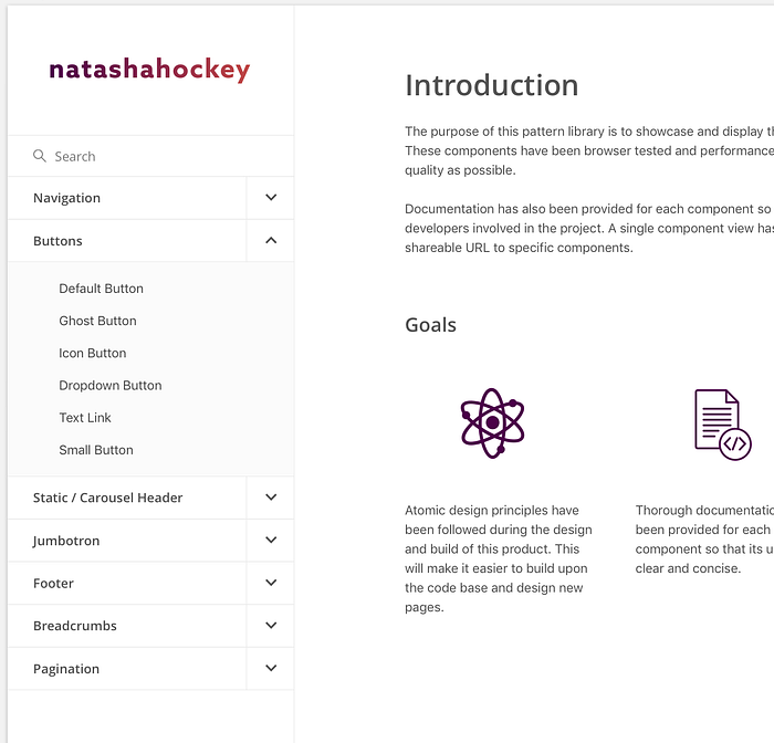
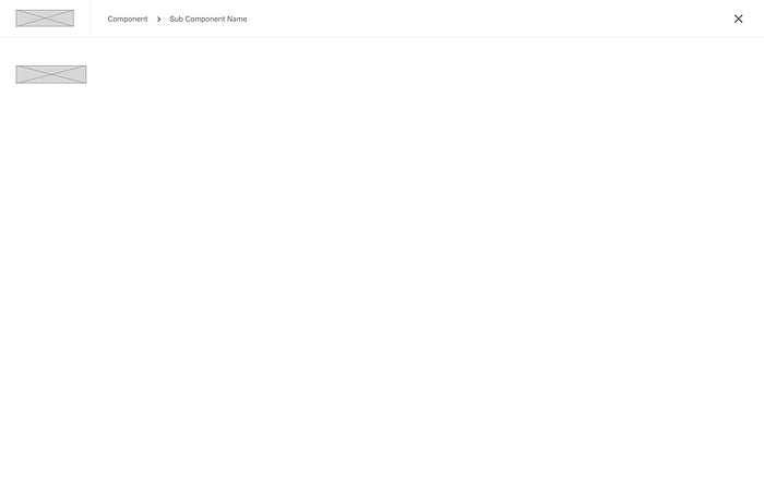
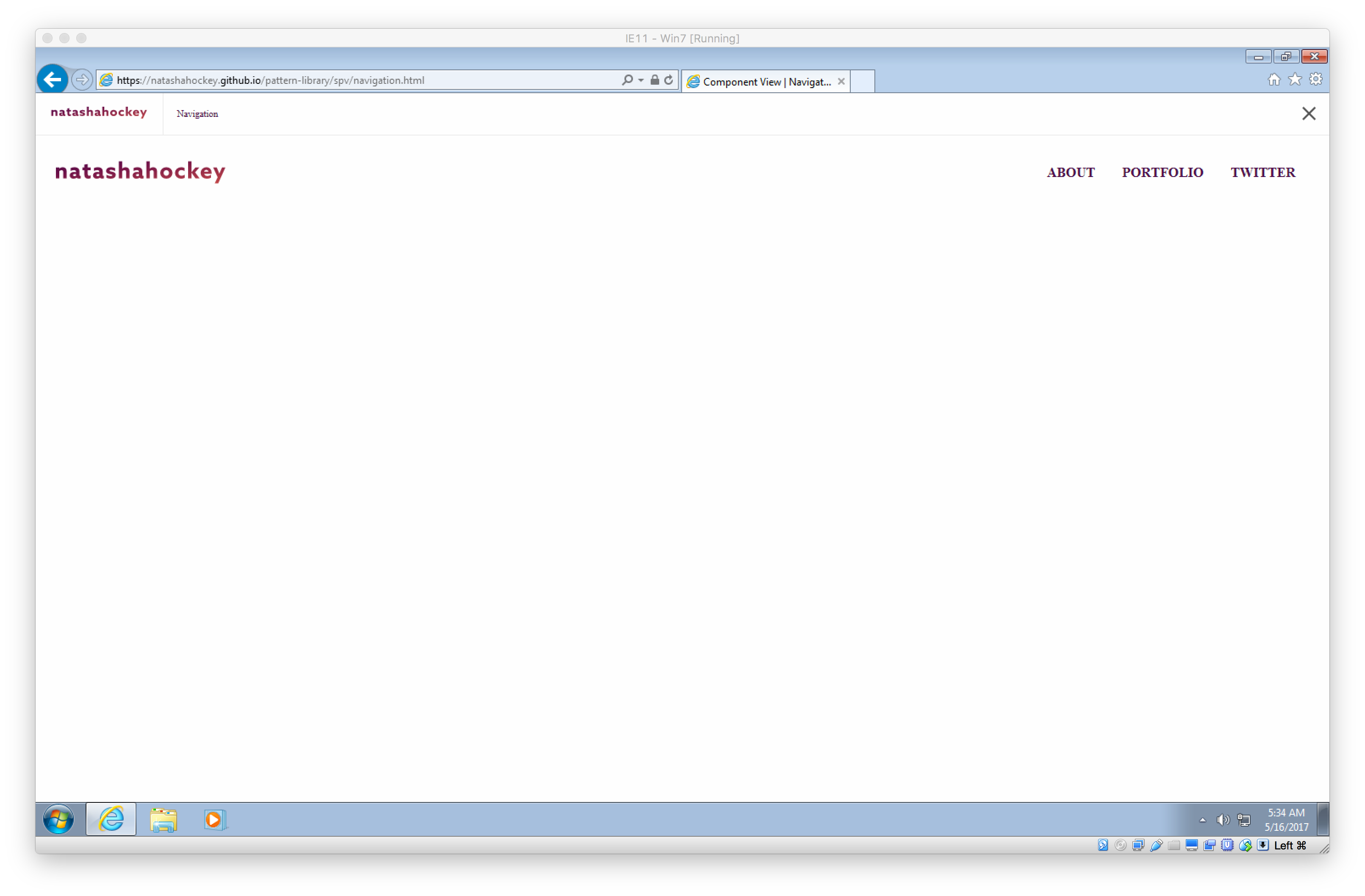
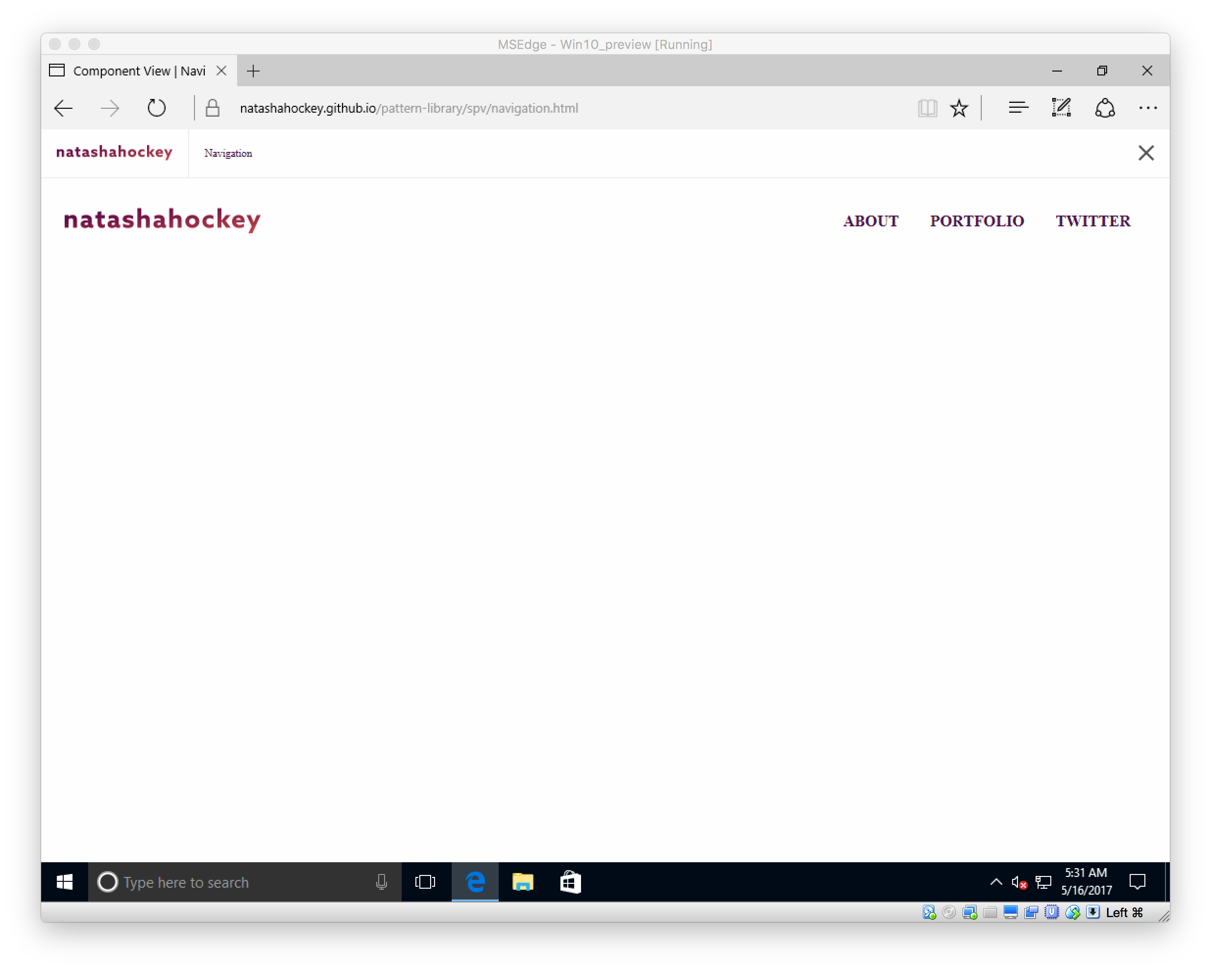
Although it wasn’t a requirement of the brief, after looking into examples of pattern libraries that already exist in the industry I decide to create a single component view. This means that users can click on the link icon and be taken to a single page view of the component. The main reason for doing this was being able to have a shareable URL to a component specific page. Being able to share an individual component with team members and client is a highly valuable feature that the pattern library will benefit from.
It was important to make sure that users were still aware of where they were, even in a single component view. This is why I decided to include a breadcrumb style navigation, allowing users to know what component and sub component view they are viewing. The ability to jump straight back to the landing page of the pattern library is also achievable. See the design for the single component view below.

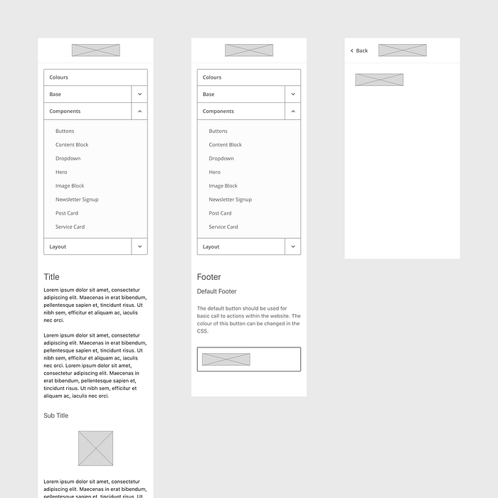
I felt strongly about wanting to make the pattern library accessible to users on mobile devices. Although the highest priority was definitely having the components accessible on desktop, it felt beneficial to have responsive components as well. I’ve created high fidelity designs and made a clickable prototype using Marvel. This shows how users would navigate and view components on mobile devices.
One of the issues faced when designing the pattern library for mobile devices was making sure that the navigation was effective. The initial thought was to create a navigation in a styled list form. However, when viewing this on a device the navigation took up most of the screen, meaning that the components were appearing below the fold. To solve this issue I have created a scrolling navigation bar. This means that users can scroll naturally between different components. Doing this has meant that the components can now be seen above the fold and in a user’s view port. Below you can see a comparison between the two different types of navigation.
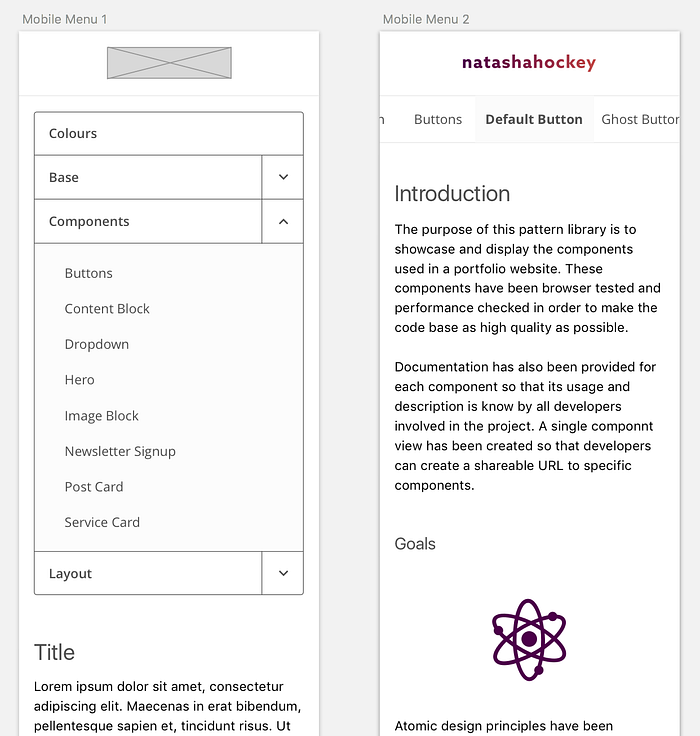
The decision was made to remove the code snippet on the mobile version of the pattern library. This is because there isn’t really the need to be able to see how the component was made. The mobile site should just provide a visual guide as to how the components should be. Having the HTML and SCSS available would make the scrolling of these pages incredibly long and invaluable in this instance.
Component Designs
The design for all of the components that have been created for this pattern library can be found below. I have created an additional two components to go in the pattern library to bulk it out so that it feels more realistic.
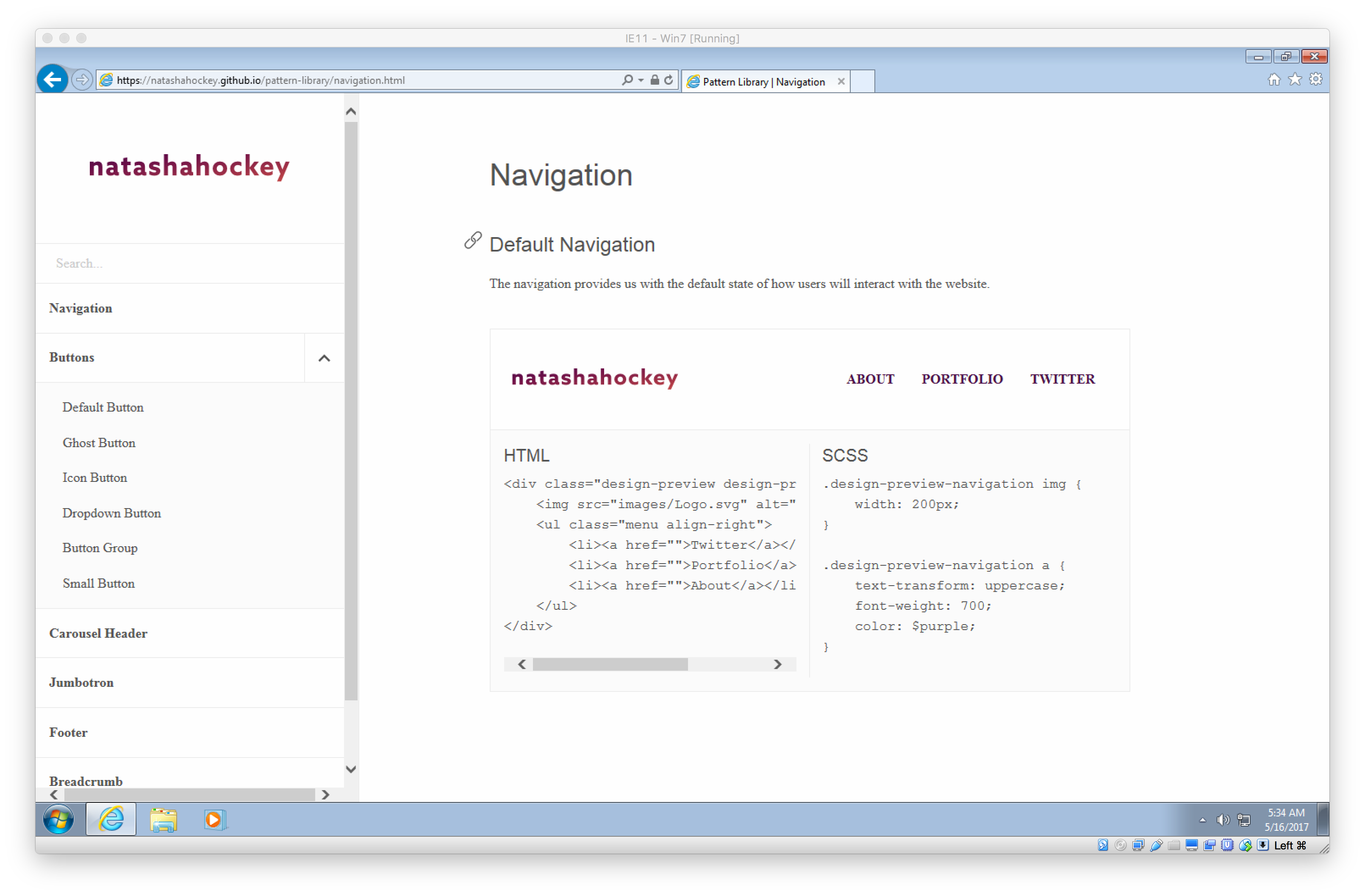
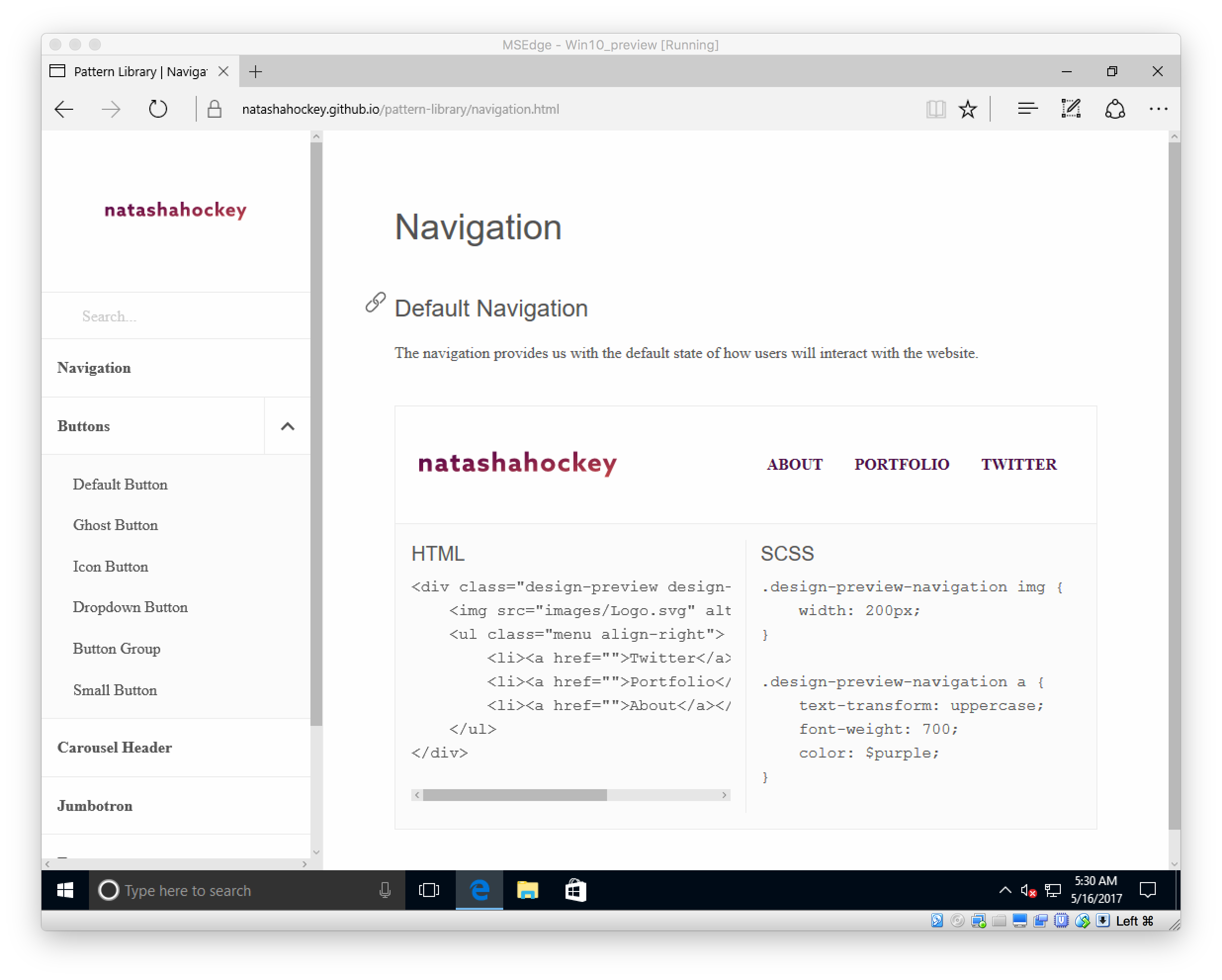
Navigation

Buttons

Header

Jumbotron
Footer

Breadcrumb

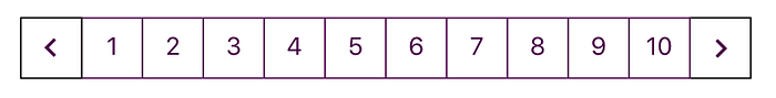
Pagination
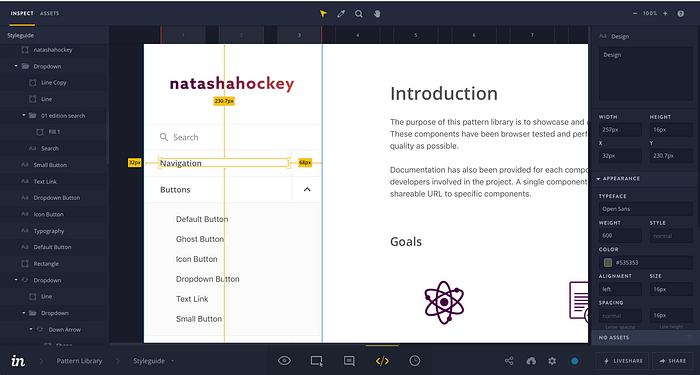
Now that the design phase was complete it was time to use the Craft plugin for Sketch to sync all of these designs into InVision. This meant that I could used the Inspect feature to find out all the information needed to implement the pattern library. The image below shows what the Inspect interface looks like and what useful information it provides.
Implementation
The implementation of the pattern library started with planning out how these pages would appear as HTML skeletons. This was done through planning out the basic structure of pages.
After getting to grips with Sassfor the first assignment in this unit, I wanted to use it again to build the pattern library. It is a lot easier than creating repeated CSS.
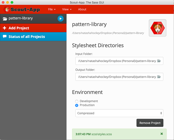
To avoid having to interact with the command line I used Scout App to handle the SCSS to CSS. When creating a new project within this app all you have to do is specify the input and output folders and make sure that production environment is selected. When working on Sass files and wanting to push changes up to GitHub using the GitHub Desktop app I had to make sure to press the play button on the Scout App to run these changes.
To make the development of this pattern library easier I wanted to use Foundation mainly for the grid. This meant that I didn’t need to make my own grid system to get the layout of pages the same as the design. To install Foundation I had to download all the files and take the CSS and JS provided and add them as a Sass partial to my styles.scss. Foundation was put as the top partial so that it was loaded in first by the browser.
@import ‘_foundation’;
@import ‘_variables’;
@import ‘_margin’;
@import ‘_type’;
@import ‘_layout’;
@import ‘_sidebar’;
@import ‘_link’;
@import ‘_design-preview’;
@import ‘_buttons’;
@import ‘_breadcrumb’;
@import ‘_pagination’;
@import ‘_jumbotron’;
@import ‘_footer’;
@import ‘_single-view’;
The documentation for Foundation was then followed to ensure that the class names added to the HTML files were right. One of the first things I wanted to get right was the layout of my designs. This meant sorting out how the sidebar and main content section would fit into the grid. I had an aside tag within my HTML that housed all of the elements needed within the sidebar. The main tag then had everything needed within the main interface. The code below shows how the class name ‘large-3 and columns’ have been added to the sidebar and ‘large-9 columns’ have been used on the main. The main has been offset by 3 columns as Foundation has a 12 column grid.
<aside class=”large-3 columns main-sidebar”>
   <ul>
       <li>Sidebar item</li>
       <li>Sidebar item</li>
       <li>Sidebar item</li>
   </ul><main class="offset-3 large-9 columns main-wrapper">
   <div>
       <h1>Title</h1>
       <h2>Sub Title</h1>
       <p>Paragraph text</p>
   </div>
</main>
Within the sidebar I wanted there to be some animation when opening and closing the button sidebar. This would reveal the six button types that exist within the pattern library. To do this jQuery’s slideToggle function was used inside a JavaScript file called main.js.
$(‘.down-arrow’).on(‘click’, function(){

event.preventDefault();

$(this).toggleClass(‘open’);

if ($(this).hasClass(‘open’) ){

   $(this).attr(‘src’,’images/Up-arrow.svg’);

} else {

   $(this).attr(‘src’,’images/Down-arrow.svg’);

}

$(‘.sub-menu’).slideToggle();
});
The Gif below shows the result of this jQuery slideToggle function.

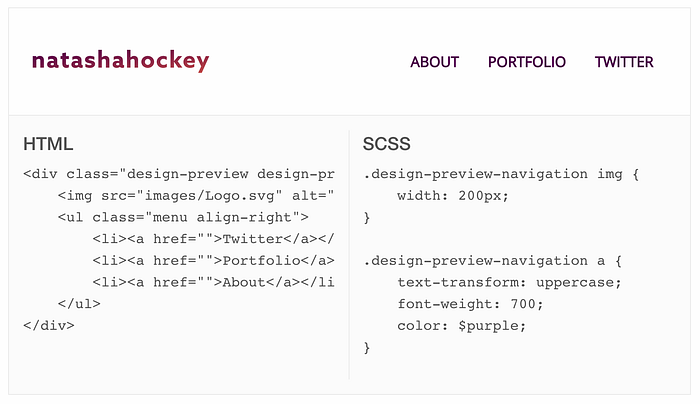
One of the most challenging elements of the website was creating the code previews (HTML and SCSS). I had never done this before so learning how to do this took some time. Getting the code in these previews to appear as real code meant that I had to use character escapes within my HTML files. To do this I used a free online tool called Free Formatter where I copied and pasted my HTML and then escaped it. Below you can see how this looks before and after the characters have been escaped.
<div class=”design-preview design-preview-navigation”>
<img src=”images/Logo.svg” alt=”logo”/>
<ul class=”menu align-right”>
<li><a href=””>Twitter</a></li>
<li><a href=””>Portfolio</a></li>
<li><a href=””>About</a></li>
</ul>
</div><div class="design-preview design-preview-navigation">
<img src="images/Logo.svg" alt="logo"/>
<ul class="menu align-right">
<li><a href="">Twitter</a></li>
<li><a href="">Portfolio</a></li>
<li><a href="">About</a></li>
</ul>
</div>
The design output for the code preview section can be seen below.
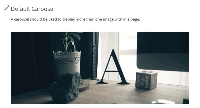
A header either static or carousel was one of the components that needed designing and implementing for the pattern library. I decided that I wanted to create a carousel header and this has been done by using Slick. Slick is a jQuery plugin that creates a responsive carousel and it’s made by Ken Wheeler. The Slick CSS and JS files were downloaded and added into my CSS and JS files for the pattern library. This was then used to create a carousel consisting of three images that would automatically transition on an infinite loop. The HTML required for this was straight forward and just relied on having the three images and the right class name ‘slick-slider’.
<div class=”design-preview design-preview-carousel slick-slider”>
   <div>
      <img src=”images/carousel-1.png” alt=”desk1"/>
   </div>
   <div>
      <img src=”images/carousel-2.png” alt=”desk2"/>
   </div>
   <div>
      <img src=”images/carousel-3.png” alt=”desk3"/>
   </div>
   </div>if ( $('.slick-slider').length ) {
    $('.slick-slider').slick({
        infinite: true,
        dots: true,
        autoplay: true,
        autoplaySpeed: 2000,
});
A Gif has been included below to show how this carousel works.
Overall the development phase of the pattern library went really well. Once having the basic structure nailed down, such as the sidebar, the rest of the interface came together really quickly. Using Foundation has made sure that the grid structure works well and as expected. This pattern library has only been coded to work on desktop and laptop devices. However, at this stage there is no real need for this to be accessible on tablet and mobile devices.
All of the code files and assets have been pushed up to a GitHub repository and the final pattern library can be found on GitHub pages by clicking the following link:
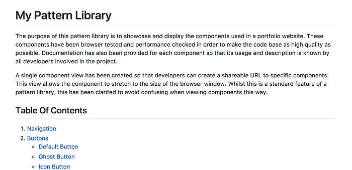
When setting up the GitHub repository a README file was created so that people wanting to view the pattern library had a basic understanding of its contents. A screenshot of this can be found below.
Overall the development phase of the pattern library went smoothly and there were no major troubles.
Browser Testing
After finishing the development of the pattern library it was important to make sure that it was accessible to all users on the main evergreen browsers. Below screenshots can be found of the pattern library working as expected in Google Chrome, Safari, Firefox, Internet Explorer and Edge.


The only issue that did arise was the font Open Sans not rendering. This was because it only worked on my machine as that’s where it was installed. To fix this I had to add a snippet of code in the head of all the html pages which loads in the font from Google Fonts.
<link href=”https://fonts.googleapis.com/css?family=Open+Sans" rel=”stylesheet”>And then I had to add some css to my type.scss file to ensure that the Open Sans font was over-riding any of the foundation font families but not effecting the code snippets.
h1, h2, h3, p, li, span, a {
    font-family: "Open Sans";
}
After this had been done and committed to the GitHub repository this issue was fixed immediately.
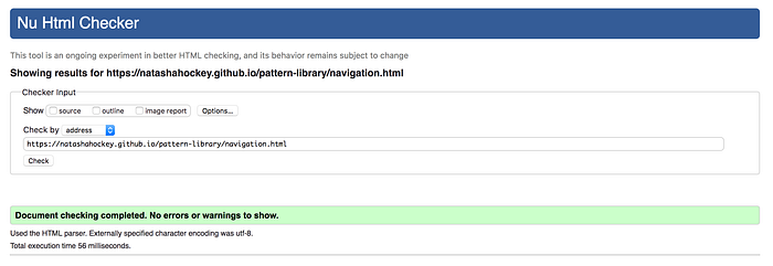
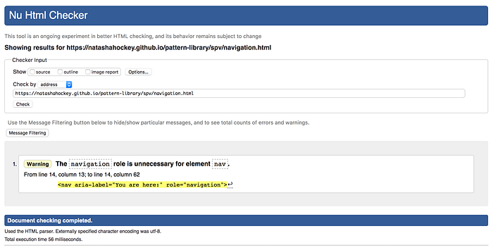
Validation
I have used the w3 HTML validator to ensure that all my HTML files are valid and meet the standards set. The screenshots below show that the pages meet these standards. One of the pages had a warning, which means it still passes and meets the standards.

Feedback
As always when creating a website / app it is really important to get feedback. A form has been created using Google Forms to ask users 3 questions about their thoughts / experience when interacting with the pattern library. These questions were:
- What do you think of the design of the interface?
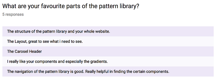
- What are your favourite parts of the pattern library?
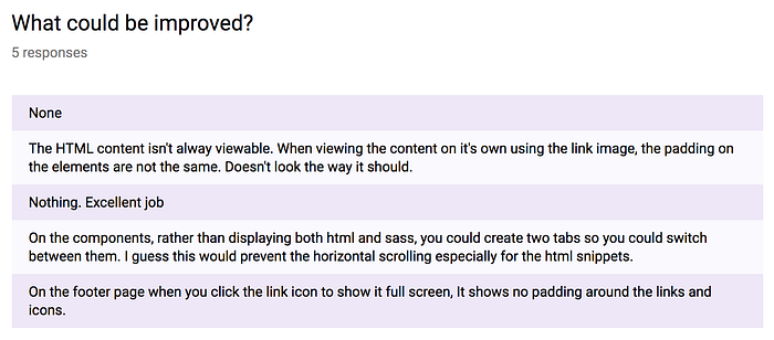
- What could be improved?
These 3 questions helped to gain an insight into what works well in the pattern library and what can be improved. The results can be seen below.
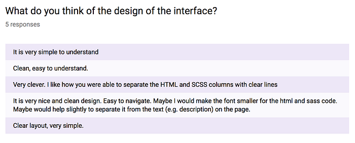
The feedback from users showed that they thought the design of the interface was clean, tidy and easy to navigate. This was really good to hear. Having a pattern library that’s easy to navigate is crucial. When using this library for large scale projects there will inevitably be more components. So ensuring that users can easily find these is important.
There were a few comments that users mentioned to improve the pattern library. The way components look in the single component view was mentioned a couple of times. When viewing a component in the single page view the component stretches to the size of the browser window. However, this is a standard feature of pattern libraries and whilst this might look alarming, those who understand the purpose of a pattern library will understand this. To make users more aware of this, I decided to update the README file on GitHub to explain the single component view in more detail. This has been shown below.
Overall I am really happy with the feedback about the pattern library.
Conclusion
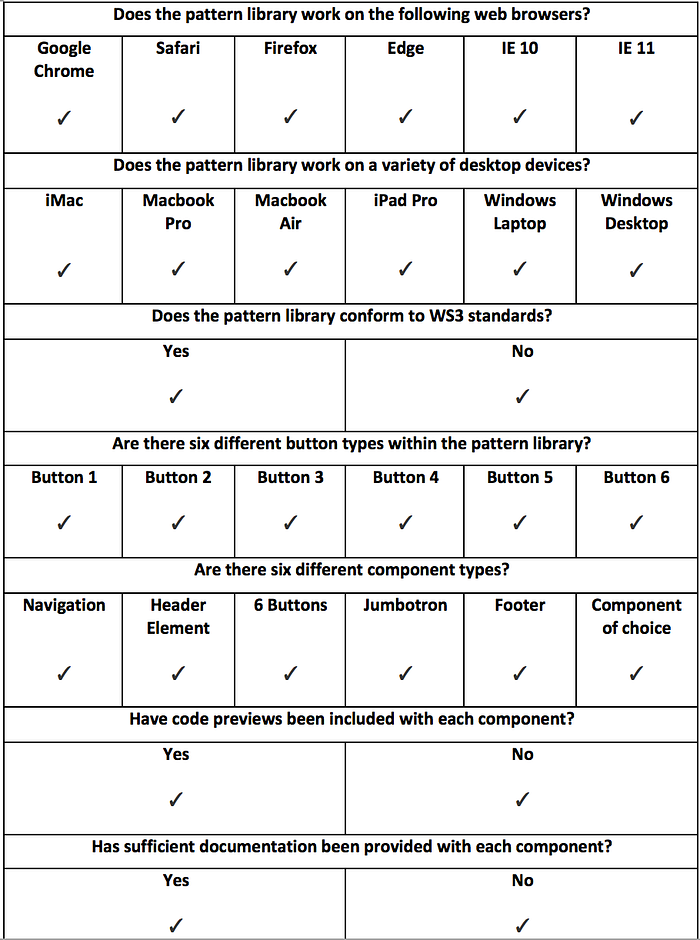
The aim of this project was to research, design, implement and test a pattern library following a Waterfall methodology. This has been achieved and in order to measure the success of this project a criteria for success was created. This involved making sure that the right components were designed, browser testing occurred and meeting WS3 standards. The completed criteria for success can be seen below and it shows that all of the criteria was met. This means that the project has been successful.
A pattern library is typically for the use of developers working on web projects. So from a designers perspective creating this helped to further my understanding of the development process. Creating these components for the pattern library relied on understanding how websites can be built component by component. It also helped to understand the basic components that need to exist for every website project. This is usually referred to as the kitchen sink. Creating this pattern library has definitely helped to better understand and bear in mind the development side of a project when designing interfaces.
Overall, I am really happy with the process that was taken to achieve this final product. Everything went well and the project was completed on time. Industry standard software and workflows have been adhered to in the creation of this pattern library. If there was more time on the project then it would have been good to make this pattern library responsive. However, it was decided that focusing on having polished desktop version was more important.

