Parallax Interactions in Principle
Creating that sweet, but healthy, eye-candy

“That looks awesome!”, a lot of us say when we see parallax scrolling on a website or app. It’s something that has really taken off the last few years. Some memorable ones for me were the uber popular Nike site, Greenpeace’s Into the Arctic, and Justin Timberlake’s product experience page for The 20/20 Experience album. (I’ll include some of my current favorites at the end.)
So. Besides all the Ooo’s 😮 and Ahhh’s 😃, there are other reasons to use parallax scrolling. Not to get too far into them, here’s a brief list of some reasons:
- Presentation
- User engagement and interaction
- Guiding the user
- Providing some FUN! 🎉
My opportunity & concept⌚️
Providing some context…
As some of you might (or might not) know, I’m quite the EV (electric vehicle) advocate. I currently drive a BMW i3 (moving to the 30 kWh Leaf next), and it has been an awesome learning experience and first step into the early adoption phase of the EV community and industry. From a designer’s perspective, there’s so much opportunity in this space with all the apps, smart features, etc. that these vehicles offer.
As my love began to grow for Material Design and Android again, I noticed that BMW never released an Android Wear version of the BMW iRemote app. When I first got the car, I was on iOS. The Apple Watch version was available, but it wasn’t great in terms of design and execution. It worked at least, though.

I recently switched to Android (for various reasons) and wanted to see how things were on this side of the waters. The mobile app was fine, but again as I said earlier, no Android Wear version. ☹️ I had never designed a fully fledged concept for a watch device, and with the timing of Google releasing the new M.D. Wearables Guidelines, I knew I had to jump on this!
Let’s get diggin’
Alright, the moment you all wanted to really dive into. Making this happen in the wonderful and easy to use prototyping tool, Principle. (14-day free trial if you don’t own a copy. And it’s based on actual usage time! 👍)
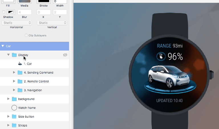
To give you a decent idea of my setup, here’s a brief overview of my artboard/layers/groups. Most of the layers & groups I kept untouched, using the Import from Sketch feature. I also hid some of the graphical elements to give you a clearer view of the main parts:

Pro tip: When you’re in Sketch, I recommend exporting your assets at 2x sizes. It’ll import into Principle at retina quality. You can even drag n’ drop directly from Sketch into the Media slot like so (or layers/groups directly to the artboard):

Setting-up & clipping our screens ✂️
Once we have our layers/groups where we want them, let’s mask out the watch display so our screens are circular. Principle makes this very easy with the Clip Sublayers option. Let’s take the background group. As you can see below, this consists of the background gradient, shadows and lens flare objects…
Important note: When your groups are imported in, they will be the size of the total bounding space of the layers within it. You will need to resize the clipped group so it matches the size of the display. This will not scale your objects. As you see below, mine was resized to the size of the display on the watch…
Now, because the display is round we’ll need to add a radius as well. In my particular design I went with a radius of 170. In most places (CSS, design apps, etc.), rule-of-thumb is just use about half of the total width or height if you are trying to get that perfect circle. Sometimes if you go too far over the half mark, you’ll get some wonky paths. I’ve seen this in Sketch a lot, and you may need to zoom in to see the wonkiness happening up close.

Go ahead and do the same for the Display group, so what will be our pages, are also clipped/masked.
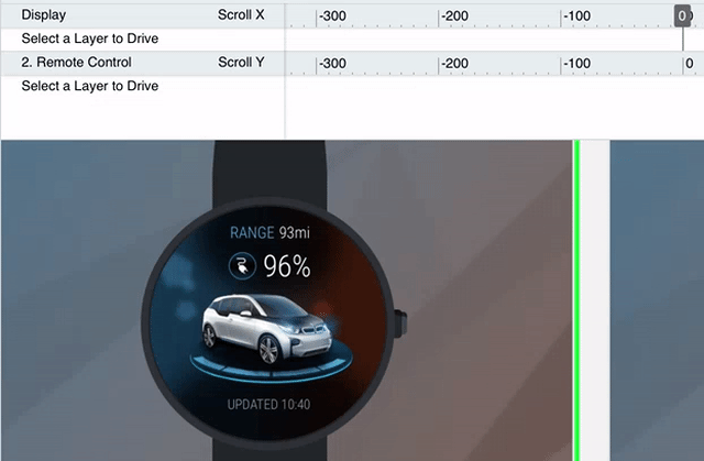
Draggable pages
We have our sizing for the two groups worked on above, so it’s time to get the first part of our paged interactions. Since we already sized our Display group to the size of the watch display, the only thing we need to do is change the Horizontal property to Page.
The result is simply what you expect! Draggable pages for each group/layer within the Display group! 📖 👈
As reference, this is covered in Principle’s docs/tutorials, in a nice simple video:
What’s next? Drivers! 🚕 💨
Let’s animate the background to start giving it that depth and 3D space. Instead of animating a second artboard and moving things around that way, we’ll be using Drivers. What are Drivers you ask? 🤔 Here is how Principle puts it in their docs:
Drivers connect properties to each other using keyframes. Unlike Animated transitions, which occur “between” artboards, drivers work in artboards.
Woah cool! That will save us a lot of workspace too! So, if you click on the Drivers button in the toolbar at the top, it will open the timeline. In my instance and screenshots, I have a few things listed already. In your case, it’ll be empty and ask to select a layer and change its Horizontal/Vertical property (Drag, Scroll, Page). Once you do that, you will see the Driver Source show up in the list. For example, if you chose Drag or Scroll, you can now drag your object in the Preview window. You’ll also see if you scrub the timeline bar, it will move the object on your artboard.
Another pro tip: You can pinch n’ zoom on your trackpad or hold ⌘ + scroll on your mouse to zoom the timeline in & out. 🔎
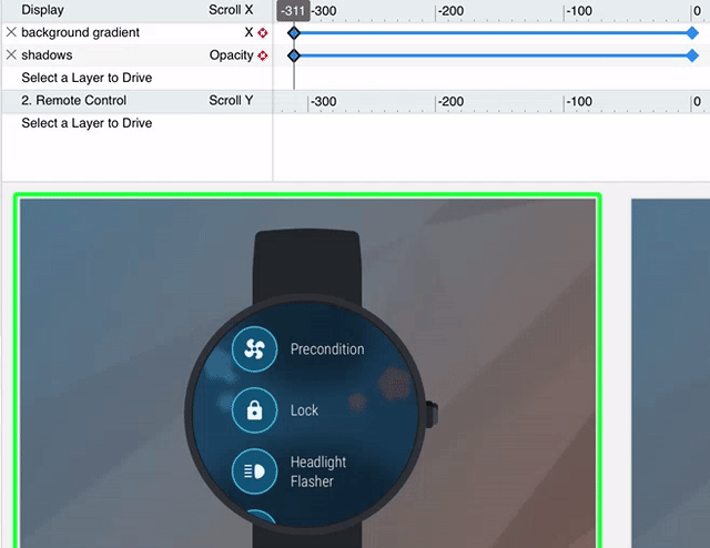
For my example, I’m going to start with making my background gradient layer move horizontally (X-axis) when I drag to each page. I’m going to leave the layer property as Static, since I don’t need to interact with it. We wouldn’t be able to interact with it anyways since our Display group is over the background. If I scrub the timeline around we’re going to see the pages slide.
Let’s go back to the 0 central position, then select the background gradient in the Driver sources and click the Add Keyframe blue diamond icon button. Once we have that first keyframe, we can scrub to the left to -311 (the width of the Display and background group), and then move the layer all the way to the right until the left edge bumps into the left side of the display. I also went ahead and turned down the shadows group Opacity to 50%. We should be seeing some movement at this point:
I’m going to let you finish the rest of the pages/views, what I’ve shown you so far should be enough for you to get there. 😊
Keep going! 🏃
You should have 3 keyframes now for the background (shadows and gradient). But wait, we still have those lens flare looking things sitting in the background right? There’s a decent amount of spacial awareness and sense of position from just moving the gradient, but if we can add some other background elements (like the lens flares) to move as well, it can really kick things up a notch! So let’s do just that.
If you think of the lens flare objects in z-depth (meaning closer/further to you), the largest one should be the closest one to you. Naturally, if things are moving from side to side, (side scrolling adventure games coming to mind like Terraria 🌄 🎮) the closest objects are going to move across the screen with the fastest and furthest change in position.

Starting with the blue side, which is the Remote Control actions page, we’re going to grab each lens flare using Drivers again, and move them over to the right. (Don’t forget to add initial keyframes at 0, before moving them.) We especially don’t want the orange flares in view.
Keeping the 3D depth in mind, let’s move the largest flare the furthest across, and the smallest one the least amount between the three. Mine looks like so:

The more drastic the difference in speed between background elements, the more apparent the parallax effect will seem.
To the finish line! 🏁
Lastly, do the same for the orange side, which are the navigation actions. Our final results should look like my GIF at the very top.
This is a simple example, but it’s enough to get your gears turning. I hope you’ve enjoyed this walk-through, and you find it useful to accomplish something you wanted to achieve! With the new Components feature in version 2.0, I’m sure there’s a way to consolidate some of this into fewer layers/groups. That will be up to you to experiment with.
Big shout-out to Daniel Hooper for making such an awesome, simple tool for designers that don’t want to code. I went to college for animation, and since I discovered this tool, my spark and longing to work in animation again, has come to life. So THANK YOU Daniel! 🙏 And as always, take it easy everyone! See you around on the interwebs, until next time. 👋
Some of my current favorite parallax sites:
- Garden Estudio
- World of Swiss
- Hello Monday (Their Greenpeace Into the Artic site was amazing for the time.)
- Sevenhills Whole Foods
- And of course Claudio Guglieri’s site

