PA LA PA PA PA

Why Mcdelivery?
Well, no prizes for guessing what this third project is about. The team decided that we wanted something that was close to the heart and Macdonald’s resonated strongly. Mcdelivery is something that would not disappear for the forseeable future as they have a niche in the food delivery scene others could not deliver — being there for your tummies 24/7.
Introduction

Mcdonald’s has its first store at the Liat Towers in 1979. The store actually managed to set a temporary record of hamburger sales on its opening.

Through the years, we at Singapore have been getting treats after treats. From the patties dipped in black pepper sauce to local food reimagined in the form of the burgers.

They even had been keeping up with times and installing these self service kiosks around their stores in Singapore.
Planning

So we sat down in our group and planned the process, along with the roles that we were going to have. Everyone had 2 jobs, one major role and one minor role. I was mainly on the direction of our User Research with a minor role in the design elements of the eventual prototype. Ben led the design elements with user research being his secondary agenda and Immanuel taking up the role of Project Manager(it means a hand in everything).

We applied time-boxing throughout the whole process. This technique made us more efficient and kept us on point for applying the double diamond design process.
User Research
Going out to gather intel is always the first thing we have to do. For this project, we needed to find out what were the eating habits of users and how they felt about the experience about using the Mcdelivery app.

From the data that we had gathered, we figured that there were a few things that really mattered for users.
- Service Recovery — Users who used food delivery frequently cared a lot about this, as most often than not, the food delivery might be late. Since it was something that could not be avoided, we would have to address this problem.
- Food Customisation- Users were annoyed that they could only do their food customisation at the checkout page and what that was worse is even after special instructions, the order might still be given the slip.
- Delivery Status- The current app has an approximate timing of the food arrival but it doesn’t let the users know which process is the food at.

With this, we came up with a rough idea for our personas and quickly sketched them out. They were refined before final presentation but they were really helpful in serving up the prototype for the new Mcdelivery App.
Problem Statement & Lo-Fi Sketching
With that, we were able to identify 3 key problems.
#1 Users need a better way to contact customer support easily because the current experience feels long-drawn and troublesome.
#2 Users with special meal / dietary requirements need a convenient and accurate way to customize their orders because the current method of doing so is ambiguous
#3 Users need a way to track the status of delivery so that their expectations of food arrival are managed
We also wanted to do something else besides the 3 problems that we would tackle. We wanted to ensure that the Mcdonald’s experience from the store to mobile is consistent.
With all these in mind, we started to brainstorm and design.
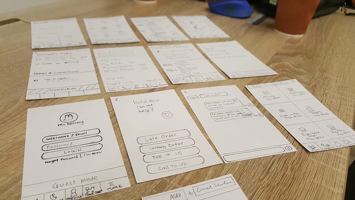
We sketched out the key screens to test out our ideas on users. We also made our first A/B testing here to check which option was more acceptable for the general public.

7 out of 8 Users tested preferred the grid layout as the larger food photos made the food more appealing.

We mapped out our Persona’s journey map based on the real experiences that one of our interviewers had been through. We needed to let the stakeholders know what is going through customers’ minds when they were going through an app which had insufficient functions.
Hi Fi-ing

Armed with our Hi-Fi prototype, we went out with our scripts and did user interviews yet again. They were all pleasantly surprised at the ease of use and understandability of the application. Most of them commented on how similar the app feels to the in-store kiosk. That was a green light and made a case for implementation of the store experience to the app as well.

Of course, we pegged the results to the System Usability Scale. In comparison, the improvement for the average score proved that our redesign was effective.
Moving Forward
The application has reached its MVP state but there were still improvements that could be made. Things like creating an on-boarding tour to show users what’s new in the app and to guide them through new features and adding an animations to help users visualise app interactions (eg. ‘genie’ effect for add to cart). Again, like the previous project, constant feedback from users was essential for us to design what would work for them. Without all the Lo-fi and Hi-Fi testing(backed up by SUS reports), the app would not be possible. I was really proud of my team for achieving something that would wow users. If possible, I would really like for us to make a pitch to Mcdelivery as this would greatly improve the customer experience for them which in turn means more revenue. I couldn’t have had asked for better teammates than Ben and Manny who were so passionate about this project. With this, I’ll end on a high note.
BRING ON PROJECT 4! (Pssst, do beep me if you would like to have a tour of the prototype! :D )
Presentation Deck Link — https://drive.google.com/open?id=1ZEHYywonxgBtHt-DwoeDpgi6GOlVLoBX

