Not Now
Not later either

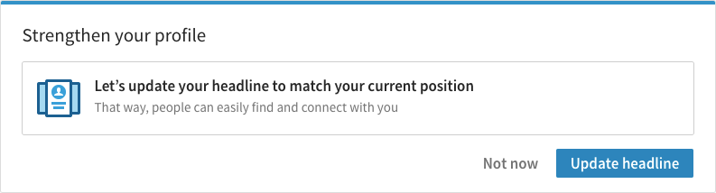
A few months back, I started noticing a trend in the micro-copy on pop-up notifications. These pop-ups, often asking me to do something like review an app, turn on notifications, or sign up for a newsletter, have two buttons. One is the call-to-action, and the other is usually labelled “Not Now”:


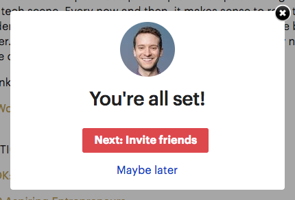
Alternatively, the button may use one of Not Now’s close cousins, “Later” or “Maybe Later”:


Now, there’s nothing wrong with having a Not Now or Maybe Later button, and there’s even a good argument for including one as an option. If users are in a hurry to complete some task in your app, they won’t have time to say, update the app your right now, but they might have time later.
The problem is the omission of a button to opt out of future pop-ups. Excluding this option takes control away from users. The only choices are submit to the will of the app or be asked to submit again later. And subjecting users to the same pop-up over and over is disrespectful of their time.
A more honest label instead of “Not Now” or “Maybe Later” might be:
I have zero interest in reviewing your app, turning on your notifications, granting you access to my personal data, or signing up for your newsletter, but please, feel free to nag me about it from now until the end of time.
But I guess that doesn’t fit on a button.
A better way
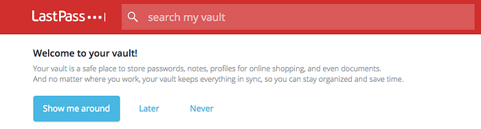
A better alternative is to include an opt out button. Some apps already do this with options like “Never”, “Never ask again”, or “Don’t ask again”:

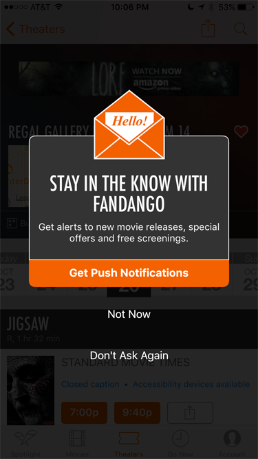
You’ll notice that those examples still have “Not Now” buttons. You don’t have to get rid of that option if you think users might actually want to opt in at a later time. Just realize there are some people you’re never going to reach:
What do you think about this trend? Does it irritate you as much as it does me? Do you have other examples of interfaces that take choice and control away from users?

