Never Just Design Pretty Little Apps
Guard against that vanity which courts a compliment, or is fed by it. — Chalmers
Surfing some design-inspiration sites with my hype-busting, critical U-X-ray eyes :) I often come away with smoke rising out of my ears. As the title implies this is a rant, but don’t take it too seriously. I’m trying to make a point.
Yes, I know that some of these design showcasing sites are not meant to be necessarily for real-world products, but then I still say they need to reflect a thoughtful approach to design, primarily by asking some critical questions “Who is this for?”, “How will people use my product” and “Is it actually usable?”
Superficial app designs that follow the latest fads and blatantly ignore basic usability conventions, UX best practices and fundamental principles of interaction design would most likely fail in the real world!
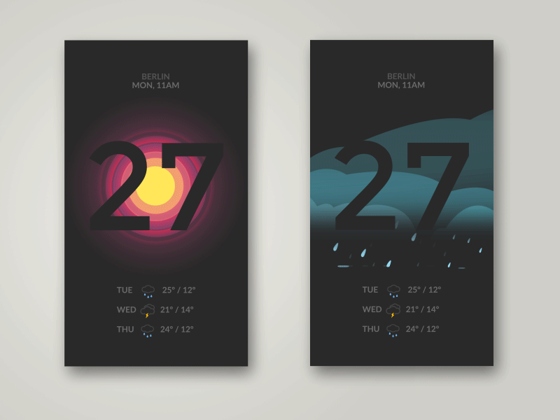
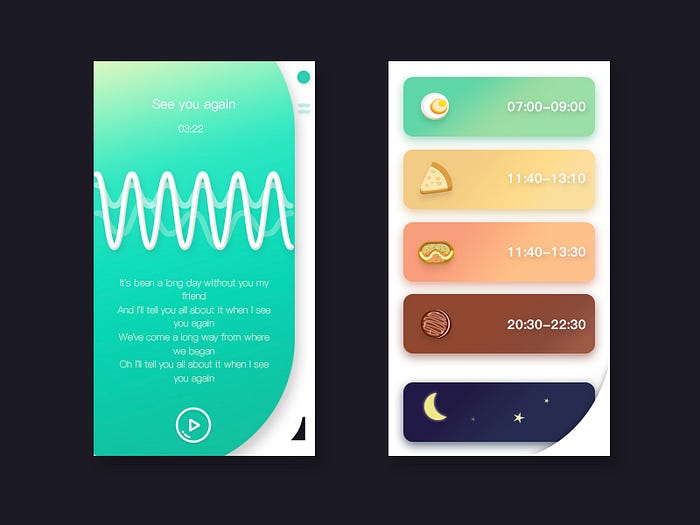
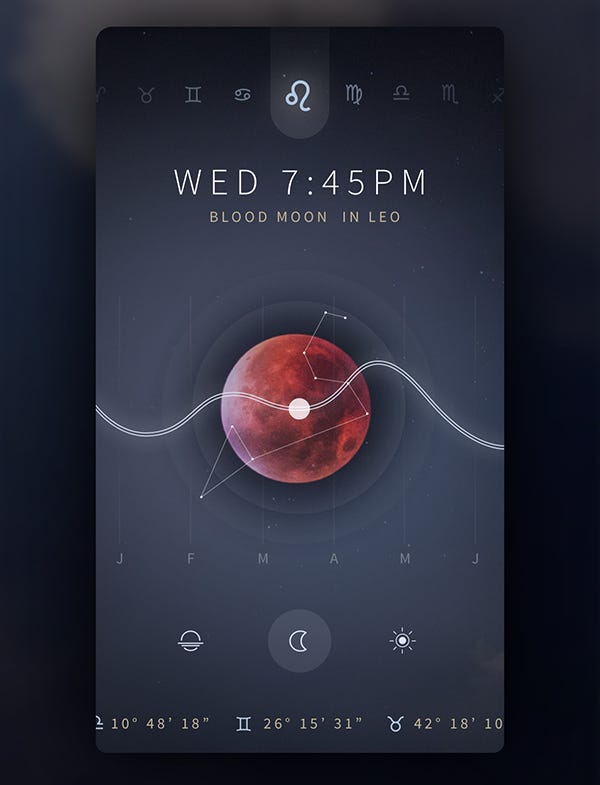
Unfortunately, these ‘concept designs’ — a single screen in an imaginary app, only serve to perpetuate designers being labeled as ‘artists’; pretenders who only care about the veneer, pretty colors and typefaces. Nowadays any app design has to go way beyond that.
I’m talking about UX.
If people in the ‘real’ world tried to actually use these apps, I guarantee that more than 50% would have a hard time doing so and subsequently give up in confusion.
Digital product designers worth their salt and wanting to elevate their game know it’s essential to ‘leave ego at the door,’ and to steer clear of unnecessary flourish, self-serving public parading and pointless audience seduction.

Abandoning usability for flattery
Great user experiences are a must if digital product design is to succeed in the marketplace. To be sure, aesthetics — great looking and ‘feeling’ designs are important, but they’re only the final touch that complements a usable product that is also a pleasure to use. Striving for aesthetic perfection alone while abandoning usability is ultimately a loser’s game.
As Don Norman who is often called “The guru of workable technology” said: “Great designers produce pleasurable experiences.”
Pleasurable experiences are those which create the least amount of friction while delivering fluid, seamless interaction and anticipatory experiences; i.e. having things appear as if by magic. The right things, in the right moment, in the right way.
The way to get there is definitely not by ignoring established best practices and design conventions and simply focusing on the facade. It’s evident Dribbble strutters 1.) you don’t understand your user and 2.) you’re copying fads.

Ignore Conventions at Your Peril
Design conventions, whether in digital product design or industrial design — for example, a car or bicycle — are rooted in human behavior, mechanics, physics, the sciences, and extensive research. They follow best practices and the human expectation of how things work because we are used to them, having followed those conventions for eons. These are conventions that have been worked out by trial and error and are proven to be very effective over time; a bit like evolution.
It’s foolhardy and somewhat arrogant to ignore or violate design conventions. They are fundamental and serve as a foundation… from which we can then innovate. It’s about what’s expected. Without them, you risk annoying the hell out of people. Imagine if every bicycle, every door handle — or the pedals and the steering wheel in every car worked differently, all purely in the name of ‘innovation.’ Two words: total mayhem.
A user interface is like a joke, if you have to explain it, it‘s not that good. (A quote from Martin LeBlanc)
Mind the Heuristics
Well-designed apps that strive to be ‘usable products’ follow well-established design conventions, basic usability guidelines and principles of interaction design (among other things), and pass heuristic evaluation with flying colors. (‘Heuristics’ because they are broad rules of thumb, not specific usability guidelines.)
For app designs to work well in the real world they should observe the 10 usability heuristics for user interface design as defined by the Nielsen Norman Group, a leading voice in the user experience field for 20 years. These are:
- Visibility of system status
- Match between system and the real world
- User control and freedom
- Consistency and standards
- Error prevention
- Recognition rather than recall
- Flexibility and efficiency of use
- Aesthetic and minimalist design
- Help users recognize, diagnose, and recover from errors
- Availability of help (this may be “quick tours” or walkthroughs)
Read about these 10 general principles for interaction design in more detail here.
Infatuation in the Name of Innovation
Oftentimes ‘app concept’ screens are designed by designers looking for lots of ‘likes’ on portfolio showcasing sites with the aim of pushing their way up to the daily ‘hot shots’ section on Dribbble. A couple of fancy, minimalist UI designs are not the product. It’s akin to designing a car door without offering any idea of what the rest of the car looks like, or how it works in a real-world scenario.

Don’t get me wrong! Design innovation is necessary; it’s healthy and critical for any discipline or creative domain to flourish. But it should not happen at the expense of good UX. Let’s make a distinction here and call it design experimentation. Under the conceit of ‘clean, minimalist design,’ merely wanting to be different and ‘cool,’ many of the so-called innovative designs paraded on these sites sacrifice basic usability.
Usability 101
Usability, a bedrock of great user experiences is a quality attribute that assesses how easy user interfaces are to use. The word ‘usability’ also refers to the practices for improving ease of use during the design process.
Whether an app is ‘useful’ is also defined in terms of utility as well as usability. Utility provides users the features they need; usability is how easy and pleasant those features are to use. Therefore, fancy app designs that ignore these basic tenets of usability end up being ‘use-less’ by definition.
It’s understandable that designers are looking for innovative and interesting ways to design their app’s navigation. But there’s a fine line between unexpected and unusable. Three things to consider in navigation design are consistency, user expectations and contextual clues. For example, it doesn’t matter how fancy your e-commerce app concept design is: if users can’t find the product, they can’t buy it.
Useful design
As Steve Jobs said: “It’s not just what it looks like and feels like. Design is how it works.”
He was talking about useful design. Aesthetics are an important component to be sure, but it comes last.
If there is a huge mismatch between users’ mental model and the conceptual model the app is toast. Mental models, as the name implies, are conceptual models in people’s minds that represent their understanding of how things work.
One of the most basic principles of interaction design is that a UI must have signifiers if it’s to be useful. If users have no visual cues in the UI called ‘signifiers’ that signal available actions or gesture interactions available to them, your product design is DOA.
As much as you as a designer may be infatuated with your product, users care about usefulness much more. They don’t want to learn your app, and they don’t want to go on a journey of discovery or experimentation to see what works by trying to swipe things in the UI. As Steve Krug, a usability consultant for more than 20 years said in his book ‘Don’t Make Me Think’: “(usability) is the overriding principle, the ultimate tiebreaker when deciding whether a design works or not.”
To be sure, as Dieter Rams, a legendary German designer at Braun in the 70s and an inspiration for all things Apple said:
“The aesthetic quality of a product is integral to its usefulness because products we use every day affect our person and our well-being. But only well-executed objects can be beautiful.”
In other words, the design has to work on all levels.

Here are the 10 commandments of good design according to Dieter Rams:

Let’s remember that visual design — the aesthetic — is just one aspect of UX design. It’s the final layer that should elevate everything that took place before it in the UX design process; ie. defining the business objectives, identifying the core user (personas); user research, sketches, ideation, wireframing, mockups, prototypes, and usability-testing. It’s the final veneer that lifts the overall user experience in alignment with designing for emotions.
Reduce Mental Effort
With bad design in action what Mr. and Mrs. Designer are doing is asking people to decipher and interpret vague icons and symbolism, thereby increasing their cognitive load. On the other hand, good user experience design will reduce cognitive load. (Cognitive load refers to the total amount of mental effort being used in the working memory.) This type of — yes, I’m going to say it — ‘selfish design’ throws roadblocks in people’s paths increasing friction and frustration. Is that really the goal?

Designers need to provide clear labeling (links and buttons), and obvious signposts (clear navigation) which will help users form a ‘mental map’ of the app and intuit where things are and how to use them. Navigation should be clear, task-oriented, logical (e.g. screen controls suggest how to use it), and its location (e.g. menu bar) consistent throughout.
Make it obvious where users should tap, if they can swipe, and make the targets large enough to be easily tapped. Prevent errors. Don’t make people guess what something means. Don’t be lazy. Avoid hamburger and kebab menus (the three dots) as they hide navigation and make content less discoverable. In particular, avoid hamburgers that don’t even look like hamburger menus! Yes, space is limited but it’s been proven that the combination of tabs (top bottom) and hamburger menus perform vastly better than just a single hamburger.


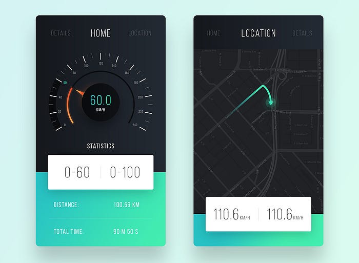
There is zero clue as to their meaning.
difficulty trying to figure out how to use this app.
Regardless, it received almost 500 likes on Dribbble, that’s what counts!
It’s not a Perfect World
If your product found its way into users’ hands, would they be able to find things and actually use it? They may not have access to a super-duper setup like the one you used to design these screens. Think again about usability and accessibility (visual disability, physical disability, cognitive disability). According to census data, in the United States at least 19% of people have a disability and the percentage is likely higher in less developed nations. If someone with less-than-perfect vision picked up your app would they be able to use it?
Is your design ‘finger-friendly’ or literally a pain to use? How much do people have to strain to reach different parts of the app screen? Are you considering user task flows and putting actionable items under people’s fingertips instead of making them jump around the four corners of the screen? Is the design really touch-compliant? Have you accounted for the obscured area under the hand that holds the mobile?
As Luke Wroblewski in Designing for Large Screen Smartphones points out, have you considered how your designs would perform on larger screens?
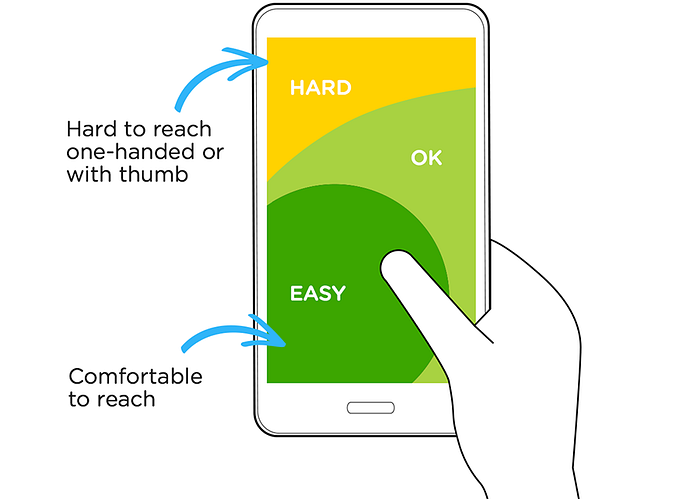
Is your design really following Apple’s iPhone Human Interface Guidelines recommendation of a minimum target size of 44 pixels wide 44 pixels tall? Microsoft’s Windows Phone UI Design and Interaction Guide suggests a touch target size of 34px with a minimum touch target size of 26px.
Don’t fall in love with super minimum contrast between text and background or tiny illegible text because it makes your design ‘hip.’
Better UX
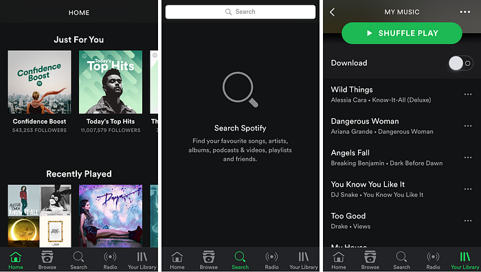
The designers even did away with icons and opted for simple text labels instead.
there’s no guesswork. (App design by Mohammed Bilal)
We Need Mo’ Better Design
So, what is good design? That discussion could fill a book, but generally speaking ‘good design’ is when it all comes together for the user of that design.
That means for a design to be ‘good’ and useful to users, it has to take into account multiple levels and factors on which it must deliver to be successful.
Design trends come and go. The average design trend only sticks around for a year or two; good usability, the foundation of UX design is here to stay.
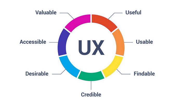
Products that have been designed according to the 7 factors of great UX will outlast any design trend; guaranteed. Designers who pay attention — to great usability, UX best practices, interaction design conventions and the factors that influence user experience — will make a greater impact than those who don’t. At the end of the day they will be rewarded, and their digital products more widely accepted and successful in the marketplace.
The Interaction Design Foundation
If, as a designer you want to become better at UX — in other words create useful mobile and desktop apps, not just pretty ones — invest some time into learning at least the basics of UX. Start by following UX blogs, and subscribe to newsletters, and online publications such as UX Magazine, UX Matters, UserTesting, uxdesign.cc, UX Design Weekly, and the Interaction Design Foundation.
Read user studies conducted with living, breathing participants — real people. As they say, the numbers don’t lie; everything else is hypothesis and assumption.
Follow UX thought leaders on Twitter. Read UX articles and white papers, the créme de la créme being: The Nielsen Norman Group and Adaptive Path,
Medium is one of my favorite destinations to read UX/UI design articles online. Designers all over the world are using it to read about design, user experience, usability and other topics related to creating and building great digital products. Here are Designers to Follow on Medium.
Read some of the foundational, classic books that every UXer I know has on their bookshelf and treat them like “UX bibles.”
- Don Norman’s seminal book on design The Design of Everyday Things
- Don Norman’s: Emotional Design: Why We Love (or Hate) Everyday Things
- Steve Krug’s: Don’t Make Me Think
- Jeff Gothelf: Lean UX: Applying Lean Principles to Improve User Experience
- Jakob Nielsen: Usability Engineering
- Susan Weinschenk: 100 Things Every Designer Needs to Know About People
Informative online resources about usability guidelines, principles of interaction design, and UX best practices. Studies, whitepapers, articles:
- First Principles of Interaction Design
- Full set of 2,397 usability guidelines (across multiple reports) from the NNGroup
- 10 Usability Heuristics for User Interface Design from the NNGroup
👋🏻 Hello! Thanks for reading and getting to the end of the article. 🙂
I’m now available for starting people on their UX designer careers through my UX Course or for ongoing mentorship on MentorCruise.
Learn UX with me at half the cost of crappy bootcamps. Get certified & build a portfolio for a high-paying job. 7-day free trial http://uxwithmiklos.com

