Netflix UI: Case Study
When I write about UI design and UX architecture, I’m usually centered around the concept that an ideal digital experience mimics a ubiquitous one from physical reality. In some cases, this is true even if the physical experience stems from an expired cultural phenomenon. Our shared experiences linger in our minds, and that can serve as an untapped energy source for powering a digital UX.

Video rental stores are now pleasant memories for those of us who had a chance to visit them. The shelves, the box covers, the movie posters were all part of the magic of renting a movie. Netflix designers were aware of this when they began their work, and they knew they had to capture part of that emotional experience if they were going to retain their users long-term.
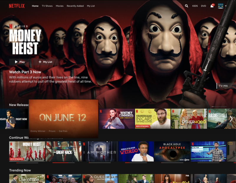
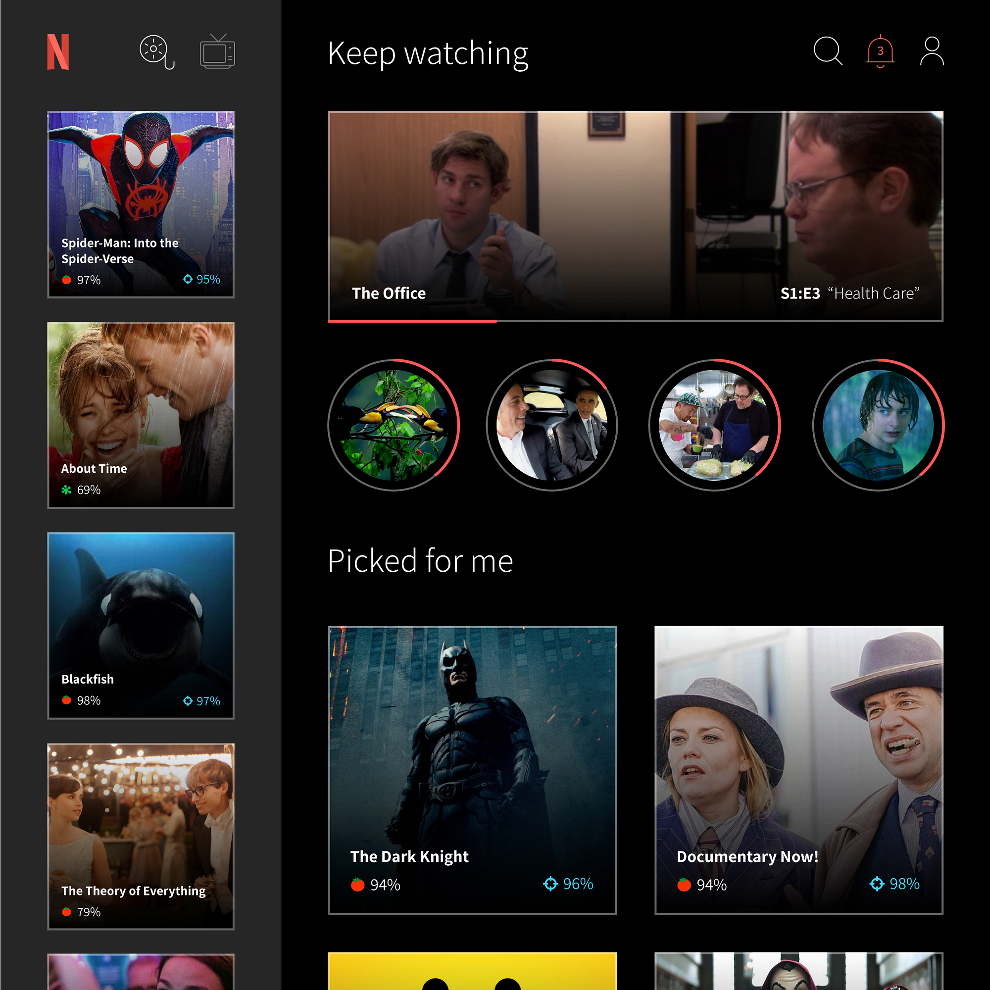
Looking at the latest Netflix UI above, you can clearly see the shelves in the bottom half of the screen, a staple of the brand. But of course, a video rental store experience isn’t only about shelves. You’re interacting with items on each shelf, picking one up, bringing it closer, flipping it over to study the copy, putting it back. Maybe you pause to look up at the wall and notice a massive poster for the latest thing which just came out, so you examine it…
When you were in the rental store, you didn’t know what you wanted, and that was ok, because the store was set up in such a way that your decision became more clear as you experienced different parts of the store, with minimal friction. That last part, as much of a formality as it may seem, is the only reason our memories of the video rental store are pleasant ones.
New store, new rules
In effect, Netflix gave us the ability to bring our couches to the rental store. They reimagined the store with a custom-tailored section for each user, promoting items which fit the user’s profile, and suppressing items which were outside of the comfort zone.
Somewhere along the way, Netflix realized that passive user data can only get you so far, and thus if the company was to generate real data on its users, then each user would need to be nudged into action.
Today’s Netflix user is no longer searching for options, but responding to them. A selection in the latest UI may have alternating cover photos, it may autoplay clips on hover, and it may be moved around and resized, depending on how much priority it’s given at the time — all distractions which keep you actively engaged in the selection process.
The screen above is chaos, the kind of anxious chaos that exists in a dark storage closet which has all of your important things, and you could get at one if you really needed to, but it would take some digging. The level of active functionality on this screen may be overwhelming for someone trying to relax and enjoy some TV.

And if all of that functionality wasn’t enough, it was eventually squeezed into our pockets. While the Netflix mobile UI is an overall acceptable design when compared to the alien dreamscape that is Hulu for mobile, or the dark caves of the HBO Now app, there’s a clear break in continuity from its desktop and TV counterparts. This is because the larger Netflix layouts rely heavily on horizontal scrolling, which is nice to have on a stationary device, but can be cringe-worthy on a tilting and turning device with automatic screen rotation.
So what could it look like?
If we were to reimagine Netflix from the ground up as a primarily active and curated experience, then any new design will likely be inspired by popular social media UI. For our purposes, this means prioritization, optimization, and noise reduction.
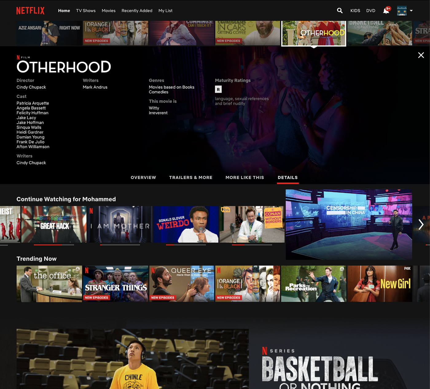
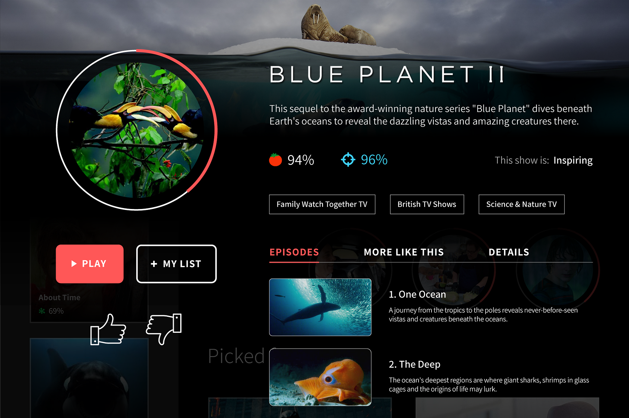
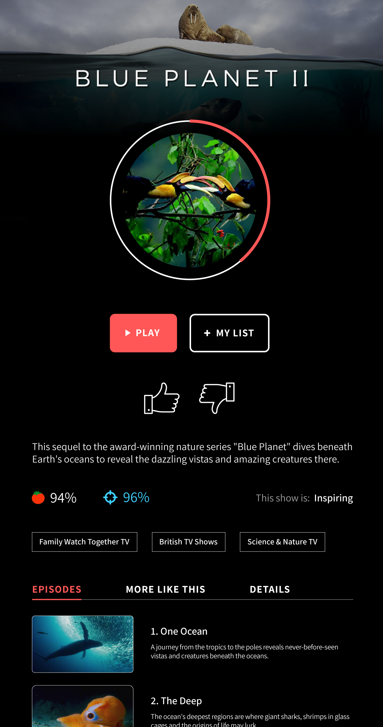
The concept I designed above is split into two columns. On the left, you have the new “rental store”, with two isles: Movies and TV shows. After all, users are typically in one mood or the other. On the right, you have a personalized section which is also split into two, with historical choices at the top and system-generated choices below. A user can now choose between three distinct starting points for their experience, and can make that choice by looking at one of three areas of the screen. No video should appear in more than one of those delineated areas at the same time. (Netflix presently breaks this rule a lot.)
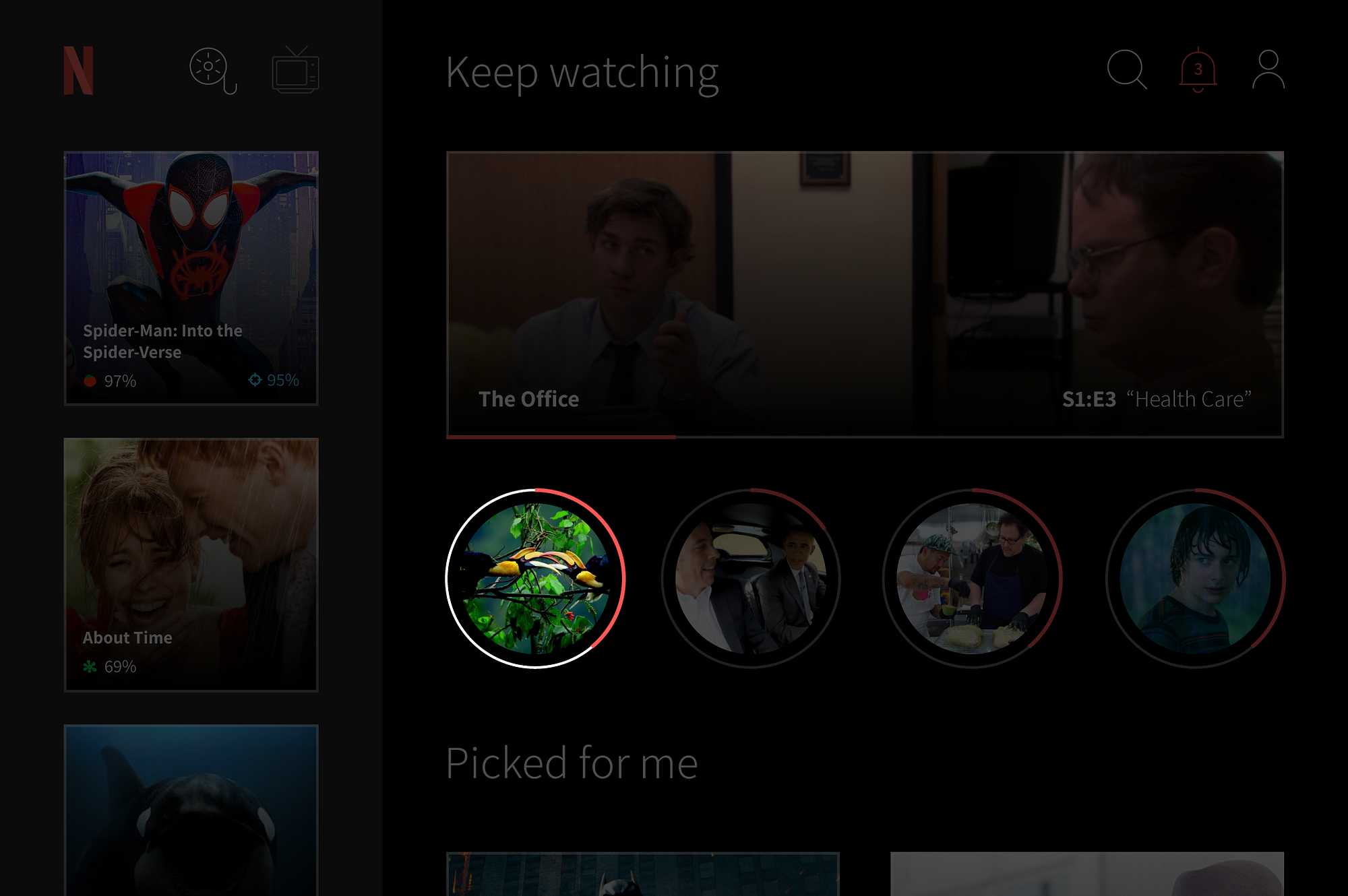
Netflix likes to indicate video progress with a red line at the bottom of a video frame. This is great when you have the full width to work with, but with elements lined up side by side, their red lines can sort of blur together as one broken line. I went with circles to make the progress easier to interpret.
I’ve also eliminated horizontal scrolling, to allow for a consistent UI on mobile, and also because I believe a user is more comfortable moving their thumbs up and down, as opposed to sideways.
One thing lacking in the current Netflix UI is consistency. In the concept above, a selection is made, triggering the screen to go dark underneath. The selection would then drift to the top left and grow larger, with related info sliding in from the right side of the screen (result below). Going back to the previous screen would trigger a reverse of the same animation storyline, without snapping to a different layout. This kind of smooth linearity in the visual experience may be comforting to a user who frequently loses their place, or is easily distracted.
It’s my opinion that Netflix could also do a better job grouping and separating their feature sets based on interactivity. In the concept above, interactive elements are grouped closely together, as are read-only elements. Items that can be clicked also share some aesthetic patterns, like border color and radius, allowing them to stick out more. A great feature is wasted if it can’t be easily accessed.
By previously breaking up the desktop/TV UI into columns and not relying on horizontal scrolling, we’ve given ourselves the right building blocks for a consistent mobile interface. Now we just need to combine those columns in a way which makes sense to the avid TV user and the first-time Netflixer alike.
Considering the concept on the left, a user transitioning from desktop to mobile to TV would feel less like they are transitioning between completely different apps, and will be more likely to continue a stream of interaction across multiple channels.
The goal of Netflix should be to eliminate the notion of a “Netflix app” or “Netflix for TV,” but rather a single, flexible philosophy which permeates across all available channels, making minimal, predictable adjustments which keep the experience frictionless.
Conclusion
Responsive UI is dying, mobile silos are dying, the future is omni-channel. Personally, I’m tired of using Airplay to avoid ever having to interact with the Apple TV remote. I’d like to press a button on the app labeled “Play from TV” and interrupt whatever is currently on the screen. I want that button text to then change to “Play from app” if I want to switch back. Most of all, I want to feel empowered to do (or not do) all of the above with a UI that protects me from the friction of having to choose.