Negative Spaces in Logos: A How-To Guide (for Dummies, by a Dummy)

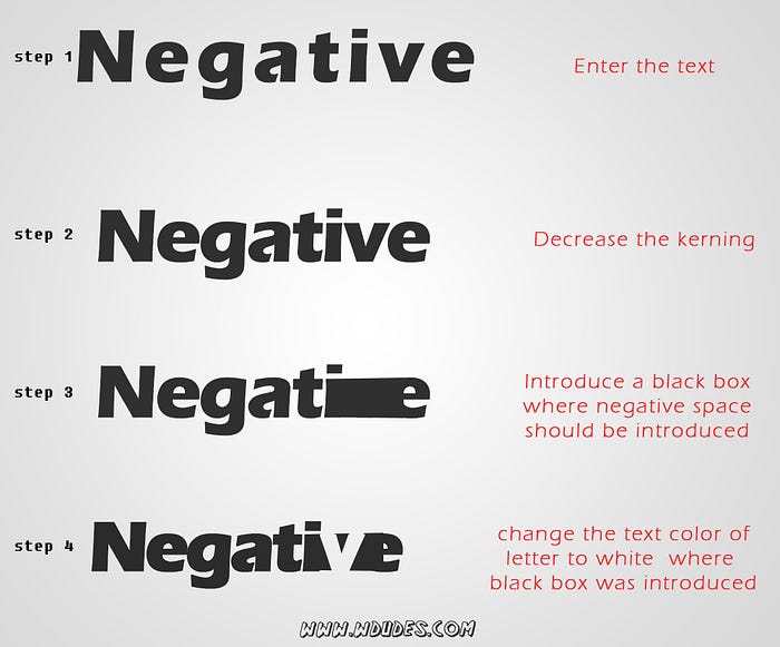
I am a big fan of negative spaces in logos. They just make the logos simply look clever and they always leave an impression. After all, that’s the characteristics that make a logo a good one. First of all, before starting this article, let me remind you this article is not going to make you a wizard of negative spaces. But I guarantee you that after reading this article you will know exactly how to direct your creative thoughts while you are planning to design a logo using negative spaces. So let’s start… and before continuing all the information given below are obtained from my experience so if there is any major please do comment…
no more blah blah… Negative spaces here we come
What is a Negative space?
(If you know what is a negative space you could skip next two paragraphs. On second thought keep on reading after all a bit of extra information might not hurt right :))
DEFINITION
Negative space may be most evident when the space around a subject, not the subject itself, forms an interesting or artistically relevant shape, and such space occasionally is used to artistic effect as the “real” subject of an image. The use of negative space is a key element of artistic composition.
I know definition always make every interesting thing boring just like that. So what is negative space?. It’s just something interesting forms in the space between two object.Still no idea …We are designers so let’s talk with pictures.
so let’s take a classic example.

We all have seen this image as an example of optical illusion… But in fact, it’s a perfect example to show negative space. Let’s take the black as the positive space. Here the positive space shows a piper at the same time if you concentrate at the rest of the white space which is not covered by the black (ie positive space) you could see a lady’s face. And that my friends are a Negative space. (I don’t know about you, But for me, that lady looks like Peggy from captain America.. right ??)
Does any actual famous logos use negative space?
Good Question my friend…. good question!
Yes.. actually there are a lot of them just search in google. But right now I’m only going to mention just one, And believe me, its quite clever

Let me see.. did you find it?
Look closely between letters ‘E’ and ‘X’…You could see an arrow… Yup that’s intentional
Okay that’s it for the introduction now let’s get into the interesting part
How to design a Negative Space Logo
This tips now I’m going to share only helps you know how to direct your creative views, and this is not a step by step tutorial on creating a logo. This is going to be a list of tips and tricks to find the hidden gems in negative spaces of shapes. And how to use them to create an effective logo
While designing a negative space logo, the first question which may arrive at your mind will be where to start
Where to start??
According to my experience, you could start with typeface based logo or a symbol based logo (I know it's not the technically correct word, But you get my point right?). If you are going with the typeface write down the word and if you are going with picture-based logo, list out all things you could imagine like animals and all.
Now let’s get busy.
Finding Clever negative spaces With shapes?
Shapes are designers closest friends. This fact applies in negative spaces too. Finding shapes in negative spaces. once you find a shape then it will be much more easy to correlate real-world elements with shapes
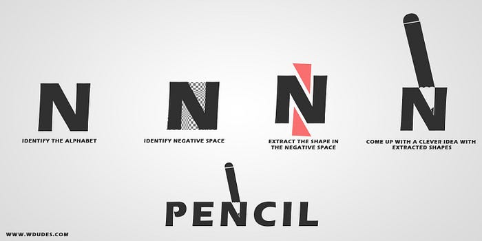
I know that’s not a good logo. But you get the point right. if you are dealing with the alphabets first you must find the negative space and extract that shape out of the letter and draw it to another paper. now all you have to do is just come up with the thing with that shape you have extracted once you find it build up on the negative space to get to your final result.
this method of finding the shape in the negative spaces also helps in case if you are dealing with picture-based logos. Such an example is shown below (this image was extracted from an ad by fiat)

Negative spaces And Overlapping
Finding possibilities for introducing clever negative space utilization is the most difficult task while designing a logo based on negative spaces. So this section is going to help you in that sector. Overlapping objects are a great opportunity to introduce negative spaces. consider two objects are overlapping each other. then a smart way to introduce a negative space in it is to assign one object as the negative space and another object as the positive space. I think more images gives you a better idea than words. so let’s do some case study on some existing logos
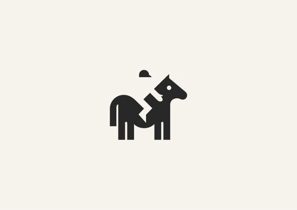
In this logo shown above the designer cleverly introduced a jockey on the horse by negative space. here an important thing to note is that with that only the illusion of the rider is complete this leads to one of ‘my theory’ while designing a negative space logo
Always try to surround three sides of the negative space with positive space elements. then only the illusion meant by the negative space get conveyed to the user
It’s not important to follow this theory always but. just keep that in mind

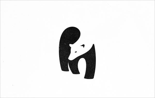
this logo here also uses overlapping elements as negative space. Here also, you could see my theory applied. For example, takes the hand of the black bear. it has a positive space above and below it and also on one side.
Overlapping in not only possible with images overlapping is also possible in typeface logos lets take some such examples


This overlapping technique is one most used technique in negative space logos in typeface based logos. let me show you an easy way to do such logos
Shadows and Negative Spaces
Just like we used overlapping images for negative spaces it is a clever way to use shadows. To get an idea about this method imagines any 3d object in your mind. Introduce that object in front of a single light source such that a phase of the object is illuminated and another phase is shadowed. Now let’s apply theories of negative spaces to it. let the illuminated phase be your positive space and the shadowed space be the negative space(vise-versa also works)
VOILA… you got an awesome logo
now let’s see some examples made with this method


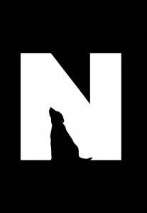
Animals and Negative Spaces
Animals are the best objects to experiment with negative spaces. Animals are so common while designing with negative spaces because we are so familiar with shapes of the animals so one can easily understand what animal it is even though we introduce some negative space tricks in it.
I usually use some clean easy methods while designing logos with animals and negative spaces
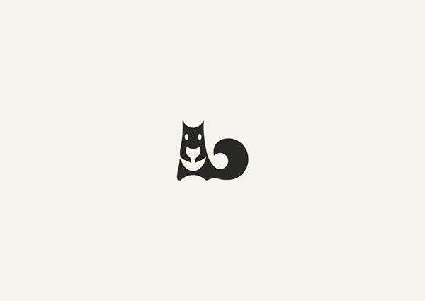
Method 1
step 1-take the front view of the animal
step 2-make the body and eyes positive space
step 3-make the head Negative space
this method works with: birds, four-legged animals
examples

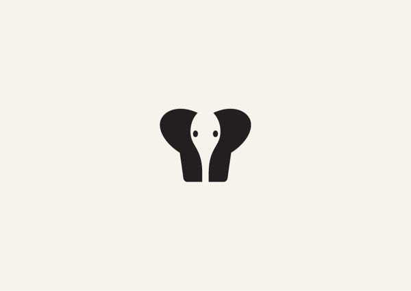
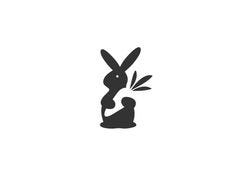
Method 2
step 1-Take the front view of the animal (side view also possible but is a bit difficult)
step 2-let the animal hold any object
step 3-make the object holding & the eyes negative space and let the body be positive space
examples
Method 3
Step 1: take a side or front view of an animal
step 2: between two legs introduce another animal (or shape) as negative space
example

Conclusion
I’m pretty sure that this information I shared with will help you in your future. And I’m a big fan of negative space logos, So if you guys design something great please do share it with me. All information provided here is only obtained from my previous experiences. So whatever I have shared here is not an adopted from any publications or anything so the information given here has helped me so I hope it will also help you guys. And if you find anything here totally stupid please do comment it so that I could also benefit it from it… and as a disclaimer, most of the example images shown here doesn’t belong to me …
I plan to write more dummy and pro stuff. So follow me on twitter