Navigating The Museum, Online.
An analysis of The Morgan Library & Museum’s website.
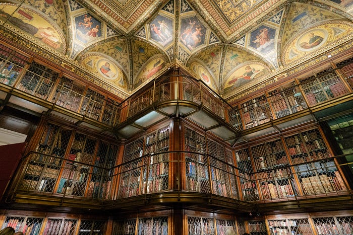
I was tasked with assessing the usability and functionality of The Morgan Library & Museum’s website. I performed the 5 tasks below to analyze the website and its competitors/comparators and, based on my learnings, made recommendations for a new navigation structure among other site updates.

Open & Closed Card Sort
In assessing the clarity of the Morgan’s current navigation set up, I started with an open card sort and used those results to inform my closed card sort categories.
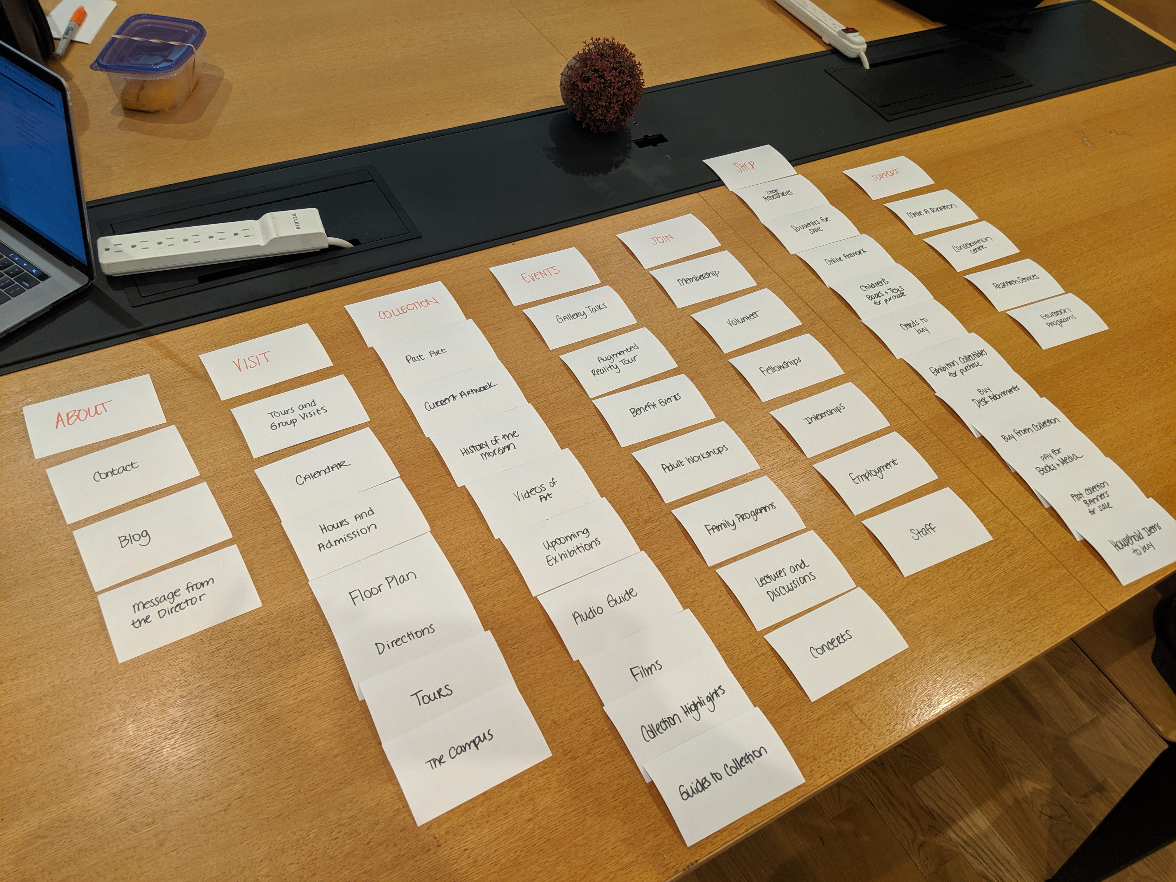
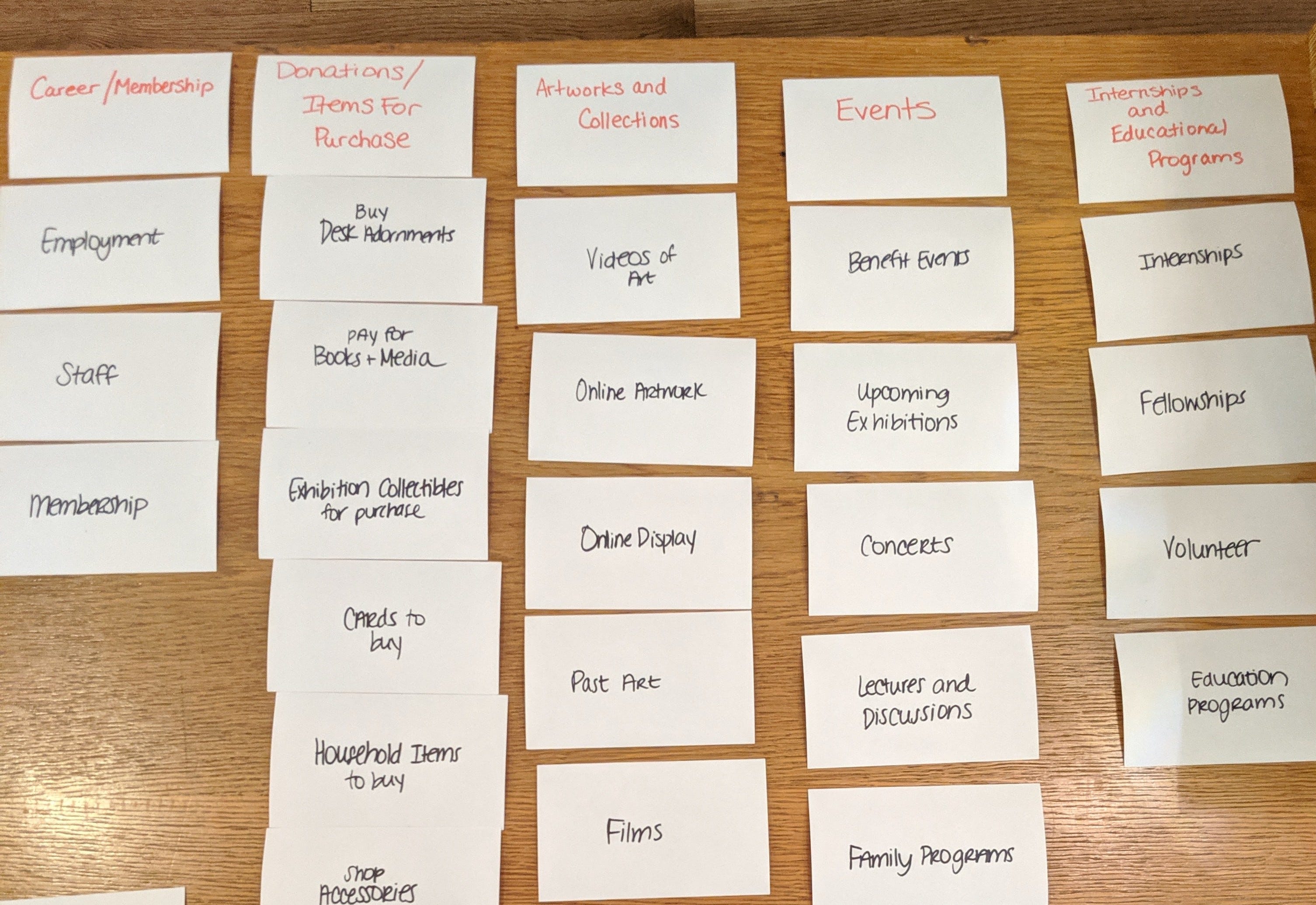
Open: I completed the open card sort with 4 participants and it was insightful to see the similarities and differences across the groupings that were created.
What I learned: Many of the site’s existing primary navigation elements such as About, Visit and Shop are recognizable to users and should remain the same. Although The Morgan’s site currently separates Exhibitions and Collections into 2 separate primary elements, most participants grouped the cards into one section. The bigger differences in groupings occurred when sorting the career, program, and resource-related cards.

Closed: The closed card sort was also completed with 4 participants. With the labels provided, these card sorts were completed much faster than the open sort sessions.
Group labels used: About, Visit, Collection, Events, Support, Join, Shop
What I learned: Although some of the card placements varied from person to person, participants felt confident in how they grouped most of the cards. Some lines were still blurred between what cards should be placed in About versus Visit, but as the participants talked through their process, they recognized that they were placing more generic information cards into the About group while Visit served as a grouping that assisted users in planning a trip. Collection, Shop and Events were the easiest of the groups to sort for participants.
Sitemap
I created a sitemap of the website using its original navigation. After completing the open and closed rounds of card sorting, I revised the sitemap to the recommendations below:
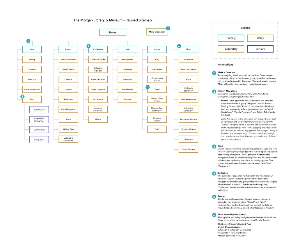
What I learned: Creating a website’s navigational structure is not easy work! Not everyone thinks the same when it comes to word association and information grouping. As a result, it can be difficult to create a navigation that serves and satisfies all users and their mental models.
User Flow
Using the original Morgan site navigation, a user flow was created with the user persona’s goals & needs in mind:
- Goals: To experience cultural events in New York City. Align her schedule with the current exhibition. Wants to discover new artists and art forms.
- Needs: To know what is currently on exhibit. Simple way to find information. Variety in the cultural events that she attends,
The task given to the user is to search for an exhibition to view at the museum and purchase admission tickets.
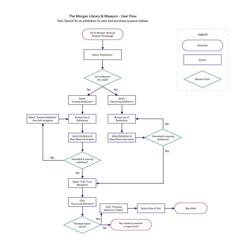
What I learned: It’s not possible to purchase admission tickets from the exhibition pages. In navigating other pages on the site, it’s hard to tell whether users can purchase tickets anywhere on the site besides visiting the Hours and Admissions page within the Visit group in the primary navigation.
Competitor/Comparator Analysis
To perform the competitor/comparator analysis, I chose the following companies:
Competitors: The Guggenheim Museum, Whitney Museum, Museum of Modern Art.
Comparator: New York City Ballet
I decided to focus on a performing art site for a comparator. I thought many of the site features would be similar even though the subject matters themselves are different from one another.
Between the 5 sites, I compared a variety of elements including: what labels are used in the navigation, the location of the How to Donate & Membership pages, visual layout of the homepage, and more.

What I learned: Even though The Morgan shares many of its features with the other websites, there are still some enhancements/improvements that could be made.
- On 3/4 of the other sites, users can buy tickets from the homepage. This cannot be done from The Morgan website.
- The Morgan does not provide a list of artists on exhibition or in the collection. Knowing what artists can be found at the museum was important to the user persona.
- All of the sites provide similar content and information but in different ways. The navigation and/or design of The Morgan website could benefit from some testing to see if there’s a more optimal way of presenting information to the user.
Heuristic Evaluation
Below are the 4 pages that I chose for Heuristic Evaluations. The evaluation were performed utilizing the Abby Method, which focuses on the following 10 principles:
Findable, Accessible, Clear, Communicative, Usable, Credible, Controllable, Valuable, Learnable, Delightful.
I provided an Observation and Score for each principle per page, as well as a Recommendation if applicable for improvement.
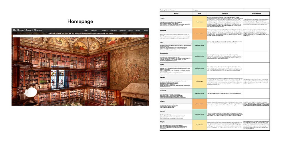


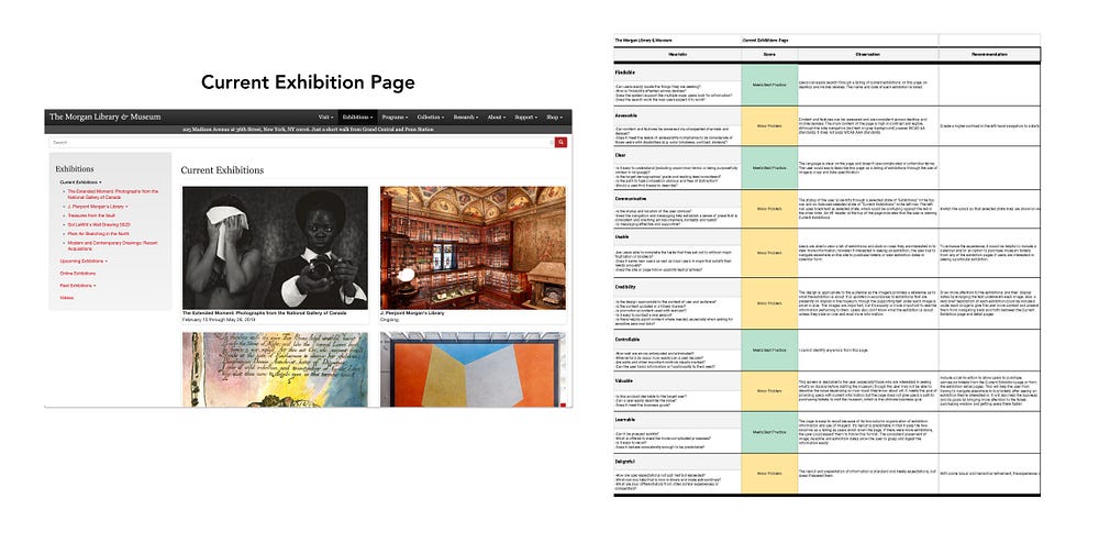
What I learned: The Morgan’s website incorporates some standard best practices. Where the site can improve is in the design and hierarchy of information that’s presented, especially on the Make a Donation page. Many of the site’s pages do not resize well for mobile which makes accessibility a challenge. Small text and the use of the color red to accent links and buttons can make the site experience difficult for those who are vision-impaired and/or color blind.
Site strengths: Clear, Controllable, Learnable
Site weaknesses: Accessible, Delightful
In summary, I learned a lot about The Morgan Library & Museum’s website and how it compares to other sites through all of the analyses I completed. Although they all had interesting results, the card sorting provided me with the most insight as it demonstrated how differently people perceive and understand information and how it’s grouped together. Building an intuitive website navigation is for sure an art and a science!

