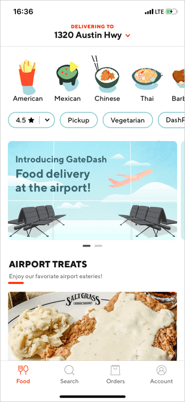
My DoorDash Redesign: Introducing GateDash, food delivery at the airport!
Waiting in line is a prevalent theme at the airport: wait for check-in, wait for security check, wait for ordering food and getting served, wait for boarding, and sometimes wait for customs check. Last week, when I was working on a project and brainstorming how to improve airport customer experience, an idea popped into my head:
Why can’t we get food delivered to the gate when we are waiting at the airport?
I was very excited about the idea and asked for several people’s opinions about it. They all loved it! One friend said, “Wow, it would be a real hit if the service is available at the airports.” I agreed. Hence, I made this DoorDash redesign with the hope that the food delivery service will be available at the airports one day.
Disclaimer: it’s my personal design exercise. I am not affiliated with DoorDash.

In this UX case study, I created use case scenarios, spotted business opportunities, conducted competitive analysis, and made UX design for GateDash, a potential airport food delivery feature of DoorDash. My process was guided by qualitative user research and design thinking principles.
Use Case Scenarios
As a frequent flyer myself, I have experienced many hungry moments due to a variety of airport frustrations. Reviewing many other passengers’ feedback on big and small airports in Google reviews allows me to extensively empathize passengers’ pains, frustrations, and anger. Therefore, I summarized typical scenarios that would occur at the airports and hinder passengers’ food experience.
Scenario 1
Imagine you are in the departure lounge and wait for boarding. At some point, you feel hungry. “It’s lunchtime”, you check your watch. You want to find something to eat but hesitate to leave your seat. You know that no more seats are left in the lounge and once you leave, you can’t have your seat anymore. It’s also quite a hassle for you to move around with your luggage. But you are hungry. The hungry stimulates your nerves and you start to feel “hangry”…
Scenario 2
Imagine you are waiting anxiously at the customs. You are worried about your short layover time and the potential of missing the connecting flight. At the same time, you also feel hungry and tired after the 11-hour flight. “I will have no time to go to the restaurant after the customs and security check. What if the restaurant can prepare my food while I am waiting here? I can pick it up on my way to the gate.”
Scenario 3
Imagine you are a foreign visitor at a U.S. airport. You don’t speak English. You feel hungry. But it’s very uncomfortable for you to go to restaurants and order food. Because the menus are in English and no food pictures are displayed. You don’t know what to expect from the food. You don’t want the embarrassing moment that you can’t communicate what you want while other customers are waiting for you to place an order…
Other Cases
For passengers who have limited food options at their gates, they may want to try the food in other terminals but reluctant to go there; for moms and dads, they may want to find the food for their kids while not pushing perambulators and checking menus restaurant after restaurant; for passengers who sit in a wheelchair, they may want to feed themselves without moving around. For airport employees who have short lunch breaks and flight crews who have limited ground times, GateDash can help them save time and truly enjoy their food.
Business Opportunities
Opportunity 1: win-win
The airport food delivery feature can make DoorDash users and restaurants more loyal to the brand because of meeting their needs. From the airports’ perspective, the food delivery service improves airport customer experience. Airports can also get more revenues from airport restaurants. From airport workers’ view, they can get their meals without waiting in line or maybe get extra income by becoming a Dasher. It would be a great collaboration for both DoorDash and the airports.
Opportunity 2: additional profitable market
According to the U.S. Bureau of Transportation Statistics, 776 million passengers took domestic flights in 2018. From the U.S. National Travel and Tourism Office’s I-94 arrival records, nearly 77 million international visitors came to the U.S. in 2017. If only 1% of total passengers use GateDash airport food delivery service, it would be nearly 8.5 million users. It’s an amazing amount of traffic. Moreover, U.S. airlines don’t provide free meals on domestic flights. Most flight meals are either expensive or not tasty. GateDash service could change the way travelers grab their quick bites when taking flights.
Opportunity 3: expand the business to other countries
Since nearly 77 million international visitors come to the U.S. in one year, the airport food delivery service would be a great portal to market DoorDash app and expand the food delivery business to other countries. According to I-94 arrival records, the top 5 international visitors are from Canada (27.6% of total visitors), Mexico (24.7%), UK (5.1%), Japan (4.6%), China (4.1%).
Competitive Analysis
Before I moved into the DoorDash redesign, I researched if any companies had done the airport food delivery service and how their users think of them.

Three U.S. companies Grab, Airport Sherpa, AtYourGate have similar services. Grab is the pioneer in airport food delivery service. It is available in many U.S. airports. From the number of app ratings, we can see that Grab is also the app that reaches the most users, with 1.69K ratings in iOS. But compared to DoorDash’s 1.75M ratings in iOS, the user base of DoorDash and Grab is nearly 1000 fold. It’s likely that Grab users are also users of DoorDash, Uber Eats, GrubHub, Postmates. Therefore, it’s a natural step for DoorDash to expand in airport food delivery service.
In Grab’s iOS app review, airport workers particularly speak highly of the app. I think one of the reasons is that Grab offers discount coupons for them. Airport Sherpa has similar user demographics as Grab. An AtYourGate post says that the users of AtYourGate are Millennials and tech-savvy business travelers. Families with kids also like to try the service.
When it comes to the interface design of the three apps, I think Airport Sherpa is the best. Its UI is much modern than Grab’s and AtYourGate’s. But Airport Sherpa’s accent color is dark purple. I wonder do the three apps’ UIs represent their users’ tastes? As a Millennial, I do love DoorDash’s vibrant color palette.
Design Process
After the preliminary research, I asked myself several questions to think about the GateDash design:
- Given the users’ needs of airport food delivery, what improvements should be added to DoorDash?
- What is the flow of food ordering and food delivery? How could the Dasher know the specific location of the passenger at the airport? How could the user know the dasher is delivering his/her food? Could passengers order food that is outside the airport?
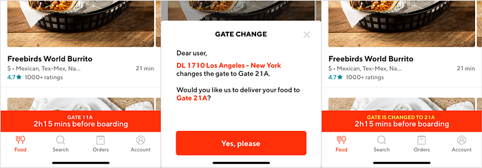
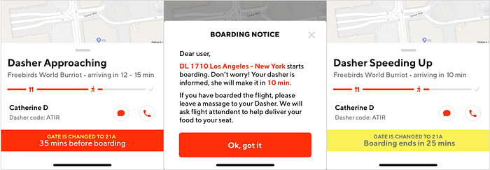
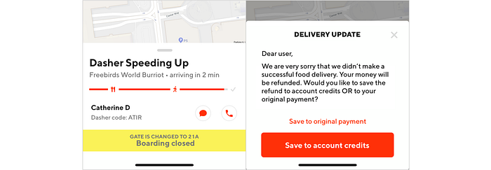
- Contingency design. What if the passenger’s flight change gate? What if the food arrives late and it starts boarding? What if the dasher doesn’t make a successful delivery because the flight is about to take off? What if the restaurants forget to put utensils and napkins in the delivery bag?


1. Added more filters to DoorDash
Since many family travelers complain it’s hard to find kid-friendly restaurants at the airports in Google reviews, I added “Kid’s” filter in the filter panel. For passengers short on time, the “Delivery time” filter can help them filter out the best options.

2. Support multiple languages
Currently, DoorDash only has the English version. It would be great if it supports other languages such as Spanish, Japanese, and Chinese in the airport food delivery service. As aforementioned, the top 5 U.S. international visitors are from Canada (27.6% of total visitors), Mexico (24.7%), UK (5.1%), Japan (4.6%), China (4.1%).
3. Simplify the information architecture of food ordering pages
DoorDash requests the users to look at the detailed dish page before the users can place an order. Users may have time to go to a new page and read the ingredients when they are ordering food at home. But airports are a stressful place for many travelers. It would be better if the users have two options, one for quick food ordering, and one for normal food ordering (existing design).
Take the following burrito screens for example. Assume you are clear that you just want to order a burrito and a coke. If your wanted burrito is featured, you need to click 5 times to put two items in the cart. If you want to try other burritos, you need 7 clicks. What if you are in a hurry and you just want to pick a whatever burrito that looks good (food items that with pictures)?
Or assume you want to order a burrito and something for your kid. You are not sure what your kid wants. You click “popular items” “burritos” “burrito bowls” “salads” “tacos” to see what the restaurant offers. You need 24 clicks to go back and forth reviewing 6 categories of food. If you select N categories, that’s 4*N clicks!

I created the quick food ordering by adding the filter panels on the restaurant page and putting a quick order button near each food item. Users can still click the food item to see detailed ingredients and specify their special instructions.
Go back to the example that you want to order a burrito and a coke. Now you only need 3 or 4 clicks to put a burrito and a coke in the cart. If you want to order a burrito and something for your kid, you only need 8 clicks rather than 24 clicks when 6 categories are selected! Hooray!

In order to make the filters look good, I tried several variants of food filters. The first one I tried is a dropdown filter. It takes less space but it still requires a certain amount of clicks. It can also be very long if it has many categories. Then I tried to display the food categories horizontally. I think it’s better to show how many items one category has. In order to let the users know the filter is clickable and left-right scrollable, I gave the categories a border. In the end, I chose the last design variant in the following image.
I played with “Full menu” “Switch menu” as well. Every time I saw “Full menu”, I wonder why not just “Menu”? If I have already got the full menu, why do I need to “Switch menu”? After clicking “Switch menu”, I said to myself, “oh, it is because restaurants have breakfast menus, lunch menus, dinner menus, or all day menus”. A well-known usability principle is “Don’t make me think”. Considering usability, I changed the design to a colored “Lunch menu” (or other menus based on the time) to let the users know it’s clickable.

In addition, some food items have pictures and some only have text descriptions in DoorDash app. It’s sometimes hard for users to know the picture belongs to the upper item or lower item. I suggest to display food items with images first, then food items with text descriptions.
4. User flow of food ordering and food delivery
How could the Dasher know the specific location of the passenger at the airport? Espcially when the passenger is on the go?
You may say that we can use GPS to know the passenger’s location. However, GPS’s accuracy is around 4.9 m (16 ft.) under open sky. It doesn’t work very well inside the buildings. Therefore, using GPS can only give a rough radius of the passenger. There are indoor positioning systems using Wifi, Bluetooth Beacons, NFC, UWB to help with indoor navigation. But they require either extra efforts from the users (i.e. login into the airport WiFi) or the airports (i.e. building Bluetooth Beacons). Moreover, many U.S. airports don’t provide free WiFi or only provide a limited time of free WiFi. These conditions create frictions for users using the GateDash service. Therefore, I tried to solve the problem through service design.
As it’s hard to find a moving passenger, to make the solution simple, I constrained the destinations of food service to the gates. Airport gate map is also created to help users locate themselves, along with flight number/gate number and users’ notes in the delivery instruction. Below two interactions show how it works.

How could the user know the Dasher is delivering his/her food? Especially when many passengers order food at the same gate?
The airport gate map solution allows the Dasher to know the user’s location. But it won’t help with the user’s understanding of the Dasher’s progress and which person is his/her Dasher. Though it’s hard to get accurate locations of Dashers when they are moving from the restaurants towards the passengers, it’s easy to calculate the time it takes walking from one point to another point at the airports. Therefore, the app can provide users an estimated arrival time of Dashers.
For recognizing Dashers, my solution is hats, electronic display boards, and the DoorDash app.

Unlike common DoorDash checkout page, it doesn’t provide a card to see the delivery destination. Instead, it gives the dress code (red DoorDash hat) and a digital code (e.g. ATIR in the above image) to let the user identify the Dasher. This experience is similar to waiting for a Uber at the airport. How do you identify this is your Uber? You may check the type/color of the car and the plate number. The Dasher’s hat will display different four digits based on the order he/she is delivering.
Why choose a hat rather than a T-shirt? My considerations are: a hat has a higher elevation than a T-shirt, it’s easier to spot the Dasher and the digits; the GateDashers would be part-time airport employees and other freelancers, it’s easier for them to put on a hat than put on a T-shirt to switch their roles to Dashers; a hat is applicable to all weathers.
Could passengers order food that is outside the airport?
I decided not to allow passengers to order food from outside restaurants in the redesign. Though it gives passengers much more food options, it adds lots of burden to the airport traffic and operations, hence harming airport customer experience and potentially causing others to blame DoorDash. It also makes the Dashers’ delivery time longer (e.g. parking at the airport, passing the security check). In addition, some Dashers may not be familiar with the airports’ indoor navigation, which adds uncertainties in successful food deliveries. Therefore, separating airport food delivery service from the existing service system and exclusively assigning airport food delivery service to GateDashers would be a better way to execute the new service.
Overall, the user flow map would look like this:

5. Contingency design
What if the passenger’s flight change gate? What if the food arrives late and it starts boarding? What if the dasher doesn’t make a successful delivery because the flight is about to take off? What if the restaurants forget to put utensils and napkins in the delivery bag?
Unwanted situations alway hinder user experience. In order to dispel passengers’ misgiving and use GateDash service, I assure the passengers will get their food at DoorDash’s best efforts through design.
Apart from the contingency interface design, Dashers will be required to check whether utensils and napkins are included in the delivery bags when performing airport food delivery service. They should also carry disposable utensils and napkins (DoorDash provides) with them in case those items are missing. Because the missing-items-experience is much more intolerable to airport DoorDash users than home/work users. Airport users are usually in a stressful state and prone to get irritated. They are also unlikely to get access to alternative utensils and napkins.
Final Thoughts & What I learned
It was my first time writing on Medium. The user experience is terrific! I can’t help wanting to write more. I have a lot of ideas about redesigning the everyday apps I use. Let me finish the DoorDash redesign first. 😉
It was also my first time adding a new feature in my redesign of an app. It was so much fun! I researched any business and technical facts that I found useful to defend the feasibility of the GateDash idea. Then I designed the airport food delivery service and the interface with various personas in mind: business travelers, family travelers, international travelers, tired travelers, anxious travelers, travelers with disabilities, airport employees, flight crews, etc. I believe GateDash will be one of the best services that ease travelers’ nerves and delight travelers at the airports.
I found thinking with context sparks new ideas. If not firstly thought about how to improve airport customer experience, I wouldn’t have the idea of GateDash. I may come up with ideas to improve DoorDash’s user experience in general but not with the airport context. Let’s diverge our thinking from airport food delivery. In what else contexts can we enjoy the convenience of food delivery? I have several ideas in mind, what about you? Feel free to leave a comment and exchange our ideas. 😊
If you like the GateDash airport food delivery idea and/or my design, please long press 👏 and share it with others. Let’s make the airport food delivery service possible!

