Muscle Mentor — Injury Prevention App: UX Case Study

Workout related injuries are not uncommon. Especially if you work out and take part in other sporting activities like football and boxing daily. Managing your changing schedule and deciding whether your muscles are up to the test is difficult to access and manage.
The opportunity was to design a dedicated app to prevent injury, especially through repetitive strain injury.
Process
Methodology: Lean UX // Timeframe: 2 weeks // Team: 1 UX designer

The beginning
This all began with the challenge of extracting a users problem and designing a dedicated app to solve it.
I convinced a colleague, Panos, to join me on the journey and sat down on a mild January day, script in hand and began firing off my questions. I started by finding out everything in his usual day to day and quickly discovered his passion for sport and fitness.
He went to the gym four times a week, played football for two and Boxed the other. But through changes in his schedule and overworking one particular muscle group for too many consecutive days, he injured himself.
Distilled findings
What is Panos trying to do and what are his goals?
Panos loves to go to the gym or take part in a sporting activity regularly. Daily in fact. His goal is to do this whilst staying injury free as he is currently injured which means he has had to reduce his schedule dramatically.
What is motivating Panos?
His obsession and love of fitness is a big motivator. He enjoys exercising, likes the way it makes him feel and helps him to maintain current body weight and physique.
User journey & experience map
It was important to map out Panos’ journey to see where all the potential pain points were.
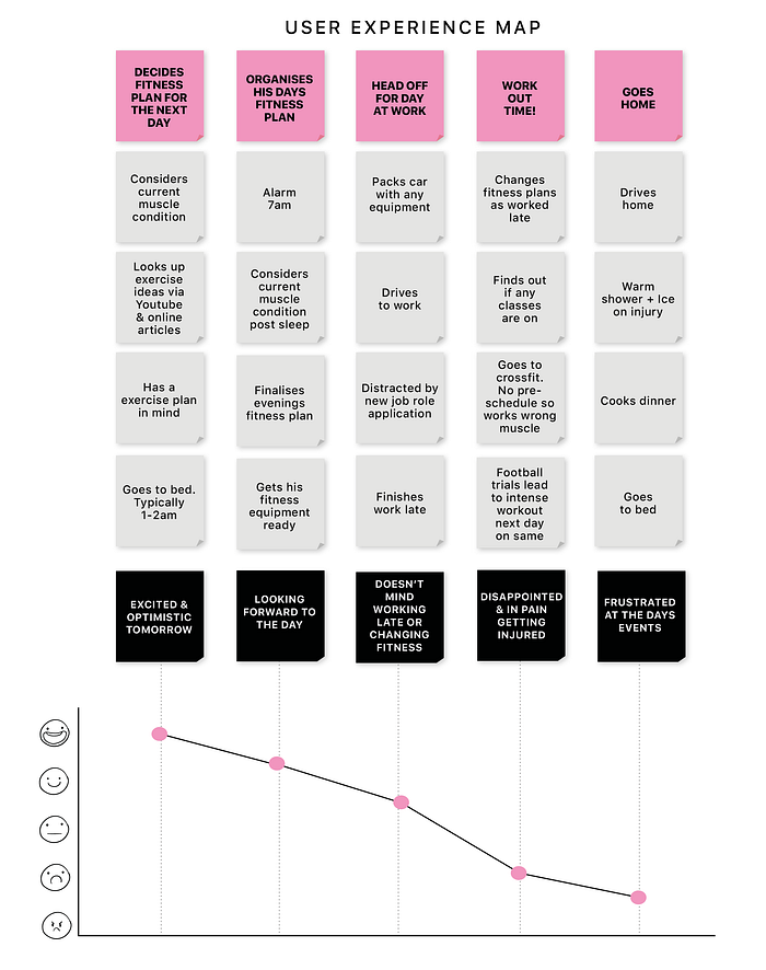
The key insight was that distraction from his work, a change to his evening’s fitness plans and not assessing previous days training was key to the injury sustained later that evening.
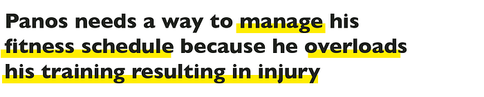
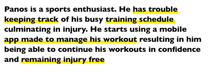
Problem statement
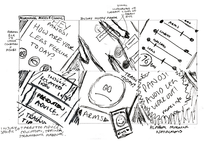
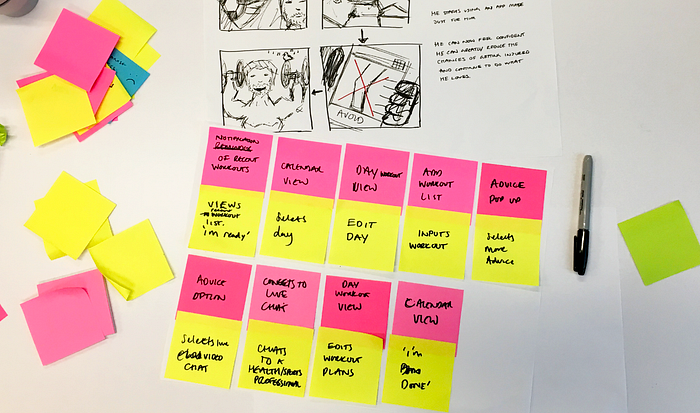
Ideation
I began the design process with some initial ideas through sketching and storyboarding.
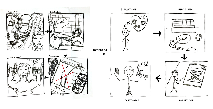
Outcome statement
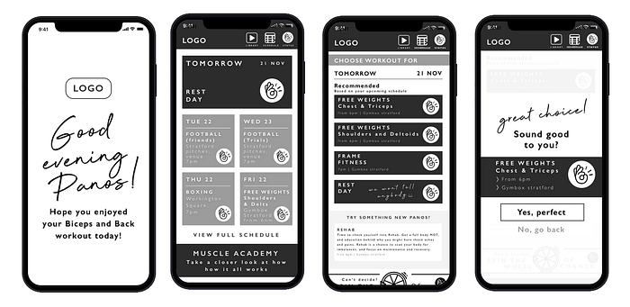
The app concept would be to monitor his muscle exhaustion levels by calculating the intensity level of his workouts and the muscle groups they targeted. He would be able to view the predicted health of each muscle. It would warn him when a particular workout is not right and to ask to chose an alternative.
Userflow and wireflow
I looked in detail at his ideal perfect day and produced a user flow and wireflow.
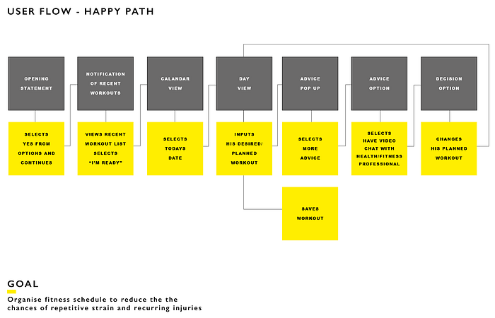
Before producing a paper prototype.
Iteration

Usability testing
I began testing with a number of users including Panos, I quickly discovered that I had it all wrong.

The issue was that it was taking several screens before warning that a potential workout would not be advised. “Why has it taken 6/7 screens to tell me I cannot do the workout I want?”. Users would then be given information plus extra advice from a live chat with a health care worker to discuss further.
I reworked the user and wire flow based on this changed of concept where the app would take the lead from the start and guide him to the best workouts from the outset.


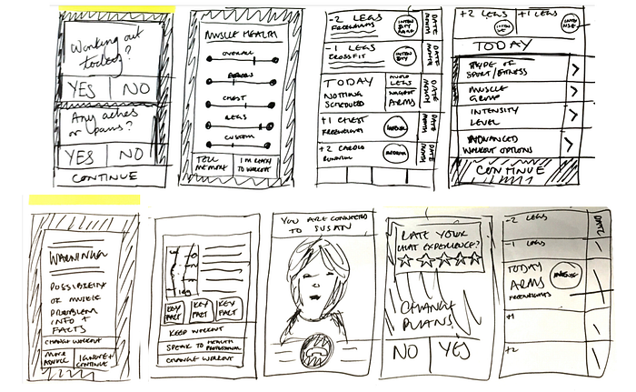
Paper prototype version 2

Following another round of usability testing and implementing changes I moved to develop the mid-fidelity version using Sketch, Craft and Invision.
Often results would come back that I would then need to clarify with my user. As I was only designing this app for his needs alone, his view and opinion were key.
Key iterations


Visual design
I had one eye of the visual and brand identity throughout. Apple, Nike and Adidas were my brand affinities and tied in nicely to my user’s style. Clean, white space, bold fonts and pops of colour.


I wanted a bold font for the heading plus a script handwritten font for personal messages. The Gill Sans family is a classic that offers a wide variety of fonts so I chose that for the body and button styles.

Final prototype
Link to a clickable prototype (InvisionApp)
https://invis.io/R2PHNEODVWK
Conclusion
Whilst I don’t believe in its current state it would completely prevent injury I do think it would work in preventing him from overloading certain muscle groups considerably if the data entered is accurate which would decrease the chances of injury.
Next steps
More testing is required. Aside from some of the wording in places, I’d like to explore the flow, add in the injury history, education and tie it all together.
Visually it needs cleaning up with more white space and separation needed. It still feels a little cluttered. And I’m not completely convinced by the colour pallet combinations. Introducing the secondary colour in places may help when more white is introduced. Also, photos and bringing it back to my brand affinities may help.
Idea wise I would love to expand it further and open it up to be designed with more users rather than just one. I’d like to involve a design team and explore involving sports scientists, personal trainers and similar sports specialists to advise and develop the idea further [ wish to join the team?].
I think the education side needs to play a big role in the app to educate the users and greatly improve the ways in which they exercise, understand their bodies better and tailor their workouts to their specific needs or problems.
Thanks for reading. Feedback is welcomed and encouraged so please share it. I’m also happy to answer any questions you may have.

