Mobile First, Desktop Worst
An op-ed from the front lines of product design at MetaLab.
First, a disclaimer: the subject of this article is Mobile First in the context of design process, not development. We cool? Okay, nice. Let’s jam. 🤙
You know what really gets on my nerves? Mobile First. Or, more accurately, the misapplication of Mobile First philosophy. Let’s take a look at Exhibit A:

This is a beautiful illustration of how Mobile First can be twisted into a design approach I’m calling “Mobile Everything”. I frequently use this menu in Google Drive to toggle between “Docs” and “Sheets” and you may have used it before too. In fact, I wouldn’t be surprised if that hamburger icon is one of the most frequently used affordances in Drive’s entire UI.
Now, before I go any further let me clear something up: the purpose of this article is not to debate the merits of the hamburger icon. I don’t care about the hamburger icon. I really don’t. We’ve got bigger fish to fry.

What irks me about this UI is that it wastes my time. There’s plenty of space in the top navigation bar for the Docs, Sheets, and Slides links to be displayed directly inline. Instead I have to open a drawer every time I’d like to switch context. In an ideal world this desktop UI would be designed to accommodate efficient switching between these major screens by making them always one click away from each other instead of two.
There must be a good reason for this though, right? If only we had a way to understand Google’s design decision making process. Well, we’re in luck because Google has Material Design: their incredibly comprehensive and ambitious system of digital design principles, components, and guidelines. Here’s what Material Design says about Drawers (emphasis mine):
When there is insufficient space to support tabs, side navigation is a good alternative. Side navigation can display many navigation targets at once. A drawer remains hidden until invoked by the user.
That’s a head scratcher because there definitely is room in the navigation to display tabs for Docs, Sheets, and Slides. Material Design’s guide goes further, though, stating that Drawers are recommended for (my notes in italics):
- Apps with many top-level views
Docs, Sheets, and Slides makes 3 top-level views, not ‘many’. - Enabling quick navigation between unrelated views
Not as quick as inline would be. - Deep navigation structures
No ‘deep’ navigation structure here. Again, there are only three top level screens. - Reducing visibility of infrequent destinations
Seems like a stretch that Docs, Sheets and Slides are infrequent destinations.
So why is Google’s design letting me down? Why are they violating their own design guidelines? Making assumptions about other’s decisions is a risky business but if I had to guess I’d say Google’s designers didn’t choose to use this design for desktop because it was objectively the best user experience for the context — instead they probably chose it because it was uniform with their mobile experience; because having a single, unified, responsive UI pattern across all devices and viewing sizes was desirable.
Mobile first in everything. Mobile first in terms of applications. Mobile first in terms of the way people use things.
—Eric Schmidt, as Google CEO, on their Mobile First philosophy

One-size-fits-all doesn’t solve a real user problem
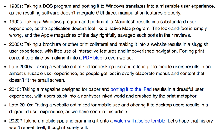
In 2009 Microsoft launched Windows 8 — an update of the Windows operating system aimed at establishing a beachhead in the rapidly growing mobile industry. One of Windows 8’s major new features was to provide, within a single operating system, a UI that could interchangeably support both traditional desktop (cursor) and tablet (touch) use. Without going into any detail, the OS is was infamously convoluted — particularly on desktop computers.
“Looking back at Windows 8, it’s easy to see where Microsoft went wrong. It was a giant bet on touch-based computing, but it made using a PC with a keyboard and mouse awkward, frustrating, and outright confusing.”
— The Verge
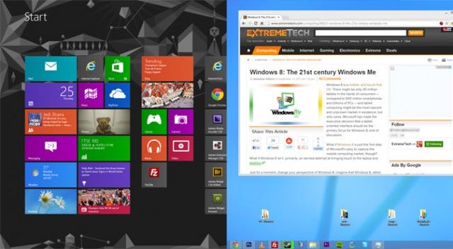
I don’t think there was anything inherently wrong with Microsoft’s idea to creating a hybrid OS. It was the poor execution of Windows 8, not its fundamental premise, that was probably its single greatest weakness. In fact, Windows 10 has had a much more positive reception than its predecessor despite being built on the same premise.
But why, besides their pursuit of a slice of the mobile pie, did Microsoft create their Windows 8 Frankenstein in the first place? What user problem was their hybrid cursor/touch UI solving? None. It isn’t a user problem. The vast majority of people don’t care about the nuances of OSs, UI systems, and design languages. Users just want products that intuitively work and many people happily use various combinations of Apple, Google, Microsoft, and third party software in their lives without a second thought.
The actual user problem is this: digital products are often confusing and hard to understand. Designing a one-size-fits-all UI can be one way of attempting to address this problem, using uniformity to deliver an identical experience across various devices and contexts. This is hard to do well, though, and more often than not is executed clumsily, resulting in a shoddy user experience.

What does it matter, for example, if an Apple Watch and a MacBook Pro have different UI’s, as long as they both provide exceptional user experiences in their own context? The pursuit of a platform agnostic UI doesn’t map neatly to a digital landscape filled with a wide array of different devices, screen sizes, users and, most importantly, input methods. As much as we want to apply order and consistency to the world, it’s important to embrace the fact that it is staggeringly complex and filled with inconsistencies.
So if one-size-fits-all UIs really can be so problematic why are they so common, especially on the web? Why does Google Docs use a mobile pattern on desktop? I believe one of the root causes is the misinterpretation of Mobile First. When a designer interprets Mobile First as meaning mobile is best, the decision to use mobile designs in desktop environments seems like a reasonable, logical leap — it plays into designers’ innate desire for elegant, ‘unified’, one-size-fits-all solutions. At worst, when Mobile First is abused it can act as an excuse for laziness — saving designers and developers from having to create separate UI for desktop and mobile — and at best it can act as an excuse for justifying holy-grail-like ‘unified’ design solutions.

Mobile Minimalism, Desktop be Damned
Two of the major constraints that have informed mobile design up until this point are: a) relatively small screen areas and b) touch interaction. As a UI designer there’s nothing you can do to get around these. There is only so much information that can reasonably fit into a small screen, especially when taking into account the fidelity of touch interaction: we have stubby fingers.
These constraints place an onus on designers to keep mobile UI’s as simple as possible. In a sense, minimalism is built into the fundamentals of mobile design by practical necessity. How can you communicate information and enable functionality effectively when real estate is at such a premium? Various hallmarks of mobile design reveal some of the answers: liberal usage of icons, breaking apps into lots of screens, disclosure menus, drawers, and so on. Many of these UI patterns are reasonable compromises when it comes to mobile user experience: they may not be as clear or efficient as they might be on desktop but they mostly work.
I have no bones to pick with the lion’s share of these approaches — especially in general terms. In the right context and with the right execution, many common mobile patterns are perfectly effective. I also don’t think it’s worth covering here some of the areas where mobile design has been especially problematic (iOS’s shake-to-undo, anyone?). What does bother me is when mobile patterns are leveraged in the desktop context for the sake of aesthetic minimalism. These patterns were developed in a state of compromise, occasionally trading clarity and efficiency for space. Yet, when there’s plenty of space to use on desktop, there’s a Mobile First temptation to continue hiding elements and menus behind icons, to aggressively truncate content, use single column layouts etc. because they look simple and nice.
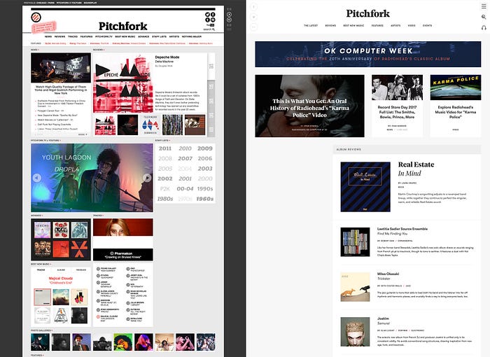
I’m overdue for an example here and I’ve already covered hamburger menus — the low hanging fruit. Let me take aim at a something new, using a website I personally have spent a lot of time interacting with: Pitchfork.com. Although this example is fairly specific to my tastes I wouldn’t be surprised if there’s a website you frequent that has similar attributes. When Pitchfork rolled out a redesign of their music website in 2016, my heart sank. Aesthetically it was a leap forward for their brand and the new design felt contemporary and fresh. Functionally, however, the site’s information density on desktop had dropped dramatically; employing what is clearly a mobile, single-column-inspired, responsive layout. Where I used to be able to hit their home page and, at a glance and with minimal scrolling, see a diverse cross section of content I now could only see a few stacked cards. There are plenty of things the new design does well but it’s still a great example of the “mobilification” of desktop.
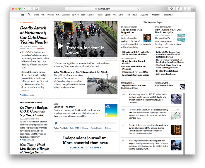
It’s important to acknowledge that the examples of Pitchfork and the New York Times are specific to the news domain, where information density is arguably of particular importance, but I still think there is a common kernel of truth to what they illustrate: minimalism and Mobile First taking precedence over function and medium in the desktop design space.
Now listen, I love minimalism. But I have to argue there’s a happy middle ground that can be found on desktop that takes into account simplicity as well as clarity and efficiency. A large desktop screen can be filled effectively and have white space at the same time. I’m not saying it’s easy but it can be done. Look no further than Vox Media’s redesign.
Jack of all Trades
Frank Chimero has a fantastic essay titled The Web’s Grain in which he muses on the practical and philosophical underpinnings of responsive design. One of the most interesting ideas he describes is what he calls “edgelessness”: screens are essentially just view-ports into flexible systems of information. There are so many different screen sizes now that worrying about specific dimensions has become meaningless. I love this idea because it implies that what is most important isn’t the screen size itself but the context of how information is presented. Digital design should be responsive, but not just in the sense of being malleable (like content stretching and contracting to fit various screen widths). It should be responsive in the sense of reacting to user’s context and displaying what is optimal given not only the available screen space, but use case, input method, device and so on. Frank articulates this complexity well:
Clearly, convergence and simplicity make for poor goals. Instead, we must aim for clarity. You can’t contain or reduce the torrent of technology, but you can channel it in a positive direction through proper framing and clear articulation.
Imagine you’re starting a new business. You’re going to sell a line of tools but first thing’s first: you need to create your first design. You chose to start with a screw driver. As you begin to design, you encounter a host of detailed decisions: should it be Philips or flat head? What size should the bit be, big or small? Should it be powered? Should it fit into a tool box or a pant pocket? The only way to answer these questions is to look at the context of where the tool is going to be used (by who, why, how etc.) and design accordingly. So, you talk to a cross section of people who use screw drivers and it turns out they mostly use: a) large screw drivers and b) screw drivers that are part of compact, multi-tools.

The large screw driver style has its benefits, like a large grip that provides easy leverage for twisting and length for reaching into cramped spaces. On the other hand the multi-tool screw driver is compact enough to fit in anyone’s pocket for impromptu use. Neither design can be said to be objectively better than the other, they’re simply different. Each is useful in the right context.

Alas, creating a single simple screw driver design simply won’t do — you’re just going to have to make two, one large and one compact, to satisfy both use cases. Not only that but each will need its own unique design optimized for it’s own context, requiring various differences in materials, features, and form factors.
Bear with me here as I tie this back to digital product design. I’m going to make a little leap. Let’s say the context of using large tools is similar to that of UI on desktop (where size and space aren’t major constraints and there is a user need for comprehensive functionality and precision) while the compact, multi-tool context of use is like UI on mobile (where space is at a premium and there is a user need for convenience, even if at the expense of fidelity).
If Mobile First design philosophy were applied in the domain of physical product design, the implication would be that you should design the compact, multi-tool screwdriver first. The compact design could then be used to inform the design of a larger version. Why? Because it allegedly is best to ladder-up in complexity (see, progressive enhancement vs. graceful degradation). This idea is, however, is based on the assumption that there is a consistent, linear relationship between complexity and form.
Thinking outside the (small) Box

I don’t believe it is possible to state that there is an objectively “right” starting point for this design project, let alone every design project. I understand much of Mobile First’s rationale: that mobile is becoming vastly more popular than desktop, for example, or that mobile is conducive to building simple designs up from basic building blocks and components. I just don’t think these arguments are strong enough to support universality. Your starting point should be determined on a case-by-case basis and be based on the context of your product and user needs — heck, even your own needs as a designer — but not by a single, immutable framework.
In the case of a project where both desktop and mobile are in scope, and of roughly equal importance, my personal preference is to begin the design process with desktop (surprise). I find having a bigger canvas challenges me upfront to deal with greater complexity and, in turn, forces to me to think more creatively. I find the constraints of mobile hamper my thinking; from the outset I’m bound by a reductive mindset that causes me to be constantly preoccupied with what I can tuck away, remove, or find some workaround for. I’d rather start big and blue sky, not worrying about the edges of the canvas. I can easily edit and whittle my designs down, removing what isn’t necessary, but I can’t bring designs into being that I never had the space to imagine in the first place.

This is what I like. It’s not objective. If you prefer the structure and clarity that mobile provides; if the constraints help you think MVP, then start there! Just keep in mind that — whichever order you prefer to design in — both mobile and desktop designs should get the TLC they need in order to be great in their own context, and not just a rehash of where you decided to start. Mobile First should not be taken as an opportunity to over-simplify and, by the same token, Desktop First should not be taken as an opportunity to pile on complexity.
Be Consistent not Uniform
Much of this article has been circling a simple, common design adage which I haven’t stated explicitly yet because it’s practically a cliche: form over function. Digital product design should be responsive to the user, giving the the right function, in the right form, for their context. This is the antithesis to Mobile First to some degree, which implies (at least when misunderstood) that the form of mobile can apply to, or at least inform, desktop design.
Yes, addressing Mobile and Desktop individually and on their own terms will often mean more design work. Yes, you might need to rethink your perfectly-responsive, scaling, uniform, Mobile-First-with-a-hamburger-menu-on-desktop design. But don’t wring your hands! Everything is going to be okay because what’s truly important in product design is consistency, not uniformity. This is what makes many brands successful — they sell an array of different products which, despite having major differences in form, all feel and function similarly. In the domain of tech an obvious example is Apple — especially in the case of their hardware (the principle, however, applies just as well to software). Apple sells various laptops, smart phones, tablets, desktop computers, smart watches, and accessories that all manage to feel part of the same family. This is because their design approach is consistent. When you see, touch, or use an Apple product you know it’s Apple regardless of whether you’ve encountered that specific device or UI before. This idea is articulated well in Gov.UK’s wonderful design principles :
#9 Be consistent, not uniform
We should use the same language and the same design patterns wherever possible. This helps people get familiar with our services, but when this isn’t possible we should make sure our approach is consistent.

You don’t need to get hung up on everything looking and working exactly the same way. Don’t cut corners, either. It’ll be hard work, but try to focus on using design to properly address each context your product will encounter: different users, use cases, input methods, devices and more. This isn’t about Mobile First, or Desktop First. This is about putting Function First and allowing form to follow.
Join us for more design news, tools and updates.

