Milanote’s tutorial, onboarding users the right way

TL;DR
Milanote is a tool for planning creative projects, and their tutorial is well done. It shows users key features while leaving them wanting to discover the rest on their own. It has almost no text to read, they don’t front load their entire tool onto you, and they reinforce learning through use.
Recently I had to brush up on best practices to create a tutorial for employees that were onboarding onto an admin tool. After which it was easier to see when onboardings were boring and hurting the experience of a user or when they were well done.
Milanote is a collaborative and cross-device tool with an infinite workspace to plan creative projects.
I am reviewing Milanote’s onboarding. I am focusing on the tutorial of the app itself, they do have a couple of screens after the signup that are imho not necessary and prevents the user in getting where he really wants to be, exploring the core purpose of the app.
An Engaging tutorial
After signing up we get a simple task to execute.
1 easy task, nothing else, and the rest of the screen is greyed out so they make it super easy to focus on that black tooltip.
They don’t tell us what this board is for, what it will help us do, but in that sentence “Drag out a new board from here to get started” we have, the most important action needed to use Milanote “drag”, and an idea of where all the tools are “from here”.

From the first sentence they give the power to the user to start interacting with the tool. This is a good way to reinforce learning through use and will allow users to easily remember what to do next time they log on rather than giving them an overview of all the tools.
Ok, we’ve dragged that board onto the canvas. Now what?

We are just exploring the app for the first time, and we don’t have a specific use for it yet, so giving us a couple of examples helps us out.
But wait… Those examples are really close to what I actually do, how do they know? Does that have anything to do with those first screens?

It does! I did another account to test it, and they change their examples based on how I “described” myself at the beginning. It’s subtle and makes us more immersed into the whole tutorial, I did not think twice about . Who says that personal data was only used to harm? Way to go Milanote!
Now let’s write in our board name.
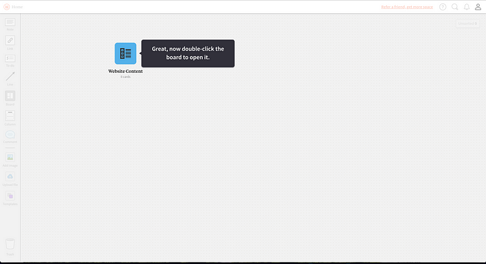
Another great copy! Positive reinforcement, an important action that we will use in the future, and they give us a sense that the board will contain something, and we should open it.
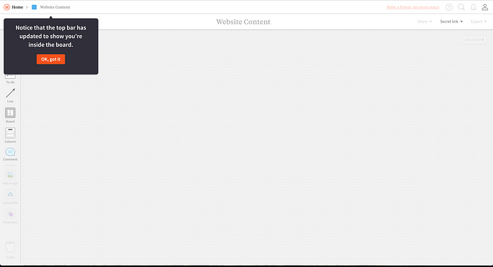
Actually we didn’t notice that, so it’s nice to point it out. It reinforces our understanding that there are deeper levels in the app other than the first canvas we saw.
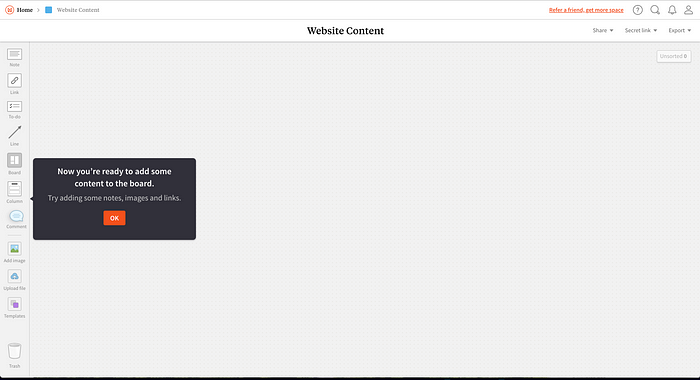
“Now you’re ready to add some content on the board”. Well we should feel ready, we have accomplished so much to get here. Although it is not super clear if the tutorial is done, they give us a clue by removing the grey layer over the whole app telling us that we are free to explore.
And here is when Milanote does something very well. They were very careful to not front-load everything that the tool had to offer. Front-loading is teaching the user everything at the beginning. This would be counterproductive because it would overwhelm the users with information that they do not need at the moment while making them less engaged with the app. Until now we have explored key parts and actions of the app but there is (hopefully) more things to learn.
Explorative Learning
From now on, every new element we drag from the right sidebar, we get a tooltip that gives us a small note and sometimes a tip.
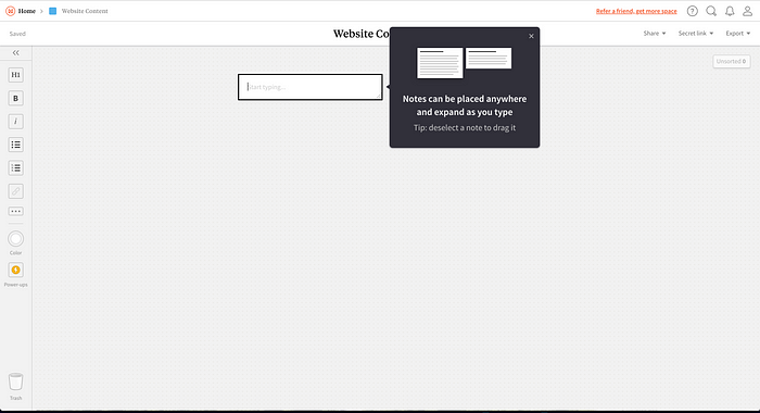
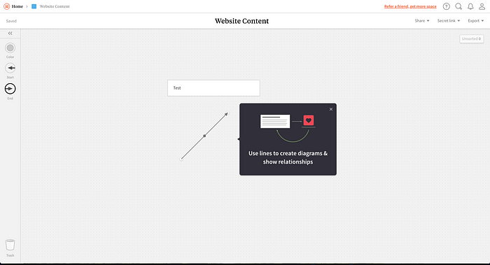
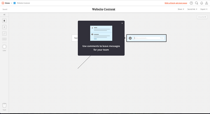
This helps users explore the app like they want and continue discovering new features while they are creating their own project boards.
Ongoing learning
They know that the users will need a super slick easy transition from [enter one of thousands project management tool] and thus they have some key elements where they can help users make the best out of their tool.
- Shortcuts: These will help power users create boards faster and be more efficient overall while using the tool.

- Relevant tips: small pieces of information that will help users to explore the totality of the app in a non-invasive way.

A few things to consider
- Skipping tutorials: some people don’t like to be told what to do and want to explore on their own. The only way to avoid the tutorial is to reload the page or to come another time, which is not obvious for your everyday user.
Their mandatory tutorial is useful to show the basic interactions but it constraints the user to go through it. One consideration that could be made is to add an escape button (or x) to skip it. - Show Progress: There is no way of knowing how long the tutorial will last and thus, users don’t know how long it will take them before they can go on their own. It could be useful to add steps numbers like “1/4” just to let the user know that the tutorial is quick
Conclusion
Milanote’s tutorial is well done. It shows users key features while leaving them wanting to discover the rest on their own. It has almost no text to read, they don’t front load their entire tool onto you, and they reinforce learning through use.
Milanote is something “new” and exciting. Can’t wait to test on a new project. Have you tried it? Let me know in the comments!
If not, start here (my referral link to get me more notes, I need the notes… )

