
What happens when you will not make a good first impression? Usually, just a few seconds decides if you will like a person or product. If you will lose the chance it will be much harder to catch up it later.
⚠️ THE ICONIC is now App Icon Templates for Sketch. You can get every App Icon Template you need.

THE ICONIC Bundle is currently sold out.
In the digital environment, App Icons are the fundamental element that establishes this impression. However, it is hard to remember all patterns, the platform guidelines and remain enough creative to design unique asset. Like many other designers, I was also struggling with the mentioned challenge. This is how the idea of THE ICONIC — App Icon Compendium was born.
💡The Story Behind The Idea
As a designer involved in the creation of a multi-platform product that includes native apps for iOS, Android, macOS and the web one, I focus on delivering a consistent experience across the whole solution. It does not mean that I make all apps identical, every piece of software has to match the native platform guidelines. I believe that this synergy between OS patterns and consistency of all apps is the way to deliver a great product.
The experience of the app begins even before user see its first page. In most cases, it is the action of recognizing and tapping apps icon. Surprisingly, the App Icon design may be a really challenging part of the project. What’s more, like the rest of the app it should match both platform guidelines and the look and feel of the solution’s brand.

The world of App Icons is very differentiated, every platform has got its own style and asset guidelines. Moreover, icon guidelines are spread around the internet.
I have found that there is no single source where you can find all needed icon templates, validate them, and check if you made everything right to maintain the high-quality asset. Until now, because THE ICONIC has a mission to help designers creating marvelous icons of their apps.
🛠 The Craft of App Icon Designers Is Hard
We all witness badly designed icons. We see them every day in the App Stores. There are some reasons for this.
The first, While most of clients and stakeholders are familiar with the shape of iOS App Icons. It is sometimes hard to explain that another platform requires different shapes and a bit modified look and feel. The stakeholder may suggest creating icons with the identical look across all platforms.
Next, some people think of the icon as if it would be a logo, but it’s not. Logos can have various shapes, icons are usually limited to square like shapes. Icons are platform dependent, while logo should be universal. It is obvious that icon should follow brand identity guidelines, but it is important to remember that it is not the next logo visualization.
Finally, App Icon Designers have no control over the surroundings of created asset. Users love to change colorful wallpapers. We have to try to predict how the icon will interact with them.

🔍 Searching for The Solution
Every app deserves the great home screen icon. It is especially challenging to create great assets for multi-platform solutions.
Creating the assets from the ground may be a time consuming and redundant work.
I have tried to find good assets on the internet, but have realized that they are inconsistent. Some of them were not updated for the latest OS. Some of them did not follow the guidelines of the platform completely. There were also some that were implemented with errors.
🚀 Meet THE ICONIC — App Icon Compendium.
The idea was simple — to create the place where a designer will find everything needed to design high-quality icons. The compendium should be updated, so the designer will not worry that used assets are outdated. There should be also an easy way to check how the icon appears on multiple backgrounds. The ability to verify if designed asset matches platform patterns was also a must.
After research and a couple of months of work, the world’s first app icon compendium is ready.
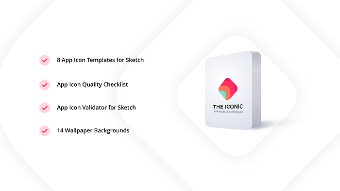
THE ICONIC includes:
- 8 High-quality App Icon Templates — designed for Sketch, they are prepared for all major platforms (iOS, Android, watchOS, macOS, iMessage, tvOS, In-App Purchase, favicon). Every template includes platform-specific color schemes and over 60 predefined shapes to kick-off design.
- App Icon Quality Checklist — prepared for Numbers and PDF. It contains over 60 checkpoints for general and platform-specific aspects of icon design.
- App Icon Validator — Sketch file that allows us to check the appearance fo the icon over various backgrounds in just a couple of seconds.
- Abstract Background Wallpapers — bonus materials that may be used to validate created icon.
What’s more, every user of THE ICONIC gets also 35% off for SQUID UI Flow Template for Sketch.
❓Why should designers care about the quality of App Icons?
If you will treat the home screen like the most valuable real estate of the particular platform then App Icons are the doors to the homes of digital products.
Speaking in the language of architects. Every settlement should have consistent entrances, but every householder takes also care of its uniqueness. It is similar to icons, as I mentioned earlier it is important to embrace connection between the app’s brand and platform guidelines.
“App Icons are the doors to the apps”
When you think of someone’s home your mental model usually focuses on the facade of the building, not on the interior in the first place. When you ask customers to draw on paper what apps they use, they will immediately sketch the icons.
This makes App Icons one of the most important parts of digital products. Look at the featured or most popular apps in the App Stores — they are all high-quality designs — carefully crafted to make a great first impression. They encourage us to tap them and download the app they represent.

🛡The quality guard for your App Icon design
THE ICONIC is a complete toolkit for App Icon Designers that includes resources for all major platforms. It solves the issues mentioned earlier. It contains consistent app icon templates, quality checklist, icon validator and other helpful assets. What’s more, it will be updated with a new content: other platforms or the updated platform-specific content.
Summing up
Taking care of the app’s experience begins with its home screen icon. If you are like me — you would like to maintain high quality and save time when you create app icons, I believe that THE ICONIC is created for you.
Feel free to discover THE ICONIC on the official website. If you would like to get it with additional 17% discount you are free to subscribe to the UXMisfit.com newsletter. The discount on the subscription works forever (not only for the first payment).

