Margins in Design — A Systematic Approach
This article is a translation, check out the original here.
Translator’s note: this is my first translation, so if you find any discrepancies or have recommendations on how to improve this article, please let me know. Any feedback is greatly appreciated!

Hello, we are Kelnik Studios, an interactive agency from Saint Petersburg, Russia. We often work with large projects, such as corporate websites, developer projects, and fancy interfaces for touch tables. To speed up the development process, we come up with various systems that help us keep everything in order. One such system deals with managing margins and indents between blocks.
Here’s a problem: margins on the website don’t match the mock-ups.
Designers often get upset with the way their designs turn out on the actual website. For them, seemingly unnoticeable differences such as a five-pixel shift, greater line-height, or incorrect border radius matter a lot.
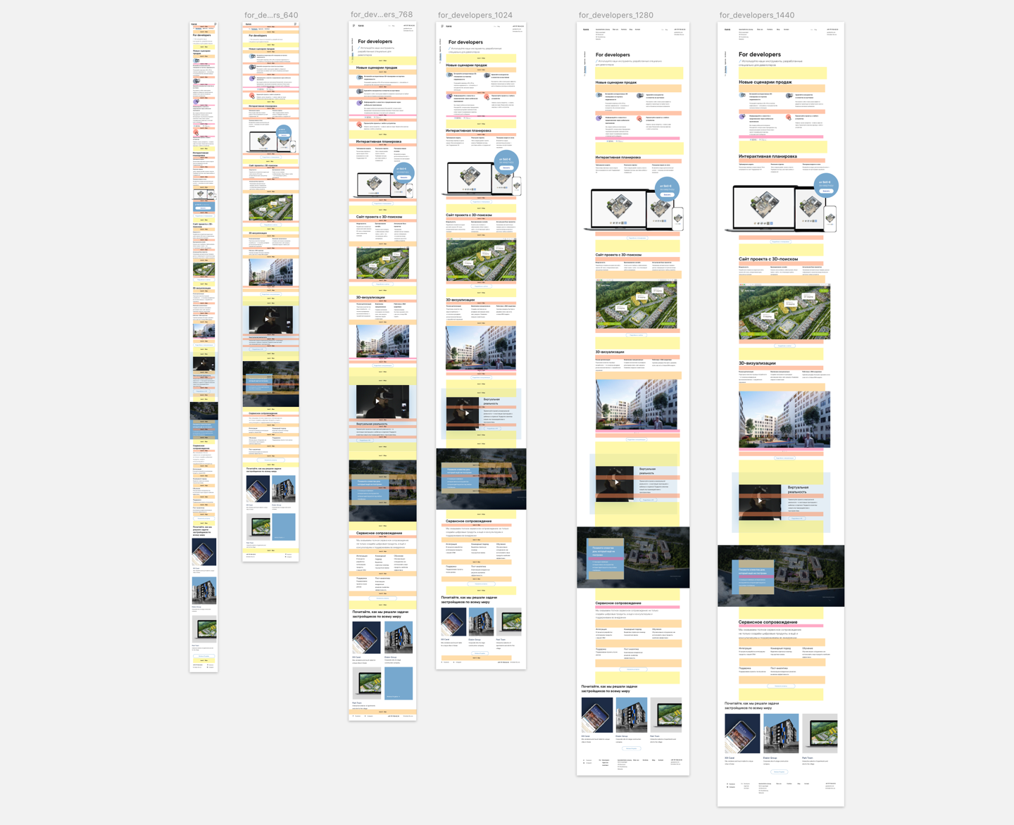
One of the most prevalent mismatches between mock-ups and the actual layouts are margins between blocks. Indeed, this may look quite awful:

That happens for a few reasons and they are not always under control of either designers or developers.
Sometimes, for example, if a header is located under an illustration, designer decides to push it farther down (which he would not have done if the header was under a paragraph). Developer, however, may not spot designer’s decision and as a result, doesn’t increase the margin on the website. We can’t blame him for it, since it’s not even his job.
Or, sometimes, something might change on the website’s layout. For example, somebody moves one of the blocks without referring to a specific mockup. Why might this happen? Well, imagine it’s Friday afternoon and all designers have already left the office to get some mojitos. The client, however, wants to do a “few quick changes” and deploy the website asap, but there’s no one in the office except some development intern. He is doing his best to get the work done, but there’s only so much he can do.
Or, sometimes, a designer loses track of all the inconsistencies in the mockups. Imagine, for example, that as he is dragging down a block, his hand accidentally flinches and the block shifts lower than it should be. Or, maybe, he forgets to document an important change. Developer, in turn, may either not understand the new connection between blocks or omit the undocumented fixes.
So, how do we tackle this problem?
We used not to have a systematic approach for the solution. If we happened to run into significant differences between the mock-ups and the layout, we would fix the problem locally.
Designer would create a bug report and developer would fix everything according to the checklist. A bug report could say something like “text in this spot got ‘stuck’ to the illustration” or “label here got attached to a different input”. Oftentimes, designer would sit with developer and they would correct the margins together, of every block and on every screen resolution.
Since we didn’t have a system, we kept on running into the same mistakes every single project.
Designers would go on rants about the importance of vertical rhythm, rules of inside / outside and overall set up of the elements on the page. Developers rant about BEM and margins on the web. They would come up with entire lectures on “layouts for designers”. Unfortunately, both teams were two concentrated on themselves and didn’t try to reach the common ground.
It became clear that we needed an instrument that would be comprehensible for both designers and developers.
We came up with the solution: a system for vertical margins.
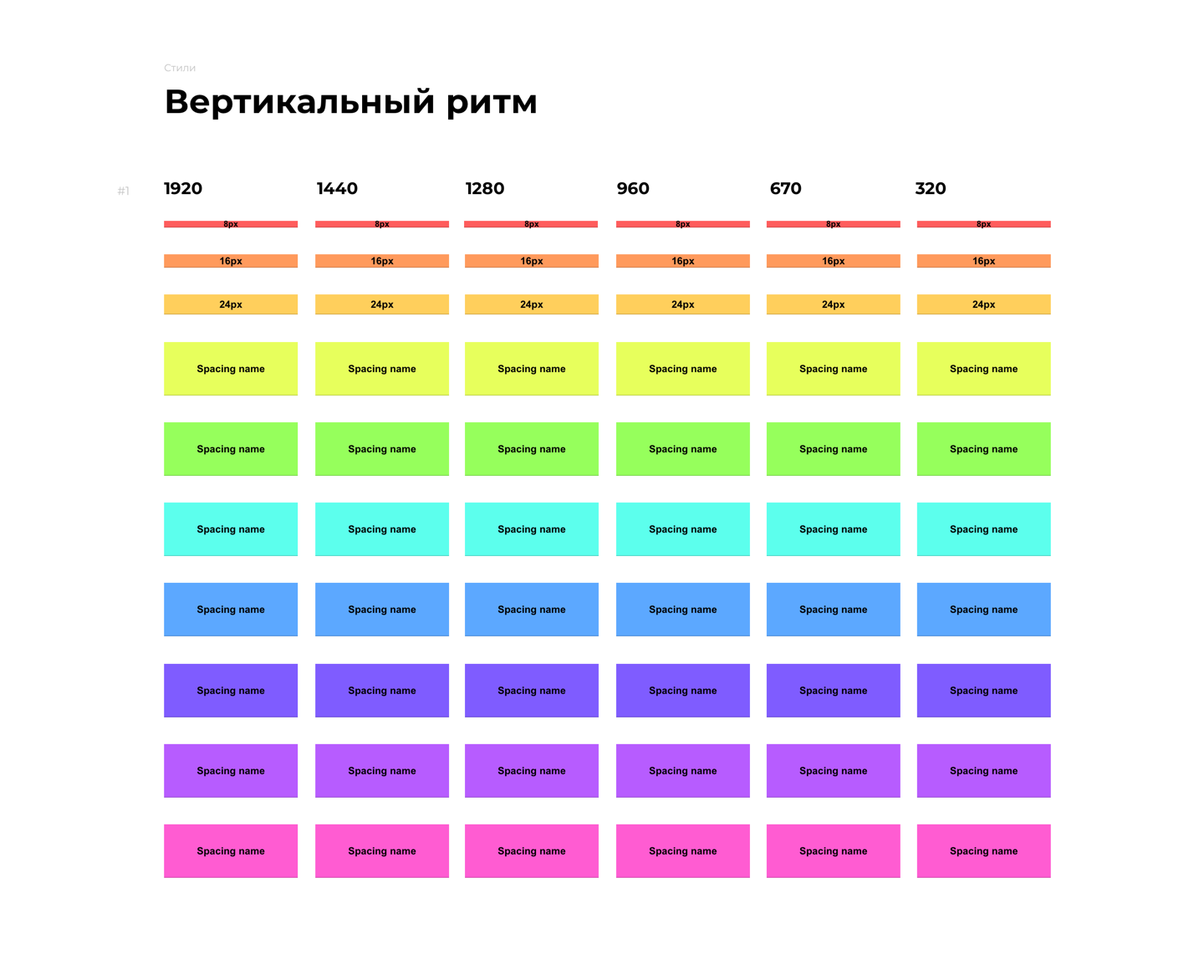
If we take a mock-up or a website layout, break it into elements, and look at the vertical margins between them, we will see a pattern. It’s uncommon to have a lot of variously-sized vertical margins on a single website. For example, Yandex landing page has only 4 of them and Apple has 8.


In our next project, we tried to clearly mark the margins. We created a new page in our guide, wrote documentation on vertical margins and showed how to use them.

Developers approved this approach and as a result, a system of vertical margins was born. Here’s an insider look on our new mock-ups:
After our first project, neither designers nor developers understood how much the system would ease the layout set up. A few projects later, however, we polished the system and made sure that it indeed works. Our system is especially useful for larger websites, where there are a lot of informational pages and each of which has to be constructed according to a specific template.
So, how does the system work?
All elements are grouped into blocks, and designer comes up with rules to construct these blocks.

Loosely speaking, we decided to set vertical margins based on levels. Level one is the smallest margin — for example, a margin between an h4 header and a paragraph or between an illustration and a caption. Second level margin is a little bigger and is used between two blocks, etc.
Although these blocks may be used for various purposes, they always have the same appearance. Connections between blocks are now visual — a developer looks at the mock-up and sees right away the designer’s patterns. As a result, designers draw mock ups more carefully and developers can easier pick up designers’ ideas.
Designer’s guide to the system
We work in Sketch and for vertical margins, we use symbols. We already have a library that contains a standard set of vertical margins.
When designer decides which margins he needs, he takes the necessary symbols from the library and adjusts them to his heights and colors. Afterwards, he places margins on the page and groups everything in the Vertical Rhythm folder. For convenience, we have a small plugin which uses a hotkey to hide and show the folder.
Obviously, it takes some time to add margins on the page. However, while it’s quite tedious, it is worth it. Mock-ups look neater, and it’s easier to return working with them after a break. Moreover, if a new designer joins the project, he will be creating designs using the same system and later on, there will be no unexpected “surprises” for developers. As you can see, sustainability of the project relies on concrete numbers.
In addition, the system also makes it easy to create responsive websites, since margins change height according to each breakpoint. Every single one of those breakpoints has a predictable behavior. It’s possible to draw just one layout of a page, create margins there and not worry about other screen resolutions. Developer will easily be able to understand how the distances change, merely by using the guide.

Developer’s guide to the system
According to our team-lead front-end developer, Kolia Shabalin:
“In a guide, designer creates a table that contains breakpoints for all used margins. This table is the nucleus of the entire project. Everyone knows what to refer to, and that’s quite convenient.
We made an agreement with designers that in layouts, they divide all margins by color. For example, a green rectangle between header and sub-header corresponds to 72px and a red rectangle corresponds to 80px.
Our system allows us not to care about numbers. From now on, we only use colors. Why colors? Well, this greatly reduces suffering and allows us to get to work. Whatever color I see on the layout, that’s the color I am using. It’s as simple as that.
Every color has its own row in the table. Simply speaking, every color is a set of margins. A different color corresponds to a different set.
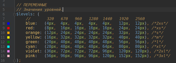
I wrote a mix-in that allows to get a hang of all these states. Our mix-in contains an away of states of every margin. It looks exactly like a table in the guide. The only thing I have to do now is call the mix-in and pass it the color I see on the layout.
For example:
@include margin-level(bottom, green); — this refers to a bottom margin, and specifies that it is “green” color. It doesn’t matter to me how many pixels this is, because the mix-in will take care of that for me”.
Result
According to our developers, it now takes 90% less time to work with margins. A developer spends 5–10 minutes to set the table in SASS and no longer worries about it. He doesn’t have to measure anything, he simply looks at the block color.
If you see the margin of level one, you use that margin. And so on.
There are, however, some side effects. While this makes life easier for the developer, the system adds extra pressure on the designer. It takes time to specify margins, group them, and create the guide. To save time, we add specifications only on unique blocks, not on all pages. All other pages are created according to the template.
Pros vs. Cons of the system
System of vertical margins works best for bigger projects with large number of layouts, for adaptive websites and for larger teams. It helps to make layouts neat and predictable..
As the volume of work increases, the effect of the system becomes more and more evident. If you have a small project or simply a landing page, the system will probably not be for you. First, it’s hard to sustain it and second, it takes some time to create it.
Author of the original article is designer Egor Gorokhov.
If you have your own system of working with the margins, please tell us about it in the comments section.

