
Making Sense of Device Resolution & Pixel Density
With the abundance of new tech devices it’s easy to get frustrated and confused about how to properly prepare assets for different devices. I personally started getting frustrated on a recent freelance project because I didn’t know how to properly setup image assets for iPhone X. So, I decided to create this article to help clear up some confusion.
I’ll kick this off by explaining what device resolution and pixel density are. I’ll follow up with how this information maps to Apple devices. Lastly, I’ll explain how this information applies to popular design tools like Sketch, Adobe Xd and Photoshop when trying to properly setup and export your assets.
Note: I’ll be focusing on Apple products throughout this article.
Device Resolution vs. Pixel Density
Resolution is the number of pixels on a device found in each dimension (width × height) that can be displayed on the screen. For example, a device with the resolution of “1024 × 768” has a 1024-pixel width and a 768-pixel height.
Pixel Density is usually measured in PPI (Pixels Per Inch), which refers to the number of pixels present per inch on the display. A higher pixel density per inch allows for more sharpness and clarity when using the device.
Apple Devices & Resolution Scale Factors
According to Apple’s Human Interface Guidelines, their coordinate system to place content on the device’s screen is based on measurements in points, which map to pixels in the display. For designers this means that on a standard-resolution screen, 1 point (1pt) is the equivalent of 1 pixel (1px).
High-resolution screens or Retina displays, on the other hand, have a higher pixel density and as a result, there are more pixels in the same amount of physical space. For designers this means we need to pay close attention to the device’s scale factor.
A standard-resolution image has a scale factor of 1.0 and is referred to as an @1x image. High-resolution images have a scale factor of 2.0 or 3.0 and are referred to as @2x and @3x images.

To drive this point home, suppose I have standard-resolution @1x image that’s 10px × 10px. The @2x version of this image would be 20px × 20px. The @3x version would be 30px × 30px. Easy right?
These are some popular scale factors as of this publication for Apple devices:
- iPhone X, iPhone 8 Plus, iPhone 7 Plus, and iPhone 6s Plus = @3x
- Retina displays and all other high-resolution iOS devices = @2x
- Standard-resolution devices = @1x
Generating Design Assets Properly
Now that we have a general understanding of pixel density and how scale factors play out on Apple devices I want to show you how to properly create your assets on Sketch, Adobe Xd and Photoshop.
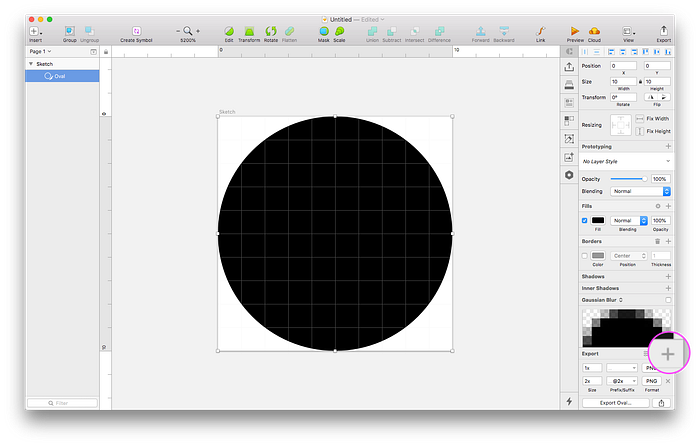
Sketch Workflow
Let’s create a basic circle shape in Sketch and export it at different scale factors for different devices.
- Standard-resolution = @1x
- Retina display (high-resolution) = @2x
- iPhone X = @3x

By default all assets exported by Sketch will be at a @1x scale factor even if you may be using a high-resolution device or Retina display.
To export your assets for higher resolution devices hit the “+” on the bottom right hand corner and Sketch will provide additional scale factors.
Adobe Xd Workflow
Let’s also create a basic circle shape in Adobe Xd and export it at different scale factors.

Although Adobe Xd’s export interface is a bit different than Sketch, notice that they both default to @1x assets. You can change this by toggling between the available scale factors.
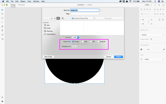
Note: As of this publication you have to manually export each scale factor.
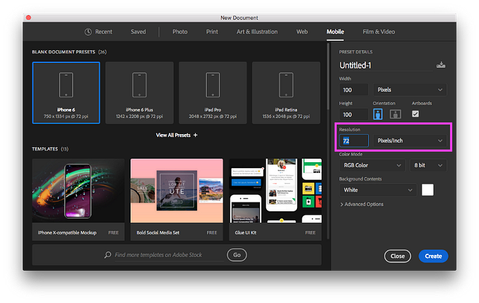
Photoshop Workflow
Working with Photoshop was the most confusing for me because it asks up front what the resolution should be. In addition, Photoshop works with raster images, which do not scale up properly when exporting for different scale factors.
So when working with Photoshop you must remember two things.
First, in a standard-resolution screen 1 point (1pt) is the equivalent of 1 pixel (1px), which means we will have approximately 72 points in 1 inch or (72px in 1in). All of your designs should remain at 72 resolution within Photoshop, which will be the equivalent for standard-resolution devices or @1x.
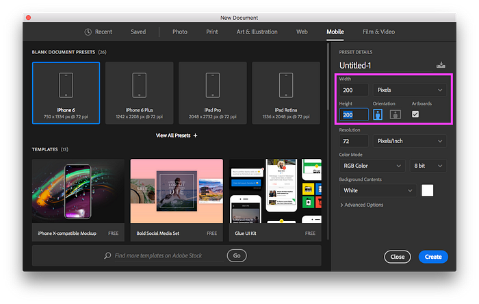
Second, to design for high-resolution devices multiply your width × height by your scale factor and leave your resolution at 72.
For example, if you want to design a 100px × 100px asset for both @1x and @2x you will need to create a Photoshop file at 200px × 200px to avoid pixelation.
And that’s it!
Final Thoughts
By now you should have a better understanding about device resolution and pixel density. You should also have an understanding of how the different scale factors map to Apple devices. And lastly, you should be able to produce the proper design assets for any device at any scale factor, whether you are using Sketch, Adobe Xd or Photoshop.

