Make Your Own Handwritten Font
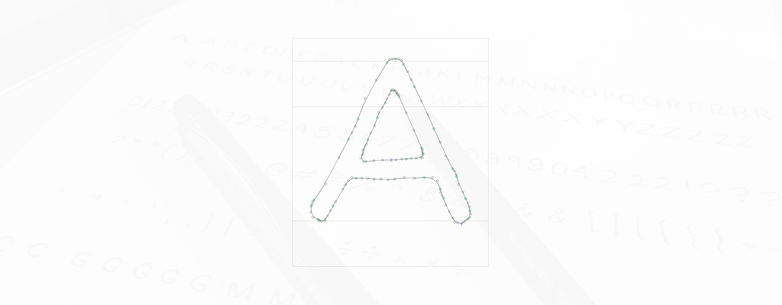
Designing a full on typeface can take months, or longer, depending on the designer and the vision behind the type. A lot of time can be spent developing the upper & lowercase letterforms, perfecting kerning, creating alternate weights, and adding diacritics & language support, etc. We’re talking a serious time investment.
However, designing a simple handwritten font can take much less time. We can shorten the process from months to days. I’m going to show some of the basics of how I created the original Aldi font, a project I completed in 2 days.

Ready to do get started? Schweet, let’s have some fun…
Note: We will be using a program called Glyphs to create our font, which I think is a Mac only program, so this exercise is for you Mac users. Sorry, PC homies…
Tools
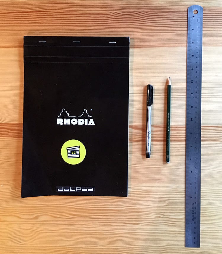
Drawing Paper
If you so desire, you can simply use some white printer paper, but I don’t recommend it. It will help to have some paper with some lines already printed on the page. I would suggest graph paper or a Rhodia dotpad (which is what I used for Aldi). Using the Rhodia, I found it handy to use a ruler + pencil to draw some straight lines across the page that marked the top and bottom bounding areas for my letters. This helps to ensure you get your character heights more accurate. Also, you’ll need an eraser handy.
Writing Utensil
Want some fat letters? Use that classic Sharpie marker. Looking to create some brushed letters? Experiment with a brush pen. Are you more into thin letterforms? Let me recommend to you the Pigma Mircon pens — they’re awesome.
I chose to use the Sharpie Pen.

Inspiration
Since this thing is going to be handwritten, you don’t necessarily need any inspiration beyond your own handwriting. However, if you desire to make your font more versatile and universal, you might want to consider taking some queues from popular fonts out there. I wanted Aldi to be a more classic, sans serif type. I used Gotham as inspiration for my letterforms. Why? Well, it’s tried and true and I like it ;)

Other Software
I will also make use of Photoshop and Illustrator in this exercise. If you don’t already have these, I think you can get a free trial of Creative Cloud.
Drawing
Let’s get right into it. Draw your letters out on your paper of choice. I recommend creating an all caps font, as this will enable you to complete this project faster. You may want to draw some letters a few times to get that “perfect” line or curve you seek…
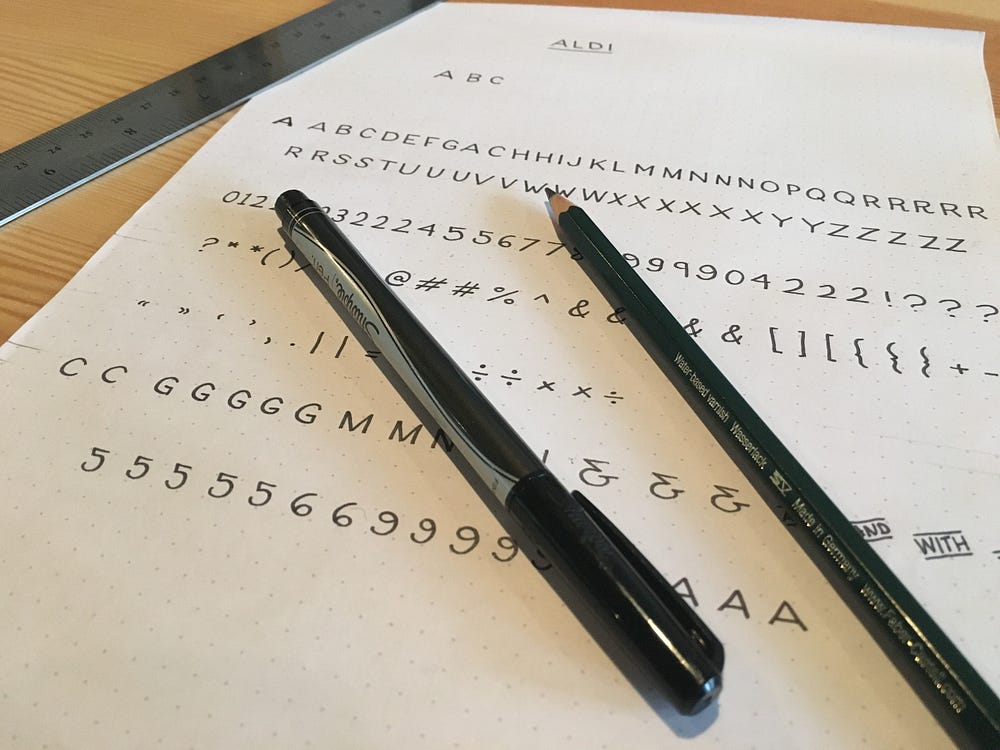
Note: Think about how designers might use your font in their work. Give them what they need. In the case of Aldi, I added numbers and some other basic characters like parenthesis, mathematic symbols, etc.
Importing
Photograph (or Scan) Your Characters
Alrighty, now you’ve got your fun-tastic, handwritten letters and symbols ready to digitize. Go ahead and erase those pencil lines you drew. A scanner would probably be ideal at this stage, but I don’t have one of those any more. Instead, I just took pictures with my iPhone and transferred them to my computer — Airdrop on Mac OSX makes this transferring of images fast and simple.
Note: If you want to collect more detail of your characters, take pictures of sections of characters up close. If you don’t really care all that much, just take a picture of the full page like shown below.
Editing Your Images
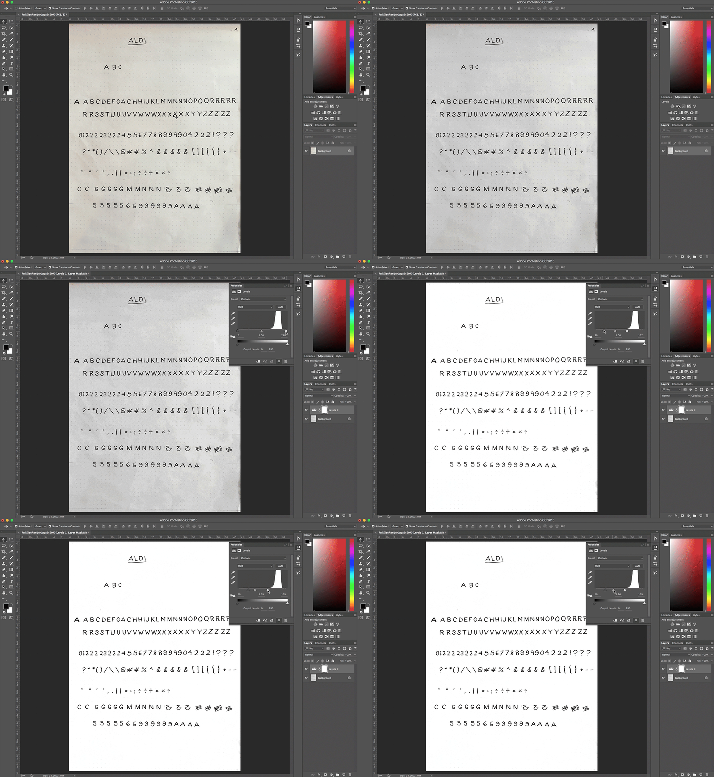
Now, these images might need some help in the way of contrast before the next step. If your photos are like mine, you’ll need to clean them up a little bit. Take your images into Photoshop, Desaturate them (⌘ + Shift + U) and use Levels to adjust your whites and blacks to get a nice high contrast. Save those images.
Tracing Your Images
Now it’s time to head over to Illustrator and import your edited images. Use the live trace feature to convert your images into vector shapes.

Delete all the white in your trace, leaving only the black characters.
Select All (⌘ + A) and Ungroup (⌘ + Shift + G). Delete any stray points. Go back through and group any character that is made of multiple shapes (like the % or “).
Note: You might need to use some guides within Illustrator to line up and/or resize your characters.
Check you out! You’ve got some vectorized letters made by your own hand! Wahoo! Now, on to making this thing into an actual type-able font…

Importing Vectors into Glphys
I’m not going to go into all the ins and outs of Glyphs in this exercise, but there are some very educational videos at GlyphsApp.com that can help answer many questions you may have after reading through this post.
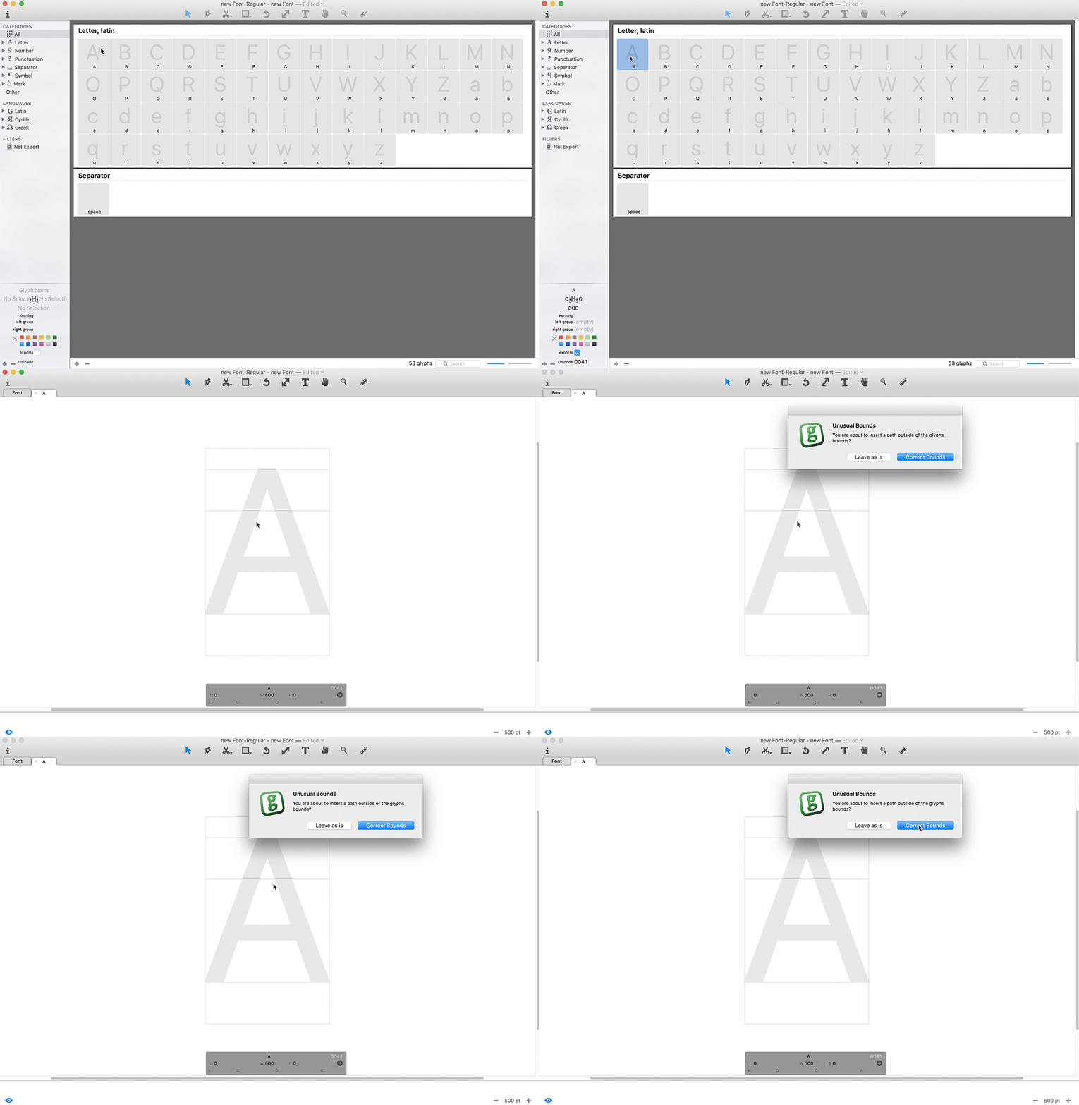
Go ahead open Glyphs and create a new font (⌘ + N). We’re going to be switching back and forth between Illustrator and Glyphs here, so keep them both handy. Go to Illustrator and copy (⌘ + C) your “A”. Switch back to Glyphs, double-click on the “A” and paste (⌘ + V) your letter in that window. (When that pop-up window comes up telling you about “Unusual Bounds,” just click “Correct Bounds”).

Update: There is another way to import your vectors from Adobe Illustrator into Glyphs that you may find you like better. This is explained in this tutorial from GlyphsApp.com.
Repeat this process for all the capital letters (and lowercase if you have them). We’ll come back in and fix the sizing later. Let’s just get all your characters in there.
If you want to add characters/symbols beyond letters, you’ll find a tool bar on the left that has some categories labeled Letter, Number, Punctuation, etc. Toggle the arrow to the left of the appropriate category. Find the sets containing the symbols you wish to pull in, and right-click. You’ll see the Missing Glyphs list appear. Select what you need and click “Generate” (If you need all the characters press ⌘ + A to select all; if you only need a few, just hold ⌘ and click the ones you want).

Repeat the same process you did for the letters for all the characters to import them into Glyphs.
Editing Your Font
Adjust Character Sizes
Now we’ll go back through and fit our characters to the appropriate sizes.
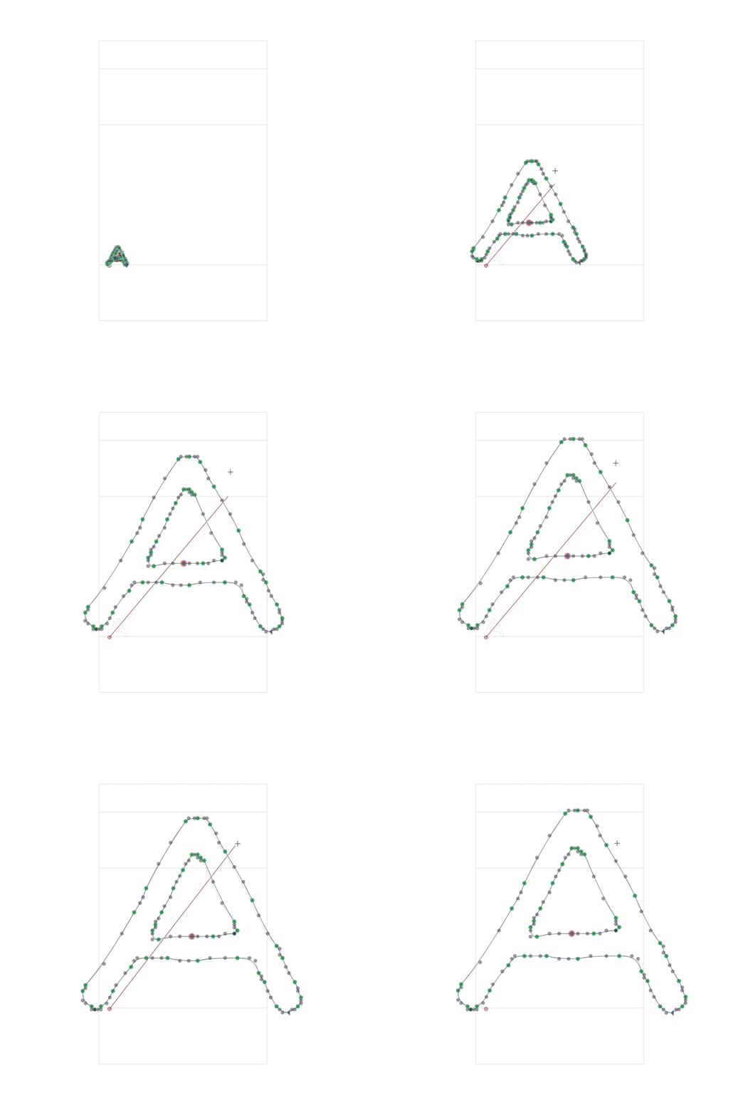
Let’s go back to the “A”. If the character box is way small, simply press ⌘ and + to zoom in.
Step 1: Line up the bottom of your “A” to the baseline.

Note: Any time you’re in this window, just press Spacebar to see the character filled in black.
Step 2: Press “S” to bring up the Scale Tool. Size your “A” to touch that area around the Cap Height line. Be sure to adjust the bottom of your character back to the baseline if it gets moved in the scaling process.
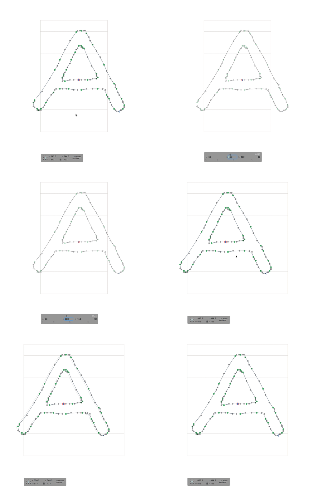
Step 3: Deselect the “A” by clicking off of it. Adjust the size of the letter box so that your character fits nicely, along with some breathing room on both sides (the default was set to 600pts, which I changed to 900pts in the example below). Select All (⌘ + A) and use the arrow keys to move your letter to the center (don’t worry about trying to get the side spacing perfect — remember, it’s a hand drawn font).
Repeat these 3 Steps for each character in your font until your font looks like the image below*.
Update from Mekka: You can batch process all glyphs at the same time in Font view. Simply select them, and choose a transformation option in the sidebar no the right (e.g. scaling), or Filter > Transformations (which provides more options), or set the sidebearings to a default for all glyphs with the controls in the lower left of the Font view.
*You’ll notice all the lowercase letters contain the corresponding capital letter. This way if you typed, “This font is fun,” an all caps version would be displayed, “THIS FONT IS FUN.” To accomplish this, you will need to utilize components.
Components enable you to re-use specific shapes — or in our case, letters — so that you don’t have to re-draw things over and over. All we need to do is add component uppercase “A” into the lowercase “a”. Simply double-click on the lowercase letter you wish to drop in an uppercase component, right-click, and choose “Add Component..” Choose the uppercase letter you wish to use from the Choose Component list and press “Select.” Boom.

Now anytime to edit the uppercase “A,” the lowercase “a” will also change.
Schweet.
Test Your Font in Glyphs
Now that you’ve got all your characters ready and sized up, it’s time to test it! We’ll start by testing within Glyphs itself. Open a new tab by pressing ⌘ + T. Now, start typing!

Pretty cool, huh?
Okay, you may notice as you try different letters, symbols and numbers that some of your spacing is funky, overlapping or too wide. No biggie. To make any edits to a character, just double-click it to enter editing mode. If you click into a letter that is a component, you’ll find it is light gray — just double-click it again to edit it.

Tweak your characters to get them just the way you’d like.
Note: If you need help with other technical aspects of Glyphs in trying to get your font just the way you want it, check out the Tutorials section of GlyphsApp.com — there is a search feature there that may be able to help you out.
Exporting Your Font
Now you’re all ready to take your new font into your software of choice. All there is left to do is Export that thing!
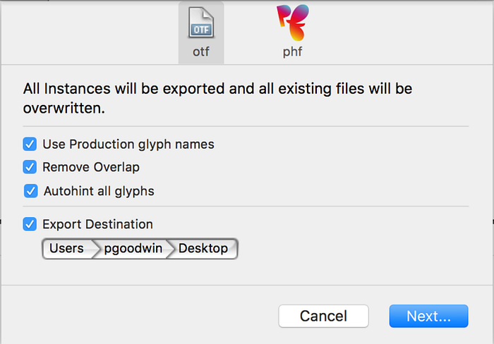
File > Export (or, ⌘ + E) will bring up your Export dialog box. Choose your desired Export Destination and click “Next.”
Check it out — a working font that you’ve made!
Update from Mekka: When exporting, I suggest leaving the Autohint option blank.
This is by no means a comprehensive guide to typography or type design. This is meant to be a fun exercise. If you want to invest more time in learning about type, check out these resources:
- Book: Designing Type by Karen Cheng
- E-Book: Typography in Ten Minutes from Butterick’s Practical Typography
- Article: What I Wish I Knew Before I Began Designing Type: Part 1 from Fort Foundry
Feel free to email me with any questions you may have. I am very much still a beginner in type design, but I’ll do my best to answer. Also, if you make your own font, I’d love to see it!
#BoomTime


