Local e-Commerce — UX Case Study
Improving the experience for kids and their parents in general hair salons

Introduction
In this project, we were focusing on delivering great experiences for the clients using a mobile website. Because e-commerce is well-studied in the industry, we were committed the most of the research time for basic and market research as well as developing a sense of professional best practices one can consistently rely on.
My partner and I, Maitri, researched and fixed a general salons website to help parents, especially mothers, book appointments and improve the local e-commerce business for the users' ease and business efficiency.
Pre-Determined Goals
Our pre-determined goals were to create an app that user can download for that specific hair salon we chose; helping the user book appointments quickly and easily. Our app idea later changed after our research.
Setting the Scope
Maitri and I were determined to go to as many salons as we could and interview the stakeholders and see what problems they had while trying to get clients in and out of their door efficiently and happy. As well as interview mothers with children to see their experiences in general and/or kid salons.
The Actual Research and Discovery
We first created a lean survey canvas and with that, Maitri created a survey online and we both sent it out to people; we got 7 responses back. We discovered that many of the users would take their children to general salons, they would look for salons from friends and family members and most of the people would call because it seemed easier. We then interviewed 4 hair salon stakeholders and one expert.
We got a lot of information that helped us create a lean UX canvas; it helped us pinpoint the problems from our local e-Commerce business all the way to fixing the problems. We also created a business analysis and from that information, we created our marketing positioning chart where we found our ideal brand position (our blue ocean). When we first started we found that our current position was more luxury and less innovation, but we wanted more value and more innovation.


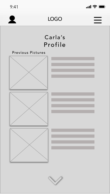
From the information, we gathered we created a user persona who would represent a mental model of our users. Our persona is Caring Carla, who is a stay-at-home mom who has a 7-year-old daughter who desperately needs a haircut. We also created Carla’s journey map to show how it impacted her while she was making a haircut appointment for her daughter.


Carla’s pain points, as well as people we surveyed, were:
- Booking appointments through a phone call
- Unknown hairstylists
- Fear of outcome (does not like the hairstyle)
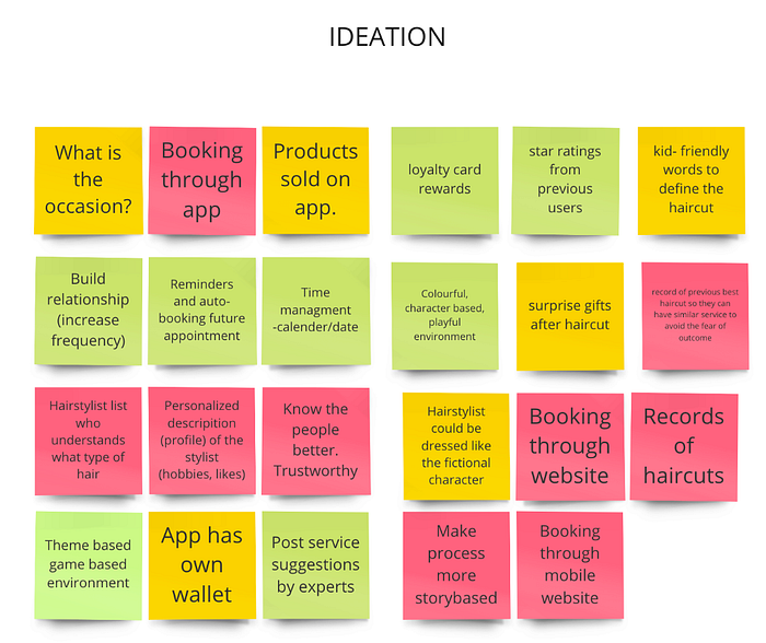
AHA Moments
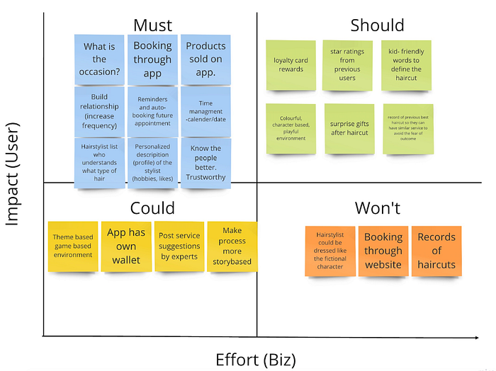
After interviewing stakeholders, employees, creating the lean UX canvas, researching and collecting business analysis, and creating our user persona, we created a task analysis. After that, we started to ideate to fix those three main pain points that I wrote above. After our ideating stage, we created a MoSCoW graph which helped us come down to specific features we must include in our website for the salon we chose to work with.

The Solution
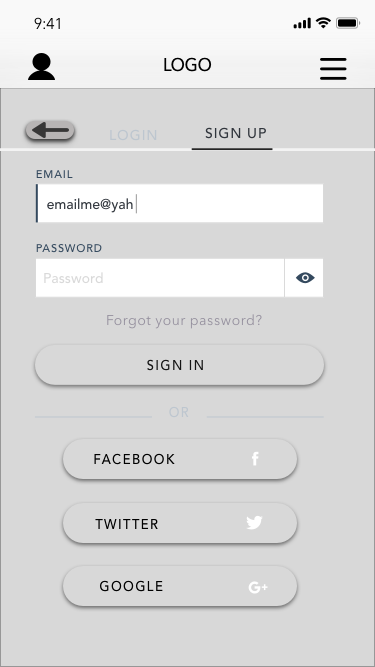
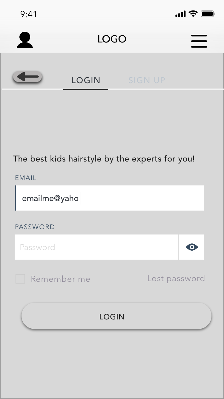
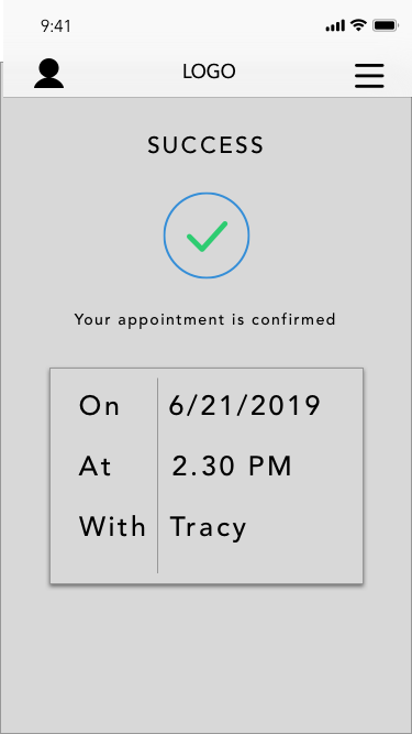
We wanted to create a mobile website that helped our users book an appointment faster and easier. It would let the user get to know their stylist more with a bio of them on the website before choosing a hair stylist for their children, and minimizing the fear of the outcome of the hairstyle the child will get by letting the user/parents upload a picture of their child’s previous haircuts or choose from other pictures. In conclusion, the mobile app would help the user feel comfortable with the stylists and make it easier and quicker to book.
Flow, Design Patterns, UI Choices
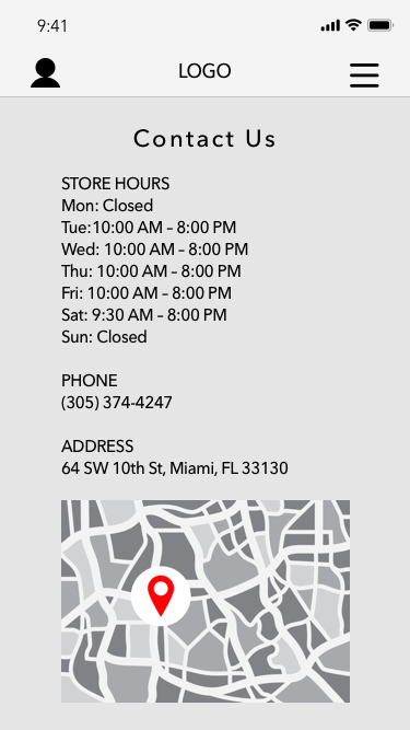
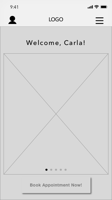
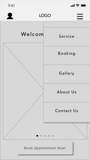
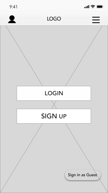
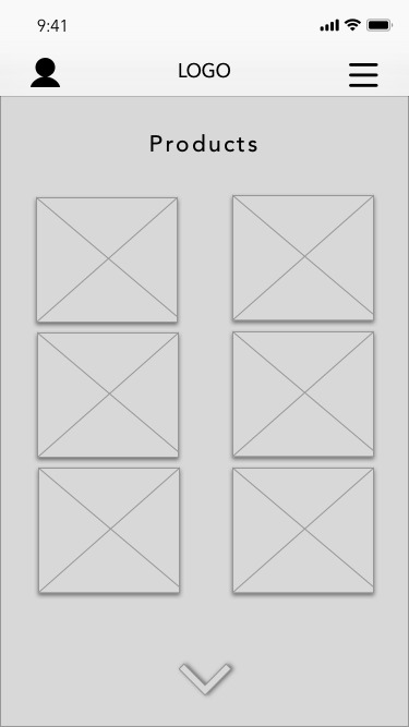
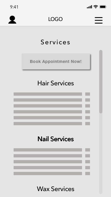
Maitri and I creating the lean UX canvas, business analysis, user persona, task analysis, MoSCoW graph, two user flows, two site maps, (the second map was a revision). After creating user flows and site maps we finally got to design our low-fidelity wireframes on how the website would look on an IOS users phone.


Below you can see the site maps we created to show the difference between website screens.


We started with designing a few low-fidelity wireframes, from there we chose the ones we gravitated towards and created them on the Sketch app. Maitri and I split the low-fidelity wireframes we chose and each created equal amounts of mid-fidelity wireframes. We later put the mid-fidelity wireframes together and I created a live prototype on InVision and transferred them to Maze to send it out to users to test the prototype. We were supposed to create the prototype from the low-fidelity wireframes but we chose to create it with the mid-fidelity wireframes because it seemed like we would get better responses because they were clean and organized.


The research we collected from the usability testing showed us where the users clicked on and it showed us a heat map. Overall, we had a 71.4% success rate. But many of the users had problems understanding the directions, they were not clear enough; the wireframes themselves were great and no major issues. Also, many people wanted to figure out what each button did and that is why it changed the success rate. Below I have included a few of the heat maps from the usability testing. As you can see in the “book now” wireframe people did not understand what to do next because of the instruction; that was a technical error on my part.


Conclusion
Maitri and I learned:
- Users do not want to call every time they have to book an appointment but they do not seem to have a better option.
- They might be in the middle of some work where it is sometimes difficult to book the appointment through a phone call; the user tends to wait until they are free to make a call. This might affect the frequency of customers at the business.
After Thought
If this application were to be an actual app we would like to have the A.I feature tested, do more usability testing and look into improving business revenue by selling the products they sell in-store online.
My personal thoughts would be from last week to this week I got better and speaking with stakeholders and other interviewees. If I had the chance to do this project over again I would choose another e-commerce business because I think this one was a little to easy in the sense that they already had a website and fixing a hair salon is a little different then fixing a boutique. A boutique you can fix the way people buy clothes online and other features, while a hair salon is more of an inside job of how the business is working. In conclusion, it was great to work with Maitri and getting to go a little more in-depth with the fidelity part of the project.
Meet the Team

← Marian Parajon (Publisher of this Medium post)
← UX/UI Student at Ironhack
← UX/UI Student at Ironhack

