Light and Dark UX Patterns
Recognizing positive and negative UI and UX experiences.

I was recently watching a YouTube video by Nick Robinson that was talking about the very interesting title from Nintendo “Rusty’s Actual Deal Baseball”; One of the main points of the video discussed was that the author was extremely surprised that the character “Pappy Van Poodle” (a lovable elderly poodle) was not readily known to the public and the reason for that was because the Nintendo game was testing the usage of Light UX patterns.
In case you’re not familiar, UX stands for User Experience. Something that has been on the minds of designers and developers since the dawn of the virtual product or service. As to what makes a UX pattern light or dark greatly depends on the desired action for the user. Not only that but it’s only recently that people are using the term light or dark in reference to best standards, like white hat, or black hat SEO. Using a quick Google search will reveal actual patterns for light mode User Interface and User Experience.
So what do dark UX patterns look like?
Roach Motels make it hard for a user to achieve an action
A few months ago, I tried out Thrive Market Subscription for Free. I was on the hunt for a easy way to order cat food, and my hippie dippie hygiene products (you caught me, crazy cat lady that is paranoid about the dreaded parabens.)
The savings were not substantial, and I honestly can’t go through products fast enough to take advantage of the savings so I went to go cancel the membership…
First off, it was almost impossible to get to the option to cancel the membership, and when you would search, the words “cancel” wouldn’t show any results. Once you actually found the information, it prompted you to talk in the chat so that they could try to keep you subscribed by throwing you free coupons and haggling you down.
They’ve actually improved the process, but it’s still buried to the point of being annoying. I would assume that if you weren’t familiar with these patterns that you would get a little lost. So even if they’ve stopped being jerks, I still consider this to be a dark pattern.


Sadly, even Amazon was guilty of making their Prime Membership deactivation harder than it needed to be. I cancelled because I wanted to shop local more often, and I can’t stand the boxes that pile up everywhere (we won’t go into the questionable work conditions that Amazon is known for.) I don’t have images since it’s been a long time since I had a membership, just take my word that it was annoying to find and they asked multiple times if I was sure. However, now they offer refunds automatically when you deactivate, which is Light UX Pattern and I will discuss it in a bit.
Forced Continuity is holding a wallet hostage
Forced Continuity is often paired with Subscriptions. They’re banking that you’ll forget you subscribed, and then continue charging you for the product or service. This is where the Roach Motel pattern comes back in to make things difficult. For example, the only way to stop the payments being processed is to cancel within a 14 day time-frame. “Technically”, companies get around this by having you check off that you’re okay with this happening, but I still argue that it is a dark pattern UNLESS you are given the option to opt out to be charged monthly upon signup. Even better, automatically un-enroll people to be charged monthly, let them know that their free trial is ending soon, and then offer to continue the service.
Bait & Switch is a huge inconvenience for users
FileZilla is prone to using this bait & switch trick, when you download the app and start clicking through the endless “next”, if you aren’t paying attention you’ll approve to download browser adware.


There are packages that do not have bundles, however they are hard to get to (hard being that it’s not immediately apparent for the user trying to download them.) The FileZilla team announced that they are not trying to misdirect users, but I disagree. I hereby list them as guilty for using dark UX patterns.
So what do light UX patterns look like?
I think you get the gist of dark UX patterns, so what do light patterns look like? Light UX is more than just the opposite of dark. Light UX keeps the best intentions in mind when moving users through the website.
If we go back to our roots, the user experience should be effortless and we can see this influence on all modern websites. We have best standards in place to ease accessibility, and help users complete actions that are beneficial to themselves.
So going back to Pappy Van Poodle, the whole point of the game is that you are haggling real money for unlocking mini-games that progress the story. In other words, we are dealing with in-game purchases. The same topic that got EA games into hot water for it’s aggressive usage of in-game purchases during the release of Star Wars Battlefront II. Except that Nintendo manages to make the process of in-game purchases pleasant.
This is achieved by the haggling process where you have to go out of your way to pay “full” price for the mini-game additions. It’s the Roach Motel situation, except that you are being forced to spend less money than what is advertised. It repeatedly asks you to haggle the price, and then if you do not, it throws you in a Forced Continuity for a cheaper price, once that fails they attempt to Bait & Switch you to pay less.
This is how Nick Robinson figured out about the mysterious character Pappy Van Poodle, who is there to make up for the alternate decision if someone decides to pay full price for the mini-game. Not only that, but the YouTuber discovered zero search results for this “secret” character, meaning that very few people decided to pay full price for the mini in-game purchases.
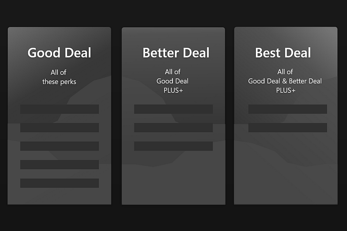
But why is this significant? Considering inflating your prices, and creating a sale has been around forever. Also, more people are offering services or products online in a way that makes one option seem like the best bang for your buck.
I’ll tell you why; Because Nintendo went out of their way to make users feel like they have control and are making accomplishments through their decisions. So how can your business online do the same?
Goodwill is just generally and morally something your company should do
Some startups are noticing that automatically refunding users when they unsubscribe from their product leads to a better retention rate.
This small instance of Goodwill can help to retain users and it’s been known for a while that making a positive impact on society makes people more willing to support you. That is originally why companies donate to nonprofit organizations (lets ignore the tax breaks).
Confidence in your service or product builds trust between you and your users
Unsubscribing users for automatic payments, aka letting them know their services are ending unless they want to commit is a perfect example of having confidence in your product or service. Ideally your product or service will actually be good and users will want to keep it. Not to be rude, but if you’re not completely dedicated to providing an outstanding product or service, then why wouldn’t you be confident in your users staying?
Ease of use allows users to complete actions in your website
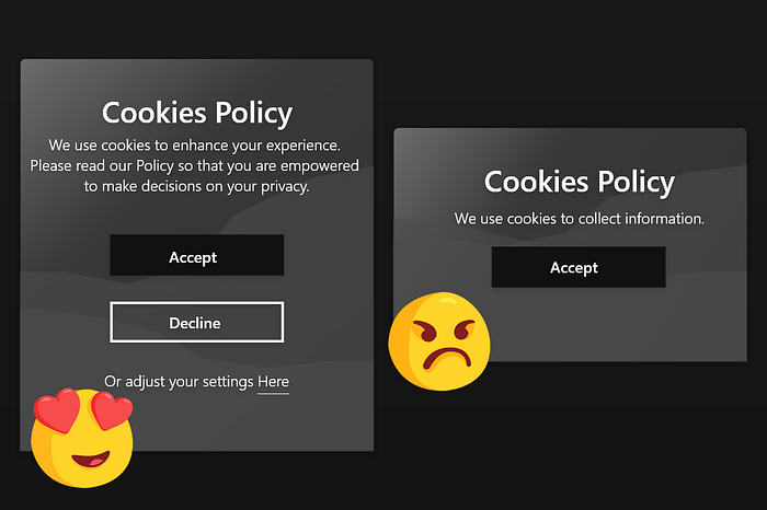
Making it easy to navigate, read, and follow directions in general is a light UX pattern. Sadly, icons should only enhance your directions, they are not a reliable source for people to use to get around without an easy to read context to go with them. Having acceptable options for being able to Opt Out or change the settings of cookies is essential for a humane choice that the user can make.
Accessibility to all, prevents users from being excluded from your service or product
Recently Beyonce’s website has been under fire for slacking on accessibility practices. I don’t know what legal grounds they actually had for suing, however, it is something to keep in mind. People want to use your website, and it’s very disheartening to get a choppy mess of text, or not being able to effectively navigate. This is more so on the developer side, however, designs should express proper contrast and color usage.
Conclusion
So what have we learned? Absolutely nothing, close the window. Just kidding, hopefully this has helped you get a better idea on how to create a positive web experience.
Watch the Video that inspired this post.
If you found this article helpful, please share it! Follow me on: Twitter :D Thanks for reading~

