Life before and after InVision

Let me start by saying I ❤ InVision. It absolutely changed my work process and has made it so much easier to present my work to clients.
What came before InVision?
My career started 10 years ago as a print designer. In my first job there was no talk of web design whatsoever — it was all branding, brochures, flyers, advertising and signage.
Fast forward a couple of years and we were in the thick of the web design boom in Ireland — suddenly every business needed a website, and fast.
In those early days presenting web designs to clients was, for me, creating a nicely formatted document with JPGs inserted and little notes on the side, my print roots influencing me.
The problem? Nobody understood the designs. Suddenly you had clients printing out a website and commenting that the text was too small or that the colours weren’t vibrant enough.

We used to send JPGs by email and ask the client to open them in their browser making sure they were zoomed to 100% — for a lot of my clients this was like asking them to stand on their head while juggling with knives and reciting Ulysses by James Joyce —simply impossible!
So most of our time was spent explaining that it would look better after it was developed.
This process was closely followed by placing JPGs into HTML wrappers and linking from one screen to the next. However, this was even more confusing for clients because they expected it to work like an actual website — so in the end that method was abandoned too.
Presenting concepts to clients in this era was a complete nightmare.

InVision changed everything
I don’t remember exactly when I first started using InVision, and it was a lot more basic at the time but it completely changed everything.
Suddenly, clients saw a design, clicked through sections and understood not only how it looked but how it would work as a website.
Over the years InVision has built on and improved the tools available within the browser and the software that it connects to on your Desktop such as Sketch.
But now, I’m reminded of Building a Winning UX Strategy by Jared Spool (and you should really watch it if you haven’t already). The first 50 or even 100 times you use a new feature you might think to yourself “Wow, this is really amazing isn’t it” but over time they just become basic expectations on how it should be.
“…these excitement generators, over time, they just become basic expectations” — Jared Spool
When these features, which once delighted you, turn into basic expectations you then start to notice the flaws (sorry InVision — I still ❤ you).
I feel like InVision might have lost it’s direction in the last couple of years. Some of the new changes have not been improvements but hindrances and there doesn’t seem (to me as a user) be any logical reason for it. They also seem to have missed very obvious opportunities for simple improvement.
What now for InVision?
I don’t know exactly what the future for InVision might be but here are some of the things I personally would like to see changed (or changed back as the case may be).
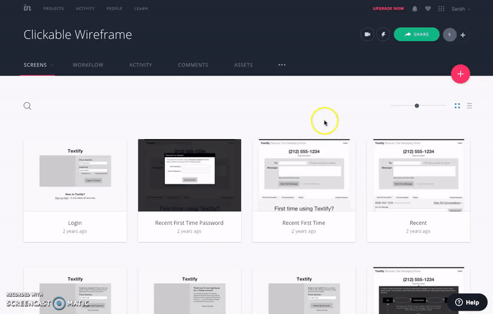
Folders for projects
I work with a lot of clients so it would be nice to have folders for each client and then within that folders for each project because each one might contain 20 or more prototypes.
Finding prototypes isn’t that easy and I rely heavily on the search feature to find the correct one. Not to mention I usually have several versions before a client signs off so I would love to see a proper folder structure added to InVision.
Sharing an external link on a project
Before: You clicked on “Share” and you got a shareable URL to send to clients.
Now: You click on “Share” and then click on “Link Settings” to access the shareable URL — how rude, making me work twice as hard! I don’t understand this change, because there’s a + symbol right beside the share button which does the exact same thing. Please put it back the way it was so I can get that share link quickly.
Screen titles easier to read
At the moment you can’t see the full title of a project if it’s too long.

Without folders I often need to put the Client Name, Project Name and Version number within the title — so they end up very long.
There’s no way to see which screen is which except for the preview thumbnail — and sometimes these would be the same image. It would be a simple change to allow the title to appear on rollover, or just let it spill onto 2 lines.
List view of projects
Instead of forcing me into a grid view it would be nice to have the option of a list view for projects — this would also solve my problem with long titles as I’d have more screen real estate — happy days :)
Setting up a new prototype
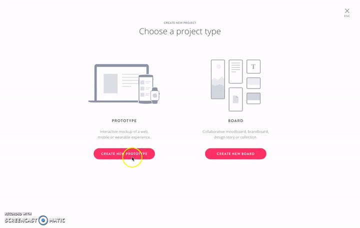
Before: Clicked on + symbol to create a new project, selected the device from a dropdown menu, typed in a title for it and created your new project.
Now: Similar process but with images instead of a dropdown menu for the device selection. The problem with this interface is two-fold:
- I always forget to type a title for my project before proceeding because I’m distracted choosing a device type
- It takes me much longer to choose which device I want from this UI, I think there are too many options for this layout to work well
I preferred the simple dropdown — I know it didn’t look as pretty but it was far faster to use — viva la dropdown!
Changing device type
I can’t tell you how many times I’ve created a project, only to realise afterwards that I selected the wrong device.
The feature to change device after a project is created is buried deep within the “…” menu, which as far as I can tell is a dumping ground for stuff they don’t know what to do with. This might be better placed somewhere more visible. Though arguably if they solved the problem above with setting up a new prototype maybe I wouldn’t make this mistake so often :D.
InVision could really use an exercise in overhauling their IA to ensure key features like this aren’t so hidden out of sight.
Undo
What program these days doesn’t have an undo button?

Sorry guys but this is basic functionality I expect with almost all software now. I am constantly accidentally deleting or moving hotspots. A little undo function would be just delightful.
Defaulting mobile to start below the status bar
When I’m on a mobile prototype the first thing I always have to do is check a box for “My design starts below the status bar”.
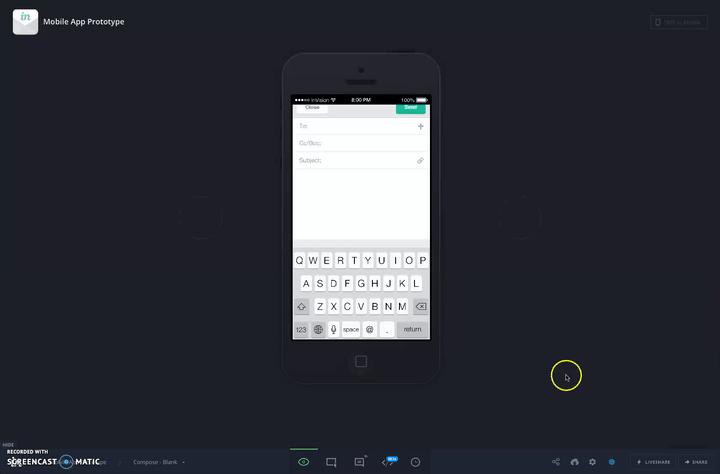
Maybe I’m wrong here but surely the majority of designers don’t include a status bar in their actual designs. I think this should be the opposite — always defaulted to on and you turn it off it you have your status bar as part of your design.
Also while we’re on the subject of mobile prototypes, there isn’t enough contrast between the background colour vs. the colour of the phone. I always change it to the white version of the phone but this could easily be solved by having a more neutral grey background that provided enough contrast between both black and white phone outlines.
Updating the title of a screen
This one has confused me a number of times. If you drag and drop to replace a single screen within your prototype, the visual updates but not the title written underneath it. This genuinely leaves me confused and unsure if I updated the screen correctly.
Updating the title of a screen seems like a no-brainer to me, but then maybe there’s a use case for those who don’t want to that I’m not aware of.
Editing prototypes through a share link
So I created my prototype and I’m ready to share it with my client. I get the shareable URL and open it up to take one last look before I send it onto the client and notice something is wrong.

Like I said before without folders, without being able to read full titles and with a lot of different prototypes and clients it takes me time to find the right one to make my edits.
But I’m already logged in on another tab in my browser, so why couldn’t there just be an “edit” link to go back to the prototype editor in a new window and make the edits I need through that shareable link?
Loading not finished
It’s not incredibly apparent which screens are up to date after uploading a new set to overwrite your old ones. Don’t forget that a lot of the time the change I’ve made it small so I won’t notice it in the thumbnail preview. An animated loading icon appears briefly in the header and after a screen is updated it says underneath “A few seconds ago”.
What I’d love to see is a loading icon instead of the thumbnail preview on each screen as it loads. It would make it easier to tell which ones have finished and which have yet to overwrite.
Last, but not least — updating common JPGs
Let’s break this one down into a story because it’s a bit tricky to explain.
In this scenario I’m working on a number of new features for a login area on my client’s website. Each feature has 5+ different user flows and the client wants me to present each flow separately with different links that they can share. A lot of the same screens are used within each of these flow prototypes just with different start / end points.
Now the client requests some changes.
Wouldn’t it be so lovely if I could update a central repository within this project so that those common screens get updated automatically within each flow for me? Right now I have to go into each of the flow prototypes and manually update each screen which has been changed which can be rather laborious when you have 20+ prototypes to update at once.
This last feature is probably never going to be implemented but if InVision went in this direction they would make my prototyping dreams come true.

I’m going to keep using InVision because I love how intuitive it is to use, how it’s sped up my prototyping and improved my presentations to clients.
My wish is that they take a breath, stop adding large new features and really tweak and refine what they have because it could be that little bit better. But then, I’m just one little user so maybe I’m missing out on the bigger picture.
In general though — a consistent two thumbs up for InVision — so thanks :)


