Is Skeuomorphism dead? I don’t think so, here’s why.

Skeuomorphism is a design concept used in product design to make digital items resemble their real-world counterparts. Whether or not you are familiar with the term, you must have come across products that featured skeuomorphism some point in your life.

In fact, skeuomorphism has been around for quite some time, the first commercial personal computers sporting Graphical User Interface (GUI) was introduced to the world in the 1980s. The Xerox Star, Apple’s Lisa and Macintosh all showcased graphical elements such as a piece of paper with a folded corner to represent a document, a folder to represent a folder (duh), a box containing spreadsheets to be a file, and of course the iconic trash can where deleted files are stored.

With the advancement of technology that enabled better graphics, came some experimental user interfaces that further mimicked real-life experiences. Originally intended to provide a more user-friendly interface for the Windows 3.1x, Windows 95 and Windows NT operating systems, Microsoft’s Bob did not manage to live up to expectations as it was discontinued after a year.
IBM, on the other hand, proposed a new software interface design methodology in 1998 called RealThings. These include RealCD, RealPhone and RealBook, to make things look more… real.

Skeuomorphic designs, like everything else, has its pros and cons. On one hand, it provides users with a sense of familiarity with its real-life counterpart, the shared visual vocabulary actually encourages interaction from users. Users’ preference for things that are familiar to them speeds up the adoption rate of a new product/feature. On the other hand, it could also trigger potential cognitive dissonance when an element in the digital product does not work the same way as it would in the physical world.
Moreover, many also think that skeuomorphism is out-dated, looks old-fashioned and doesn’t necessarily help users who have never encountered the physical object (eg. a floppy disk). Designers the world over has also slowly but surely ditched skeuomorphic designs in preference for the cleaner, sleeker-looking flat designs.

However, I do think some elements of the design concept is still relevant in current-day settings simply because we are constantly re-inventing the way we do things.
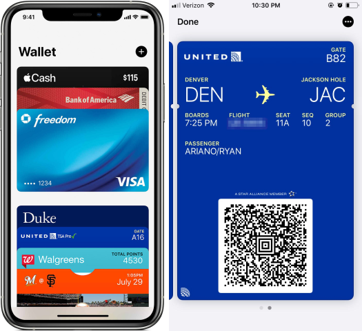
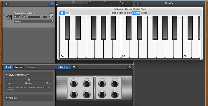
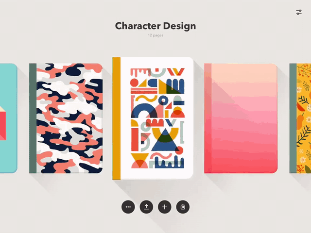
The iPad and Apple Pencil combo allowed artists and students alike to scribble directly onto a screen to make art or take down notes. Cash is no longer king, we now use a range of different payment methods including credit/debit cards, NFC payment, QR codes, face recognition payment (FRP) and more to make payments. And with remote work being the norm in today’s world, work & collaboration is fueled by video conferencing tools and real-time collaboration tools.
The way we create (music, art, or content), make payments or work & collaborate, these processes are drastically different from only 5 years ago.
Not only can Skeuomorphism be presented visually, but it can also be shown through interaction and audio/sound effect. These design elements can be used in product design to enhance user experience by easing the transition from the real world to the digital world. Below are some examples.

These are just some of the examples of ways skeuomorphism can be incorporated into the design of a feature or product. It allows users to get a sense of how the product works, its functionality, thus helps with user education and adoption rate. The next time when you’re designing, take into consideration if these skeuomorphic design elements are able to provide a better experience for your users.

