iPad pointer on the web
A short diary of iPad pointer recreation with GSAP

a week ago I saw a new IPad Pointer presentation and was very excited about what they did. It was very interesting to see how they design different pointer modes and attention to details. Here is the presentation:
Some of their approaches were very interesting, and I immediately start to think if I can recreate the same cursor effects on the web.
Today, the article will be written as a diary — separated into days, it will be easier to track the progress and fallow the story.

But before let me share my “contextCursor” module, so, you will know what I’m talking about👇🏽
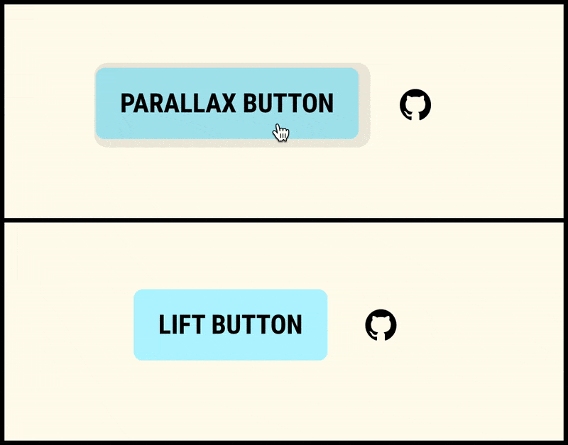

Effects to recreate
There was a very interesting feature like custom cursor — when we can morph the standard cursor into any shape/image we want, but today I’ll try to recreate these effects:


The general challenges here will be:
- Morphing/transitions smoothness.
- Parallax for the cursor and the target element on hover.
- Cursor morphing in the “Lift” mode.
The rest of the day I spend on my thoughts and research.
I knew that perhaps I use GSAP library. I used it before and can say that it’s a problem solver for interactive animation. But I decided to start on my own, just to check how easy it will be and fill all layers of pain when something doesn't work.
The first shot was based on the collision tracking of an object with another object and the hover animation was solved with CSS transitions.
I had some trouble with collisions. For some reason, the collision fired only for the last element.
The rest of the day I spend torture myself mentally. I fell asleep thinking about waking up and solve this question.
Gees what? I gave up. I ask Gods on the StackOverflow. It solved my issue.
The reason was in the wrong understanding of how forEach works. It doesn’t wait when a function returns. And instead of this:
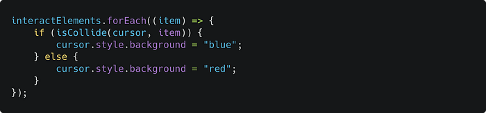
I should use this:
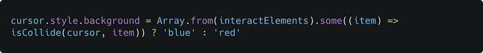
Not so elegant, but works! I mean with forEach we can use one loop function for all props.
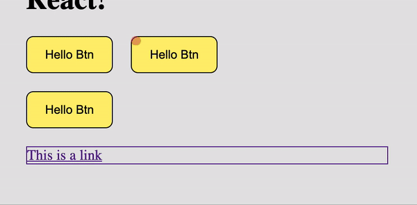
Here is the first implementation. Simple and… twitchy. Always start the cursor transformation from the top-left position.
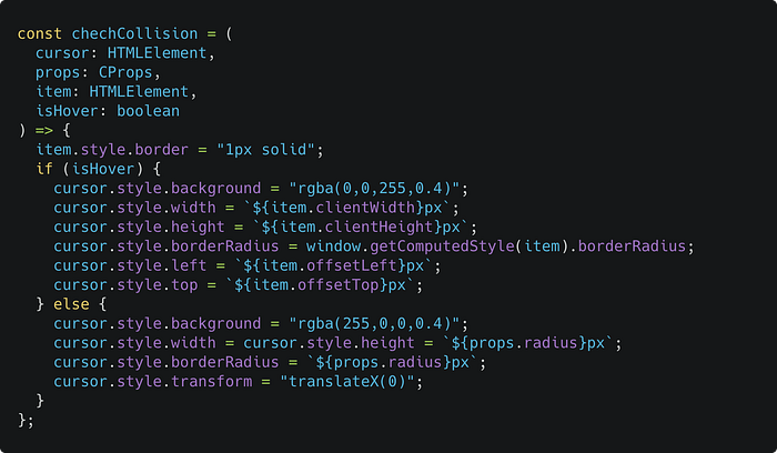
To be able to click through the overlay cursor I added pointer-events: none; to the fake cursor and added transition property for border-radius, width, height and background-color. The collision function:
The issue — cursor morphing start not from the cursor center but from the top/left position of the target element.
So, I tried another approach — I tried to correct the start position with transform property.
But it was a bad idea to move the cursor with top and left positioning and use transform at the same time to correct the point of transformation. This only worked only on the “input” but not the “output”.


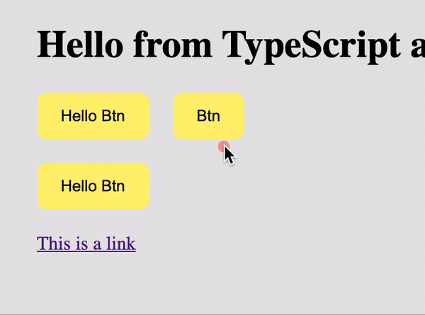
And to make a proper output animation I had to calculate a cursor position inside the target element and correct top/left and transform y, x in parallel. And I did it but the result was too glitchy.
I wrote this module with Typescript. Because it helped me to keep my code clean and helped me to handle errors + very convenient tips.

Body styles
I added a property that will reset margin and padding for the body, due to this the mouse can be positioned wrong.


I fell asleep with a thought that the next day I’ll try GSAP.
The GreenSock Animation Platform (GSAP for short) is a powerful JavaScript library that enables front-end developers and designers to create robust timeline based animations. This allows for precise control for more involved animation sequences rather than the sometimes constraining
keyframeandanimationproperties that CSS offers.

So, GSAP. GSAP forums it’s a powerful thing. But many examples you can find on Codepen as well. A simple and small example that I found as a reference.
And I tried the same approach. With GSAP it works like a charm
A few interesting examples. A library that can morp the cursor to the target element and without external libraries 👇🏽
And really awesome cursor effects on Codrops including source code 👇🏽
I also learned the difference between mouseleave / mouseenter and mouseout / mouseover 👇🏽


̶T̶h̶e̶ ̶n̶e̶x̶t̶ ̶t̶h̶i̶n̶g̶ ̶I̶ ̶d̶i̶d̶ ̶i̶s̶ ̶s̶e̶p̶a̶r̶a̶t̶e̶d̶ ̶e̶x̶e̶c̶u̶t̶e̶ ̶f̶u̶n̶c̶t̶i̶o̶n̶s̶ ̶b̶y̶ ̶t̶y̶p̶e̶s̶.̶ ̶B̶e̶c̶a̶u̶s̶e̶ ̶I̶ ̶p̶l̶a̶n̶n̶e̶d̶ ̶t̶o̶ ̶m̶a̶k̶e̶ ̶s̶e̶v̶e̶r̶a̶l̶ ̶m̶o̶d̶e̶s̶ ̶o̶f̶ ̶t̶h̶e̶ ̶c̶u̶r̶s̶o̶r̶.̶ ̶T̶h̶e̶ ̶f̶i̶r̶s̶t̶ ̶a̶n̶d̶ ̶t̶h̶e̶ ̶d̶e̶f̶a̶u̶l̶t̶ ̶o̶n̶e̶ ̶w̶i̶l̶l̶ ̶b̶e̶ ̶c̶o̶n̶t̶e̶x̶t̶ ̶c̶u̶r̶s̶o̶r̶.̶ UPD: I leave only one mode — context-cursor
I also separated cursor effects. You can add specify these types in the data attribute data-cursor.
So we have these effects:
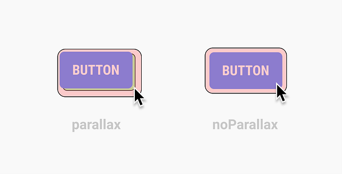
— noPadding. By default will add small padding to the cursor.

— noParallax. Will switch off the parallax effect.
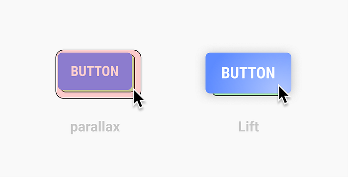
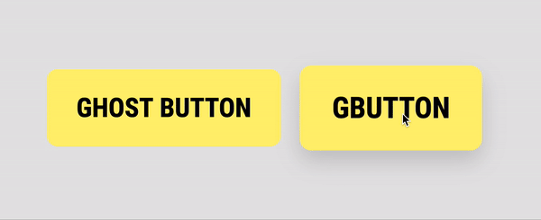
— Lift effect. The cursor will be dissolved in the button. Reincarnating the cursor into a button — we will lift the button a little and add a shadow to it.
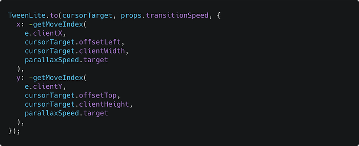
Parallax effect
First, we need to do is detect when the mouse moves right and left when it is on a hovered element mouseenter. To do so we need to take the relative mouse position:

and then we need to subtract half the width of the element from the relative position:

And the last thing we have to do to make it work is to add the speed variable. This variable will slow down the movement. We will add this variable to the module as a changeable argument.

Let’s make a function that will count the parallax.

Now we need to implement the same effect to the hovered element but with the negative sign:
I added an active class
c-cursor_activewhen the cursor is hovering an element. That you can add your custom active styles without involving JS.
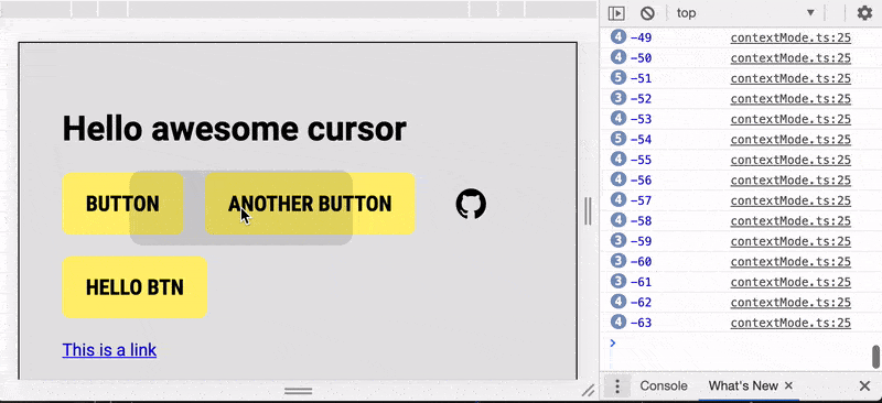
But there is a problem. X and Y props go as subpixels in CSS transform but left and right props go as rounded numbers and because of that, the animation was to “steppy” like there is 10 fps instead of 60.
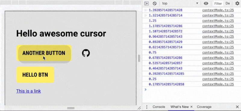
Compare to the back icon which we animated with X and Y property which GSAP translates to the transform prop. Translate animation is much smoother.
It took me some time, but I wrote an operation for the cursor using X and Y transform.
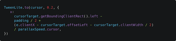
It’s a dirty code, but works. I’m planning to make it up after I’ll do all that I planned to achieve.
Here is the result before (with the left and top props) and after (with the x and y props):


Also if you want more about difference betweeen transform and pos:top/left check this article that explains Translate() and absolute position movement:

The last day to add the final effect. I added the “Shift” effect. It was easy to do because all you need to do here is add a shadow and scale to the target element.
Here are some tips how you can use CSS variables, but I used
c-cursor_activeclass to set the active CSS color.https://greensock.com/forums/topic/21422-how-to-animate-using-css-variables-as-target-values
The first version looks like this:
Now let’s make the effect prettier. Move the box-shadow property from the cursor to the target element to make the transitions smooth. And add a “flare” on the button that will fallow the cursor. I also added a little blur to cursor on the hover to smooth the morphing and this gave an interesting side effect — as is a lens-flare that blurs objects` edge a little.


In addition, I added a few adjustments — you can switch off paddings for the cursor when it hovered and switch off the parallax effect on hovering.

{Writing this article and unsuccessful attempts to make an NPM module}
I wanted to upload this module as an NPM package but the adjustment for this will take too much time, so I publish it as is, and you still can copy it and use it in your projects or modify it any way you want.
Next three days I spend to write the documentation and made the demo, and to finish this article as well :-)

In general, I achieved and tested things that I wanted and could say that it looks interesting on the web. But here is my reasons why such cursors won't be implemented as a unified pointer:
- The web already has their cursors, there are some many of them. The web cursor is a solid pattern. We associate the web with the arrow cursor.
- Using this type of cursor as a default one could be a CPU consuming task.
- The web doesn’t need to change patterns and look. The web is a pure constructor with which you can build whatever you want — it only gives you a simple boilerplate, you can use it or you can write your own.
- We have many different interfaces on the web — tense and opposite, with a lot of white space, controls, buttons with different functions, etc. So the implementation of such pointer will ruin UX half of them. It will force to redesign websites to make them fit for a new pattern.
But… at the same time, I do not reject that in the future we will see a new “fancy” cursor, because:
- Our computers are getting more powerful, which means that we’ll be able to implement more complex features, without reducing efficiency.
- Major, big companies that have a monopoly on the market could implement and force new features in their products. Exactly like apple did with iPad pointer. And developers will be free to choose between the old and the new.
Just before I publish this article I saw a new article on codrops by Mary Lou, it calls magnetic buttons. Very similar to what I wanted to achieve here and so different solutions. Realy liked it. You can also check it and view the source code.
Another cool feature by Mary Lou and iPad pointer also has it is — non-standart hit area, a bigger hit area. Which is pretty cool when you can choose when to trigger the cursor morphing. I’ll implement it if someone asks me to include it in the code. But here are two ways how I think we can achieve it:
- The cheap and simple way — just add
:pseudo-elementto the cursor and make it bigger. Then we track when pseudo-element cross the target element. - The second way — we track everything in
mousemovelistener and use a special collider function.
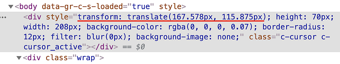
I found an interesting bug when I started to make a demo page — the cursor is not moving during the scroll (like on the example below). The solution is very simple — just add position: fixed to the cursor.
And another fix that I made — I changed the method to get an element position. When you have scroll on your page — use el.getBoundingClientRect().top or left instead of el.offsetTop or el.offsetLeft.
DEMO PAGE 👇🏽
GITHUB PAGE 👇🏽

Thank you for reading!

