
Introduction: What are Ghost Buttons?
You’ve decided to buy a new pair of shoes. You open up google, navigate to your favorite shoe site, and linger for a second at their home page. The banner image is appealing, but where is the button to get you to the pair you want? It couldn’t be that small, square box right in the middle of image, could it?
Ghost buttons, buttons with a colored border but no color fill, have become pretty commonplace online. They get the name “ghost” to describe their transparent nature — since they lack a fill color, they take on the background’s appearance (frequently a photograph). But whenever I see them, I have to wonder: did the designers a/b test the buttons? Maybe it’s my background in Conversion Rate Optimization, or maybe it is the ubiquity of them in modern web design. Either way, I have a problem with them.
In this article, we will discuss how web design has evolved from skeuomorphism to flat design, how ghost buttons have gained in popularity in the past few years, and what their impact can be on user conversion.
Where did Ghost Buttons come from?
Ghost buttons weren’t designed in a vacuum — much like anything else on the web, they are the result of user understandings, technical limitations, and aesthetic preferences. So, when we ask ourselves where ghost buttons comes from, we need a little historic context:
1984: Apple releases the first Macintosh
It’s arguable that the first Macintosh was responsible for introducing the graphical user interface (GUI) to the general public. It used the concept of files as rendered papers, containers that could hold files as folders, and a group of containers as a file directory. In 1984, personal computers were a relatively new concept and very few homes had one. By using these visual metaphors, users were able to make the cognitive leap between the physical object and the digital one.
Apple used the design approach of skeuomorphism where the designer stylizes digital tools and concepts to resemble their real-world counterparts. For instance, earlier versions of Apple’s Notes app, referenced yellow legal pads. The idea was that the visual metaphor would help new users quickly understand how to use the app — the Notes app was merely a digital version of the iconic yellow legal pad.
2001 — A team at razorfish launched the first site that adapted to a user’s viewport,
2004 — Cameron Adams creates this example of resolution dependent layout
2007 — Release of the first iPhone
The invention of the iPhone is significant not only because it introduced a greater number of people to skeuomorphism and the Apple way of thinking, but also because it is a mobile device. This was the beginning of smart phone ubiquity and the emphasis on mobile design.
2008–1 in 2 human beings in the world, owned a mobile phone.
2010 — Release of the first iPad
2010 — Ethan Marcotte coined the term “Responsive Web Design”.
Ethan Marcotte defined Responsive Web Design to mean fluid grids, flexible images and the use of media queries. Instead of creating separate architectures for mobile devices and desktops, RWD proposed one fluid architecture that could adapt to any screen size.
Flat Design
While early explorations in responsive web design began to explore how the web could be more fluid and elastic and how that might work, Flat Design began to envision what it might look like. Although many at the time saw Flat Design as a more futuristic, modernist aesthetic, its roots date as far back as the 1950s to Swiss International Style, Modernism, and Bauhaus movements. Flat design strives to subtract unnecessary decoration. Enter the ghost button — stripped of all decoration, reduced to an outlined rectangular shape with actionable text — this design choice is definitely in the flat design family.
When did we start seeing ghost buttons?
We start seeing references to ghost buttons sometime in 2014. A tumblr blog called websiteswithghostbuttons started circulating and Daniel Klopper was the first to tweet #ghostbuttons.
Some speculate that ghost buttons originate from Heads-Up-Display design. (There are similarities in that HUD UI is often monoweight, and meant to give information without obscuring the pilot’s field of vision.) It’s hard to tell exactly where ghost buttons began, but we can review some of the early adopters.
Examples of Skeuomorphism.
With the release of Windows Phone 7 and Windows 8, Microsoft introduced a design system called “Metro”. This system featured the use of bold color, simple typography and…ghost buttons!
Amongst all of the early adopters , Apple’s iOS 7 release was perhaps the greatest influence over the trend taking hold. In this Wired article, Apple stressed that user interfaces should be “unobtrusive and deferential” so that the UI “recedes, elevating your content” — rather than competing with it. There aren’t many people who today would argue against Apple’s philosophy — content should be the most important element, not the interface elements that support it.
How are designers using ghost buttons?
Now that we have an idea how ghost buttons may have originated, why did they become a full-on trend? Most designers would likely argue, that their simplistic design makes them versatile. Especially, when you consider full-width hero images or video-heavy website, ghost buttons will often recede and help put the focus on the imagery and type.
It’s not uncommon to see ghost buttons pop up on creative agency websites. Perhaps it is the versatility of ghost buttons — they can be an element of a simple, minimalistic design and they can also be used in richer more complex designs. For example, Crispin Porter and Bogusky’s homepage uses a version of a ghost button that is even further simplified, with the top border of the button subtracted.
One common use case for ghost buttons, is as a compliment to a solid fill button beside it. This two button approach typically has the solid fill button as the main call to action and the ghost button as the secondary, less important actionable task. Some designs go further than this, and incorporate a mix of ghost and solid fill buttons, either to denote hierarchy or to provide variety.
The use of solid color (or gradient) backgrounds, has also been on the rise since the advent of flat design. Ghost buttons can pair well with this type of design, because it serves as a neutral element. Ghost buttons are also (as we mentioned earlier), an evolution of flat design so if the overall look and feel embraces that aesthetic, then ghost buttons can work well visually.
The Implications of Using Ghost Buttons
While we’ve just discussed all the great reasons why designers use ghost buttons, here are some unfortunate facts and figures that make them less than awesome. Although ghost buttons can aid in creating a pleasing visual design, they can also create issues that can both affect the user experience and have a negative business impact. Angie Schottmuller, former Chief of Conversion Marketing at Unbounce, had this to say about them:
Ghost buttons drive me crazy. It goes against usability. The concept is a designer’s fantasy trend that should die. The only time I find this tactic useful is when a client insists in having two CTAs on the page, and I basically want one to disappear. Ghosted buttons have ghost conversions.”
Here are some common usability issues that can be associated with the use of ghost buttons:
Legibility: If placed over a busy image/video without sufficient contrast, it can be difficult for users to make out what the cta says.
Contrast: If say, the ghost button and typography are both white, placed over an image, there is often a lack of hierarchy to draw a users eye to the main actionable task you want them to complete. This can have real implications on landing pages, where conversions can be impacted.
Clarity: While copy and interaction animations can help, it may not be clear that it is a button. If there isn’t appropriate context and depending on your audience’s age, there could be some confusion.
While all of the above issues should not be taken lightly, the potential impact on conversions is one that can cost businesses money. There have been a couple of conversion studies that have looked at the impact a ghost button vs a solid fill button can make. Elevated Third ran a test on their newsletter, one version populated with ghost button CTAs, and another with solid fill buttons. They found that the solid fill version, outperformed the ghost button version by nearly 7%.
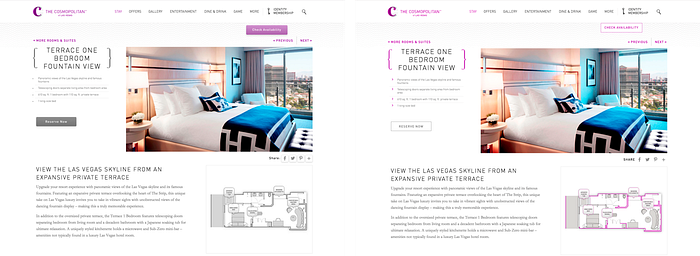
In another test, the website ConversionXL found a 20% decrease in clicks (based on 10,000 visits) when testing the following images:
Nielsen Norman Group recently released a study, that concluded “Flat UI Elements attract less attention and cause uncertainty.” In the study, NNG found that users spent 22% more time on web pages that had weak signifiers (i.e. there weren’t clear, actionable buttons or links). Since this study was based on targeted findability tasks, the goal is for a user to complete the task as quickly as possible. More time on a page means those users faced more cognitive load.
Since the publications of NNG’s study, there has been some backlash that it did not truly focus on flat design. Sean Dexter of Cigna wrote an article titled Flat Design: Why you should question Nielsen Norman’s research on the trendy design style. In his article he mentions that one of the better examples in the NNG study actually compares a ghost button to a solid fill, thus making the test more about contrast rather than flat design. The problem with this observation is the assumption that ghost buttons are a different problem and not intimately tied to flat design. The argument that NNG’s study was primarily focused on weak vs strong signifiers rather than flat design, is not without merit. That being said, I don’t think it is a stretch to say that many flat design executions have suffered from a lack of contrast.
These are small samples, and results will vary based on a number of factors such as industry, audience, type of traffic to the page, position on the page, copy, etc. That being said, if you use ghost buttons prominently in your website or email newsletter, this data should make you consider running some a/b tests. Do you have any ghost button conversion tests that you’ve ran? I’d love to hear the results.
Next Steps: Design with intentionality.
We’ve talked about what ghost buttons are, their possible origins, different ways they are being used and possible implications for their use. What can designers do differently, as the approach the design of new brand identity systems and websites? Here are a few takeaways to consider the next time you are considering using ghost buttons:
- Use ghost buttons as secondary call-to-actions
- Consider contrast, legibility, and clarity
- Be consistent
- Test, test, test!
Above all, be aware of the possible implications and do not create designs that are largely dependent on ghost buttons. Talk with the involved stakeholders and be sure to have an action plan to test your buttons, early and often. Many designers are wary of data-driven decisions, perhaps because they are afraid that the data will force an undesirable design direction. Data is not the enemy, and if we choose to ignore it, we do so at the potential peril of our clients and the brands we manage.
Surely the decision to use ghost buttons will not single-handedly destroy a brand’s user experience or conversion rate, but if it is not considered and approached with intentionality, it can be a significant factor. It’s our responsibility as digital designers to be aware of the impact of our decisions, so next time think twice about using that ghost button and at the very least, test!

