Introduction to Ant Design System for Figma
A small story behind a large UI kit
Hello everyone, my name is Mateusz and I’m the product designer behind Ant Design System for Figma. I’ve been using Figma for almost 3 years and decided to create an ultimate solution to help me in my everyday work.
In this short article you will learn what it is, why I created it and how it can help you. You will also see how you can use the system and how it works.
What?
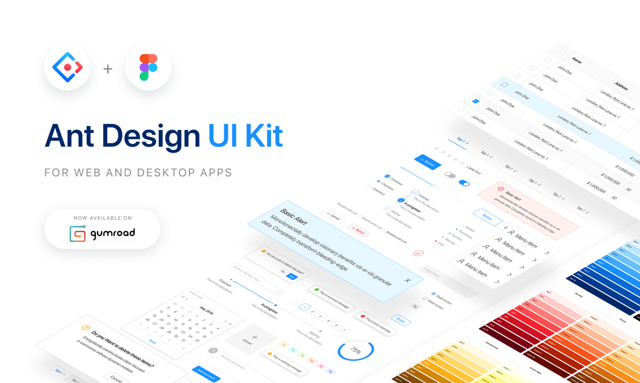
Ant Design System for Figma is the UI kit that contains over 2100 handcrafted interface components for web and desktop apps. There are buttons, inputs, checkboxes, tables, tooltips, icons and other commonly used interface elements. All of this is customizable and ready to use.
What is more, it’s based on a popular React UI library — Ant Design. That means your developers can use Ant Design to code React apps based on your designs. You can learn more about Ant Design on its website.
Why?
So why did I create Ant Design System for Figma?
In my everyday work I build interfaces, style guides and UI libraries. I need to create typography scales, color palettes, documentation, buttons, inputs and all components states from scratch for every product I create.
I thought to myself: “Wait, what if I could build a large UI kit once and then use it to create other component libraries for products I design?”
Because of this thought, I designed Product Design Kit for Figma. Now it reached over 6K downloads on Gumroad and still has a great interest, 10 months after the release. You can read more about it here.
Product Design Kit was a small project and after hundreds of hours of UI work my needs for this ‘ultimate’ solution arose. I started noting what I missed in the PD Kit and began to explore new possibilities for a better version of it. Because of the experience I already had, I knew what this new solution should have:
- a rich component library consisting of commonly used UI elements
- each component should have states so I don’t need to create anything from scratch
- the library should have icons too, so I don’t need to look for icons every time I start a new project
- nice and accessible color palettes
- consistent typography scales
- extra feature: it should be consistent with the existing design system so when a company needs to prototype something using web components, they can use its web library
- existing system should be MIT licensed so everybody can use it
I started doing research while having this in mind. One day I found Ant Design System and it was a perfect match ❤
Following the best practices I learned during these years of working with Figma I spent 3 months doing the UI kit from scratch. Component after component, reading the documentation and inspecting Chrome Dev Tools I managed to create 43 unique ant design components with states that resulted in over 2100 UI elements.
Now, these 3 months of work are saving me hundreds of hours of repetitive stuff I did previously. What is more, Ant Design System for Figma was #3 Product of the Day on Product Hunt and now it’s also featured on Gumroad.
Who?
Who and how can benefit from using Ant Design System for Figma?
Product, UI / UX Designers
Stop creating the same inputs, buttons, icons and style guides from scratch, along with every new project started like I did previously! Use this large library of UI components and styles to deliver your work faster. You can also customize this UI kit however you want to match your product’s UI style.
Developers
Design consistent and accessible interfaces and test how it will look before coding it — without relying on designers. What is more, this UI kit was created following principles of Ant Design React library that has over 50 000 stars on github!
IT managers / Entrepreneurs
Create MVPs efficiently and save hundreds of hours on UI Design. This is also a great place to start if your product or brand needs a design system. Equip your team with this library in the Figma environment and build consistent products faster.
How to use it
I have recorded a timelapse (4 minutes) and video tutorial (30 minutes) on how I use it to design a simple UI. You can watch it below:
Timelapse:
Tutorial:
How to get it?
Visit www.antforfigma.com or get it directly from Gumroad: https://gumroad.com/l/antdesign

